Page 1 of 4
[UPDATE RELEASE] Combat HUD_v4.0 OXZ
Posted: Wed Jan 04, 2012 1:08 pm
by Smivs
Version 4.1 now available - also in Widescreen. Full details are on the wiki page.
Combat HUD OXP
The Combat HUD is an improved version of the basic HUD, which has been optimised for combat situations - the layout is tidier and more logical making it easier to use.
The main Scanner is green (rather than red) and the Compass is a gentler shade of blue. If a scanner targeting enhancement is fitted the reticule will turn red when the target is centered.
The vital information (Laser temperature, shields and Energy) has been grouped together on the right side to allow at-a-glance assessment during combat. The scoop indicator, status light, joystick sensitivity indicator and the Aegis indicator are on the right side next to the scanner. The console messages are also displayed here, above the gauges.
On the left side of the main scanner are the speed, pitch and roll, fuel, cabin temperature and altimeter gauges. The Compass and Scanner Zoom are also here, and the comms messages will be displayed above these gauges.
The clock is centrally positioned above the scanner.
The HUD will acommodate up to Sixteen pylons and eight energy bars, so the HUD is suitable for all available ships.

Download Combat HUD OXP
here.
Wiki page
Smivsonline
This work is licensed under the Creative Commons Attribution-Noncommercial-Share Alike 3.0
Unported License. To view a copy of this license, visit
http://creativecommons.org/licenses/by-nc-sa/3.0/
or send a letter to Creative Commons, 171 Second Street, Suite 300, San
Francisco, California, 94105, USA.
The OXP was developed by Smivs.
Re: [RELEASE] Combat HUD
Posted: Wed Jan 04, 2012 5:01 pm
by CaptSolo
Nice HUD Smivs. I'll fit it to my ship for tonights patrol.
Re: [RELEASE] Combat HUD
Posted: Sat Jan 07, 2012 8:50 pm
by OneoftheLost
Bah! Smivs I need you to stop making OXPs. My oxp folder cant take much more.

Will give this a try! Looks promising so far.
Re: [RELEASE] Combat HUD
Posted: Sun Jan 08, 2012 12:01 am
by Duggan
well, I must say its a great OXP and I would dearly love it.. I followed the instructions as listed to the letter , even pressing the shift key as I opened a saved game.. But the Falcon HUD insisted on showing it self. Now Among the brilliant HUDs now coming of the production line, I also thought the mil 4K HUD was pretty good too. which did install over the Falcons Dash board quiet nicely, but being of a certain age, the writing on the on screen messages on Mil 4K proved a little to small on my antiquated eyes . So i guess I'm stuck with the Falcon dashboard until some kind soul tells me what I can do to get the Combat HUD in or alternatively enlarge the writing on the Mil 4k.

Re: [RELEASE] Combat HUD
Posted: Sun Jan 08, 2012 12:21 am
by Smivs
The Falcon HUD is probably over-riding the Combat HUD. Open the shipdata.plist for the falcon (don't use Notepad!) and see if there's a line like
or similar.
If there is, either delete just that line, or change the name of the Combat HUD hud.plist to the one in the Falcon OXP.
Re: [RELEASE] Combat HUD
Posted: Sun Jan 08, 2012 1:01 am
by Duggan
Smivs wrote:The Falcon HUD is probably over-riding the Combat HUD. Open the shipdata.plist for the falcon (don't use Notepad!) and see if there's a line like
or similar.
If there is, either delete just that line, or change the name of the Combat HUD hud.plist to the one in the Falcon OXP.
It was as simple as that

Thank you Smivs, I am now the proud owner of the Combat Hud. There's a lot of cleverness in Nottingham which is why I in Derby feel the need to bring balance to the Ooniverse by being a veritable study in ineptitude

Re: [RELEASE] Combat HUD
Posted: Sun Jan 08, 2012 7:21 am
by Fatleaf
Duggan wrote:There's a lot of cleverness in Nottingham....
Have you been there!

Re: [RELEASE] Combat HUD
Posted: Sun Jan 08, 2012 10:32 am
by Smivs
Duggan wrote:
It was as simple as that

Thank you Smivs, I am now the proud owner of the Combat Hud. There's a lot of cleverness in Nottingham which is why I in Derby feel the need to bring balance to the Ooniverse by being a veritable study in ineptitude

My pleasure. Not too much cleverness...just an educated guess, but I'm glad it worked. I wonder who else lives here in the East Midlands?
Re: [Re-RELEASE] Combat HUD
Posted: Tue Jan 10, 2012 6:18 pm
by Smivs
v2.0 is now available. See first post for details.
Re: Combat HUD
Posted: Thu Jan 24, 2013 10:32 am
by Smivs
v2.1 is now available. Previous versions had a bug in the code which was not previously causing any problems, but became an issue when used with Oolite v1.77.
Re: [UPDATE RELEASE] Combat HUD_v3.0 OXZ
Posted: Sun Jun 29, 2014 2:09 pm
by Smivs
29th June, 2014. Version 3.0 now available - OXZ only.
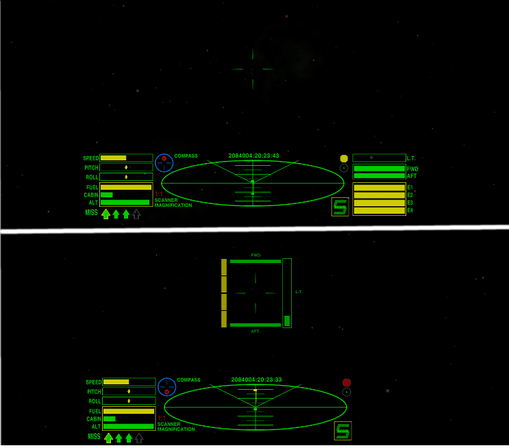
The Combat HUD is a neatly laid out HUD, with information grouped logically around the main scanner. Comms and Console messages appear above the dials and there is provision for two MFDs. Combat HUD switches to 'Combat Mode' when at Red Alert - vital information is presented around the crosshairs.
On the left side of the main scanner are the speed, pitch and roll, fuel, cabin temperature and altimeter gauges. The Compass and Scanner Zoom are also here, and Comms messages will be displayed above these gauges.
Laser temperature, shields and Energy have been grouped together on the right side. The Console messages are also on the right side, above the gauges, and the scoop indicator, status light and joystick sensitivity indicator also appear here. The Aegis indicator is bottom-right.
The Clock is centred at the top of the HUD, allowing room for up to the maximum of 16 pylons at the bottom.
The Combat HUD has been optimised for combat situations. If a scanner targeting enhancement is fitted the reticule will turn red when the target is centered.
When at 'Red Alert' the right-side dials (weapons temperature, fore and aft shields and energy) are removed and replaced by dials arranged around the crosshairs, with the laser temperature to the right, energy to the left and fore and aft shields above and below the crosshairs. This allows close monitoring of these vital functions during combat, and the dials are slightly transparent to aid vision.
These dials are removed and replaced by the standard position dials when no longer at Red Alert.
Top image:- Standard CombatHUD
Lower image:- CombatHUD at Red Alert

Re: [UPDATE RELEASE] Combat HUD_v3.0 OXZ
Posted: Sat Jul 05, 2014 8:25 am
by Smivs
The
overhaul is going well and most of the new features have now been incorporated into the HUD.
I do have one question though. The "alert_conditions" key doesn't seem to work with the message GUI, is that right?
Edited to add:- Sneak peek at the new widescreen version.

Re: [UPDATE RELEASE] Combat HUD_v3.0 OXZ
Posted: Sat Jul 05, 2014 9:50 am
by cim
Smivs wrote:The "alert_conditions" key doesn't seem to work with the message GUI, is that right?
Correct, it only works with "dials".
Re: [UPDATE RELEASE] Combat HUD_v3.0 OXZ
Posted: Sat Jul 05, 2014 9:56 am
by Smivs
That's what I though, thanks.
Can it be made to work in a future version? Pretty please

Re: [UPDATE RELEASE] Combat HUD_v3.0 OXZ
Posted: Sat Jul 05, 2014 10:00 am
by cim
Smivs wrote:That's what I though, thanks.
Can it be made to work in a future version? Pretty please

Possibly. It's a bit trickier since you can define two of the same dial and it just works, but you can only define one message log because of the format of hud.plist


