Page 4 of 11
Re: New splash screen and icon
Posted: Wed Oct 25, 2023 10:01 am
by Redspear
...just to add that the most complete, if I had to pick one right now and we couldn't change it, icon presented thus far is (IMHO of course)...
Simple, clear, distinct.
phkb wrote: ↑Tue Oct 24, 2023 10:07 pm
Edit to add: Once we have a "definitive" version, I'll share whatever resources I've created, and then everyone can go nuts with colours.
Sounds like a plan

Re: New splash screen and icon
Posted: Wed Oct 25, 2023 10:41 am
by hiran
Redspear wrote: ↑Wed Oct 25, 2023 10:01 am
...just to add that the most complete, if I had to pick one right now and we couldn't change it, icon presented thus far is (IMHO of course)...
Simple, clear, distinct.
phkb wrote: ↑Tue Oct 24, 2023 10:07 pm
Edit to add: Once we have a "definitive" version, I'll share whatever resources I've created, and then everyone can go nuts with colours.
Sounds like a plan

+1
Re: New splash screen and icon
Posted: Wed Oct 25, 2023 1:04 pm
by phkb
The trouble is, I've really gone off that white/red combo! I just feel the light red colour towards the ends of the wings is just... well, weak. The black variants feel stronger. But maybe that's just me.
Anyway, here's some more options:

Re: New splash screen and icon
Posted: Wed Oct 25, 2023 3:34 pm
by Gwydion
I really like there new red icon designs.
I you don't like the light red bleaching out could you make a gradient and fade into gold. That would make the wing tips gold?
Re: New splash screen and icon
Posted: Wed Oct 25, 2023 3:54 pm
by phkb
Gwydion wrote: ↑Wed Oct 25, 2023 3:34 pm
I you don't like the light red bleaching out could you make a gradient and fade into gold. That would make the wing tips gold?
Kind of like this?

Re: New splash screen and icon
Posted: Wed Oct 25, 2023 4:10 pm
by cbr

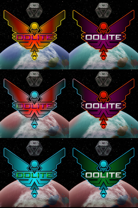
and a few hue variants...
Re: New splash screen and icon
Posted: Wed Oct 25, 2023 4:43 pm
by arquebus
Now I want a disco variant that just strobes through all the color versions.
Re: New splash screen and icon
Posted: Wed Oct 25, 2023 4:46 pm
by Gwydion
Yes, the red/gold one is what I was thinking. Love it.

Re: New splash screen and icon
Posted: Wed Oct 25, 2023 6:40 pm
by Redspear
phkb wrote: ↑Wed Oct 25, 2023 1:04 pm
The trouble is, I've really gone off that white/red combo! I just feel the light red colour towards the ends of the wings is just... well, weak. The black variants feel stronger. But maybe that's just me.
Ir you remember up thread, I prefered it fading to black, just with the red being more dominant than the black. I was saying if I had to pick one , with no changes.
phkb wrote: ↑Wed Oct 25, 2023 1:04 pm
Anyway, here's some more options:

...jingle bells, jingle bells... 
The red text on the gold doesn't work for me. The other one is much better in terms of readability but so dark that it looks like you hate red and were contractually obliged to include it...
Maybe we're doing this wrong and should think instead how it looks as a small icon. We shouldn't lose anything be scaling up but by scaling down that may not be the case.
Meanwhile...
phkb wrote: ↑Wed Oct 25, 2023 3:54 pm
Gwydion wrote: ↑Wed Oct 25, 2023 3:34 pm
I you don't like the light red bleaching out could you make a gradient and fade into gold. That would make the wing tips gold?
Kind of like this?

Again, the red is almost lost here but it may be just(/nearly) enough solve the readability on the purely gold versions earlier.
Re: New splash screen and icon
Posted: Wed Oct 25, 2023 7:17 pm
by cbr
phkb wrote: ↑Wed Oct 25, 2023 1:04 pm
The trouble is, I've really gone off that white/red combo! I just feel the light red colour towards the ends of the wings is just... well, weak. The black variants feel stronger. But maybe that's just me.
Nope me 2!
&
Maybe we're doing this wrong and should think instead how it looks as a small icon

Re: New splash screen and icon
Posted: Wed Oct 25, 2023 8:11 pm
by Redspear
cbr wrote: ↑Wed Oct 25, 2023 7:17 pm
Maybe we're doing this wrong and should think instead how it looks as a small icon

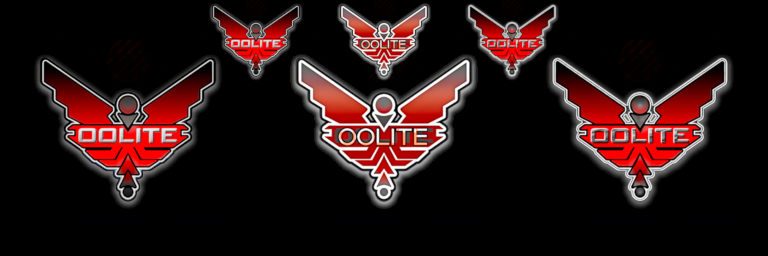
The leftmost two work the best I think. Personally, I feel you've cut a liitle two much red on the 'baubles' given how dark that grey is. Other than that, I'd say those two look really good!
Re: New splash screen and icon
Posted: Wed Oct 25, 2023 9:23 pm
by cbr

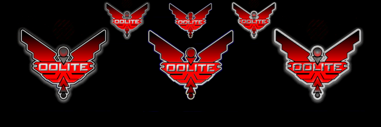
'Nuances', center one added...
Re: New splash screen and icon
Posted: Wed Oct 25, 2023 9:31 pm
by phkb
Redspear wrote: ↑Wed Oct 25, 2023 6:40 pm
The red text on the gold doesn't work for me.
Maybe a bit of bronze, instead? Gold is a hard colour to get a good match to.

Redspear wrote: ↑Wed Oct 25, 2023 6:40 pm
The other one is much better in terms of readability but so dark that it looks like you hate red and were contractually obliged to include it...


Actually, it was a black-dark red variation, but I've increased the saturation in the above one to make it more dominant.
Redspear wrote: ↑Wed Oct 25, 2023 6:40 pm

Again, the red is almost lost here but it may be just(/nearly) enough solve the readability on the purely gold versions earlier.
Red doesn't do well with the gold - by the time the gradient has finished transitioning, it ends up looking more orange than red. And if I stop the gradient early (ie only have a small transition near the tips of the wings), the red just looks wrong. Swapping to the dark red solves a bit of this, but well, dark red, for haters of red!
Here, see if you think the same:

Redspear wrote: ↑Wed Oct 25, 2023 6:40 pm
Maybe we're doing this wrong and should think instead how it looks as a small icon.
There are things I can do with just the icon to make things more readable: swapping coloured text for just black, removing bevels, etc. I think any of the samples I've put forward will be able to work as an icon (I mean, there's only so much you can do with 32x32 pixels or less, but the other sizes are ok).
Using the bronze/gold combo as a sample...
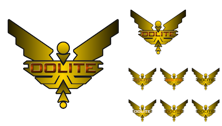
Here, the largest icon is 256x256, which is mostly still equivalent. The next size down is 128x128, which is now starting to lose some definition. The rest of the sizes are 64x64, and I've taken a different approach with each one, using a solid colour for all except the first one. I think the text can be made to be quite readable at that resolution. Below that resolution everything becomes a little indistinct. I could also remove the gradient on the really small sizes, which might help a bit more.
The point is, whenever we decide on the colour combo we like the most for the splash screen, I can make the icons work with it.
Re: New splash screen and icon
Posted: Wed Oct 25, 2023 10:45 pm
by Redspear
cbr wrote: ↑Wed Oct 25, 2023 9:23 pm

'Nuances', center one added...
Hello centre

phkb wrote: ↑Wed Oct 25, 2023 9:31 pm
Red doesn't do well with the gold - by the time the gradient has finished transitioning, it ends up looking more orange than red. And if I stop the gradient early (ie only have a small transition near the tips of the wings), the red just looks wrong
Perhaps I haven't been clear. If it just looks like some kind of 'rose' gold then that's fine with me. The gold being dominant over the red works I think (not talking about the text here) but the black being
too dominant over the red (YMMV) just makes it look like an old sofa to me I'm afraid...
phkb wrote: ↑Wed Oct 25, 2023 9:31 pm
Redspear wrote: ↑Wed Oct 25, 2023 6:40 pm
The red text on the gold doesn't work for me.
Maybe a bit of bronze, instead? Gold is a hard colour to get a good match to.

My issue with the red on the gold was that it gets 'lost'. Fine for a 'blend', less so for text.
The image on the right however, looks pretty good I think.
phkb wrote: ↑Wed Oct 25, 2023 9:31 pm
There are things I can do with just the icon to make things more readable: swapping coloured text for just black, removing bevels, etc...
The point is, whenever we decide on the colour combo we like the most for the splash screen, I can make the icons work with it.
Point taken. As you were...
Re: New splash screen and icon
Posted: Wed Oct 25, 2023 11:22 pm
by arquebus
My opinion is opposite Redspear's haha. I really like the red on gold.
Is the font "fixed" for us? I mean is there a specific reason it's that font, and we can't really change it without a whole 'nother multi-page thread?

The reason I ask is because when I look at some of these versions, what I read isn't Oolite, it's Dolite. The O is too boxy, so in some versions it looks more like a D. Which is the case in the red on gold image above - for me, anyway.


