

New splash screen and icon
Moderators: another_commander, winston
Re: New splash screen and icon
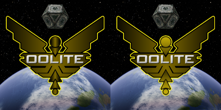
Here is another based off of the latest choices. Goes back to the gold and silver idea arquebus had on the first page. Proof of concept only as the shading on the circles and chevrons could be much improved in the hands of someone with talent.
Humor is the second most subjective thing on the planet
Brevity is the soul of wit and vulgarity is wit's downfall
Good Night and Good Luck - Read You Soon
Brevity is the soul of wit and vulgarity is wit's downfall
Good Night and Good Luck - Read You Soon
-
Redspear
- ---- E L I T E ----

- Posts: 2900
- Joined: Thu Jun 20, 2013 10:22 pm
- Location: On the moon Thought, orbiting the planet Ignorance, looking through a telescope with the lens cap on
Re: New splash screen and icon
I take your point and I think that's an important consideration to mention but I'm thinking that these look ok on a pale background (maybe it's me...)
I think there's two main reaseons that I prefer the coriolis. 1. Although Griff did a great job with both, I've always thought his work on the coriolis was outstanding. 2. Seeing the coriolis ahead makes it a view from within the game, first person; compared to seeing the cobra where I'm left thinking this might be a third person view (less immersive/inviting IMHO).
Yeah, minimalist works for me too!
I think that if we're going to have a second colour in there then a medium to light grey seems to work pretty well. There is a risk of it detracting from the text however. Maybe the text could be closer to white? Also, like arquebus, whether it fades to black or white, although I have a preference, it Isn't a big problem for me either way.
This one for example might be growing on me but the contrast between the dull 'gold' and the bright 'silver' is maybe a bit too much - I think it's needed for the name to stand out but not for the rest.
I know things can easily get bogged down in nit-pickery but it seems to me that we might actually be getting somewhere...???
-
phkb
- Impressively Grand Sub-Admiral

- Posts: 5698
- Joined: Tue Jan 21, 2014 10:37 pm
- Location: Writing more OXPs, because the world needs more OXPs.
Re: New splash screen and icon
Definitely! Iterating through these designs is kind of fun!
Maybe something more like this, then:
-
phkb
- Impressively Grand Sub-Admiral
- Posts: 5698
- Joined: Tue Jan 21, 2014 10:37 pm
- Location: Writing more OXPs, because the world needs more OXPs.
Re: New splash screen and icon
A couple more variations on a theme:
We're getting closer, I think!
We're getting closer, I think!
-
hiran

- Theorethicist
- Posts: 2654
- Joined: Fri Mar 26, 2021 1:39 pm
- Location: a parallel world I created for myself. Some call it a singularity...
Re: New splash screen and icon
Thinking about it...
Would it be possible to define a relationship between the outline and the filling? The outline color could be defined, e.g. a stong blue and the filling would be a gradient from dark gray to a dark version of the outline.
With that the concise color could be varied on the context. For the current OoliteStarter splash screen some orange would be a better match while for the current Oolite splashscreen it is not.
And noone limits us to have icons for the core and icons for the ecosystem.
Sunshine - Moonlight - Good Times - Oolite
-
phkb
- Impressively Grand Sub-Admiral
- Posts: 5698
- Joined: Tue Jan 21, 2014 10:37 pm
- Location: Writing more OXPs, because the world needs more OXPs.
Re: New splash screen and icon
When you say "outline", do you mean the bright gold outline around the entire logo? And by "filing", do you mean the dull gold colour inside the icon itself (from the last example, anyway)?

Re: New splash screen and icon
i am ok for now
I really like that red gradient...
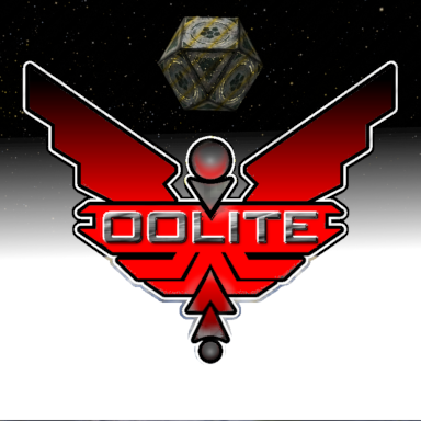
variant with double black outline, darkened characters and reduced 'oolite' to 99%
-
Redspear
- ---- E L I T E ----
- Posts: 2900
- Joined: Thu Jun 20, 2013 10:22 pm
- Location: On the moon Thought, orbiting the planet Ignorance, looking through a telescope with the lens cap on
Re: New splash screen and icon
Me too but... IF gold is to be preferred then some thoughts:
Not the one on the left for me but the one on the right is better. I think it addresses the contrast issue quite nicely.
Gold is a nice nod to the original source material/inspiration:
I believe that the original BBC logo was in silver, on both manual and box art.
For almost all of the conversions however, it seems to have been transformed into gold.

Alchemy!... sort of...
Some of those conversions really were quite different too.
Ramble commencing...
For example (from memory and so may contain bunk...), the coversions made by Torus really were the origins of the 'torus drive'. I remember reading an interview from one of the conversion team that suggested Bell & Braben had come across as a little snooty and not particularly helpful. Ironically, he went on to be quoted as saying how messed up some of the original mechanics were and how he had to fix them (not sounding snooty at all...) Of course interviews are often about sales more than truth but the key point here being (IIRC) that some of the things oolite has inherited aren't just from the minds of Bell, Braben & Holdstock...
Ramble complete...
So as our own conversion, maybe gold IS the colour?
Brighten up the one on the right a bit (not necessarily as much as the original elite logo above) and you might win me over... I'm not promising anything
-
hiran
- Theorethicist
- Posts: 2654
- Joined: Fri Mar 26, 2021 1:39 pm
- Location: a parallel world I created for myself. Some call it a singularity...
Re: New splash screen and icon
Affirmative, Quite Grand Subadmiral Sir!
Sunshine - Moonlight - Good Times - Oolite
Re: New splash screen and icon
Just one more...

-
hiran
- Theorethicist
- Posts: 2654
- Joined: Fri Mar 26, 2021 1:39 pm
- Location: a parallel world I created for myself. Some call it a singularity...
Re: New splash screen and icon

Sunshine - Moonlight - Good Times - Oolite
-
phkb
- Impressively Grand Sub-Admiral
- Posts: 5698
- Joined: Tue Jan 21, 2014 10:37 pm
- Location: Writing more OXPs, because the world needs more OXPs.
Re: New splash screen and icon
How's this?
Re: New splash screen and icon

and the red with 'gold' glow
-
phkb
- Impressively Grand Sub-Admiral
- Posts: 5698
- Joined: Tue Jan 21, 2014 10:37 pm
- Location: Writing more OXPs, because the world needs more OXPs.
Re: New splash screen and icon
I see no reason why we couldn't have specific icon colour sets for different applications. One colour set for the main game. One for Oolite Starter. One for the Debug Console.
Edit to add: Once we have a "definitive" version, I'll share whatever resources I've created, and then everyone can go nuts with colours.
As for SVG... I'll let you know. I've been working with bitmaps so far, and my SVG skills are... limited!
-
Redspear
- ---- E L I T E ----
- Posts: 2900
- Joined: Thu Jun 20, 2013 10:22 pm
- Location: On the moon Thought, orbiting the planet Ignorance, looking through a telescope with the lens cap on
Re: New splash screen and icon
Both of these are improvements I would say but the 'effect' may be lost or even undesirable at smaller sizes.
Yeah, it's definitely getting there by my estimation.
One problem with both this and cbr's images above is that the word oolite doesn't stand out very well.
Two alternative suggestions:
1. colour the word white instead of silver.
2. take a(nother) leaf from the original's book and outline the word ('oolite' in this case) in similar fashion to the icon itself.