Web redesign
Moderators: another_commander, winston
-
Disembodied

- Jedi Spam Assassin

- Posts: 6885
- Joined: Thu Jul 12, 2007 10:54 pm
- Location: Carter's Snort
-
JensAyton

- Grand Admiral Emeritus

- Posts: 6657
- Joined: Sat Apr 02, 2005 2:43 pm
- Location: Sweden
- Contact:
I like it, but…seventh wrote:Something is ready:) No flash, no CMS
- The picture on the intro page is beautiful, and helps establish the colour scheme… but as mentioned upthread, using OXP content as the splash image is a bit misleading. :-/
- I meant it about text sizes.
- The navigation jumps around when the scroll bar is hidden or shown (notably, when switching to the Gallery page). This is a general problem with right-aligned stuff; the current site “fixes” it with overflow-y: scroll; on the <html> element.
- In Safari, at least, there seems to be a misalignment between the default and highlighted versions of the navigation background images. I can provide screen shots if you need them.
- The current site simplifies the download page by hiding the downloads for other platforms when possible. Adapting this for the redesign should be easy.
- It’d be nice if the topmost gallery was expanded when you went to the gallery page.
E-mail: [email protected]
-
ClymAngus

- ---- E L I T E ----

- Posts: 2514
- Joined: Tue Jul 08, 2008 12:31 am
- Location: London England
- Contact:
You have an interesting more general point. This an opportunity to add things that we think might hook people in. That said I fully under stand we don't want to make it too busy.
It all really depends on the kind of function you want this page to have really. Now all we have to do is make the wiki look more like a tec manual and we'll be open for business.
It all really depends on the kind of function you want this page to have really. Now all we have to do is make the wiki look more like a tec manual and we'll be open for business.


The two galleries also seem to be showing the same 20 pictures at the moment - the second one seems to be accidentally calling the pics from the first.
My OXPs via Boxspace or from my Wiki pages  .
.
Thargoid TV
Dropbox Referral Link
Thargoid TV
Dropbox Referral Link

Yes, I think this way. I just copy-pasted information from the old site.Selezen wrote:Needs some mention of Giles somewhere though...
Not so great as yoursGriff wrote:wow, that's very very nice work!
It's possible, but if it's necessary.Nijik wrote:I presume (from a position of little knowledge on these things), be easy to expand upon?
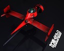
Showing Griff's Cobra I meant it as example one of possible images, maybe represented more artistically.lfnfan wrote:- to have an exhaust plume coming from the cobra on the front page (shame we can't see that pic on all the pages). Perhaps also some "fierce energy fire" mirroring Drew's text?
There is opportunity to show any different nice oolite objects. (Maybe randomly on every visit)
As a variant I planned to make a more detailed scene of space fighting.
just copy-past for the oolite.orgSendraks wrote:I agree with Ifnfan - not sure mentioning 1.65 is terribly helpful, too many oxp compatibility issues.
Initially I also thought to put the Cobra up, but then the navigation will be at the foot of the page and maybe out of range.Disembodied wrote:I would make would be to show the Griff Cobra from above, rather than below ...
Can we place a short reference near the ship, describing illustration? Like a " *Cobra MK3 from Griff's OXP " etc. ?Ahruman wrote:The picture on the intro page is beautiful, and helps establish the colour scheme… but as mentioned upthread, using OXP content as the splash image is a bit misleading. :-/
I think it won't be unfair to others OXPs, I hope everyone believes that it's real masterpiece, showing real possibilities of the game (my own experience shows me that original "nude" ships may scare a novice )
I remember what you meantAhruman wrote:I meant it about text sizes.
OK, thanksAhruman wrote:The navigation jumps around when the scroll bar is hidden or shown (notably, when switching to the Gallery page). This is a general problem with right-aligned stuff; the current site “fixes” it with overflow-y: scroll; on the <html> element.
It's very very strange.Ahruman wrote:In Safari, at least, there seems to be a misalignment between the default and highlighted versions of the navigation background images. I can provide screen shots if you need them.
Share you screenshots and tell me resolution of your screen, please. .
This should not happen, because the blocks have absolute positioning.
By the way if I designed the site for myself I would use flash menu, because it's reliable, easier and more impressive. But I've prefered more democratic way for the present.
OK, it is logical.Ahruman wrote:The current site simplifies the download page by hiding the downloads for other platforms when possible.
OKAhruman wrote:It’d be nice if the topmost gallery was expanded when you went to the gallery page.
Sure, the content has shown conditionally. All the details need to edit.drew wrote:Would it be completely and utterly self serving of me to request a 'Novella' link as part of the navigation, or should I just be statisfied with the quote on the page (looks very good btw)?
The main thing I wanted to show you is the new look at the navigation and the fact that we needn't reinvent the wheel. My project - it is actually the same as oolite.org, but slightly improved. IMHO simple scandinavian design is the best designClymAngus wrote:You have an interesting more general point. This an opportunity to add things that we think might hook people in. That said I fully under stand we don't want to make it too busy.
It all really depends on the kind of function you want this page to have really. Now all we have to do is make the wiki look more like a tec manual and we'll be open for business.
Usually making up of content it's enough to do a looking good page.
It's for fast exampleThargoid wrote:The two galleries also seem to be showing the same 20 pictures at the moment - the second one seems to be accidentally calling the pics from the first.
I also wonder how large the star map background pictures are. They are now GIF, but I wonder at possibilities to reduce colour depth.
After all, you want this to load really quickly and they actually use very few colours. Can we assume everyone looking for OOlite has a browser that deals with PNG?
But maybe you already optimised for this.
Best wishes,
Oscar
After all, you want this to load really quickly and they actually use very few colours. Can we assume everyone looking for OOlite has a browser that deals with PNG?
But maybe you already optimised for this.
Best wishes,
Oscar
-
drew

- ---- E L I T E ----
- Posts: 2190
- Joined: Fri May 19, 2006 9:29 am
- Location: In front of a laptop writing a book.
- Contact:
Hopefully I'm not the only one who read that and got a Monty Python-esque "Ah... I see you have a machine that goes ping!" in their head?ovvldc wrote:OOlite has a browser that deals with PNG?
Mostly humbly grateful - thanks!seventh wrote:Sure, the content has shown conditionally. All the details need to edit.
Cheers,
Drew.

Web Redesign
As a newby player of Oolite since 08/09 and Elite way back in '88/89, I have to stop watching and reading to jump in and shout Yes! to the web example presented by Seventh. I've bookmarked many of your pages from all over the place as I have collected info about this new Ooniverse. This is just what would engage hyperdrive! Good onyer.
Simple is better, but remember the us wrinklies, the memory and eyesight can let us down at times. Typesize only needs making clear with a slight increse in size and good contrast.
Now how do I modify my foxy Falcon 'S' with an enhanced laser sight? ...
Simple is better, but remember the us wrinklies, the memory and eyesight can let us down at times. Typesize only needs making clear with a slight increse in size and good contrast.
Now how do I modify my foxy Falcon 'S' with an enhanced laser sight? ...
-
Disembodied
- Jedi Spam Assassin
- Posts: 6885
- Joined: Thu Jul 12, 2007 10:54 pm
- Location: Carter's Snort
No, I just mean that the top of the Cobra III is more visually interesting ... the picture would be oriented exactly the same, just we'd see the upper surface of the ship rather than its belly. I wouldn't change the page layout at all.seventh wrote:Initially I also thought to put the Cobra up, but then the navigation will be at the foot of the page and maybe out of range.Disembodied wrote:I would make would be to show the Griff Cobra from above, rather than below ...
-
JensAyton
- Grand Admiral Emeritus
- Posts: 6657
- Joined: Sat Apr 02, 2005 2:43 pm
- Location: Sweden
- Contact:
I really like the plain white underbelly. Firstly, as I said before it establishes a colour scheme (making it look like “deliberately and carefully chosen white on black” rather than just “white on black), and secondly it reminds me of the plastic models of pre-CG film and TV.Disembodied wrote:No, I just mean that the top of the Cobra III is more visually interesting ... the picture would be oriented exactly the same, just we'd see the upper surface of the ship rather than its belly. I wouldn't change the page layout at all.
E-mail: [email protected]
-
JensAyton
- Grand Admiral Emeritus
- Posts: 6657
- Joined: Sat Apr 02, 2005 2:43 pm
- Location: Sweden
- Contact:
I can’t recreate it now. Annoying; I spent some time making sure it wasn’t an optical illusion, but didn’t take any screen shots. Maybe I was using the Webkit nightly or something.seventh wrote:It's very very strange. :shock: Before to show the site, I tested it in Opera, Firefox, IE7, IE8, Chrome, Safari 4 (on PC).Ahruman wrote:In Safari, at least, there seems to be a misalignment between the default and highlighted versions of the navigation background images. I can provide screen shots if you need them.
Share you screenshots and tell me resolution of your screen, please.
E-mail: [email protected]
-
Disembodied
- Jedi Spam Assassin
- Posts: 6885
- Joined: Thu Jul 12, 2007 10:54 pm
- Location: Carter's Snort
I see what you mean ... but the upper surface of the Cobra could still be largely monochrome. It's a more interesting shape, with planes and angles and the structural details around the engines. My (minor) peeve is not so much with the colour of the underbelly, it's that it's more-or-less flat.Ahruman wrote:I really like the plain white underbelly. Firstly, as I said before it establishes a colour scheme (making it look like “deliberately and carefully chosen white on black” rather than just “white on black), and secondly it reminds me of the plastic models of pre-CG film and TV.