I sometimes access this site from my phone, and I really dont want to have to go looking for a link to a lowfi version. Im sure there are many other people who dont always connect with DSL. I have no idea about iPhones etc. but my phone does not have megafast connectivity. Some people will also pay for data. And unless you are youtube, or iplayer etc there is no really excuse for needing a low-fi link.
Seriously lets do this properly, go back to thinking about what we want to achieve, and what demograhics we are targetting. What messages are we trying to get across.
From this we derive guidelines such as those give by Ahruman (or not, maybe we should be appealing to the web 3.0 generation).
Images are great for showing pictures. To my mind they are poor for showing text. I dont think we need to worry too much about text readers (I guess not many blind people play oolite) but thinking about accessibility is a good idea, and buttons age badly. For me, Id say the website should be text and information heavy, with images to show off gameplay and atmosphere. Some downloadable videos might be nice, but lets focus on being a useful website for people looking for info on oolite.
Web redesign
Moderators: another_commander, winston

I don't know if we should concentrate much on phone-surfers... I mean, they won't probably download the game while browsing with their phones, so when they first hear about Oolite, they would probably rather check it out detailed on a PC, wouldn't they?Cmdr James wrote:I sometimes access this site from my phone, and I really dont want to have to go looking for a link to a lowfi version. Im sure there are many other people who dont always connect with DSL. I have no idea about iPhones etc. but my phone does not have megafast connectivity. Some people will also pay for data. And unless you are youtube, or iplayer etc there is no really excuse for needing a low-fi link.
Seriously lets do this properly, go back to thinking about what we want to achieve, and what demograhics we are targetting.
Well, yeah, have to agree there.Cmdr James wrote:Images are great for showing pictures. To my mind they are poor for showing text.
Still not sure about sizes though.
When I first launched the site which is linked in my profile, I didn't have a clue about coding and made it with iWeb. Most of the text was - you guessed it - images. So some day, I started learning HTML and CSS, also since some users complained that it's... not very convenient to browse with a 56k modem when the site is unneccessarily, extremely big.
Since then, they were quite happy with the changes. So now I wonder - what is reasonably big for 56k users? I mean, the banner of my site alone is 205 KB big and would load nearly 4 seconds for the 56k users.
-
Cmdr James

- Commodore

- Posts: 1357
- Joined: Tue Jun 05, 2007 10:43 pm
- Location: Berlin
You dont think we should worry about people like me coming to the oolite website? So Im not the most important guy here, but my point is that I expect to be able to read the website on my phone and my netbook over slow comms.Corny wrote:I don't know if we should concentrate much on phone-surfers... I mean, they won't probably download the game while browsing with their phones, so when they first hear about Oolite, they would probably rather check it out detailed on a PC, wouldn't they?Cmdr James wrote:I sometimes access this site from my phone, and I really dont want to have to go looking for a link to a lowfi version. Im sure there are many other people who dont always connect with DSL. I have no idea about iPhones etc. but my phone does not have megafast connectivity. Some people will also pay for data. And unless you are youtube, or iplayer etc there is no really excuse for needing a low-fi link.
I started my phone browser and looked at your site, I could read the text in a few seconds, to load everything was more like 20 seconds. But actually its not so much the bandwidth that concerns me for our site, its that simple "properly written" standards compliant sites work well, anything with flash, or clever layout or that assumes a pc screensize, or lots of scripting is almost unusable.
-
Commander McLane

- ---- E L I T E ----
- Posts: 9520
- Joined: Thu Dec 14, 2006 9:08 am
- Location: a Hacker Outpost in a moderately remote area
- Contact:
Just for fun I made a quick test with your website:
First attempt: 25 seconds
Second attempt: 33 seconds
Third attempt: 8 seconds
Fourth attempt: 11 seconds
I think the better results for the last two are due to parts of the content being cached in the proxy server? (I was using IE with InPrivate setting, in order to prevent anything from being cached locally.)
By the way: I liked it that the text showed up first. What I find really annoying is websites from which every last single ad-banner is loaded before a single word of the actual site content shows up. Unfortunately this is true for the majority of commercial websites. On instances I have paid for half an hour in an internet cafe with god-knows-what kind of connection and literally spent the first 15 minutes until the login-fields of my webmail provider became accessible for entering my user name and password. 15 minutes after which I could have ripped their heads off for hugely customer-unfriendly site layout, if they wouldn't have happened to be located on a different continent.
And my problem is not so much the speed, but the stability of my connection. I am terrified every time I am doing one of those updates on a Windoze where it says in big letters on the screen "DO NOT DISCONNECT YOUR COMPUTER OR YOUR INTERNET CONNECTION DURING THIS UPDATE". To date I didn't have a power blackout during one of those update sessions, and I really don't want to know what would happen if we had.
As long as it is working, I think our download speed is actually quite good (during long downloads I occasionally have in excess of 70 MBps, at least that's what the download window is telling me). I think for all our computers together (some 15 or so) we have a total bandwidth of about 100 or so MBps (which is of course always a value preceeded in the ISP's advertising by the ominous words "up to"), so it depends heavily on (1) what everybody else is just downloading and (2) what the actual usable bandwidth from our ISP currently is. Which depends on factors I only can imagine (one of which certainly is the famous we-don't-actually-mean-what-we're-promising-you factor).
The other thing most of you would need to get used to is that for the first 3 to 5 seconds after clicking a link nothing appears to be happening at all. This is due to us having a pure satellite connection for both download and upload, creating the same delay you can see in the 10 o'clock news when someone is interviewed via satellite (I remember the days when this kind of connection was still quite expensive and rare, and the news anchor had to explain the and apologize for the delay every time). And as East Africa is one of the last areas of the world still not connected via a highspeed sea cable (I think), it may well be that the connection from the server in wherever (was Nairobi for a long time) to the website I am addressing is made through another satellite link, adding another delay.
The last thing preventing myself from enjoying fancy and bandwidth-heavy websites is that--as far as I know--I have no control over what kind of things our ISP is blocking in order to save bandwidth. For a long time YouTube was completely unaccessible for us, instead of embedded videos there was only an ugly empty white square to be seen. This seems to be a matter of the past now, though.
Anyway, even set aside the internet access problems on the dark continent, I would also like to make the point on the note of good webdesign, that all too often fancy graphics, animations, flash, and whatever are just used to cover up the fact that the actual content offered is quite poor. Personally I don't need a fancy flash film which--after finally loading--doesn't actually contain anything valuable for me, and just serves as an OTT link to the next page. But then I am certainly not part of the web 3.0 generation.
First attempt: 25 seconds
Second attempt: 33 seconds
Third attempt: 8 seconds
Fourth attempt: 11 seconds
I think the better results for the last two are due to parts of the content being cached in the proxy server? (I was using IE with InPrivate setting, in order to prevent anything from being cached locally.)
By the way: I liked it that the text showed up first. What I find really annoying is websites from which every last single ad-banner is loaded before a single word of the actual site content shows up.
And my problem is not so much the speed, but the stability of my connection. I am terrified every time I am doing one of those updates on a Windoze where it says in big letters on the screen "DO NOT DISCONNECT YOUR COMPUTER OR YOUR INTERNET CONNECTION DURING THIS UPDATE". To date I didn't have a power blackout during one of those update sessions, and I really don't want to know what would happen if we had.
As long as it is working, I think our download speed is actually quite good (during long downloads I occasionally have in excess of 70 MBps, at least that's what the download window is telling me). I think for all our computers together (some 15 or so) we have a total bandwidth of about 100 or so MBps (which is of course always a value preceeded in the ISP's advertising by the ominous words "up to"), so it depends heavily on (1) what everybody else is just downloading and (2) what the actual usable bandwidth from our ISP currently is. Which depends on factors I only can imagine (one of which certainly is the famous we-don't-actually-mean-what-we're-promising-you factor).
The other thing most of you would need to get used to is that for the first 3 to 5 seconds after clicking a link nothing appears to be happening at all. This is due to us having a pure satellite connection for both download and upload, creating the same delay you can see in the 10 o'clock news when someone is interviewed via satellite (I remember the days when this kind of connection was still quite expensive and rare, and the news anchor had to explain the and apologize for the delay every time). And as East Africa is one of the last areas of the world still not connected via a highspeed sea cable (I think), it may well be that the connection from the server in wherever (was Nairobi for a long time) to the website I am addressing is made through another satellite link, adding another delay.
The last thing preventing myself from enjoying fancy and bandwidth-heavy websites is that--as far as I know--I have no control over what kind of things our ISP is blocking in order to save bandwidth. For a long time YouTube was completely unaccessible for us, instead of embedded videos there was only an ugly empty white square to be seen. This seems to be a matter of the past now, though.
Anyway, even set aside the internet access problems on the dark continent, I would also like to make the point on the note of good webdesign, that all too often fancy graphics, animations, flash, and whatever are just used to cover up the fact that the actual content offered is quite poor. Personally I don't need a fancy flash film which--after finally loading--doesn't actually contain anything valuable for me, and just serves as an OTT link to the next page. But then I am certainly not part of the web 3.0 generation.
It was meant as a question. I don't visit the internet per phone and speculated that I wouldn't check out a site about a computer game via phone.Cmdr James wrote:You dont think we should worry about people like me coming to the oolite website? So Im not the most important guy here, but my point is that I expect to be able to read the website on my phone and my netbook over slow comms.
I see. I can fully understand that.Cmdr James wrote:I started my phone browser and looked at your site, I could read the text in a few seconds, to load everything was more like 20 seconds. But actually its not so much the bandwidth that concerns me for our site, its that simple "properly written" standards compliant sites work well, anything with flash, or clever layout or that assumes a pc screensize, or lots of scripting is almost unusable.
So... I guess that's still "okay" for that kind of connection?Commander McLane wrote:Just for fun I made a quick test with your website:
First attempt: 25 seconds
Second attempt: 33 seconds
Third attempt: 8 seconds
Fourth attempt: 11 seconds
Yeah, one big reason I use ad blocking are annoying flash ads and slow loading advertisements...Commander McLane wrote:By the way: I liked it that the text showed up first. What I find really annoying is websites from which every last single ad-banner is loaded before a single word of the actual site content shows up.
So I'm really glad that I got free, much webspace without having to put ads there.
I don't like Flash very much, either. All flash content is blocked by default at my browser, and YouTube-Videos are shown as .mp4 via the <video>-tag of HTML5 with my media player inside the browser. Just so you know that I really don't want to include flash in the websiteCommander McLane wrote:Anyway, even set aside the internet access problems on the dark continent, I would also like to make the point on the note of good webdesign, that all too often fancy graphics, animations, flash, and whatever are just used to cover up the fact that the actual content offered is quite poor. Personally I don't need a fancy flash film which--after finally loading--doesn't actually contain anything valuable for me, and just serves as an OTT link to the next page. But then I am certainly not part of the web 3.0 generation.
By the way, examples for good (imho) webdesign I like to look at are found at CSS Zen Garden.
-
ClymAngus

- ---- E L I T E ----
- Posts: 2514
- Joined: Tue Jul 08, 2008 12:31 am
- Location: London England
- Contact:
I'll have to take a look at my css scripting. You can do a lot with it that's for sure and it is fast.Corny wrote:I don't like Flash very much, either. All flash content is blocked by default at my browser, and YouTube-Videos are shown as .mp4 via the <video>-tag of HTML5 with my media player inside the browser. Just so you know that I really don't want to include flash in the website
By the way, examples for good (imho) webdesign I like to look at are found at CSS Zen Garden.
Draft 2:
more Glow (overkill?):
Fonts changed to Helvetica and size 14 for the main content, but I think it would look a little different when it's actually coded since GIMP seems to not display the fonts very greatly at my system.
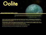
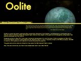
Planet is a placeholder taken from Ahrumans nice "griff-boa-2-wide.png"-banner. It's a planet from the Famous Planets-OXP, if I'm not mistaken?

more Glow (overkill?):

Fonts changed to Helvetica and size 14 for the main content, but I think it would look a little different when it's actually coded since GIMP seems to not display the fonts very greatly at my system.
Planet is a placeholder taken from Ahrumans nice "griff-boa-2-wide.png"-banner. It's a planet from the Famous Planets-OXP, if I'm not mistaken?
-
JensAyton

- Grand Admiral Emeritus

- Posts: 6657
- Joined: Sat Apr 02, 2005 2:43 pm
- Location: Sweden
- Contact:
All hail the Bitmap Bros! Xenon II is of course one of the best games evar, but I don’t know that it would make a good Oolite web site. :-)ClymAngus wrote:
Hey, it’s only been there for, er, one and a half years.Kaks wrote:That's probably the reason the oolite.org layout has stayed more or less the same since launch
Oh dear, how did I get that wrong? Too much Century Gothic at work, I guess.Corny wrote:Err woops, Futura. As I said, I would change it anyway.
12 is in fact unreasonably small for body text on the web. The fact that it’s common doesn’t change this.Corny wrote:The latter. Font-size for the content is 12.Ahruman wrote:The text is also unreasonably small (or the navigation links are unreasonably big)
(12 points, actual points, is a largish size for print, but there are two reasons not to use it on screen: 1. on many screens, “12 pt” text will be significantly smaller than 12 points; 2. screens are generally further from the eyes than a printed page. To preclude a pointless argument, I hereby decree: I will not accept a design that makes the body text smaller than the browser default, or one which does not scale well when the browser text size is changed.)
I’m pretty dogmatic on this point, but I can make an exception for the “Oolite” caption.Corny wrote:No effects, but images were planned to be used. Accessibility is given with the alt-tag, if I'm not mistaken.
Non-distracting hover effects are OK (we already have some CSS-based ones if you’re using Webkit), but Lightbox is the worst thing to hit the web since <BLINK>. (It replaces a non-modal interface with a modal one for no good reason, one of the most deeply stupid things you can do in interaction design.)Corny wrote:No CMS, no scripting (hover-effects and opening-effects (lightbox) for pictures with JavaScript at most. Definitely no must).
With all that said, it might come as a surprise that I like the general thrust of Draft 2 (non-overkill edition). :-) I’m even OK with the image-backed flavour text. I’d like more spacing between the nav links, though.
The lonely-planet image works better than I’d have expected, although it’s a bit unfortunately cropped at the top (could be fixed by editing out the nebula). I’ll take some more high-res planet shots (with System Redux planets and perhaps some procedural ones, with the new less-distorted texturing) on the weekend. (A different planet for each main screen might be nice.)
If you aren’t ready to give up in frustration at my stubbornness, I’d like to see a proposal for the Gallery page, which I personally feel is more desperately in need of redesign than the rest. (I’d accept smaller text for image captions, but no Lightbox.)
E-mail: [email protected]
-
Greyman

- Dangerous

- Posts: 98
- Joined: Thu Jun 05, 2008 5:54 pm
- Location: somewhere in the Bavarian outback
Just had an idea for a banner tonight and kept fighting with the GIMP until I got this:

Well it's just a draft of what it could look like. I guess a wizard like Corny could get more out of the idea, like fancy glow effects or other stuff.
Well it's just a draft of what it could look like. I guess a wizard like Corny could get more out of the idea, like fancy glow effects or other stuff.
Get the Oolite Keymapper for Mac here!
At least you have an excuse for getting that wrongAhruman wrote:Oh dear, how did I get that wrong? Too much Century Gothic at work, I guess.Corny wrote:Err woops, Futura. As I said, I would change it anyway.
Alright. So good thing that I changed it - often I don't realize that fonts are too small, I'm working at a 13,3"-screen and don't have a problem with thatAhruman wrote:12 is in fact unreasonably small for body text on the web. The fact that it’s common doesn’t change this.Corny wrote:The latter. Font-size for the content is 12.Ahruman wrote:The text is also unreasonably small (or the navigation links are unreasonably big)
So no font size for the body text at all, right?Corny wrote:To preclude a pointless argument, I hereby decree: I will not accept a design that makes the body text smaller than the browser default, or one which does not scale well when the browser text size is changed.
DealAhruman wrote:I’m pretty dogmatic on this point, but I can make an exception for the “Oolite” caption.Corny wrote:No effects, but images were planned to be used. Accessibility is given with the alt-tag, if I'm not mistaken.
Yeah, I'm on WebKit.Ahruman wrote:Non-distracting hover effects are OK (we already have some CSS-based ones if you’re using Webkit), but Lightbox is the worst thing to hit the web since <BLINK>. (It replaces a non-modal interface with a modal one for no good reason, one of the most deeply stupid things you can do in interaction design.)
Don't worry about Lightbox, then
Okay, that was definitely surprisingAhruman wrote:With all that said, it might come as a surprise that I like the general thrust of Draft 2 (non-overkill edition).I’m even OK with the image-backed flavour text. I’d like more spacing between the nav links, though.
Thanks!Ahruman wrote:I’ll take some more high-res planet shots (with System Redux planets and perhaps some procedural ones, with the new less-distorted texturing) on the weekend. (A different planet for each main screen might be nice.)
Different planets will be no problem as long as you provice enough pictures
Ahruman wrote:If you aren’t ready to give up in frustration at my stubbornness
Wouldn't I rather be the stubborn one?
Ahruman wrote:I’d like to see a proposal for the Gallery page, which I personally feel is more desperately in need of redesign than the rest. (I’d accept smaller text for image captions, but no Lightbox.)
Have to try a bit around for that because I can't just draw one in GIMP - I have to write a CSS design where you can add more pictures without having to deal with the CSS file.
Since you kinda approved it already, I can start anyway
I would rather put myself just a bit over "lame"... maybe "below average", speaking in Elite-ranksGreyman wrote:Just had an idea for a banner tonight and kept fighting with the GIMP until I got this:
Well it's just a draft of what it could look like. I guess a wizard like Corny could get more out of the idea, like fancy glow effects or other stuff.
Guess a combat-ranking is adequate since I'm fighting with GIMP as well sometimes
I achieve fancy glowing effects with duplicating the layer and applying gaussian diffuser to it, by the way - not that hard.
Edit: One more thing: May I assume that people visiting Oolite.org use browsers that support png transparency correctly?
Like... good browsers?
-
DaddyHoggy

- Intergalactic Spam Assassin

- Posts: 8515
- Joined: Tue Dec 05, 2006 9:43 pm
- Location: Newbury, UK
- Contact:
Where possible and depending on what machine I have access I use Firefox as my default (usually 3.5 and above, but FF2 on some of my machines) browser, does that count "as a good one"?
Oolite Life is now revealed hereSelezen wrote:Apparently I was having a DaddyHoggy moment.
-
JensAyton
- Grand Admiral Emeritus
- Posts: 6657
- Joined: Sat Apr 02, 2005 2:43 pm
- Location: Sweden
- Contact:
Not really. :-/ It is necessary for it to be functional in IE6, and not particularly horrible in IE7. For what you’ve done so far, good old-fashioned image slicing is probably the best bet. Firefox 2 support is desirable, although not key; but if you have problems there, you’re probably pushing it as far as cross-browser compatibility goes. Old versions of other browsers aren’t really worth worrying about.Corny wrote:Edit: One more thing: May I assume that people visiting Oolite.org use browsers that support png transparency correctly?
Like... good browsers?
Oh, one other thing: every page must have the BerliOS banner on it.
E-mail: [email protected]
Hrmph, if only IE would be properly functional...Ahruman wrote:Not really. :-/ It is necessary for it to be functional in IE6, and not particularly horrible in IE7.Corny wrote:Edit: One more thing: May I assume that people visiting Oolite.org use browsers that support png transparency correctly?
Like... good browsers?
Yeah. Increases the size a bit again, since the bar can't be repeated... over the planet, it has to be inserted "manually".Ahruman wrote:For what you’ve done so far, good old-fashioned image slicing is probably the best bet.
Other than that, it shouldn't be a problem.
SureDaddyHoggy wrote:Where possible and depending on what machine I have access I use Firefox as my default (usually 3.5 and above, but FF2 on some of my machines) browser, does that count "as a good one"?
Last edited by Corny on Fri Jan 08, 2010 12:57 am, edited 2 times in total.
-
JazHaz

- ---- E L I T E ----
- Posts: 2991
- Joined: Tue Sep 22, 2009 11:07 am
- Location: Enfield, Middlesex
- Contact:
Another thing to think about!Ahruman wrote:12 is in fact unreasonably small for body text on the web. The fact that it’s common doesn’t change this.Corny wrote:The latter. Font-size for the content is 12.Ahruman wrote:The text is also unreasonably small (or the navigation links are unreasonably big)
(12 points, actual points, is a largish size for print, but there are two reasons not to use it on screen: 1. on many screens, “12 pt” text will be significantly smaller than 12 points;
There is a difference between the apparent size of screenfonts on a Mac and on a PC.
On the PC the same point size will appear about 1.3 times bigger than on the Mac. The Mac's superior design makes 12 points equal 12 pixels, but on a PC 12 points is about 18 pixels.
See the following webpage which discusses the issue, as it relates to webpage design.
http://www.wpdfd.com/issues/5/its_the_d ... ifference/
JazHaz
Thanks to Gimi, I got an eBook in my inbox tonight (31st May 2014 - Release of Elite Reclamation)!Gimi wrote:Maybe you could start a Kickstarter Campaign to found your £4500 pledge.drew wrote:£4,500 though!<Faints>
Cheers,
Drew.
-
JensAyton
- Grand Admiral Emeritus
- Posts: 6657
- Joined: Sat Apr 02, 2005 2:43 pm
- Location: Sweden
- Contact:
…as it related to web design over a decade ago. This is no longer true.JazHaz wrote:See the following webpage which discusses the issue, as it relates to webpage design.
http://www.wpdfd.com/issues/5/its_the_d ... ifference/
E-mail: [email protected]