Join us at the Oolite Anniversary Party -- London, 7th July 2024, 1pm
More details in this thread.

Oolite Icon Competition

General discussion for players of Oolite.

Moderators: winston, another_commander

User avatar
KZ9999
Deadly
Deadly
Posts: 225
Joined: Fri Jan 23, 2009 8:55 pm
Location: Lost in Witchspace being hunted by a Thargoid Swam.

Post by KZ9999 »

KZ strolls past and sees Ahruman's last post. Shakes head and mutters 'Now he tells us!' Shuffles off. Returns a bit later and drops off...
Image
Mutters with a rye grin 'You can tell he's a Mac user, the logo he wants looks like it could have been stamped in a Apple iPod factory.'
Ahruman wrote:
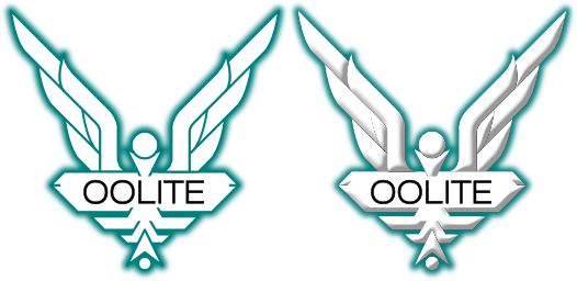
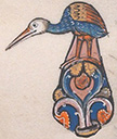
“Less abstract” might be a better description. After all, the original Elite logo is less abstract than the current Oolite icon or KZ’s proposal. .... It’s very clear in my mind, but I can’t really put it down in words, and certainly not in Illustrator.
How less is 'less abstract'? Do you want the starbird to actually have a hawk's head? Bigger, smaller, more, or less feathers? Claws or not. Keep the ball at the base, or lose it? I know what it's like when you have grand design stuck in your head, the overall look is very clear but when it comes fine details, it's as hard to grasp as mist.

Seriously, pick apart the design and tell me where I'm going wrong.
KZ999's Oolite documents, including the new draft Oolite Game Manual, can be found at www.box.net
User avatar
Griff
Oolite 2 Art Director
Posts: 2479
Joined: Fri Jul 14, 2006 12:29 pm
Location: Probably hugging his Air Fryer

Post by Griff »

Wow, those are really nice KZ9999! I know you haven't got a lot of time at the moment to take requests, but i'd really like to see a version of logo on the left without the fade out on the outside edges, just keep that line solid like the interior lines, but maybe a bit thicker, and without the ball at the bottom!
User avatar
Cody
Sharp Shooter Spam Assassin
Posts: 16071
Joined: Sat Jul 04, 2009 9:31 pm
Location: The Lizard's Claw
Contact:

Post by Cody »

KZ

Yeah, go for it...hawk's head and claws on the right hand logo.
I would advise stilts for the quagmires, and camels for the snowy hills
And any survivors, their debts I will certainly pay. There's always a way!
User avatar
Kaks
Quite Grand Sub-Admiral
Posts: 3009
Joined: Mon Jan 21, 2008 11:41 pm
Location: The Big Smoke

Post by Kaks »

Wait, something a bit like this?

Image

That should please Lestradae! :)
Hey, free OXPs: farsun v1.05 & tty v0.5! :0)
User avatar
FSOneblin
---- E L I T E ----
---- E L I T E ----
Posts: 460
Joined: Tue Oct 30, 2007 12:15 am
Location: Yes, That is True

Post by FSOneblin »

Kaks wrote:
Wait, something a bit like this?

Image

That should please Lestradae! :)
No! Like this!

Image

Now, how much money do I win?

FSOneblin
Don't panic

Now an "adult!"
User avatar
Lestradae
---- E L I T E ----
---- E L I T E ----
Posts: 3095
Joined: Tue Apr 17, 2007 10:30 pm
Location: Vienna, Austria

..

Post by Lestradae »

Ah yes, the austrian soup duck logo.

Perhaps I should suggest replacing it with KZ9999 Oolite logos to our government, it looks much better.

:lol:

L
User avatar
McSpider
Average
Average
Posts: 14
Joined: Tue Sep 22, 2009 10:45 pm
Location: Milky Way Galaxy

Post by McSpider »

My Entry's.
Image Image

I also have hand-tuned icons at sizes:
512 x 512, 256 x 256, 128 x 128, 32 x 32, 16 x 16.
Last edited by McSpider on Mon Sep 28, 2009 11:05 pm, edited 2 times in total.
User avatar
Kaks
Quite Grand Sub-Admiral
Posts: 3009
Joined: Mon Jan 21, 2008 11:41 pm
Location: The Big Smoke

Post by Kaks »

McSpider, thank you!
They're both very nice entries! :)
Hey, free OXPs: farsun v1.05 & tty v0.5! :0)
User avatar
seventh
Dangerous
Dangerous
Posts: 82
Joined: Sun Nov 15, 2009 5:29 pm
Location: Moscow, Russia
Contact:

Post by seventh »

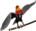
There are my preliminary sketches. If you want to modify them I can share my hi-res and vector files. And if my logo is accepted, I'll be able to draw it more accurately. Thanks for attention.

Image

Image

Image

Image
User avatar
Captain Tylor
Dangerous
Dangerous
Posts: 90
Joined: Fri Sep 26, 2008 11:44 am
Location: London

Post by Captain Tylor »

Cool
User avatar
DaddyHoggy
Intergalactic Spam Assassin
Posts: 8512
Joined: Tue Dec 05, 2006 9:43 pm
Location: Newbury, UK
Contact:

Post by DaddyHoggy »

And the late arrival - delivers a stunning blow to the opposition!

They're fab!

Bravo and Welcome to the Forum (the friendliest this side of Riedquat)
Selezen wrote:
Apparently I was having a DaddyHoggy moment.
Oolite Life is now revealed here
another_commander
Quite Grand Sub-Admiral
Posts: 6569
Joined: Wed Feb 28, 2007 7:54 am

Post by another_commander »

@seventh: Maybe if the wings were a bit bigger (as in wider)? Looking at the logo from a distance, it reminds me of a wasp somewhat, but I have to give it to you: it's a VERY impressive attempt.
User avatar
Rxke
Retired Assassin
Retired Assassin
Posts: 1757
Joined: Thu Aug 12, 2004 4:54 pm
Location: Belgium

Post by Rxke »

Yes quite impresssive, esp. the last one that keeps the original Oolite's icon flavouring.
User avatar
Kaks
Quite Grand Sub-Admiral
Posts: 3009
Joined: Mon Jan 21, 2008 11:41 pm
Location: The Big Smoke

Post by Kaks »

Ah, yes, that explains why the last icon feels 'right'... nice use of the 'traditional' colours, btw! :)
Hey, free OXPs: farsun v1.05 & tty v0.5! :0)
User avatar
Rustybolts
---- E L I T E ----
---- E L I T E ----
Posts: 293
Joined: Sun Jun 07, 2009 6:22 pm
Location: UK

Post by Rustybolts »

The second one and last one are very good
STE.+ Firefly/Dragonfly + BlackJacksbullion v.1.23 link below.
http://www.mediafire.com/?sharekey=ca16 ... f6e8ebb871
Image
Post Reply