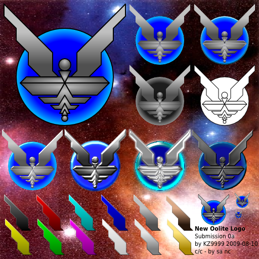
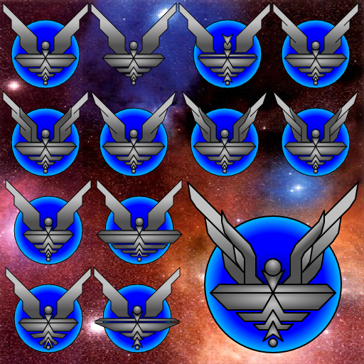
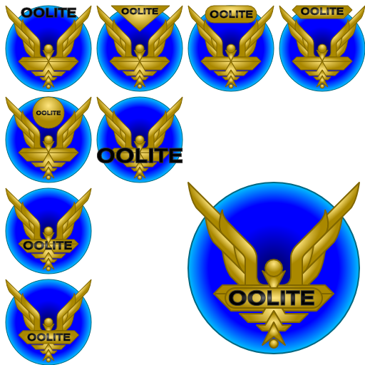
Oolite Icon Competition

General discussion for players of Oolite.

Moderators: another_commander, winston

Post Reply
User avatar
JensAyton
Grand Admiral Emeritus
Posts: 6657
Joined: Sat Apr 02, 2005 2:43 pm
Location: Sweden
Contact:

Oolite Icon Competition

Post by JensAyton »

The new icon, designed by seventh, has been selected.
Image Image


Original post:
Oolite requires a new icon. Current systems use icons up to 512 × 512 pixels, while the current Oolite icon only exists as a bitmap up to 128 × 128 256 × 256 pixels, and doesn’t really have enough detail to be enlarged anyway.

For these reasons, I am soliciting designs from the comoonity. Entries must be submitted before Oolite is ready for a “stable” release, which won’t be for at least two months. One entry will be chosen, and the designer will win nothing other than having their design as the official Oolite icon and a mention in the official Oolite credits file.

Required deliverable
  • One 512 × 512 pixel icon with alpha channel, designed to composite against arbitrary backgrounds and be recognisable at resolutions down to 16 × 16 px.
Optional extras
  • Hand-tuned icons at sizes: 256 × 256, 128 × 128, 64 × 64, 48 × 48, 32 × 32, 16 × 16.
  • A monochrome version of the icon.
  • A vector version of the icon.
  • A larger version of the icon (1024 × 1024 or above).
  • Any original files used to create the icon.
I will create appropriate document and OXP icons for each platform based on the application icon.

All submissions must be licensed to the Oolite project for distribution under Oolite’s dual license and any future license Oolite may switch to.
Last edited by JensAyton on Fri Mar 05, 2010 4:57 pm, edited 2 times in total.
User avatar
JensAyton
Grand Admiral Emeritus
Posts: 6657
Joined: Sat Apr 02, 2005 2:43 pm
Location: Sweden
Contact:

Post by JensAyton »

Note: KZ9999 is already working on a submission, but some healthy competition would be nice. There is no requirement that submissions look like the old icon, although a starbird-type design is an easy way to score on sentimentality. :-) I’d be happy to see a more “realistic” take on the starbird if anyone’s up to it.

Other than the application icon, the design will be used in other contexts such as:
  • Branding on official and semi-official documentation
  • The game’s splash screen
  • The web site
  • Rank icons on the forum
  • Other stuff, almost certainly
User avatar
KZ9999
Deadly
Deadly
Posts: 225
Joined: Fri Jan 23, 2009 8:55 pm
Location: Lost in Witchspace being hunted by a Thargoid Swam.

Post by KZ9999 »

I second the request for competition. I would love to see other peoples takes on a figurehead/logo for the game. I just started doing the classic starbird because of my own need for a vector version of the logo.

There's no reason why the oolite logo should even be the starbird. The way game is expanding in so many new directions, it's only logical that we have a new take on the logo too.

Plus any new takes would inspire me to come up with other funky ideas for it. :lol:
KZ999's Oolite documents, including the new draft Oolite Game Manual, can be found at www.box.net
User avatar
KZ9999
Deadly
Deadly
Posts: 225
Joined: Fri Jan 23, 2009 8:55 pm
Location: Lost in Witchspace being hunted by a Thargoid Swam.

The first, but not the last

Post by KZ9999 »

Since I help start this thing, it's only fair that I put up the first, of what will be several submissions....

Image

I know I've gone overboard with the highlighting filters and it won't scale down that well but just an idea to get you other talented artists going. the blue disc behind the starbird represents a witchspace cloud and it's a full alpha channel object so it's quite transparent.

So come on folks, I can't be the only one with the talent to come up with the goods.
KZ999's Oolite documents, including the new draft Oolite Game Manual, can be found at www.box.net
User avatar
KZ9999
Deadly
Deadly
Posts: 225
Joined: Fri Jan 23, 2009 8:55 pm
Location: Lost in Witchspace being hunted by a Thargoid Swam.

Submission 0a

Post by KZ9999 »

This is my first official submission for the Logo Redesign Contest.
I have tried to keep true to both the current design and to evoke the orginal Elite design (and not cross the look and feel barrier.)

Image

Image examples in order from left to right, top to down.
Standard Vector Image:Standard design with black border, Matt design border-less, Matt design with vector boarder,
Gray Scale, White body with black border.
Filters applied: Simple spectacular effect, Glowing metal effect, Translucent glass, Matt button effect.
Alternative Tints for Starbird: Black, Red, Cyan, Blue, Steel, Bronze, Yellow, Green, Magenta, White, Silver, Gold.
Standard Vector version scaled to 64x64, 32x32, 16x16 pixels
The images have been placed on a multi-coloured background to show the effectiveness of the design and to highlight where alpha channel effects have been used.

No text is included with the logo, the reasons being that: 1 ) If text is to be used it must be the central part of the design, i.e. IBM or SUN. 2 ) If text is of lesser importance, it should totally abandoned to avoid repetition of the `name', i.e. Pepsi or Subaru. 3 ) Finally is is pointless to include text in the logo for it will blur as it scales down, effecting the surrounding graphics.

More to come :twisted:
KZ999's Oolite documents, including the new draft Oolite Game Manual, can be found at www.box.net
User avatar
DaddyHoggy
Intergalactic Spam Assassin
Posts: 8501
Joined: Tue Dec 05, 2006 9:43 pm
Location: Newbury, UK
Contact:

Post by DaddyHoggy »

I like!

I notice from the date in your image you're going to be submitting this in five days time :? :wink: (2009-08-10)
Selezen wrote:
Apparently I was having a DaddyHoggy moment.
Oolite Life is now revealed here
User avatar
Selezen
---- E L I T E ----
---- E L I T E ----
Posts: 2513
Joined: Tue Mar 29, 2005 9:14 am
Location: Tionisla
Contact:

Post by Selezen »

As seen in another thread, I have a submission for the logo contest...

Image
It's simple and clean and I think it would be nice as a badge or embroidered patch that could be worn on (in-game) flight suits or civvy clothes as well as a game logo.

It would work nicely (with a bit of work on the colours) for a rank insignia too:

Image

Much tweaking could follow, but this is the basic idea. There is also a version with a circlet around it holding a lozenge above the robotic avian's head which could be used for actual military rank or some other supplemental information.
User avatar
Ivan
Competent
Competent
Posts: 33
Joined: Fri Jul 25, 2008 11:57 am
Location: Reading, UK

Post by Ivan »

Selezen wrote:
As seen in another thread, I have a submission for the logo contest...
When KZ9999 mentioned the IBM logo I thought of a 'scan line' type logo too, a bit like this. It's quite nice, although I'd go for different colours: perhaps grey or green at lower levels, going up to gold and black. (Dalek hierarchy colours maybe :)
User avatar
KZ9999
Deadly
Deadly
Posts: 225
Joined: Fri Jan 23, 2009 8:55 pm
Location: Lost in Witchspace being hunted by a Thargoid Swam.

Some more variation on the theme...

Post by KZ9999 »

It's a fortnight later and here's another batch of designs for the comp'. All of these designs take my standard design and twisted it in to different directions.
Image
In order they are: b01 original design, b02 no wormhole, b03 crested and gappy, b04 edged feathers
b05 forwing and edged feathers, b06 blade feathers, b07 forwinged and blade feathers, b08 forewinged and full length blade feathers
b09 narrow body, b10 gappy wide body
b11 twisted blade body, b12 wide gappy body with collared head.
Large image: Full feathered wings and tail and collared head.

It should be noted that I can mix and match features from the various designs to make a better design.

The new twist come from the original design of all things
Image

There's still a few ideas I've got left to try so watch this space... :twisted:
KZ999's Oolite documents, including the new draft Oolite Game Manual, can be found at www.box.net
User avatar
Nemoricus
---- E L I T E ----
---- E L I T E ----
Posts: 388
Joined: Mon May 18, 2009 8:51 pm

Post by Nemoricus »

That looks very good KZ9999.

I just realised that a spaceship based off of the Elite logo would be many kinds of awesome itself. Anyone care to give that a try?
Dream as if you'll live forever
Live as if you'll die tomorrow
User avatar
KZ9999
Deadly
Deadly
Posts: 225
Joined: Fri Jan 23, 2009 8:55 pm
Location: Lost in Witchspace being hunted by a Thargoid Swam.

The final variations

Post by KZ9999 »

Ok now for the final mucking around with the logo...
Image
No need to name each version as they all are pretty self explanatory.

The only thing I will add is that is that all of the three official sets I've posted can be mixed and match to make the final design. That's it, I'm out of ideas now. Come on folks, give it your best shot and post something.

(I do reserve the right post any other brain farts that come to mind. <Knowing LOL.>)
KZ999's Oolite documents, including the new draft Oolite Game Manual, can be found at www.box.net
User avatar
goran
---- E L I T E ----
---- E L I T E ----
Posts: 294
Joined: Sat Feb 23, 2008 12:32 am
Location: Zagreb, Croatia
Contact:

Post by goran »

I don't think that EVERY graphic element needs a gradient fill.
User avatar
Diziet Sma
---- E L I T E ----
---- E L I T E ----
Posts: 6311
Joined: Mon Apr 06, 2009 12:20 pm
Location: Aboard the Pitviper S.E. "Blackwidow"

Post by Diziet Sma »

'Course it does! Too much still ain't enough! :twisted: :mrgreen:
Most games have some sort of paddling-pool-and-water-wings beginning to ease you in: Oolite takes the rather more Darwinian approach of heaving you straight into the ocean, often with a brick or two in your pockets for luck. ~ Disembodied
User avatar
Cody
Sharp Shooter Spam Assassin
Posts: 16059
Joined: Sat Jul 04, 2009 9:31 pm
Location: The Lizard's Claw
Contact:

Post by Cody »

Concerning the new Oolite icon, there appears to be a concensus of silence. (Apart from general approval of KZ's work).

Why not get away from the starbird design completely. As I see it, that style is a bit passe. A “standard” outbound Cobra against a wormhole background (no frills or extras) as in KZ’s early t-shirt design seems to me to be a far better choice.

However, that’s only my view, of course. I'm sure many will disagree with me on that.

One of Griff’s Cobras would also look very good, but maybe not at small sizes.
I sometimes wish I had the art skills for this sort of thing, but I most definitely do not.

Ahruman sort of suggested he’d like to see a more “realistic” take on the starbird, but I cannot envisage that at all.

Ah well, just an old man's wanderings...


Regards
I would advise stilts for the quagmires, and camels for the snowy hills
And any survivors, their debts I will certainly pay. There's always a way!
User avatar
JensAyton
Grand Admiral Emeritus
Posts: 6657
Joined: Sat Apr 02, 2005 2:43 pm
Location: Sweden
Contact:

Post by JensAyton »

El Viejo wrote:
Ahruman sort of suggested he’d like to see a more “realistic” take on the starbird, but I cannot envisage that at all.
“Less abstract” might be a better description. After all, the original Elite logo is less abstract than the current Oolite icon or KZ’s proposal.

I have a vision of a white starbird edged in a blue-green shadow, with hints of feather details and stuff. It’s very clear in my mind, but I can’t really put it down in words, and certainly not in Illustrator. :-)
Post Reply