RFC: Fancy classics

General discussion for players of Oolite.

Moderators: winston, another_commander

Post Reply
User avatar
Captain Hesperus
Grand High Clock-Tower Poobah
Posts: 2310
Joined: Tue Sep 19, 2006 1:10 pm
Location: Anywhere I can sell Trumbles.....

Post by Captain Hesperus »

ClymAngus wrote:
That's the point, it's psychology..... no one is scared of an airy fairy manga ship.
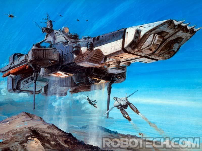
I would be afraid of this manga ship....
Image

Captain Hesperus
The truth, revealed!!
Image
User avatar
JensAyton
Grand Admiral Emeritus
Posts: 6657
Joined: Sat Apr 02, 2005 2:43 pm
Location: Sweden
Contact:

Post by JensAyton »

I think the effect would be more, er, effective if it didn’t have two pogo sticks for landing gear.
User avatar
DaddyHoggy
Intergalactic Spam Assassin
Posts: 8515
Joined: Tue Dec 05, 2006 9:43 pm
Location: Newbury, UK
Contact:

Post by DaddyHoggy »

If this is the SD1 then from memory it turned back into a more human like figure to land...

Ah, I did love Robotech - except when Minmay (sp?) sang, I tended to FF past those parts.
Selezen wrote:
Apparently I was having a DaddyHoggy moment.
Oolite Life is now revealed here
User avatar
Simon B
---- E L I T E ----
---- E L I T E ----
Posts: 836
Joined: Thu Oct 23, 2008 5:54 am
Location: Red Beach NZ
Contact:

Post by Simon B »

Well - I never liked the original Viper-interceptor... to me it just looked fat. I pictured more a sportscar version - you've got to imagine it rendered with interpolation.

However, I'll bear the above comments in mind and see what happens if I keep the angular upper panels.

You'll find that color is highly visible in the game. I have oxps on my site using that color - have a look at the arachnid oxp - the Avondale is that color. Also, the viperiii oxp ships all use that livery - only less grunge.

It should be simple to create a "new ship" texture as well. Include in the final oxp.

Meantime, I'm working on a Krait.

The last reworking of especial note was by Griff. I've reviewed what people said about that and keeping the Krait shape ... and the above discussions suggest I should keep the flat-panel upper body, inset the cockpit and fiddle the underside.

The spikes have been giving me trouble ... I've got three versions, along with the option to make them into guns.

Curiously, the mesh2obj script seems to be turning out models which are too big ... at least the dimensions of the .obj model disagree with whats in the dat file.

I'm not sure what to do with the actual scale of the model. Anyway, the dat says the Krait is 55m wide, but the obj model is 90m wide - this cannot be right. For now I'm scaling to fit the dat stats ... but I'm sure I saw a 35-40m Krait in an earlier game? Perhaps there has been some drift as models get converted?

Updates coming - when models get finalized, they will get added to the neolite oxp the same way as the big ships.

I have a ball-turret model now too... so a turreted anaconda may show up as a bonus - interest?

Lastly - I have received reply from S John Ross re. those fonts - he is the copyrights holder and has indicated agreement with the use on these ships.
Simon Bridge
[re2dux] [neolite]
"Everything is perfect down to every last flaw..."
HBT: The Book of Verse - Principia Discordia
User avatar
Simon B
---- E L I T E ----
---- E L I T E ----
Posts: 836
Joined: Thu Oct 23, 2008 5:54 am
Location: Red Beach NZ
Contact:

Post by Simon B »

OK - yike - when I was writing the above post there were only five pages of comment - Reading through the additional pages shows that V2 is clearly not a popular design ... I'll see what I can come up with - probably I'll have to put the models into a dummy oxp and run them through the game.
Simon Bridge
[re2dux] [neolite]
"Everything is perfect down to every last flaw..."
HBT: The Book of Verse - Principia Discordia
User avatar
ClymAngus
---- E L I T E ----
---- E L I T E ----
Posts: 2514
Joined: Tue Jul 08, 2008 12:31 am
Location: London England
Contact:

Post by ClymAngus »

Simon B wrote:
OK - yike - when I was writing the above post there were only five pages of comment - Reading through the additional pages shows that V2 is clearly not a popular design ... I'll see what I can come up with - probably I'll have to put the models into a dummy oxp and run them through the game.
Publish and be damned sir! I'd say if you like them leave them in, if people really have an issue then they can hack said ships out of the code. Your the one doing all the work here after all.

The good thing about oxping is it's a pick and mix democracy. Some one could submit a 60 foot long flying wang oxp and be derided for the act forever more. Doesn't matter, people don't have to slap it in their addons folder.
User avatar
Simon B
---- E L I T E ----
---- E L I T E ----
Posts: 836
Joined: Thu Oct 23, 2008 5:54 am
Location: Red Beach NZ
Contact:

Post by Simon B »

ClymAngus wrote:
Publish and be damned sir! I'd say if you like them leave them in, if people really have an issue then they can hack said ships out of the code. Your the one doing all the work here after all.
The task I have set myself here is more than merely pleasing myself - I've already done that ... twice.

The trick here is to re-imagine the entire set of classic ships, keeping the classic style, involving others, and ending up with a believable candidate for replacing the classics entirely - perhaps so the current set of default ships gets relegated to an OXP...

Now I don't think these ships will actually go out in the default Oolite 2.35 or whatever, but the resulting discussion may pave the way for some more profound change in this direction.

This is big picture stuff.

So it's not just a matter of like or not to like. Does the resulting set of ships form something that cries out "this is oolite!"
Simon Bridge
[re2dux] [neolite]
"Everything is perfect down to every last flaw..."
HBT: The Book of Verse - Principia Discordia
User avatar
Simon B
---- E L I T E ----
---- E L I T E ----
Posts: 836
Joined: Thu Oct 23, 2008 5:54 am
Location: Red Beach NZ
Contact:

Viper Update:

Post by Simon B »

Viper Update

In light of previous discussions, the Viper II has received a makeover.
The crumpled paper look has gone and I've adjusted the specular so that reflections are more coppery - warmer. But I've kept the bits I liked about the previous model.

Image

For comparison:
Image

The effect of changing the lighting is to make the craft darker and more orangey.

The paler one is actually more visible.
Fewer lines and sigils also make a ship more visible against space.
Simon Bridge
[re2dux] [neolite]
"Everything is perfect down to every last flaw..."
HBT: The Book of Verse - Principia Discordia
User avatar
Simon B
---- E L I T E ----
---- E L I T E ----
Posts: 836
Joined: Thu Oct 23, 2008 5:54 am
Location: Red Beach NZ
Contact:

Post by Simon B »

Neo Krait
I felt sure I'd posted this earlier - but cannot seem to find it.

Neolite treatment of everyone's favorite pointy ship. The original model is in three parts! The spikes gave me the most trouble - I have about a dozen different ones now.

Image

Never mind the paint-job, that's just for something to look at. The Krait is a much usurped model, everyone has their own custom paintjob anyway - so I made the texture easy to redo ;)

Presumably we want several versions. Perhaps a tribal-style design like the Griff Krait? Do people want a twin-gun version? (I have a very nice laser model sitting on that Namu for eg...)

I notice that a general "approved look" is developing ... if the classic models are thought of as an attempt to reproduce an existing real-life craft with oversimple forms - then they tended to take the overhead profile of the ship as the defining design characteristic.

Nonetheless, I'm going to have a go pushing these limits - it's no good getting all the ships looking the same.
Simon Bridge
[re2dux] [neolite]
"Everything is perfect down to every last flaw..."
HBT: The Book of Verse - Principia Discordia
User avatar
Lestradae
---- E L I T E ----
---- E L I T E ----
Posts: 3095
Joined: Tue Apr 17, 2007 10:30 pm
Location: Vienna, Austria

..

Post by Lestradae »

Simon, according to the "not so many people interested in my ships topic".

To judge how many people like something according to the responses (or, indeed, non-responses) here on the forums can be pretty treacherous.

Back in those days when RS was a very dividing topic, someone did a poll here how many people did play and liked RS and how many meant "no way, I'm not even trying this out".

About 40 people answered the forum poll. 25 or so said RS was too much for them of some sort, 8 said they had tried it but taken it out again and 7 voted for they liked it and kept it.

When the poll closed after a week or so, 1.500 (!) downloads of the RS version that was current back then had happened in the three months it had been downloadable. And when I put out a new version that fixed a few problems, it again got downloaded about 1.200 times in three months. So the poll numbers didn't convey any sort of meaningful information.

Same will be the case with your ships. Opponents of something will be very vocal, people disinterested either way won't say anything, and praise is rare. So if you judge from that, the picture you get is massively and not very realistically biased.

A new ship set for the core game is an entirely other pair of shoes, though. If you want to do that, I suggest kick-starting a big debate about that, because the people who will decide on that will be the devs and perhaps the opinions of the most vocal people on the forum.

Your ships shown, irrelevant how good they look (I for one could easily imagine them as the new standard) will not start a debate on their own, I think.

Just my 0.2 Cr 8)

L
User avatar
Disembodied
Jedi Spam Assassin
Jedi Spam Assassin
Posts: 6885
Joined: Thu Jul 12, 2007 10:54 pm
Location: Carter's Snort

Post by Disembodied »

Simon B wrote:
The trick here is to re-imagine the entire set of classic ships, keeping the classic style, involving others, and ending up with a believable candidate for replacing the classics entirely - perhaps so the current set of default ships gets relegated to an OXP...

Now I don't think these ships will actually go out in the default Oolite 2.35 or whatever, but the resulting discussion may pave the way for some more profound change in this direction.

This is big picture stuff.

So it's not just a matter of like or not to like. Does the resulting set of ships form something that cries out "this is oolite!"
In my opinion, what you've done so far with the three cargo ships, the Vipers (I like the new Interceptor, BTW), and the Krait, you're pretty much on target! It's like being able to see the subtleties of shape that the original Elite games couldn't show – details of form that were always there, but we couldn't see them before. I know the real reason behind the convex-geometric "design philosophy" was because of the limitations of tiny, elderly computers, but it's become, in my head, an essential part of the look and feel of the (core) ships. Which is not to say that other design philosophies can't be reflected in other ships, perhaps built by other races or using other technologies – but these models are definitely both distinctively new and comfortingly familiar! Keep going! :D
User avatar
wackyman465
---- E L I T E ----
---- E L I T E ----
Posts: 831
Joined: Thu Nov 06, 2008 10:15 pm
Location: Currently hunting you down in an Imperial Courier

Post by wackyman465 »

*What he said.*
I shot him back first. That is to say, I read his mind and fired before he would have fired on me. No, sir, he wasn't a fugitive.
User avatar
ZygoUgo
---- E L I T E ----
---- E L I T E ----
Posts: 406
Joined: Mon Nov 17, 2008 4:15 pm
Location: Blighty

Post by ZygoUgo »

@Lestradae, I agree, opinions are only for conversation purposes and something for people to bounce ideas off.
Nice job there Simon, the interceptor looks realy solid.
I realised why the first one bothered me, for some reason it reminds me of the Predator, not sure why :?
User avatar
Simon B
---- E L I T E ----
---- E L I T E ----
Posts: 836
Joined: Thu Oct 23, 2008 5:54 am
Location: Red Beach NZ
Contact:

Critical Mass!

Post by Simon B »

I've done a ton of models ... and still not lost momentum. I've also pickud up a few extra skills in the textures.

There is a cool trick - when you make the first UV map, use a model which has as few edges as needed for it to hold it's shape, and get the mapper to put the edges in. This will produce your site-lines in the texture, and I have been using them, after a gauss-blur by 7px, for those burn lines. (Which means I also need any edges likely to get burned too).

Open the exported uv-map in the GIMP (or whatever) and duplicate it. Then layers > transparency > color to alpha the copy. Keep this layer an top - rename it "edges" because that's what it is.

For a simple texture, I'd have the oolite light-metal map on the (second to) bottom layer - then add the paintwork to the layer above that - set the layer mode to "grain merge".

But ... above that I can create a subtle effects layer like this ...

duplicate the paint layer - set it's mode back to normal.
add a blank layer under it - pick out a dark-ish shade from the metal texture - fill the entire layer with this color.
merge these two layers together... this is going to look ugly right now, we'll fix that: the idea is that these colors are going to darken the middle of each flat panel. (You can also use this method to make the middles lighter - however I use the edges+blur to darken the edges instead.)

duplicate your edges layer and move it down so it sits above the merged layer from before. Invert it's colors and apply a gauss-blur (5px) ... duplicate that, and apply a gauss-blur to the dupe (10px this time), again for 20px. Now you have three layers of white blurry lines. duplicate them as needed to create a bold white halo around the lines ... there should still be a bit of dark in the center of the smaller panels, but don't worry if the smallest are completely white.

Now - merge all those layers down. call the layer "age-effect" or something. Make all the white bits transparent ... now it's pretty. Compare normal mode to groin-merge to multiply ... one of these is usually better than the others.

This has the same effect as some of the pro tutorials, but achieved with simple tools and less work.

Meantime... I'll put the newer models in one post each.
Simon Bridge
[re2dux] [neolite]
"Everything is perfect down to every last flaw..."
HBT: The Book of Verse - Principia Discordia
User avatar
JensAyton
Grand Admiral Emeritus
Posts: 6657
Joined: Sat Apr 02, 2005 2:43 pm
Location: Sweden
Contact:

Re: Critical Mass!

Post by JensAyton »

Simon B wrote:
There is a cool trick
May I suggest the Skinner’s Den thread? ;-)
Post Reply