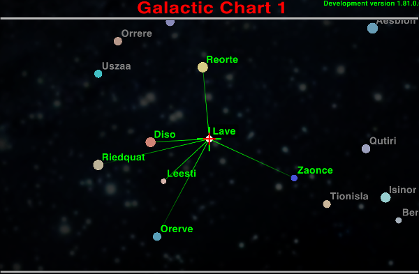
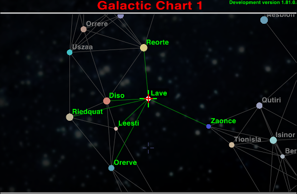
I've fiddled with the new gui settings regarding chart look in Oolite 1.81 for a bit now and found these settings working quite well and to be my favorite. My sole intention has been to get rid of the circle (that bothers me because it's inaccurate) while trying to keep the overall feel of the chart the same.
The result looks like this. Without ANA and with ANA:
I still think there are advantages to having a circle: on the top chart, it's not obvious that Riedquat is reachable (and a newbie might have doubts about Orerve, too ... "Is that green line fading out before Orerve? Maybe I don't have enough fuel to get all the way there ..."). Yes, all the reachable systems have green text, but it took me a couple of minutes to spot that (this may have something do with me being slow on the uptake, though ). Unless there's a clear green = reachable, yellow = out of range declaration somewhere on the chart, some people* may struggle.
* dim, inattentive people are still people! And we vote. If we remember. And can get the lines to cross inside the right box ...
I still think there are advantages to having a circle...
Circle would definitely be my number one choice, if it was accurate. It's a personal thing, but now that I know that it's inaccurate, I just can't stand it.
The real issue is the archaic formula used for distance calculation, but outright fixing that is not a trivial task. It would require repositioning the systems so that the current connections would not be broken and new ones would not be introduced. At least with full 7.0 circles. I find it to be a very interesting problem and at some point might even try to solve it, but for now I'm concentrating on other tasks and settle for the solution of simply substituting the circle with lines and system colors.
for now I'm concentrating on other tasks and settle for the solution of simply substituting the circle with lines and system colors.
It might be easier (for the dim and inattentive, at least) if the non-reachable systems weren't shown in as bright a colour as the reachable ones. How would it look if the non-reachable system names were grey, for example? Bright green = reachable, dim grey = out of range. And then (in the ANA at least) the reachable system names could be coloured according to risk: Green = Corporate State or Democracy; Amber = Confederacy, Communist or Dictatorship; Red = Multi-government, Feudal or Anarchy.
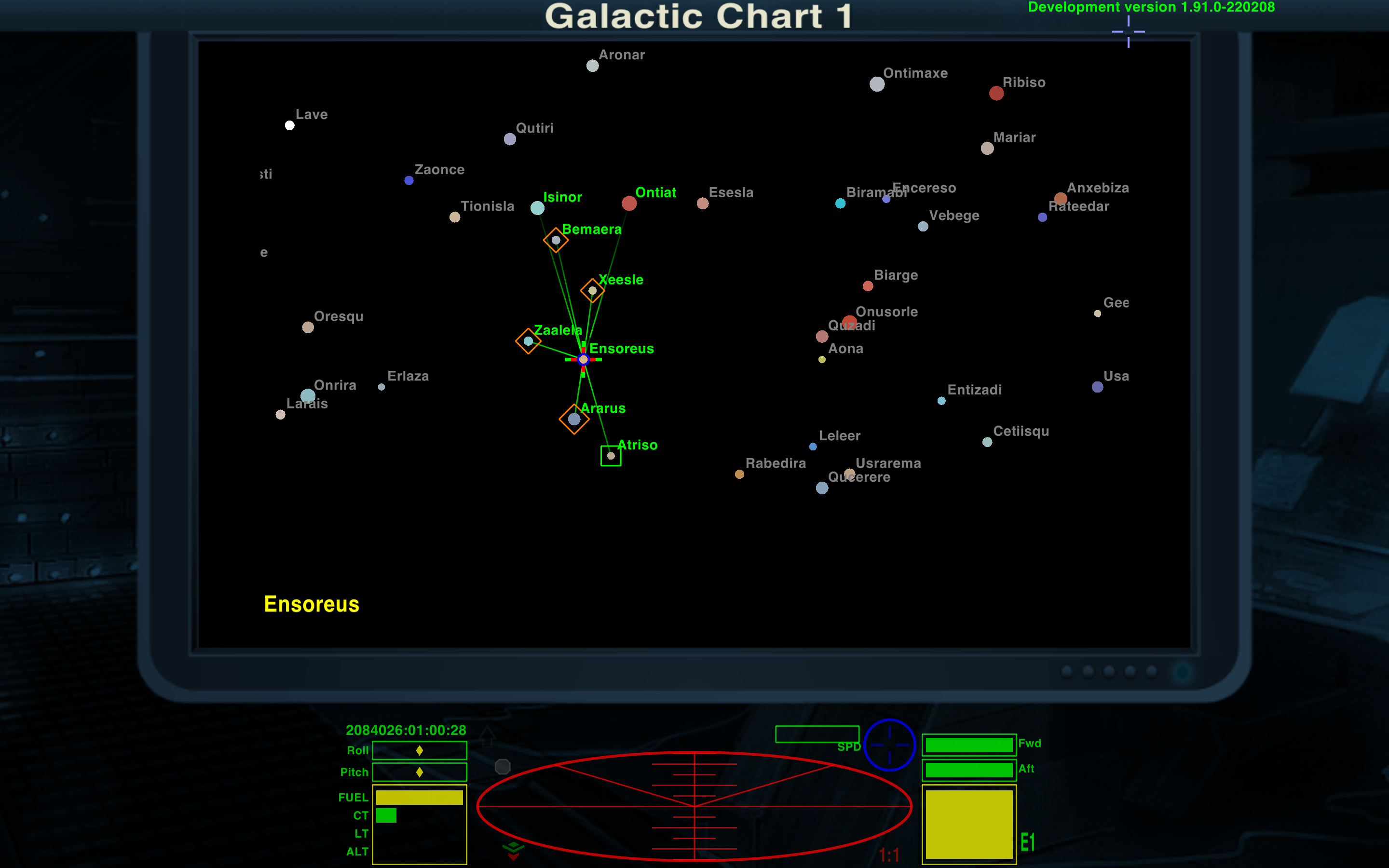
Thanks, gray for non-reachable systems is a lot better. The first post has been updated with new images and plist definition.
Currently it's only possible to set a generic system name color and a reachable system name color. Hard to say if coloring with risk would be a useful addition or not. Probably not worth it, but someone else might think the opposite. I'm quite content with the current system of switching between the name and system info symbols.
That is a lot clearer. How would it look, though, if you kept the green lines to in-range systems on the ANA screen as well? Assuming that's possible?
That's not possible with simple gui-settings. For ANA there is a link_color planetinfo option, that could be set via script. Might be possible to achieve something, although fading would not be possible. Maybe I'll check it out at some point.
It required a little scripting to work with ANA, so I made a small oxz out of it. Download is in the first post. Behavior in interstellar space is still wrong, but otherwise it seems to be working fine.