NOTE: All the functionality and positioning described in this and related posts below (with some minor cosmetic changes) has now been incorporated into
NumericHUD 3.20 by Norby. As a result, the HUD will now automatically adjust itself to different screen resolutions in a far more pleasing manner. Many thanks to Norby for his patience and ideas during the process!

=========================================================
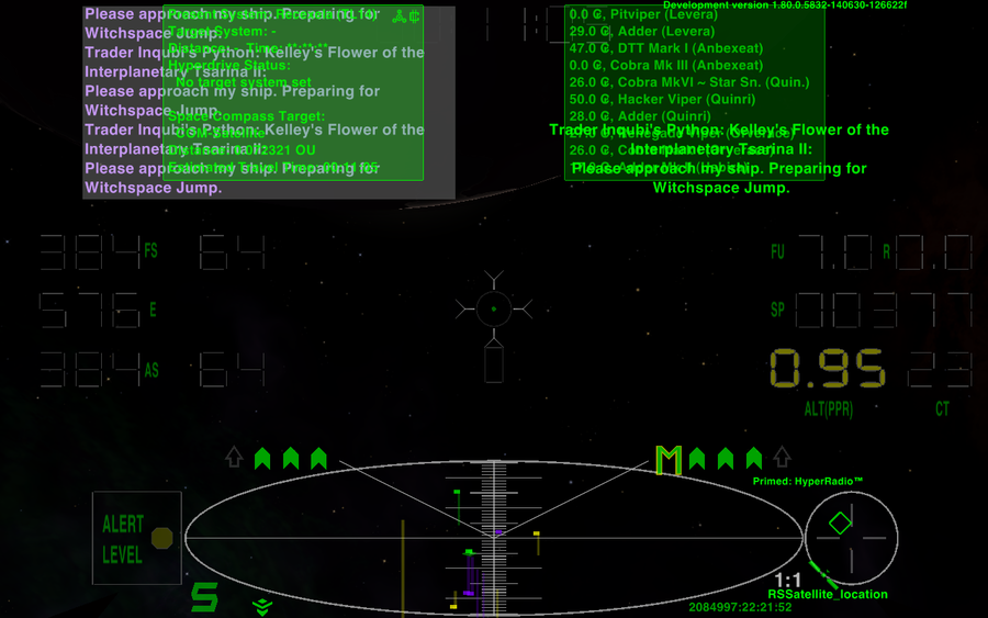
Whilst I'm loving the MFDs in 1.80, they do present some problems with my preferred HUD, the NumericHUD3. Things are all bunched up and overlapping. And the ETA clock at top-centre is almost totally obscured by everything else that's going on.
Here is how things look with both MFDs active, and messages arriving.. yech!

As I play Oolite on a laptop, with 1280x800 resolution, I have
some extra room to unclutter things, but not as much room as with some other HUDs. The digital gauges take up a fair bit of screen real-estate, even though they themselves don't obscure the view.
So the plan is to move the MFDs out to the upper corners, move the message console across to the left, to the upper centre of the screen, and put the Comms Log above the least important (in combat) instruments, the fuel, speed and altitude gauges. Something that has long annoyed me about the Comms Log is that it activates every time a message is received. I want it to stay inactive, unless I press the key to activate it. Any gauge at a critical level will glow brightly anyway, to get my attention, so even with the Comms Log visible, I'll still know what's going on. Finally, I want to enable the new Scanner features, so I'll have a non-linear scanner, (meaning if I zoom in, the scanner will still show distant objects as well) and the Ultrazoom, giving me zoom levels up to 16x.
So, opening up the
numerichudv3.plist, scroll all the way down to the bottom.
To relocate the MFDs, on lines 7062-7077, change this:
Code: Select all
	multi_function_displays = (
		{
			width = 198;
			height = 132;
			x = -156;
			y = -72;
			y_origin = 1;
		},
		{
			width = 198;
			height = 132;
			x = 156;
			y = -72;
			y_origin = 1;
		}
to this:
Edit: see
Spara's improved MFD positioning code, in his post below, and use that instead of mine.
Code: Select all
	multi_function_displays = (
		{
			width = 198;
			height = 132;
			//x = -156;
			x = -280;
			y = -72;
			y_origin = 1;
		},
		{
			width = 198;
			height = 132;
			//x = 156;
			x = 280;
			y = -72;
			y_origin = 1;
		}
You'll notice that I commented out the original values, instead of just replacing them. Moving things around on the HUD is very much a trial-and-error job, so keeping the original settings around makes it easier to get things back to square one if you really mess up while trying to get the elements positioned the way you want.
Now for the message and comms GUIs. On lines 7078 - 7101, change this:
Code: Select all
	message_gui = {
                  width 	 = 290;
                  height 	 = 150;
                  x		     = 175;
                  y 		 = -80;
		  y_origin	= 1;
                  row_height = 15;
		  alpha		= 0.95;
                  };
	comm_log_gui = {
  		           width 	  = 290;
  		           height 	  = 150;
  		           x 		  = -175;
  		           y 		  = -80;
			   y_origin	= 1;
  		           row_height = 15;
				   background_rgba = "0.33 0.33 0.33 0.75";
				   alpha		= 0.95;
		           };
to this:
Code: Select all
	message_gui = {
                  width 	 = 290;
                  height 	 = 150;
                  //x		     = 175;
                  x		     = 0;
                  y 		 = -80;
		  y_origin	= 1;
                  row_height = 15;
		  alpha		= 0.95;
                  };
	comm_log_gui = {
  		           width 	  = 290;
  		           height 	  = 150;
  		           //x 		  = -175;
				   x 		  = 238;
  		           //y 		  = -80;
  		           y 		  = -240;
			   y_origin	= 1;
  		           row_height = 15;
				   background_rgba = "0.33 0.33 0.33 0.75";
				   alpha		= 0.95;
				   automatic = no;
		           };
(sorry about the crazy formatting - people who randomly mix tabs and spaces in their code are really annoying!)
The most interesting part of the above is the extra line I've added:
automatic = no;
This stops the Comms Log from appearing every time a new message is received. Now it will
only be displayed when I press the key.
Now for the new Scanner features. At the very bottom of the plist, just above the final
} character, add the following 3 lines of code, so you have this:
Code: Select all
// Activate Non-linear Scanner and Ultra-zoom modes
			scanner_non_linear = yes;
			scanner_ultra_zoom = yes;
}
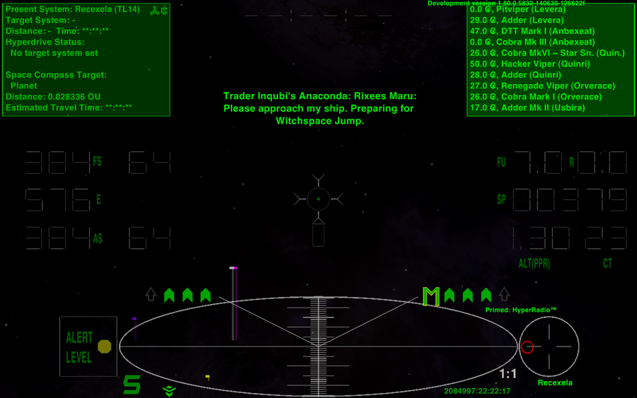
The end result, during flight looks like this:

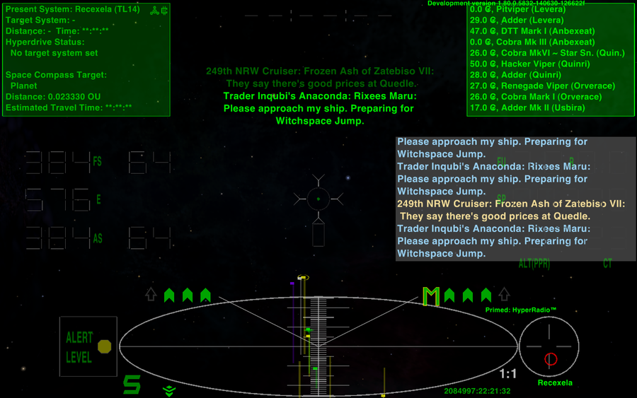
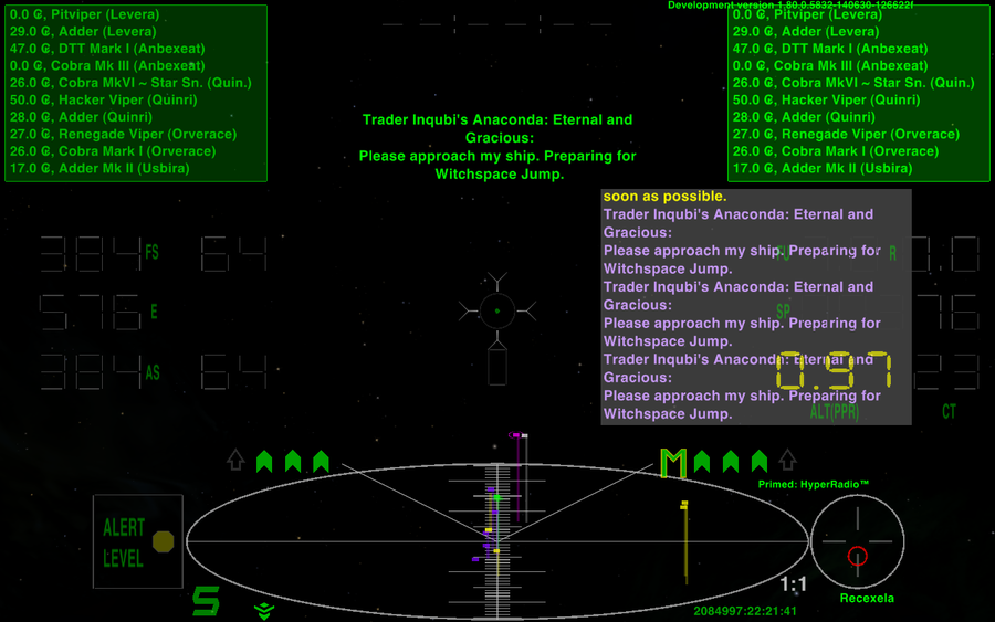
And if I activate the Comms Log:

If you look closely, you'll notice that I kept the MFDs and Comms Log a couple of pixels out from the screen edge. I found they look better when not hard up against the frame around the laptop screen. (though I see the small gaps don't show up so clearly on the resized images)


