Page 1 of 4
Smivs' Shipset OXP - Development thread.
Posted: Thu Apr 01, 2010 7:08 pm
by Smivs
Smivs'Shipset is a sort of permanent Work in Progress, so any development news will be posted here for future versions. The next version (v3.0) will feature improved emission maps (lighting effects), more alternative paintjobs, and will include on-board models to insulate the Shipset against changes to the standard Oolite models.
Oops! I've just noticed that I've posted this under 'Discusions'. It might be better in the OXP section, so if any Admin wants to move it, that's fine.
I'm currently working on a replacement Ship Set for Oolite, using the original standard models with new Textures. I have gone for a clean, uncluttered, 'realistic' style (as per my Boa II Clipper OXP).
I intend firstly to re-texture all the standard Oolite ships, and then add other items (Stations, cargo pods etc) as a second release a little later on.
I would be interested to hear what you good people think of the idea in general, and what I've done so far. I am going through the ships alphabetically, and below is a composite of the ships I've been working on up to now. At this stage these may be final versions or may not depending on how I feel about them and perhaps what you all think of them.
I expect I'll make further posts in this thread as I finish more of the ships, and may well be looking for a bit of help and advice regarding scripting the OXP at some time as this is not a strong point of mine.
Please let me know what you think, and please be Honest!
Edit:- Out-of-date image removed.
Posted: Thu Apr 01, 2010 8:21 pm
by another_commander
Moved to Expansion Pack.
Posted: Thu Apr 01, 2010 8:25 pm
by DaddyHoggy
Nice textures with one caveat - repetitive tiling effects - especially noticeable on the Cobra MkIII and MkI
Posted: Fri Apr 02, 2010 1:06 pm
by Smivs
DaddyHoggy wrote:Nice textures with one caveat - repetitive tiling effects - especially noticeable on the Cobra MkIII and MkI
Thanks for your comment. This is a good point, and one I had realised might need addressing. Below is a re-done Mk3 Cobra (next to one with the 'old' finish) which is something I'll do to the other ships over the next few days. I took the opportunity to replace the access hatch at the same time...the original was a bit small.

Posted: Wed Apr 07, 2010 1:05 pm
by Smivs
More progress to report after a short break over Easter. I've re-visited many of the existing textures now to remove that 'tiled' effect that afflicted some of them, and tidy up a few small details at the same time.
I have also now more or less finished the two Morays, with some reservations. As these ships were built by the Marine Trench Company largely for aquatic species, I thought a 'fishy' look might be appropriate, but I'm wondering if I've gone a bit too far.
The first is the Starboat (top view), the second the Medical Boat (front-on).

I think I quite like them right now but as is often the case when you do a job like this you can get so involved in details that you miss the big picture. What do you all think? Do you like these or have I lost the plot?
Posted: Wed Apr 07, 2010 1:09 pm
by JazHaz
Smivs wrote:As these ships were built by the Marine Trench Company largely for aquatic species, I thought a 'fishy' look might be appropriate, but I'm wondering if I've gone a bit too far.
I think I quite like them right now but as is often the case when you do a job like this you can get so involved in details that you miss the big picture. What do you all think? Do you like these or have I lost the plot?
I like, but I think you have lost the plot!


They need toning down a tad! Maybe needs less definition, to make it a bit more subtle.
Posted: Wed Apr 07, 2010 2:25 pm
by Diziet Sma
Smivs wrote:I thought a 'fishy' look might be appropriate, but I'm wondering if I've gone a bit too far.
Umm.. yes.. you did.. two or three bits too far, even..

Posted: Wed Apr 07, 2010 3:48 pm
by Smivs
Thanks, you've confirmed my worries. Just knocked this demo up quickly to see what a toned-down effect might look like....is it better? I'm not sure if I like it as much and am now wondering if i shouldn't just go back to the Drawing Board and start over!

Posted: Wed Apr 07, 2010 5:50 pm
by Disembodied
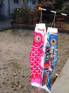
That's better than the first set, I think, but have you thought about making the scales bigger? There are some nice-looking kite designs that use a big, bold fishscale motif ... it might be worth a try!

Posted: Wed Apr 07, 2010 6:06 pm
by Smivs
Disembodied wrote: have you thought about making the scales bigger?
Ah! Now that's a thought.
Posted: Sat Apr 17, 2010 2:06 pm
by Smivs
Progress report:-
I'm still working on the Moray's, with my current thoughts tending towards a more subtle (reptilian?) scale effect, perhaps like this.

To avoid getting too bogged down, I've moved on and have been working on the Python variants. Below are prospective versions of the standard Python, Blackdog (pirate), and Trader variant.

I've also had a quick look at the Sidewinder, below.

All need a bit of 'dressing' and tweaking, but are a fair idea of how the final versions will probably look.
Posted: Sat Apr 17, 2010 2:10 pm
by JazHaz
Yes, the Moray looks much better. Like the 'reptilian scales'.

Posted: Sat Apr 17, 2010 2:22 pm
by Gimi
Agree with JazHaz, the Moray looks great. You hit the nail on that one. BZ.
Posted: Sat Apr 17, 2010 2:34 pm
by Griff
they all look great! i agree, the new moray skin is very nice, maybe you could re-use your earlier one for the thargoids, maybe increase the scale of the pattern a bit so it's not quite so 'busy'?
Posted: Sat Apr 17, 2010 2:53 pm
by Smivs
Thanks, guys. I'm glad you like them.

Griff wrote:... the new moray skin is very nice, maybe you could re-use your earlier one for the thargoids,...
Griff, you must be psychic, that's exactly what I was thinking. 'T' is next, so watch this space...


