Join us at the Oolite Anniversary Party -- London, 7th July 2024, 1pm
More details in this thread.

[UPDATE RELEASE] Combat HUD_v4.0 OXZ

Discussion and information relevant to creating special missions, new ships, skins etc.

Moderators: another_commander, winston

User avatar
Smivs
Retired Assassin
Retired Assassin
Posts: 8408
Joined: Tue Feb 09, 2010 11:31 am
Location: Lost in space
Contact:

Re: [UPDATE RELEASE] Combat HUD_v3.0 OXZ

Post by Smivs »

This is what I was trying - ignore the comment-outs, they're just there because it doesn't work...maybe for the future?

Code: Select all

// Standard position
        message_gui =
                {
//              alert_conditions = 7;
                width = 132;
                height = 125;
                x = 335;
                y = 65;
                y_origin = -1;
                row_height = 12;
                };
// Red Alert Position
//      message_gui =
//              {
//              alert_conditions = 8;
//              width = 132;
//              height = 125;
//              x = 100;
//              y = 0;
//              row_height = 12;
//              };;
Commander Smivs, the friendliest Gourd this side of Riedquat.
User avatar
Smivs
Retired Assassin
Retired Assassin
Posts: 8408
Joined: Tue Feb 09, 2010 11:31 am
Location: Lost in space
Contact:

Re: [UPDATE RELEASE] Combat HUD_v4.0 OXZ

Post by Smivs »

V4.0 is now available.
This is a major overhaul to incorporate all the new features in Oolite v1.80. There is also a Widescreen version for 16:10 and 16:9 monitors. Full details and pics are on the wiki page.

Edited to add:- Upgrading the standard HUD is straightforward, but if you are up-grading fom v3.0 to the new widescreen version, make sure you manually remove the old one first.
Commander Smivs, the friendliest Gourd this side of Riedquat.
User avatar
mossfoot
---- E L I T E ----
---- E L I T E ----
Posts: 827
Joined: Fri May 30, 2014 4:07 pm
Contact:

Re: [UPDATE RELEASE] Combat HUD_v4.0 OXZ

Post by mossfoot »

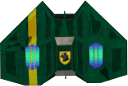
You know, I think I like everything about this HUD except the combat laser/shield/energy layout. It's just so blocky! Maybe if it was was slightly curved all around? Or at least the fore/aft shields to represent the bubble around you? I'm not sure what to suggest but it's really my only quibble about it. That center area is useful... it's just not sexy ;)
--
Image
Pilot: Mossfoot - Ship ID: Viaticus Rex (Cobra MKII)
Rank: Competent - Status: Clean

http://www.noahchinnbooks.com/
User avatar
Smivs
Retired Assassin
Retired Assassin
Posts: 8408
Joined: Tue Feb 09, 2010 11:31 am
Location: Lost in space
Contact:

Re: [UPDATE RELEASE] Combat HUD_v4.0 OXZ

Post by Smivs »

I know what you mean. The dials are just blocky unfortunately. That's one reason I made the shield bars much thinner. CSOTB's Chupacabra HUD has some curved dials which are probably what you have in mind, and they are a bit easier on the eye, but TBH never looked totally convincing either. Limitations of the game. Incidentally, I did try a lot of different layouts for these, including setting them at various distances away from the crosshairs. The funny thing is further out they actually did look a bit better, but in testing I found having them close was actually best from a useability point of view.
I am sometimes amazed at what can be done within the limits of the game, but sometimes it can be a bit frustrating as well. The compromise is often your best friend.
Commander Smivs, the friendliest Gourd this side of Riedquat.
User avatar
mossfoot
---- E L I T E ----
---- E L I T E ----
Posts: 827
Joined: Fri May 30, 2014 4:07 pm
Contact:

Re: [UPDATE RELEASE] Combat HUD_v4.0 OXZ

Post by mossfoot »

THERE MUST BE A SOLUTION!!!

;)
--
Image
Pilot: Mossfoot - Ship ID: Viaticus Rex (Cobra MKII)
Rank: Competent - Status: Clean

http://www.noahchinnbooks.com/
User avatar
Smivs
Retired Assassin
Retired Assassin
Posts: 8408
Joined: Tue Feb 09, 2010 11:31 am
Location: Lost in space
Contact:

Re: [UPDATE RELEASE] Combat HUD_v4.0 OXZ

Post by Smivs »

I'll have to have a think. As you probably guessed I'm not 100% happy with these myself, and if they can be improved i will certainly try.
Commander Smivs, the friendliest Gourd this side of Riedquat.
User avatar
spara
---- E L I T E ----
---- E L I T E ----
Posts: 2676
Joined: Wed Aug 15, 2012 4:19 am
Location: Finland

Re: [UPDATE RELEASE] Combat HUD_v4.0 OXZ

Post by spara »

Some clever use of crosshairs, perhaps?
User avatar
mossfoot
---- E L I T E ----
---- E L I T E ----
Posts: 827
Joined: Fri May 30, 2014 4:07 pm
Contact:

Re: [UPDATE RELEASE] Combat HUD_v4.0 OXZ

Post by mossfoot »

Smivs wrote:
I'll have to have a think. As you probably guessed I'm not 100% happy with these myself, and if they can be improved i will certainly try.
If you want me to spitball some ideas (and see if others can help determine if it'll work or not):

Perfect circle, using the current layout system you have, using the thickness of your current shields for the bars. diameter of the circle should be fairly large, probably out to where your box's corners are now.

Bracketed arches top and bottom for shields, a translucent center (that still allows full or perhaps even enhanced visibility ala MilSpec4000's hud) which wears down as energy is reduced. Crosshairs fill up in all directions equally as lasers heat up. Should have a single pixel box outline for when not in use so it's still visible.

Alternatively, perhaps use the above idea, but instead use the freed up area in the bottom right to make the energy banks larger and more noticeable. That would also restore some visible balance to the screen since that whole area is left empty in red alert mode.
--
Image
Pilot: Mossfoot - Ship ID: Viaticus Rex (Cobra MKII)
Rank: Competent - Status: Clean

http://www.noahchinnbooks.com/
User avatar
Smivs
Retired Assassin
Retired Assassin
Posts: 8408
Joined: Tue Feb 09, 2010 11:31 am
Location: Lost in space
Contact:

Re: [UPDATE RELEASE] Combat HUD_v4.0 OXZ

Post by Smivs »

OK, I've had a think :shock: and wondered if a low-opacity image of some sort might soften things a bit. This is nowhere near finished, but could something like this work?

Image
Commander Smivs, the friendliest Gourd this side of Riedquat.
User avatar
spara
---- E L I T E ----
---- E L I T E ----
Posts: 2676
Joined: Wed Aug 15, 2012 4:19 am
Location: Finland

Re: [UPDATE RELEASE] Combat HUD_v4.0 OXZ

Post by spara »

That look much better 8) . The blank spot where the gauges were is a bit funny though. Why not just leave the gauges there and have a double set on screen?
User avatar
mossfoot
---- E L I T E ----
---- E L I T E ----
Posts: 827
Joined: Fri May 30, 2014 4:07 pm
Contact:

Re: [UPDATE RELEASE] Combat HUD_v4.0 OXZ

Post by mossfoot »

It's more attractive, yes, but it's covering up a lot more real estate. Maybe make the blue more translucent?

I'm guessing that the idea of doing a curved shield bar is trickier than it sounds? If you could combine the crosshairs with the laser temperature idea mentioned earlier, then maybe the flat shield bars on top and bottom wouldn't be so bad? (I do kind of like the idea of an expanded ship energy bar filling up the bottom right in combat mode to balance out the HUD)
Last edited by mossfoot on Sat Jul 05, 2014 7:41 pm, edited 1 time in total.
--
Image
Pilot: Mossfoot - Ship ID: Viaticus Rex (Cobra MKII)
Rank: Competent - Status: Clean

http://www.noahchinnbooks.com/
User avatar
spara
---- E L I T E ----
---- E L I T E ----
Posts: 2676
Joined: Wed Aug 15, 2012 4:19 am
Location: Finland

Re: [UPDATE RELEASE] Combat HUD_v4.0 OXZ

Post by spara »

If you don't want to invent the wheel again, there are a couple of nice solutions in other HUDs.

* Yet Another Hud has a nice looking condition red state.
* Sniper Camera System HUD puts them in a cross formation sort of extending the crosshair.
* Klepto hud squeezes them inside to crosshair.
* G-hud looks a bit like your first attempt, but uses shorter bars. Not so blocky effect that way.
User avatar
Smivs
Retired Assassin
Retired Assassin
Posts: 8408
Joined: Tue Feb 09, 2010 11:31 am
Location: Lost in space
Contact:

Re: [UPDATE RELEASE] Combat HUD_v4.0 OXZ

Post by Smivs »

Hmmm, plenty of good ideas and suggestions :)

The image is not as intrusive as it looks in the screenshot above. To give you a better idea I just went out and 'accidently' got into a bit of a tussle with the local cops - as you can see the Viper is clearly visible, as is the edge of the planet and even the atmosphere.

Image
Commander Smivs, the friendliest Gourd this side of Riedquat.
User avatar
Cody
Sharp Shooter Spam Assassin
Posts: 16063
Joined: Sat Jul 04, 2009 9:31 pm
Location: The Lizard's Claw
Contact:

Re: [UPDATE RELEASE] Combat HUD_v4.0 OXZ

Post by Cody »

Smivs wrote:
This is nowhere near finished, but could something like this work? [snip]
Do me a favour, Smivs? Could you give me that code snippet for the Witchspace Destination legend (I might get it right that way).

Never mind, I've got it right anyway.
I would advise stilts for the quagmires, and camels for the snowy hills
And any survivors, their debts I will certainly pay. There's always a way!
User avatar
mossfoot
---- E L I T E ----
---- E L I T E ----
Posts: 827
Joined: Fri May 30, 2014 4:07 pm
Contact:

Re: [UPDATE RELEASE] Combat HUD_v4.0 OXZ

Post by mossfoot »

Smivs wrote:
Hmmm, plenty of good ideas and suggestions :)

The image is not as intrusive as it looks in the screenshot above. To give you a better idea I just went out and 'accidently' got into a bit of a tussle with the local cops - as you can see the Viper is clearly visible, as is the edge of the planet and even the atmosphere.

Image
I think you're closing in on a winner!

I'd make the blue a bit more translucent, but not much. Maybe now the four different bars should be of similar widths now (ie make the energy banks and laser temps thinner)
--
Image
Pilot: Mossfoot - Ship ID: Viaticus Rex (Cobra MKII)
Rank: Competent - Status: Clean

http://www.noahchinnbooks.com/
Post Reply