Page 7 of 15
Just A Quick Post
Posted: Mon Aug 10, 2009 10:38 pm
by KZ9999
I thought I would post a small update on the logo stuff I've been fiddling with over the last week. Since
El Viejo got me started on this track, here's a work in progress on the t-shirt idea.
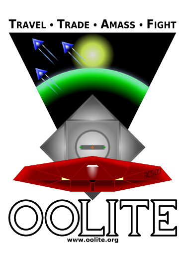
I've still got a ton of details to add, but I'm doing it at a4 scale so it will print quite nicely on inkjet transfer paper. (I hasten to add, that when we get some form of avatar system back up and running, that red cobra is mine.

) As for the back, I go with your idea, just adding that there should be tick boxes for each system. We can show how great an traveller we are when we show our
Eliteness by ticking of each system we've visited.
 Selezen
 I like where you are going with the idea. I could really see it as an embroidered uniform badge. The only thing I would do differently is to change the interweave size/ratio of the stripes. I think a bar/gap thickness ratio of 2/1 or 3/1 would look more bold and dynamic, especially on a dark background; but that's just the way I see it. Following on from
Daddy Hoggy thoughts; colour wise you could start with: green for harmless - mostly harmless, yellow for poor to above average, red for competent to deadly, and gold for elite.
Posted: Mon Aug 10, 2009 10:44 pm
by Cody
Oh yes, KZ, I like that.
You can have the red Cobra: I'd like a purple one!
Re: Just A Quick Post
Posted: Tue Aug 11, 2009 8:00 am
by Diziet Sma
KZ9999 wrote:I thought I would post a small update on the logo stuff I've been fiddling with over the last week. Since
El Viejo got me started on this track, here's a work in progress on the t-shirt idea.
I've still got a ton of details to add, but I'm doing it at a4 scale so it will print quite nicely on inkjet transfer paper.
In amongst that detail.. add some features to the Coriolis station, to make it a little easier for those who've never seen the game to realise it's a space station..
VERY nice design, by the way!


Posted: Tue Aug 11, 2009 8:01 am
by Selezen
Ok then, when I get a few minutes I'll implement the ideas for change. I like the idea for respacing the bars. Not sure about the colour suggestions - I wanted to put silver in there for Dangerous and Deadly at least.
I'll work on it. Thanks for the suggestions!
Re: Just A Quick Post
Posted: Tue Aug 11, 2009 11:35 am
by KZ9999
Diziet Sma wrote:In amongst that detail.. add some features to the Coriolis station, to make it a little easier for those who've never seen the game to realise it's a space station..
VERY nice design, by the way!
Maybe something like this perhaps?
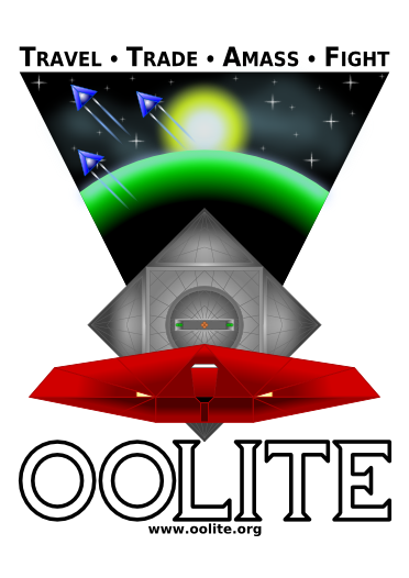
I was planning to add the thrusters trails linking the cobra to the station which should spell it out.
Glad to be of help
Selezen 
Don't listen to me on the colour thing, it's your design so take it where you want to go. I'll just be interested in seeing the results.
Posted: Tue Aug 11, 2009 11:46 am
by Cody
Hi, KZ.
What have I started...yeah, thrust trails will do nicely.
If you want me to be picky, the Station should be further back, so as not to dwarf the Cobra.
Regards
Posted: Tue Aug 11, 2009 12:15 pm
by ClymAngus
El Viejo wrote:Hi, KZ.
What have I started...yeah, thrust trails will do nicely.
If you want me to be picky, the Station should be further back, so as not to dwarf the Cobra.
Regards
I don't know, I like the way that from a distance it has a 2 triangles, hourglass look to it. The lower triangle pointing up representing the works of man and the top triangle pointing down representing the works of nature. Any smaller and you'd loose that effect which would be a pity.
I'd put a patch like that on my leathers soon as look at you.
Posted: Tue Aug 11, 2009 1:01 pm
by Diziet Sma
Just an idea.. don't know if it would look right.. (too unsymmetrical perhaps) Maybe add another cobby exiting the station and hooking a hard turn just 100 metres out of the bay, so as to show the scale of the station and an underside view of the cobby at the same time.. maybe make it red also to connect it to the one in the foreground..
I second the thrust trails idea.. that would work well.
Posted: Tue Aug 11, 2009 1:18 pm
by zevans
Diziet Sma wrote:Maybe add another cobby exiting the station and hooking a hard turn just 100 metres out of the bay, so as to show the scale of the station
http://www.youtube.com/watch?v=GmU_q5xrnto
Posted: Wed Aug 12, 2009 2:04 am
by KZ9999
Diziet Sma wrote:Just an idea.. don't know if it would look right.. (too unsymmetrical perhaps) Maybe add another cobby exiting the station and hooking a hard turn just 100 metres out of the bay, so as to show the scale of the station and an underside view of the cobby at the same time.. maybe make it red also to connect it to the one in the foreground..
I second the thrust trails idea.. that would work well.
It's easily do-able. I'll have a think about it over the next week and see what I come up with. A small cobra doing a hard climb out of the docking port with it being just a silhouette over the twilight/atmosphere zone of the planet. <thoughtful hum...>
Oh, and before I forget. If anyone is wondering what has become of the rank badge stuff I was doing, I've put it on hold till there's a winner of the icon design. Whoever wins I can easily just drop their design into the centre of the wing design and we are away laughing.
As a small PS, I would like to give you a personal thanks for the doing the windows trunk compiles. I've been using them as the basis for fact-source and fact-checking of the manual details (24k words with 3k worth of changes in the last 7 days!)
ClymAngus wrote:I don't know, I like the way that from a distance it has a 2 triangles, hourglass look to it. The lower triangle pointing up representing the works of man and the top triangle pointing down representing the works of nature. Any smaller and you'd loose that effect which would be a pity.
I'd put a patch like that on my leathers soon as look at you.
You know I didn't even notice that.

I just went with a balanced look for both colour and shape. There's a whole sub-context I wasn't even aware off. As for making it a patch, I wonder what it would look like as a airbrushed picture on the back of a leather bomber jacket, a-al WWII US Airforce Crew. It certainly up my geek cred'

Posted: Wed Aug 12, 2009 2:10 am
by Diziet Sma
This video is not available in your country due to copyright restrictions.
WTF? copyright restrictions? on an Oolite video?

(at least, I'm guessing it's an Oolite vid..)
Posted: Wed Aug 12, 2009 2:17 am
by Diziet Sma
KZ9999 wrote:As a small PS, I would like to give you a personal thanks for the doing the windows trunk compiles. I've been using them as the basis for fact-source and fact-checking of the manual details (24k words with 3k worth of changes in the last 7 days!)
My pleasure... I'm glad to know it's proving to be a useful service for some people..
As a side-note, once I iron out the wrinkles to get trunk working happily alongside 1.72, I'll also be making trunk autopackages available for Linux. With luck that will be done today.
Posted: Tue Aug 18, 2009 11:29 am
by KZ9999
Well stick a fork in it, `cause I think it's done.
I tried playing around with sticking extra details in the design and decided that
less is more. The only thing I couldn't pull off at the moment is having the glow trails twist to show that the ships a leaving a spinning station. If anyone got's-a idea on how to do it with Inkscape, please message me.
(I'm so tempted to make up a oxp just so that I can have that as my cobra in the game.)
If everyone is happy with the design, I'll upload copies of it to my file box space in the next week. Be warned I've done some test outputs and both the postscript and 600dpi png both weigh in at over 4mb each. One neat trick is that I can also upload a copy to my photobucket space and you should be able to order a printed t-shirt or hoodie etc via their link with Kodak, if you don't want to print off it yourself. I'll set it up and post a direct link if people want it.
The idea for the grand tour for the back of the t-shirt had to be caned. The only way I could fit all 2048 planets names into a a4 sheet is with 5 point type. As proud as I am to be an Ooliter, I seriously don't someone face pressed up that close to read the type.
As a small bonus this is my new avatar should the system be unlocked again.
*

I've posted some new variants on the
logo comp thread so drop by there too.
Now back to the actually writing the game manual. <mutter, mutter.>

That is until someone suggests something else that is
* I did have an idea on a number 8 solution to the problem. Create a new user called avatar-submission managed by the moderators. When a user become above average they can post their avatar to avatar-submission, and if it passes the moderators approval it get uploaded by them. It's not an ideal solution, but it is at least a solution.
Posted: Tue Aug 18, 2009 12:06 pm
by Thargoid
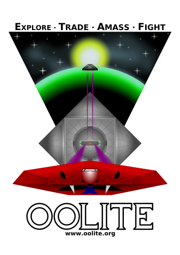
You could always reverse the order of the text at the top, to be more the actual progression of things (especially if you're bounty hunting or into piracy). Then it's also a hidden FATE...
Posted: Tue Aug 18, 2009 12:10 pm
by another_commander
Thargoid wrote:You could always reverse the order of the text at the top, to be more the actual progression of things (especially if you're bounty hunting or into piracy). Then it's also a hidden FATE...
Seconded. Bonus points for spotting FATE.