Page 5 of 15

Posted: Thu Jul 16, 2009 3:12 pm
by Micha
KZ9999 wrote:
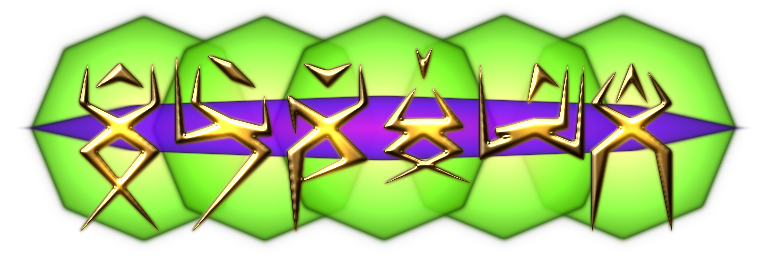
If anyone is interested, the gold on the Thargoid badge is my concept of their written language. It's from a insect Ideogram language idea I developed for a story I never wrote a few years back.
It looks a bit like a stylised dude dancing, tbh :D

Posted: Thu Jul 16, 2009 3:14 pm
by ClymAngus
Ahruman wrote:
I’d use these for the forum right now, except it would be unfair to the hypothetical competition. :-)
I for one capitulate. I'm sticking to things that haven't been done yet rather than reinvent and try to glory hound something that already appears to be in a very safe pair of hands. :)

although I may animate the final design. But that's a variation not an invention.

Another day, another set of badges/bb-icons

Posted: Fri Jul 17, 2009 5:06 am
by KZ9999
Firstly a fix-up of the Mostly Harmless, Pirate and Banned badges.
ImageImageImage
Many thanks to Griff for the sword through skull idea. :) 1>

Ark got me think about making a set of special badges for highlight the efforts of the various contributors so I came up for the following system

Supreme Commander with the gold wing-tips and claws for people like Ahruman. It's also the only one that has purple feathers, thanks El Viejo.
Image

For the core contributors, tinted wings with claws : red for coders, blue for artists (3d, sound, textures, etc), green for other roles such running the BBS. I chose these 3 colours because it's the 3 primary's of light.
ImageImageImage

For second tier contributors, tinted wings with claws : magenta for OXP creators, cyan for creators of other materials, yellow for other people of merit.
ImageImageImage

Plus two spaires:
ImageImage

For other roles on the bb we have the standard elite starbird badge with tinted wings:
ImageImageImageImage
Of course, we have got the black wings for the assassins and red for the snipers, but that still gives six to use.

It was never my goal to overshadow the comp'. There is no reason why we can't use these badges in the game as the rewards from the Guild of Combatants while having a separate logo for the actual game.

Just to show you the scale I've been working on, here's the thargoid badge at 768x256 pixels. It's quarter size of the 1536x512 pixel vector source file. All I can say yea for vector drawing programs. The master SVG file which contains every badge created is 400kb in size, the bitmap below is 213kb!
Image

Speaking of Thargoids.

Actually Micha the shapes on the Thargoid badge represent the antenatal, manipulative hand, and foot hands of the insect race I created. Since they are unable to use facial expression and vocal tones to express details in their language, the top part expresses emotional state, the bottom limbs broad concepts (house, blue, people...) and the middle limbs add context (my house, warm blue, those people.)

Yes Thargoid you will be able to have the logo all for your own. :lol: I'm happy with the work now, and baring any last fine tunes, I'll upload the zip contaning all the work and source files sometime next week for general use.


1> Thanks for the kudos, coming from such a great designer it's high praise in deed.

Posted: Fri Jul 17, 2009 9:37 am
by ClymAngus

Posted: Fri Jul 17, 2009 12:30 pm
by DaddyHoggy
KZ(10^4-1) :wink: I think you've done a sublime job - irrespective of the outcome of the comp - to think these wonderful creations came initially from your need to vectorise the original logo!!

So, what colour do you give yourself?

So of your spare colours which ones go to the fiction/back-story writers? :wink:

Although mine would have to be tartan as an Assassin/writer/OXP contributor :lol:

Posted: Fri Jul 17, 2009 12:44 pm
by Cody
I like it, KZ9999, I like it a lot, but if green is a primary colour, I'm living on the wrong world!

Posted: Fri Jul 17, 2009 12:55 pm
by goran
Excellent job KZ. Unified look with enough variety. Image

Posted: Fri Jul 17, 2009 1:06 pm
by DaddyHoggy
El Viejo wrote:
I like it, KZ9999, I like it a lot, but if green is a primary colour, I'm living on the wrong world!
:? RGB = Red Green Blue - the three primary colours of white light

I also notice KZ has done CMY = Cyan Magenta Yellow the three primary colours used in printing.

http://en.wikipedia.org/wiki/Primary_color

Posted: Fri Jul 17, 2009 1:47 pm
by KZ9999
DaddyHoggy wrote:
KZ(10^4-1) :wink: I think you've done a sublime job - irrespective of the outcome of the comp - to think these wonderful creations came initially from your need to vectorise the original logo!!

So, what colour do you give yourself?

So of your spare colours which ones go to the fiction/back-story writers? :wink:

Although mine would have to be tartan as an Assassin/writer/OXP contributor :lol:
In answer to your first question DaddyHoggy, at the moment I guess mainly cyan with a slight greenish tinge since I'm mainly doing background oonivers work, but since I've updated the RS and slowly plugging away at the manual I get to have slightly mouldy wings :lol: In answer to the second question, since your created background stuff and have done oxps, you are entitled to both magenta and cyan. Tartan'ing CMR would be a great way of wearing a migraine. <smirk/grin.>

You know, it hadn't occurred to me that many of the contributors are multi-rolled. (stupid mistake really, considering what so many are posting about on the board.) I'll have a think about it on the weekend and see if I can come up with an idea that would allow people to show that they have more than one string to their bow.

Let us also not forget that CYM are also the seconday colours of white light as-well. If nothing else, owning a Acorn Electron taught me the basics of colours and how to play with them. (Brown from checker-boarding red and green spring to mind.)

I know that this is double posting, but I thought I should show you the latest experiment on the logo I came up with while i was nursing a download (damn being at the ass end of the internet on dial-up.) I thought the compo' thread should have at least one example to get peoples creative juices going.

Image

I know I've gone overboard with the highlighting filters and it won't scale down that well but just an play on the idea.The blue disc behind the starbird represents a witchspace cloud and it's a full alpha channel object so it's quite transparent.

That's it for now. Oh, and thanks for all the ego stroking. Being unemployed at the moment, ment that it has taken a fair old beating from all the failed job applications, so it's nice to know I'm actually able to something useful.

Posted: Fri Jul 17, 2009 2:08 pm
by Cody
Apologies, KZ.

It seems that green is the new yellow. I was thinking of pigments, probably.
I had better go back to school (or my own world).

Posted: Fri Jul 17, 2009 5:01 pm
by Ark
KZ9999 wrote:
Harmless and Mostly Harmless
ImageImage

Poor, Average, Above Average
ImageImageImage

Competent, Dangerous, Deadly and Elite.
ImageImageImageImage
Imagine how nice those will be in the Game info screen
I know I know!!!! post NMSR but a little daydreaming won’t harm me (or anybody else)

Posted: Tue Jul 21, 2009 7:41 am
by Selezen
RGB is the standard primary palette for light-based colours (like on a screen or in the air) and RYB is the palette for pigment based colours (paint, ink etc) as el viejo said.

:-)

Some fantastic logos on here so far! I did 3D versions of the Elite and Oolite logos in Wings some time ago. I wonder if they would be useful. I spend do much time procrastinating over designs that it would take me a year to put one together. Mind you, that said, I'm a dab hand with Inkscape now and might be able to put a nice logo together. I might just do that. :-)

Posted: Thu Jul 23, 2009 10:37 pm
by KZ9999
I'm finally back...

Having thought about the multi-skilled people that make up the Oolite BB, I come up with concept of skill feathers
Image and Image
Following on the idea of the previous ranks concepts, people who are invovled in the game/universe creation will get feathers with a claw from the left set, other elites get feathers from the right set. A person chooses elite badge and colour for what they most want to known for, then followed by stacked feathers showing what other roles they play.
Of course this is assuming that PHPBB would support having a t/f table attached to each user's details dynamically displaying this information; and that someone would be willing to managing it.

Further fine tuning of the Elite badges, making the gem wings more translucence and increasing the feather count to 5.
ImageImageImageImage
The images are dumps from the vector masters with out any filter effects applied. The matt look I feel would be better for the BB and the glowing metal look kept for the game itself.

Selezen
Thanks for the complement and may I say a loud `Go for it!' I know I'm not the only creative type in here and it just feels odd to be running in a one horse race. As I've posted in the comp' thread I would love to have the competition to inspire and challenge my own work to better heights. Could you post a screen shots of the 3d logo's you did, I (and I'm sure others) would be interested in seeing what you did.

Any more suggestions out there?

Posted: Thu Jul 23, 2009 11:06 pm
by ClymAngus
KZ9999 wrote:
I know I'm not the only creative type in here and it just feels odd to be running in a one horse race.
maps, yeah. I know.
KZ9999 wrote:
As I've posted in the comp' thread I would love to have the competition to inspire and challenge my own work to better heights. Could you post a screen shots of the 3d logo's you did, I (and I'm sure others) would be interested in seeing what you did.
I don't know, being ring leader has it's benefits. :D
KZ9999 wrote:
Any more suggestions out there?
yes, gif animation mouse overs and userbars both rich sources of cool stuff that might embellish an already good design.

Posted: Fri Jul 24, 2009 1:23 am
by Nemoricus
I like these very much indeed and would love to see them used officially.

So, any thoughts as to what each color should represent?