Page 5 of 11
Re: New splash screen and icon
Posted: Wed Oct 25, 2023 11:25 pm
by phkb
arquebus wrote: ↑Wed Oct 25, 2023 11:22 pm
Is the font "fixed" for us? I mean is there a specific reason it's that font, and we can't really change it without a whole 'nother multi-page thread?
But it's BankGothic! The font that says "the future!" since 1930!
*Sigh*
Let me have a look at what I've got available....
Re: New splash screen and icon
Posted: Wed Oct 25, 2023 11:31 pm
by Nite Owl
phkb wrote: ↑Wed Oct 25, 2023 9:31 pm]
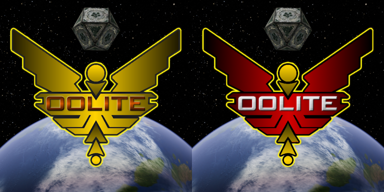
The one on the right looks good, red is a favorite of mine so a slight bit of prejudice. The shading on the circles and chevrons is reversed from the light source though. The center of the red area is the lightest so the circles at the edges should be the darkest with the chevrons getting progressively lighter as they get closer to the center.
Re: New splash screen and icon
Posted: Thu Oct 26, 2023 2:16 am
by phkb
I think we're approaching "critical mass" (maybe)!
How's this?
Now, about fonts. Here's some samples I threw together. The ones on the left are (mostly) ones I have on my machine. The ones on the right are from a quick search for "Space" fonts. Some interesting ones in there.
One of the points of the splash screen is that it has to "pop" - grab your attention (in a good way) and suggest some of what you'll find in the game. The font can lend a bit of force to that. Anyway, here's the samples:
I don't want to get into too much of a discussion. Feel free to send me any personal favs (even ones not on this list), and I'll put some actual splash screen samples together.
Maybe I should follow some of the suggestions from this link!
How to make your text look futuristic
Re: New splash screen and icon
Posted: Thu Oct 26, 2023 2:53 am
by phkb
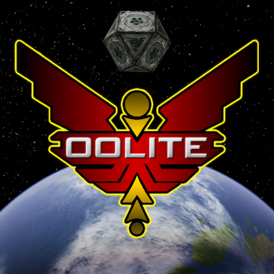
Actually, maybe I should jump in with a real sample. So, here's the splash with Eurostile Bold Extended:

What do you think?
Edit to add: I'm still tweaking the text a little. Eagle-eyed viewers will notice it's not centred properly yet.
Another edit to add: I'm actually like this last version a lot. The contrast is good, the colours pop, and the composition seems pretty balanced. But, because there was a hint that maybe silver for the chevrons might be good, here's a final version with updated centered text and two flavours of chevrons.
Re: New splash screen and icon
Posted: Thu Oct 26, 2023 4:09 am
by hiran
phkb wrote: ↑Thu Oct 26, 2023 2:53 am
Actually, maybe I should jump in with a real sample. So, here's the splash with Eurostile Bold Extended:
What do you think?
Edit to add: I'm still tweaking the text a little. Eagle-eyed viewers will notice it's not centred properly yet.
Another edit to add: I'm actually like this last version a lot. The contrast is good, the colours pop, and the composition seems pretty balanced. But, because there was a hint that maybe silver for the chevrons might be good, here's a final version with updated centered text and two flavours of chevrons.
In the meantime there were many good looking ones so I am confused. And while usually I'd go for a bit less color I believe the left version looks better than the right. Is it the same as on top?
Re: New splash screen and icon
Posted: Thu Oct 26, 2023 4:14 am
by phkb
hiran wrote: ↑Thu Oct 26, 2023 4:09 am
In the meantime there were many good looking ones so I am confused. And while usually I'd go for a bit less color I believe the left version looks better than the right. Is it the same as on top?
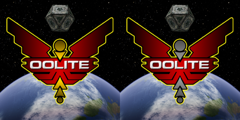
The only difference between the left and right is the colour of the chevrons. Everything else is the same. Edit to add: if, by "same as on top" you mean the first image in my last post, the only difference was some small tweaks to the text to center it and make it fill up the space a bit more.
And you're right, there were a lot of good variations. My paint.net project has about 40 layers in it with the leftovers! Some of these might be used for other things in future.
Re: New splash screen and icon
Posted: Thu Oct 26, 2023 9:50 am
by Redspear
Quick flyby...
Yes, I think all of the red ones look pretty good. I think the new font choice solves the 'double D' problem.
I think the reason that the gold / silver comparison is slighthly 'unfair' however given that they both have a gold outline. I'd grant the silver one a silver/white outline and also make the silver a bit brighter - if it doesn't 'pop' as much then it's likely to be becasue it's duller rather than just because its silver.
Anyhow, the red is good, the new font is good, the whiter text is good.
Gold or silver?... Get the polish out on that silver first!

I think the gold makes the red look a bit warmer but the silver makes it look bolder... That's a somewhat vague sentence. Are we all at risk of turning into edible arts graduates

Re: New splash screen and icon
Posted: Thu Oct 26, 2023 1:37 pm
by Nite Owl
The one on the right has the most appeal to my eye. The left one has too much gold in it with both the outline and circles/chevrons in gold. Redspear's suggestion of making the silver in the right one lighter/brighter also gets a nod but it should still fade from dark at the edges to lighter towards the center. The new font and font color does look better but perhaps is not futuristic enough? Without going too far in that direction what is there now is fine.
Re: New splash screen and icon
Posted: Thu Oct 26, 2023 5:35 pm
by cbr
phkb wrote: ↑Wed Oct 25, 2023 9:31 pm
Those small ones would be great mission reward medals


Re: New splash screen and icon
Posted: Thu Oct 26, 2023 5:37 pm
by hiran
cbr wrote: ↑Thu Oct 26, 2023 5:35 pm
Those small ones would be great mission reward medals
Nice idea.

Re: New splash screen and icon
Posted: Thu Oct 26, 2023 9:13 pm
by phkb
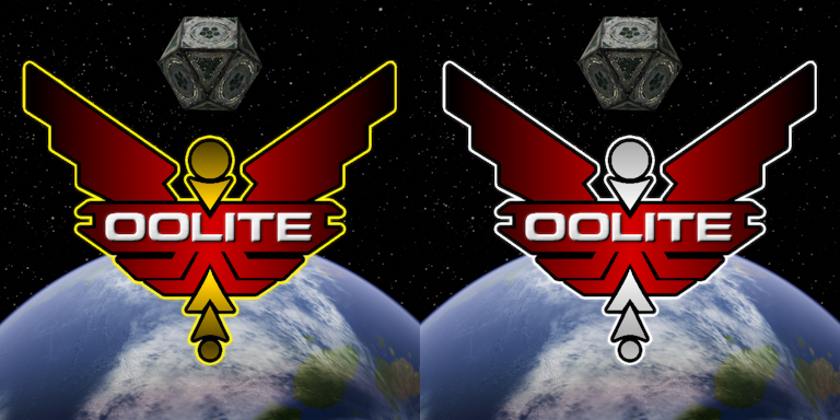
OK, here's the finalists:
Re: New splash screen and icon
Posted: Thu Oct 26, 2023 9:23 pm
by Redspear
hiran wrote: ↑Thu Oct 26, 2023 5:37 pm
cbr wrote: ↑Thu Oct 26, 2023 5:35 pm
Those small ones would be great mission reward medals
Nice idea.
Yep.
phkb wrote: ↑Thu Oct 26, 2023 9:13 pm
OK, here's the finalists:
Wow, you really did polish that silver didn't you...
I'd have gone maybe a bit less close to white but that one still gets my vote. It's the bolder of the two I think.
...Just noticed hiran's sig:
Sunshine - Moonlight - Good Times - Oolite
Surely the last one should be 'Buggies' (thargoids)?

Re: New splash screen and icon
Posted: Thu Oct 26, 2023 9:29 pm
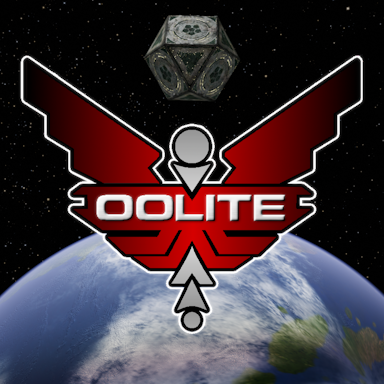
by phkb
Redspear wrote: ↑Thu Oct 26, 2023 9:23 pm
Wow, you really did polish that silver didn't you...
I'd have gone maybe a bit less close to white
How's this?
Re: New splash screen and icon
Posted: Thu Oct 26, 2023 9:33 pm
by cbr
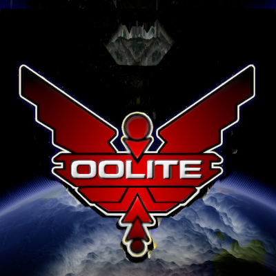
Another redone, spot the difference regarding 'lines'
Re: New splash screen and icon
Posted: Thu Oct 26, 2023 10:16 pm
by Redspear
phkb wrote: ↑Thu Oct 26, 2023 9:29 pm
Change the white outline to a similar grey and we have a potential boner
cbr wrote: ↑Thu Oct 26, 2023 9:33 pm
Another redone, spot the difference regarding 'lines'
If that extra 'real estate' were to be put to use then the word 'oolite' could be lowered slightly to place it at a more respectful distance from the 'neck' of the logo. Those two black lines either side though (unchanged icon)... they help to define the shape when reduced to an icon I think.