But it's BankGothic! The font that says "the future!" since 1930!
*Sigh*
Let me have a look at what I've got available....
Moderators: another_commander, winston

But it's BankGothic! The font that says "the future!" since 1930!
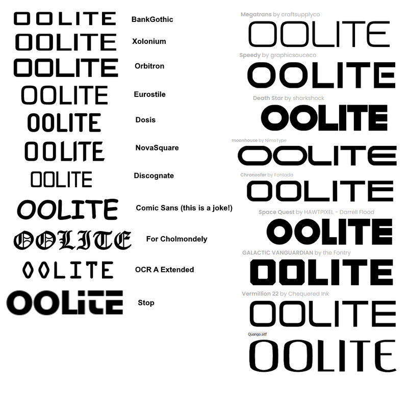

In the meantime there were many good looking ones so I am confused. And while usually I'd go for a bit less color I believe the left version looks better than the right. Is it the same as on top?phkb wrote: ↑Thu Oct 26, 2023 2:53 amActually, maybe I should jump in with a real sample. So, here's the splash with Eurostile Bold Extended:
What do you think?
Edit to add: I'm still tweaking the text a little. Eagle-eyed viewers will notice it's not centred properly yet.
Another edit to add: I'm actually like this last version a lot. The contrast is good, the colours pop, and the composition seems pretty balanced. But, because there was a hint that maybe silver for the chevrons might be good, here's a final version with updated centered text and two flavours of chevrons.

The only difference between the left and right is the colour of the chevrons. Everything else is the same. Edit to add: if, by "same as on top" you mean the first image in my last post, the only difference was some small tweaks to the text to center it and make it fill up the space a bit more.


Yep.
Wow, you really did polish that silver didn't you...
Surely the last one should be 'Buggies' (thargoids)?Sunshine - Moonlight - Good Times - Oolite
How's this?
Change the white outline to a similar grey and we have a potential boner
If that extra 'real estate' were to be put to use then the word 'oolite' could be lowered slightly to place it at a more respectful distance from the 'neck' of the logo. Those two black lines either side though (unchanged icon)... they help to define the shape when reduced to an icon I think.