Page 355 of 475
Re: Screenshots
Posted: Sun Aug 12, 2018 6:42 am
by another_commander
cbr wrote: ↑Sun Aug 12, 2018 12:17 am
Aaah the atmosphere is back, overall it seem everything is a bit lighter and there seem to be a slightly bigger difference
in the lighted and nonlighted parts of objects...
I feel a little performance hit on everything, reacting a tad bit slower on keyboard commands, still 40/50fps.[/size]
All objects have been artificially made over-reflective and glossy in the build you downloaded for testing purposes. The new system allows for a very wide flexibility of material representations with judicious use of the shininess materials parameter. Onjects can appear less lit and metallic if you want them to, or they can appear completely non-reflective. In today's nightly, you will find that the vanilla game has been returned to a look very close to its previous normal one and you will just notice that overall, the lighting "feels" better now. You can of course play with the shader to change it to your preferences.
The problem you had initially is of interest. I think you are on Linux, right? Could you try to change it back to Blinn-Phong and see if there are shader compilation errors in the log? (I would expect them to be). If there is a shader issue, it might help pinpoint and fix it, even though now GGX is in any case the new default.
I would like to contimue the discussion on a separate topic, if OK with you, so that this one is left to screenshots alone. Feel free to open a thread in Testing and Bug Reports and this and all other issues related to the new shader can be discussed over there.
Re: Screenshots
Posted: Sun Aug 12, 2018 11:43 pm
by cbr
This is I believe Blin(g)n-Phong
Code: Select all
OOSPECULAR_NEW_MODEL
OOSPECULAR_NEW_MODEL		1
OOSPECULAR_NEW_MODEL_GGX
OOSPECULAR_NEW_MODEL_GGX	0
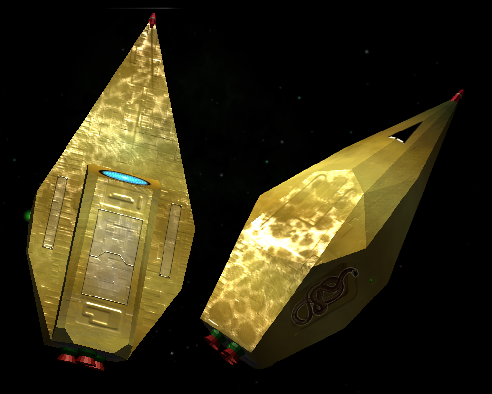
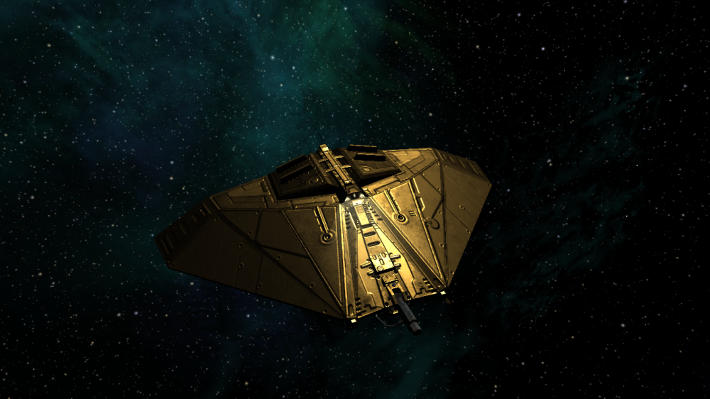
Which works nicely on goldfingers classic mussurana,
I also experimented with the specular map included in the mussurana.oxz

happy

Re: Screenshots
Posted: Mon Aug 13, 2018 3:37 pm
by another_commander
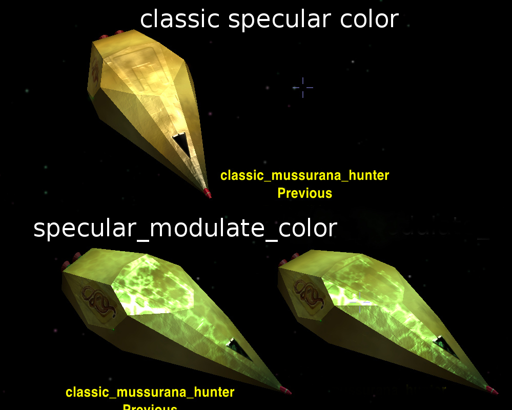
If you are trying to emulate a golden material, maybe it is worth trying to set a specular color equal to that of gold. Try setting the key specular_modulate_color = (1.0, 0.766, 0.336) so that the actual specular is mixed with this gold base color and see if you get a better result.
Re: Screenshots
Posted: Mon Aug 13, 2018 4:56 pm
by another_commander
Re: Screenshots
Posted: Mon Aug 13, 2018 6:32 pm
by cbr

there's a lot to finetune with all these options


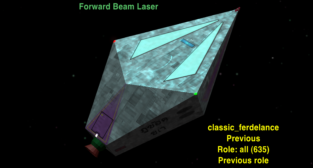
a lot of the ships from the classic collection seem to shine with the new shader

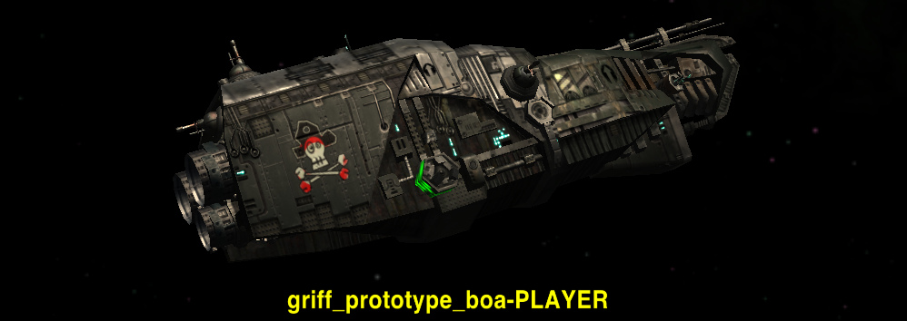
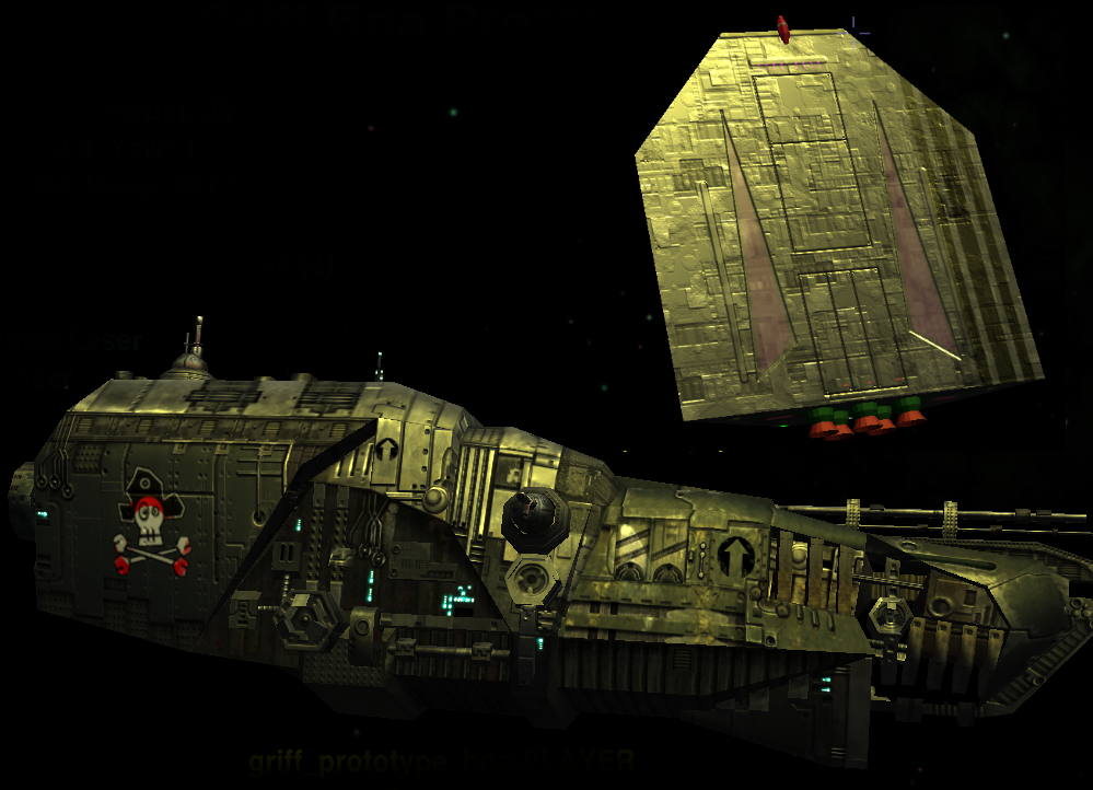
aah 'my' prototype boa looks a lot less shiny

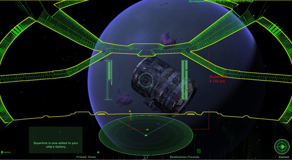
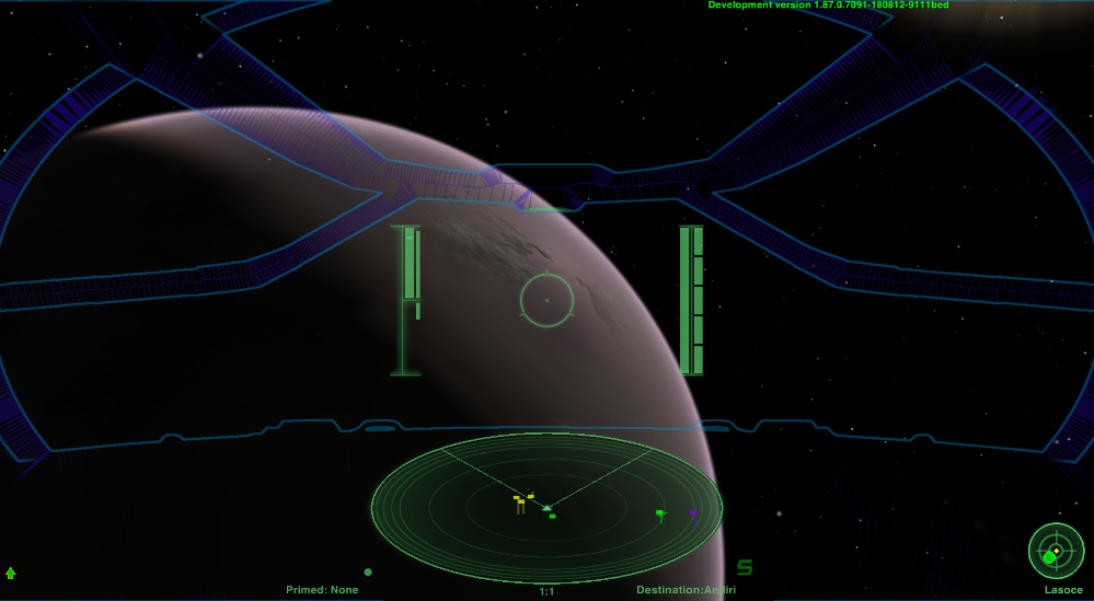
retrolook for the new dangerous hud

Re: Screenshots
Posted: Mon Aug 13, 2018 6:41 pm
by another_commander
@cbr: Nice, but I don't think your Griff Boa uses the new shader; at least from what I can tell from that pic. This ship has its own shaders set and they have to be manually edited in order to get the new methods applied.
Re: Screenshots
Posted: Mon Aug 13, 2018 9:42 pm
by Smivs
cbr wrote: ↑Mon Aug 13, 2018 6:32 pm
a lot of the ships from the classic collection seem to shine with the new shader
It seems to be amplifying the specular map.
These textures were designed to 'glint'. I tested them by getting a ship to barrel-role and when viewed at the right angle to the sun they reflect really nicely and the hull-plate effect really shows up well. Each texture was fine-tuned visually this way. In early testing they sometimes looked a bit too shiny, even with the 'shininess' in Materials set to what was otherwise an optimal amount. To offset this the specular map was made a bit 'blotchy' by incorporating the 'dirt' layer from the diffuse map, and this gave a more natural look to the reflected light.
It is this which is showing up in your screenshots. Much more light is being reflected, and the 'dirt' is becoming pronounced.
Re: Screenshots
Posted: Tue Aug 14, 2018 5:58 am
by another_commander
Smivs wrote: ↑Mon Aug 13, 2018 9:42 pmIt seems to be amplifying the specular map.
Just a note to say that the new shader does not exactly amplify the specular map. It models light reflections in a physically accurate way. Because specular light is now calculated differently, anything based on the old settings will likely look weird. In most cases, a re-adjustment of the shininess values will sort it out and this is what we are currently trying to fine tune for the core game (i.e. core ships not looking too different out of the box to what we had before). Reducing shininess may bring the looks closer to their previous state but not because it amplifies the spec map less, but because lower shininess represents more microsurface detail, which menas more irregularity in the direction light rays are reflected on such surfaces.
Re: Screenshots
Posted: Tue Aug 14, 2018 8:24 pm
by another_commander
Re: Screenshots
Posted: Tue Aug 14, 2018 10:37 pm
by cbr
very very nice another_commander !
The light seems to really reflect the material without it looking like a paintjob.
Factory fresh aluminium mkiii


I like them as they are but have to look how they look in 'my' oolite

Re: Screenshots
Posted: Wed Aug 15, 2018 11:15 am
by Redspear
At the risk of staring the obvious on at least two counts...
These look great. Nice work a_c.
Ambient system lighting could make quite a difference in term of viewer expectation of these materials.
That's fine of course but just to make the point that they might/could look even more like gold/copper etc. than is easily captured in one game screenshot.
Griff's models just keep holding up don't they...
Re: Screenshots
Posted: Thu Aug 16, 2018 7:38 pm
by another_commander
One more metallic Cobra variant: Chrome, lit under yellow and white colored suns.


Re: Screenshots
Posted: Thu Aug 16, 2018 8:57 pm
by Redspear
Awesome!
How do they look with the 'maintenance level' shader in a beat up state?
Re: Screenshots
Posted: Thu Aug 16, 2018 11:22 pm
by cbr
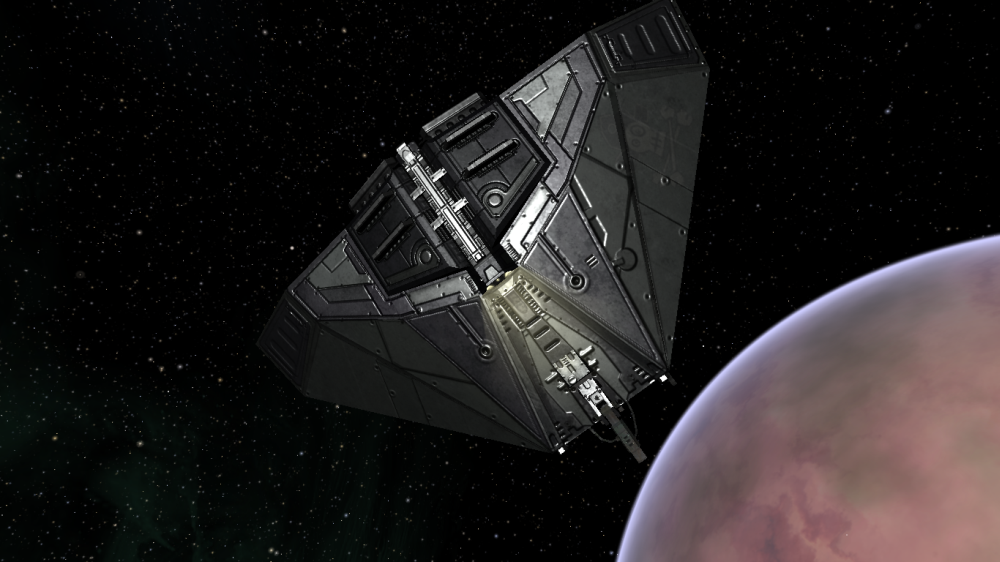
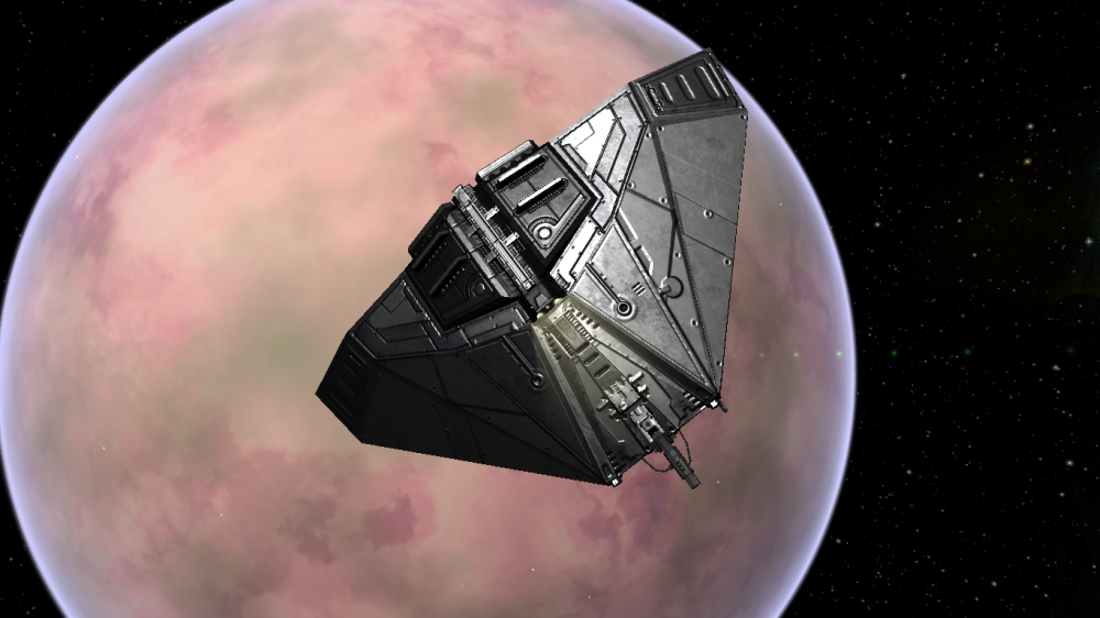
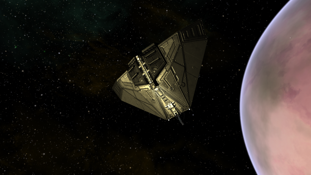
current planet view

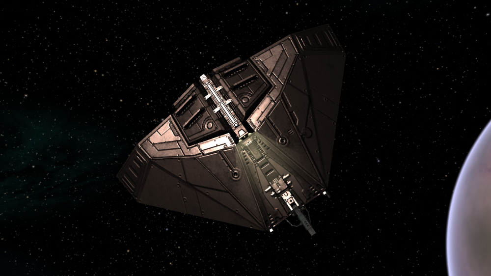
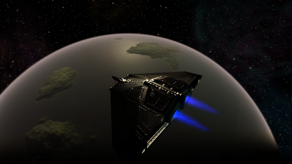
Viewing ships in a system with a yellowish star/sun

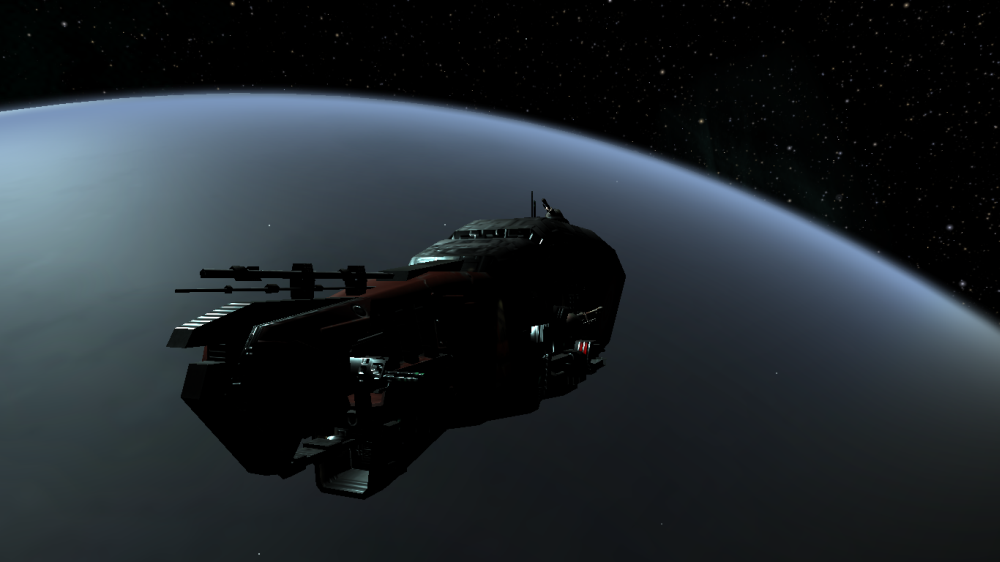
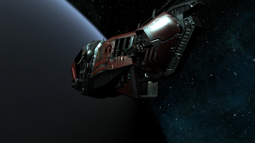
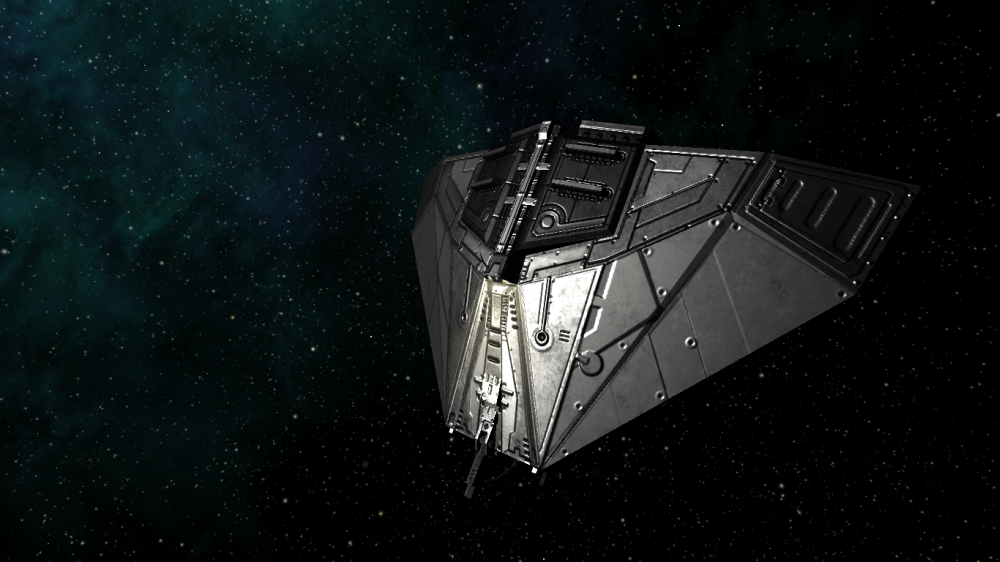
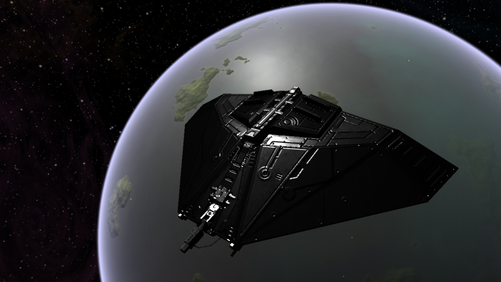
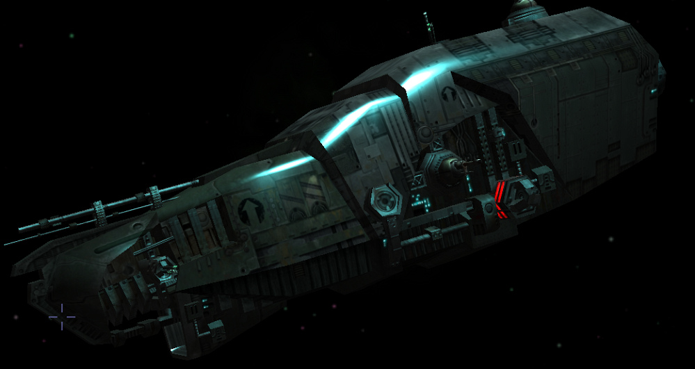
Prototype Boa / Boa 2 with shininess upped

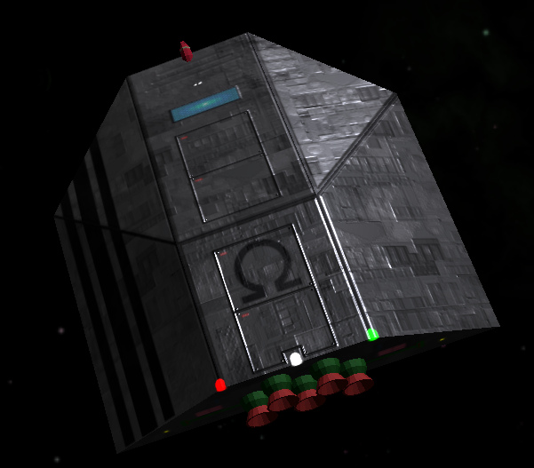
Constrictor in all it's deadly glory under a whiter sun/star

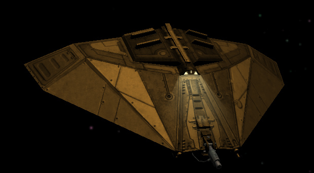
I replaced the shader in de griff mk3 oxz with the one posted above by a_c
The colors look ok (gold), but seems to be missing some gloss...

Re: Screenshots
Posted: Fri Aug 17, 2018 6:07 am
by another_commander
@Redspear: I am not sure how it will look with the damage shader applied. What you see up there has been created by changing the original Griff's shader and hard-coding a value of RGB (0, 0, 0) for the diffuse color and RGB (255, 255, 255) for the specular color, which are the values suggested by the chart found
here. Other shaders applying overlays, which are not designed for this kind of material handling, may have to be modified as well to look good and not out of place.
Those pics above are meant as a quick and dirty demo of what can be achieved with the new specular system. Materials can be made to look even better than this, by following certain guidelines when designing textures. Normally one would want to create albedo (i.e. diffuse minus any baked-in lighting information), specular (again, without any baked-in light info) and shininess (spec map alpha channel) maps for fine control of the way light behaves when interacting with the surfaces, rather than brute-force specific color values in the shader.
What I am trying to get at with this is that things may look better or not, depending on how compatible current textures are with the new system. Generally they will look better, but there might be cases where shaders or textures may have to be reworked to work at maximum capacity with the new system.
@cbr: Check your logs for shader compile errors. If they are clean, then try increasing the shininess value for the MkIII shader materials in shipdata.plist to something like 75 or 80 and see if there is any difference.
