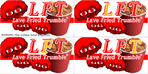
Yes, you're right ...Ark wrote:A static screenshot that posted by me is the only thing that you have seen. Am i right?
Replacing Constores with Griff Trade outposts@Griff and Doc
Moderators: another_commander, winston
- Disembodied
- Jedi Spam Assassin

- Posts: 6885
- Joined: Thu Jul 12, 2007 10:54 pm
- Location: Carter's Snort
I do not detect anything wrong with the dancing robot (8 frames animation) and the Happy Frog (4 frames animation) and the only think I have done is to change the number of frames in the shader code inside the shipdata plist. Are you sure for that Griff?Griff wrote:just changing the number of frames in the shipdata.plist will break the animation i'm afraid, the shader will chop up the original image incorrectly and well end up with a quater of the next frame sqaushed into the current frame.
- Griff
- Oolite 2 Art Director

- Posts: 2510
- Joined: Fri Jul 14, 2006 12:29 pm
- Location: Probably hugging his Air Fryer
i'm pretty sure it does, mind you i'm not near a pc with oolite at the moment to test, i'm sure i remember seeing odd stuff when i was making the drinking spaceman and it turned out to be the number of frames in the image and the number of frames specified in shipdata.plist not matching.
hmm, when you change the numbers in the shipdata.plist are you starting oolite with the shift key pressed down so it re-reads all the files in the oxp's again?
hmm, when you change the numbers in the shipdata.plist are you starting oolite with the shift key pressed down so it re-reads all the files in the oxp's again?
- Pangloss
- ---- E L I T E ----

- Posts: 303
- Joined: Wed Dec 13, 2006 5:57 pm
- Location: Scranton, PA (via Stevenage, Herts)
No offense taken. I'll work on that today!Ark wrote:Well the only change in the code (in order to replace the drinking spaceman with happy frog) is to change the frames of the ad in shipdata.plist from 5 to 4. The fact that that ad has letters has nothing to do with code changes.DaddyHoggy wrote:Ark's plan - and I agree - is minimal code changes between Constores. However, I don't mind that on occassion the text is the wrong way round - if anything it adds to the realism of the 'verts...
My main concern for the constores is to be different but at the same time similar so I wanted to put on the roof things that are similar with the drinking spaceman like the dancing robot or the funky chicken.
Does anybody of you that have the wip tried to change the texture of the roof billboard in one set with the happy frog and also change the frames of the ad in shipdata plist from 5 to 4 so he can see it live (DO NOT FORGET THE SHIFT!!). A static screenshot that posted by me is the only thing that you have seen. Am i right?
But if everybody agrees that I should put the happy frog with letters (but apparently without first seeing it live on a constore) that is ok with me i will do it
As for the pacman made by pangloss is definitely out of the question to ask me put it on a constore unless pangloss first make that look like a neon billboard (no offence pangloss - sorry about that)
"All is for the best in this best of all possible worlds..."
Dr.Pangloss, Voltaire's 'Candide'.

Dr.Pangloss, Voltaire's 'Candide'.

- DaddyHoggy
- Intergalactic Spam Assassin

- Posts: 8515
- Joined: Tue Dec 05, 2006 9:43 pm
- Location: Newbury, UK
- Contact:
@Pangloss - yeh, pretty much, but I also meant with more contour following around the outside of the pacman outline - so it's not quite so squared and harsh.
It's definitely getting there...
It's definitely getting there...
Oolite Life is now revealed hereSelezen wrote:Apparently I was having a DaddyHoggy moment.
- Pangloss
- ---- E L I T E ----

- Posts: 303
- Joined: Wed Dec 13, 2006 5:57 pm
- Location: Scranton, PA (via Stevenage, Herts)
You're just trying to get me to use up all my PhotoBucket bandwidth!DaddyHoggy wrote:@Pangloss - yeh, pretty much, but I also meant with more contour following around the outside of the pacman outline - so it's not quite so squared and harsh.
It's definitely getting there...

How's this one look?
"All is for the best in this best of all possible worlds..."
Dr.Pangloss, Voltaire's 'Candide'.

Dr.Pangloss, Voltaire's 'Candide'.

- Griff
- Oolite 2 Art Director

- Posts: 2510
- Joined: Fri Jul 14, 2006 12:29 pm
- Location: Probably hugging his Air Fryer
You must be fed up of that flippin' pacman by now Pangloss, so i very cautiously offer a small crit (please dont bite through your mouse cable in fury  ), it just that pacman looks like he's covered in soot or something, hmm, could you place an yellow or orange colour or something in the beneath him to fill in the black areas on his face? and maybe a red layer to fill in his gloves?
- DaddyHoggy
- Intergalactic Spam Assassin

- Posts: 8515
- Joined: Tue Dec 05, 2006 9:43 pm
- Location: Newbury, UK
- Contact:
That's my fault - I was trying to get Pangloss to think about making pacman less solid a bit more "glowly" - I'm open to suggestions of how we make the pacman more like a "proper" neon billboard. It's an excellent sign, seems a shame if we can't contextualise it (now there's a word and a half) to everybody's satisfactionGriff wrote:You must be fed up of that flippin' pacman by now Pangloss, so i very cautiously offer a small crit (please dont bite through your mouse cable in fury), it just that pacman looks like he's covered in soot or something, hmm, could you place an yellow or orange colour or something in the beneath him to fill in the black areas on his face? and maybe a red layer to fill in his gloves?
Oolite Life is now revealed hereSelezen wrote:Apparently I was having a DaddyHoggy moment.
- Commander McLane
- ---- E L I T E ----

- Posts: 9520
- Joined: Thu Dec 14, 2006 9:08 am
- Location: a Hacker Outpost in a moderately remote area
- Contact:
Thank you McLane Thank you!!!!!!!Commander McLane wrote:Away from the full body, and replace it with concentric yellow 'neon' rings.DaddyHoggy wrote:I'm open to suggestions of how we make the pacman more like a "proper" neon billboard.
Just an idea...
Just for the record a simble open and save by windows paint will do the jobAhruman wrote:One way to fix it would be to use pngcrush as follows:In fact, you may as well remove any other colour management information while you’re at it:Code: Select all
pngcrush -rem cHRM yah_set_C_ad_small_2frames.png yah_set_C_ad_small_2frames_fixed.pngProtip: everyone distributing PNGs over the interlink should have pngcrush or OptiPNG installed, and should be using them on said PNGs. Heck, install both; last time I checked OptiPNG was slightly better at reducing PNG size, but it doesn’t have as many options (like -rem above).Code: Select all
pngcrush -rem cHRM -rem gAMA -rem iCCP -rem sRGB yah_set_C_ad_small_2frames.png yah_set_C_ad_small_2frames_fixed.png
Can I ask what the dimensions are for the new constore (trade outpost, whatever the thing's called)?
I've got an idea in the back of the hivemind for something to offer to add to it (as I've got just about enough graphical skill to draw breath) but it would depend on the station size. If the station is too small it would look weird.
I've got an idea in the back of the hivemind for something to offer to add to it (as I've got just about enough graphical skill to draw breath) but it would depend on the station size. If the station is too small it would look weird.
My OXPs via Boxspace or from my Wiki pages  .
.
Thargoid TV
Dropbox Referral Link
Thargoid TV
Dropbox Referral Link
This is the beta version of the modified your ad here oxp. Also something is wrong with the glowads shader effects in my sytem. I am playing in simple shader mode and glowads sometimes do not glow. By rebuilding the cache the problem solved temporarily. So I want I feedback about this.
Edit: -Link removed by Ark-
The version is only for test purposes and the link will be functional for only 15 days.
Changes since the last wip:
1. Every station now has a deferent roof billboard
2. Corrected a bug in the shipdata plist that affected only mac users
3. I have put in set C the happy frog ad in the 1x1 billboard (the blue ouster that originally was in the wip has been moved to set E) and the roof billboard variation of the same ad to the mall wart constore.
Just for the record sets A, B & D are finished but I still believe that we must modify the roof billboard in set C especially now that we are using the almost same ad in the roof and in the 1X1 billboard of the station so if I am going to have a non letter version of that roof billboard I am going to change it (Griff hello!!!!)
Oh... and inside the texture folder of set C and D there is a HR version of the adring. If your system can cope with this just delete the original adring and rename those HR adrings from yah_set_X_griff_station_adring_HR to yah_set_X_griff_station_adring
Also this is the first wip for set_E
Edit: -Link removed by Ark-
Things in order to finsh set_E
1.A non shader version of the pacman adring done!!!
2.Err .. yes the pacman roof billboard pretty please!!! done!!!
@Thargoid: the station was created by Griff so I cannot answer to your question. Perhaps if you download the wip you will find the answer there
Edit: -Link removed by Ark-
The version is only for test purposes and the link will be functional for only 15 days.
Changes since the last wip:
1. Every station now has a deferent roof billboard
2. Corrected a bug in the shipdata plist that affected only mac users
3. I have put in set C the happy frog ad in the 1x1 billboard (the blue ouster that originally was in the wip has been moved to set E) and the roof billboard variation of the same ad to the mall wart constore.
Just for the record sets A, B & D are finished but I still believe that we must modify the roof billboard in set C especially now that we are using the almost same ad in the roof and in the 1X1 billboard of the station so if I am going to have a non letter version of that roof billboard I am going to change it (Griff hello!!!!)
Oh... and inside the texture folder of set C and D there is a HR version of the adring. If your system can cope with this just delete the original adring and rename those HR adrings from yah_set_X_griff_station_adring_HR to yah_set_X_griff_station_adring
Also this is the first wip for set_E
Edit: -Link removed by Ark-
Things in order to finsh set_E
@Thargoid: the station was created by Griff so I cannot answer to your question. Perhaps if you download the wip you will find the answer there
Last edited by Ark on Mon Feb 16, 2009 7:05 am, edited 3 times in total.
- Pangloss
- ---- E L I T E ----

- Posts: 303
- Joined: Wed Dec 13, 2006 5:57 pm
- Location: Scranton, PA (via Stevenage, Herts)
Please, if someone has time to replace the body with concentric yellow rings, that's your project!
Here's what I have. Enough difference for it to be neon, but not enough for it to be dirty-looking. There is a very very slight glow to the yellow... it shows better on the red. I think it's harder to see on the lightness of the web page.

This reminds me of all the websites I've ever done, and I'll tell you why. I'd start off by telling people "here's the main design" and people would say "ah, but we need to use Times New Roman for the font."
And I'd say "that's alright, because all I need to do is change the CSS document and it'll change all the text. Because text is like that."
So then they'd get this idea into their head that EVERYTHING was just changing one piece of code. "We want the buttons slightly more rounded" woud mean I'd have to do all the buttons again (and I used to delight in having mouse-over, page-you're-on, and mouse-off versions).
One place wanted me to change the shade of green four times because it wasn't "hunter green". So I searched for Hunter green online, and showed them how there are a bazillion different shades of 'hunter green'. From that moment on, I started asking people to give me their colors in hexidecimal RGB and never had a problem since!
Here's what I have. Enough difference for it to be neon, but not enough for it to be dirty-looking. There is a very very slight glow to the yellow... it shows better on the red. I think it's harder to see on the lightness of the web page.

This reminds me of all the websites I've ever done, and I'll tell you why. I'd start off by telling people "here's the main design" and people would say "ah, but we need to use Times New Roman for the font."
And I'd say "that's alright, because all I need to do is change the CSS document and it'll change all the text. Because text is like that."
So then they'd get this idea into their head that EVERYTHING was just changing one piece of code. "We want the buttons slightly more rounded" woud mean I'd have to do all the buttons again (and I used to delight in having mouse-over, page-you're-on, and mouse-off versions).
One place wanted me to change the shade of green four times because it wasn't "hunter green". So I searched for Hunter green online, and showed them how there are a bazillion different shades of 'hunter green'. From that moment on, I started asking people to give me their colors in hexidecimal RGB and never had a problem since!
"All is for the best in this best of all possible worlds..."
Dr.Pangloss, Voltaire's 'Candide'.

Dr.Pangloss, Voltaire's 'Candide'.
