Page 137 of 139
Re: Progress
Posted: Sun Aug 30, 2020 8:03 pm
by Commander_X
Cody wrote: ↑Sun Aug 30, 2020 11:52 am
Thanks to the dev team for Oolite 1.90 - shame I can't play it.
Waidaminute-waidaminute! Who was testing this then ?!

Re: Progress
Posted: Sun Nov 22, 2020 2:26 pm
by another_commander
In tomorrow's nightly we will have a little upgrade in the planet properties: atmosphere density.
Some planets can be made to have denser atmosphere than others. This will allow for more variety in planets' appearance. To achieve this, you can use either the planetinfo.plist property
air_density or the Javascript planet entity
airDensity. The accepted value range is from 0.0 to 1.0 and anything outside of this range will be automatically clamped. We default all planets to 0.75 in the core.
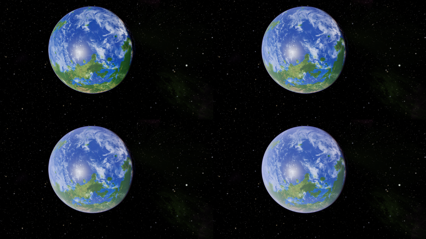
Here is an example of what this does. In the shots below, we see stranger's FPO Lave in four increasing atmosphere densities: 0.2, 0.5, 0.75 and 1.0. Every other parameter in the planet definition is the same in all pictures.

Re: Progress
Posted: Sun Nov 22, 2020 2:35 pm
by Cody
Nice!
Re: Progress
Posted: Mon Oct 03, 2022 4:34 pm
by Cholmondely
another_commander wrote: ↑Sun Nov 22, 2020 2:26 pm
In tomorrow's nightly we will have a little upgrade in the planet properties: atmosphere density.
Some planets can be made to have denser atmosphere than others. This will allow for more variety in planets' appearance. To achieve this, you can use either the planetinfo.plist property
air_density or the Javascript planet entity
airDensity. The accepted value range is from 0.0 to 1.0 and anything outside of this range will be automatically clamped. We default all planets to 0.75 in the core.
Here is an example of what this does. In the shots below, we see stranger's FPO Lave in four increasing atmosphere densities: 0.2, 0.5, 0.75 and 1.0. Every other parameter in the planet definition is the same in all pictures.

I've added this to
https://wiki.alioth.net/index.php/Planetinfo.plist but it needs editing by somebody who understands it...
Re: Progress
Posted: Mon Nov 14, 2022 8:45 am
by another_commander
It looks like for the last couple of years we've been doing stuff without updating the progress thread, which is a pity because it is nice to have all dev progress collected somewhere where it can be found quickly. So, here it is, this is what has happened in the game after the time of the last post back in November 2020.
- Added
setShipDataForKey, allowing OXPs to fiddle with the properties of all ships directly.
- Added Update All option to OXP Manager.
- In-game keyboard configuration, including selected international keyboards support (yay!).
- Replaced Hejl / Burgess-Dawson tone mapper with ACES.
- Added extra joystick mapping options to the stick configuration screen.
- Implemented user defined planet dark side illumination.
- New renderer. We now render to 16-bit floating point framebuffer, which enables post-processing and other graphics effects, like bloom.
- Added special visual effect for cloaking device.
- Implemented MSAA.
- Adjustments to the game's detail levels. First two detail levels are not using shaders, last two use them.
- Implemented colorblind mode.
- Implemented output to HDR capable display devices (currently Windows only).
Hopefully I have not forgotten anything, if I have please shout so we can add accordingly.
Re: Progress
Posted: Sun Nov 20, 2022 3:48 am
by Massively Locked
another_commander wrote: ↑Mon Nov 14, 2022 8:45 am- Added
setShipInfoForKey, allowing OXPs to fiddle with the properties of all ships directly.
Can you verify that it's
setShipInfoForKey? I played with and added it to the wiki as
setShipDataForKey.
Re: Progress
Posted: Sun Nov 20, 2022 4:28 pm
by another_commander
Actually it is both. setShipInfoForKey is the new method that does the job in-code and is mentioned in the pull request that implemented the feature, but setShipDataForKey is the name of the JS function that is available through the game's API. It is more correct to list the feature using the game API version, which is what users will be exposed to, so this has been changed accordingly above. Thanks for catching this.
Re: Progress
Posted: Sat Jan 21, 2023 10:18 pm
by Cholmondely
Pleb wrote: ↑Tue Mar 25, 2014 11:48 am
Gimi wrote:@Cim:
Sometimes you would want a ship to appear in the library only after a certain event or after the player encounters the vessel for the first time.
Equally, sometimes only parts of the information on the ship should be visible at first, and the rest revealed upon a mission event.
Is this possible?
The ship library is accessed before the game loads so there is no way of implementing this. The only way this would work is if you could only access the library after the player has loaded a saved game or started a new one.
Is this still true?
Re: Progress
Posted: Fri Feb 24, 2023 7:26 pm
by another_commander
Just added some intital shader code to control final output color saturation. Right now you have to edit the value at the start of the main function of the final fragment shader to change it, but I believe it would not be very hard to make it a game parameter, either as a defaults file entry or as a game menu option (if we are able to find any space in the options list to insert it, that is).
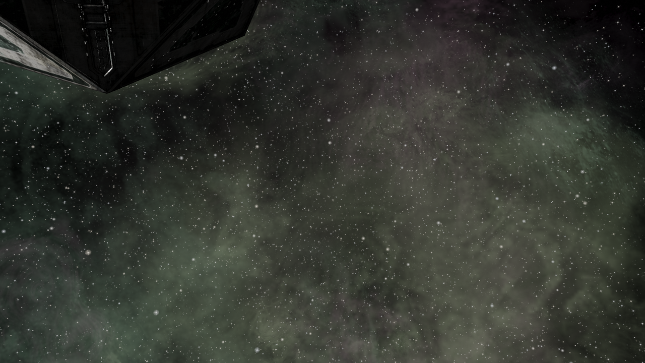
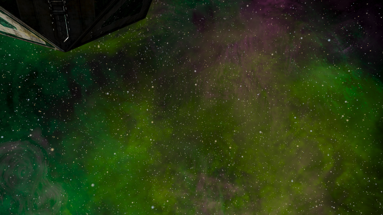
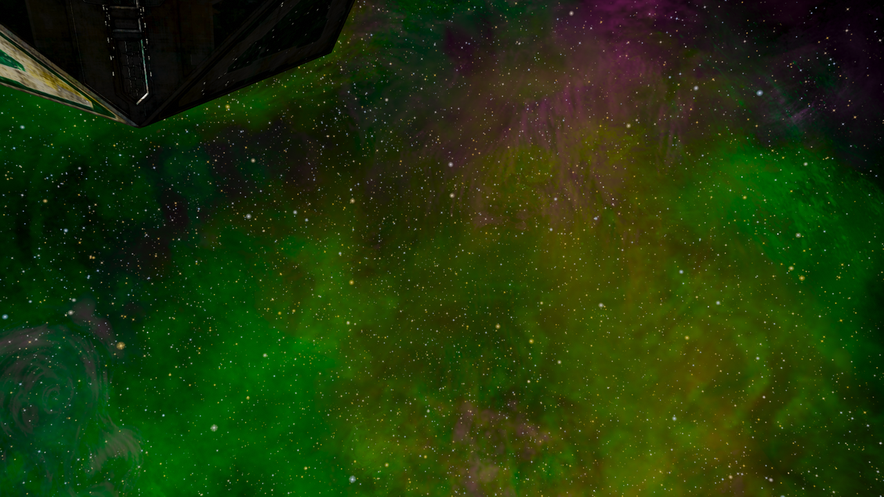
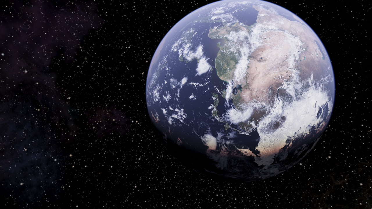
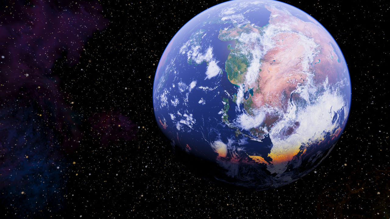
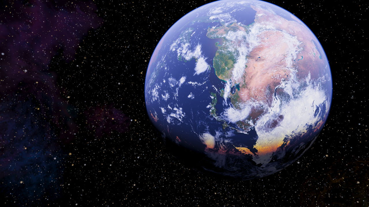
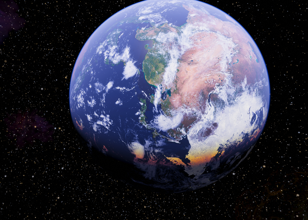
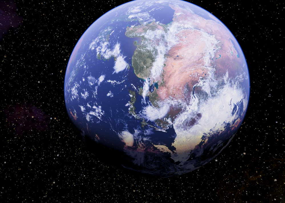
What this does, you ask? Well, here are two sets of screens to show you. The first screen in each set uses a saturation of 0.5, the second one uses 1.0 (the default value which creates the output we are all used to), the third uses a saturation of 2.0 and the fourth uses 3.0, which is probably too high a value and is used for demonstration of the effect. A saturation of 0.0 will produce a black and white image and the HUD is not affected by default, it is affected when in colorblind mode, though. There is no current limit to the saturation value, but IMO it should be restricted between 0.0 and 2.0, so that it does not producce unreasonable or simply ugly or ridiculous results.


Re: Progress
Posted: Fri Feb 24, 2023 8:59 pm
by Redspear
They look interesting.
We may well have different eyes and/or monitors but (having viewed on two of the latter) the planets in particular make a useful comparison. Nebulae in general seem so variable as for it to boil down largely to personal preference.
(Purely IMHO of course...) The 3.0 value brings a realistic vibrancy to the oceans and desert but perhaps a tad too much to the forests and day/night terminator. 2.0 by comparison seems not only more subtle but also less realistic.
Not a request, but based purely on the above a 2.5 value might be interesting but of course one can tweak near endlessly.
I think there are plenty of examples in real life where colours continue to surprise us with their intensity. To me the 2.0 example looks like the photo I'd take (and be disappointed with), 3.0 more like what I actually saw.
YMMV.
Re: Progress
Posted: Sat Feb 25, 2023 10:00 am
by another_commander
Everything comes down to personal preference at the end of the day and trying to keep everyone happy with the quality of the image they get is exactly what this featurette is about.
As far as Earth is concerned, the second picture out of the four is the one containing the original "artistic intent", which is also why it has the terminator calibrated to show a very slight, yet perceptible enough transition from day to night colors and is the one I personally prefer. I am not a huge fan of overly saturated colors. The two that you seem to prefer most are the saturation-boosted ones, with the last one being overly saturated, as it stands. Still, being able to have the choice of how the final image will look for you, me and everyone is what makes it worth implementing here. I have no current plans of changing any defaults, the shader is still set up for a saturation of 1.0 (2nd image), but providing ways to control this user-side in an as simple as possible manner would be the end goal.
BTW, here is what the test image looks like with a saturation of 2.5. Hopefully this is your sweet spot.

As an extra bonus for those running trunk in HDR, enabling higher levels of color saturation offers an opportunity to dive into the extended color gamut that HDR supports. Some of the colors you will be able to see in this mode will simply not be possible to achieve in SDR or depicted in a standard screenshot (this is the case even for saturation of 1.0, but increasing it makes it more probable that such colors will be encountered).
Re: Progress
Posted: Sat Feb 25, 2023 10:24 am
by cbr
the above 2.5

the above 2.5 with reduced greens and reds

the above 2.5 used mask

In 2.5 the greens and reds are a bit much for me.
Can the effect be applied to a certain spectrum of the color range?
A very personal personal preference indeed...
Re: Progress
Posted: Sat Feb 25, 2023 10:50 am
by another_commander
cbr wrote: ↑Sat Feb 25, 2023 10:24 am
Can the effect be applied to a certain spectrum of the color range?
Unfortunately no, it is applied on the whole image and even if you could apply to a certain spectrum, that would not be of much help, really. Scene changes or even camera viewing position changes in the same scene would create situations where the required spectrums would have to change constantly too and this is something that cannot be predicted (without very complex algorithms at least).
In the specific example we've been looking at, the blue color can be enhanced a lot without affecting the others by simply increasing the system.mainPlanet.airColorMixRatio to something like 0.75-0.80, but this is obviously not the same thing as increasing the color saturation of the entire image.
Re: Progress
Posted: Sat Feb 25, 2023 3:31 pm
by Redspear
another_commander wrote: ↑Sat Feb 25, 2023 10:00 am
As far as Earth is concerned, the second picture out of the four is the one containing the original "artistic intent", which is also why it has the terminator calibrated to show a very slight, yet perceptible enough transition from day to night colors and is the one I personally prefer.
cbr wrote: ↑Sat Feb 25, 2023 10:24 am
In 2.5 the greens and reds are a bit much for me.
Could the two be related?
Raleigh Scattering. So if one judges by only one criteria at a time (i.e either ocean blues or day/night transition) then very different assessments of a sweet spot likely emerge?
I know, I know, I know, all academic etc...
another_commander wrote: ↑Sat Feb 25, 2023 10:00 amI am not a huge fan of overly saturated colors.
Me neither. Semantics and all that
 True colour Earth
... but, to quote wikipedia, "Absolute true-color rendering is impossible", so I'm not proving anything with the image I'm linking to.
Re: Progress
Posted: Sat Feb 25, 2023 6:42 pm
by Cholmondely
But our earth is irrelevant, no? Different planets, different suns... so the day-night terminator may well be different from what we expect on this planet, as may colours, their saturation etc. So it is truly a matter of "De Gustibus ".
