Page 2 of 3
Re: A Description of the Improved Lighting and Materials System
Posted: Mon Jan 17, 2022 11:44 am
by Cody
What's this, Griff - you got a top hat now? Very snazzy!
Re: A Description of the Improved Lighting and Materials System
Posted: Mon Jan 17, 2022 12:29 pm
by Griff
i changed my hat for a santa one for Christmas, then found this one when i was looking for my usual hat go to back, thought i'd try it out for a bit

Re: A Description of the Improved Lighting and Materials System
Posted: Mon Jan 17, 2022 1:33 pm
by Redspear
Griff wrote: ↑Sun Jan 16, 2022 5:43 pm
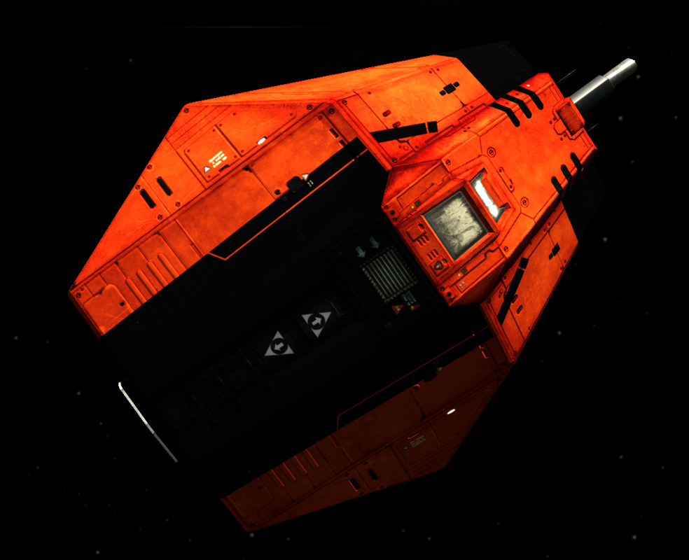
As it looks like no one else has said it yet... That's a(nother) great looking model Griff.
The Sidewinder was always one of my favourites and your tribute to the original distinctive shape combined with fine yet distinctive detailing works really well. Kudos.
As for the colour scheme, what were you thinking?

(just kidding

)
Re: A Description of the Improved Lighting and Materials System
Posted: Mon Jan 17, 2022 1:40 pm
by Cholmondely
Griff wrote: ↑Mon Jan 17, 2022 12:29 pm
i changed my hat for a santa one for Christmas, then found this one when i was looking for my usual hat go to back, thought i'd try it out for a bit

Ummm... silk or felt?
Re: A Description of the Improved Lighting and Materials System
Posted: Tue Jan 18, 2022 8:10 am
by Griff
thanks for the kind words Redspear, i've been picking away at it for ages, it's the first model that i've successfully 'baked' some of the highpoly details from into a normal map, i tried earlier with a cobraIII model and it was a distaster, but it seemed to work OK with this one. Plan with this is to get it looking great with Oolite's Materials then try for shader version just for the engine glows and decals and stuff
@Cholmondely
It's more like a tube of crepe paper shaped into a hat i think

Re: A Description of the Improved Lighting and Materials System
Posted: Mon Jun 27, 2022 7:15 pm
by Cholmondely
Issues brought here from elsewhere
Metallic Material with a non-Black diffuse map
cbr wrote: ↑Mon Jun 27, 2022 6:36 pm
wonder question...
gloss = 0
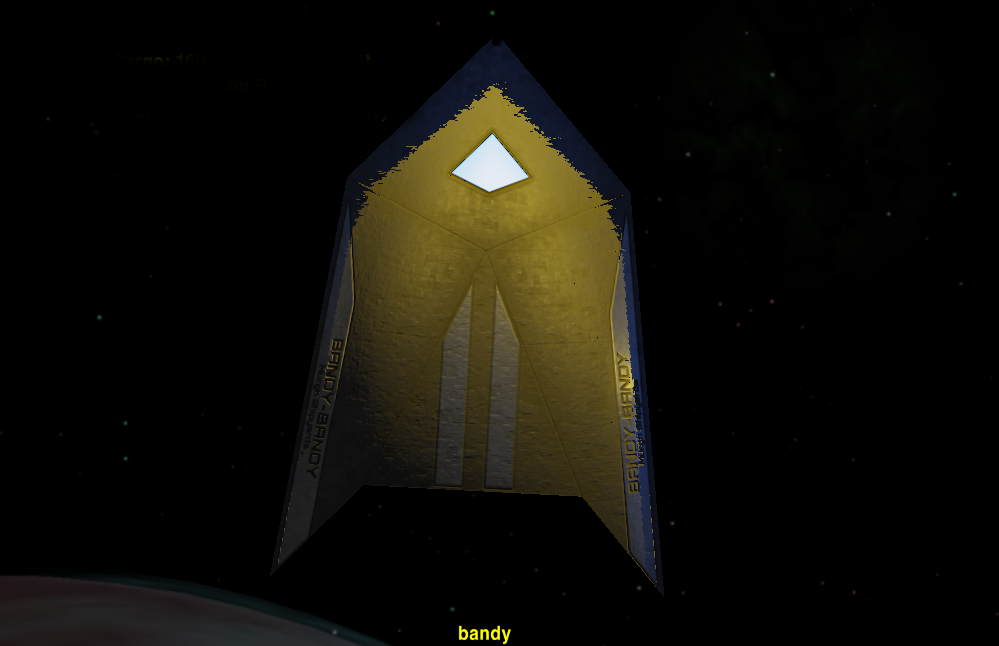
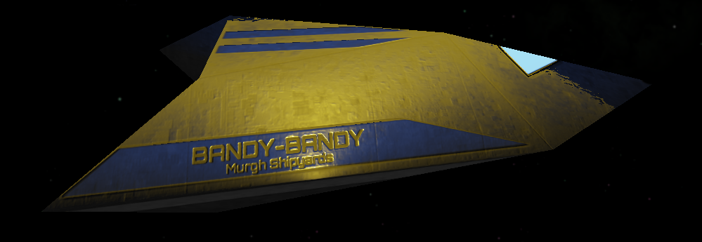
gloss = 1
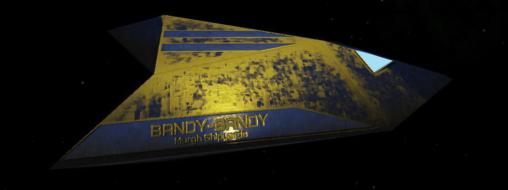
gloss = 1 and partial color overlay diffuse map
The original grayscale diffuse map
Added
monocolor ( yellow fill ) spec map with
grayscale gloss in alpha
Why do I see blue areas?


another_commander wrote: ↑Mon Jun 27, 2022 6:56 pm
cbr wrote: ↑Mon Jun 27, 2022 6:36 pm
Why do I see blue areas?


Because you have created an impossible material and because Oolite's lighting model complies with light energy conservation.
Only metals can have colored specular in nature and, as we know already, if you have a metallic material then you need to provide a black diffuse map. You are providing a non-black diffuse, therefore you are creating a material that cannot exist in nature.
Still, Oolite tries to apply physically based lighting that conforms to light energy conservation to that impossible material. In doing so, it creates a specular reflection with the inverse of the color you have provided in the spec map. If you are providing a yellow specular, that inverse color will be blue.
Solution: Avoid invalid materials.
Re: A Description of the Improved Lighting and Materials System
Posted: Tue Oct 25, 2022 8:09 pm
by cbr
When using the new materials system does / should
"smooth" = no;
Still work for light and shadow(s)?
Re: A Description of the Improved Lighting and Materials System
Posted: Wed Oct 26, 2022 5:16 am
by another_commander
cbr wrote: ↑Tue Oct 25, 2022 8:09 pm
When using the new materials system does / should
"smooth" = no;
Still work for light and shadow(s)?
I don't see why it shouldn't. Lighting does not depend on the mesh it is applied on.
Re: A Description of the Improved Lighting and Materials System
Posted: Wed Oct 26, 2022 10:57 pm
by cbr

Well the shadows do make the model look better, perhaps
I expected the shadows 'harsher' pronounced...
Re: A Description of the Improved Lighting and Materials System
Posted: Wed Aug 09, 2023 7:40 pm
by cbr
Re: A Description of the Improved Lighting and Materials System
Posted: Sat Sep 23, 2023 3:32 pm
by cbr

The original gsagostinho textures had that nice lacquer paint look,
is it possible to recreate that with the improved lighting and materials system?
Re: A Description of the Improved Lighting and Materials System
Posted: Sun Sep 24, 2023 12:55 am
by Switeck
cbr wrote: ↑Wed Oct 26, 2022 10:57 pm

Well the shadows do make the model look better, perhaps
I expected the shadows 'harsher' pronounced...
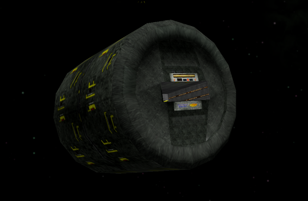
I'm still looking for what OXP/OXZ that station can be found in...
Re: A Description of the Improved Lighting and Materials System
Posted: Sun Sep 24, 2023 7:33 am
by Cholmondely
Switeck wrote: ↑Sun Sep 24, 2023 12:55 am
cbr wrote: ↑Wed Oct 26, 2022 10:57 pm

Well the shadows do make the model look better, perhaps
I expected the shadows 'harsher' pronounced...
I'm still looking for what OXP/OXZ that station can be found in...
cbr was good enough to create an
oblong version for Xeptatl's Sword as an updated version of the monitor station. But we were looking for something which was less obvious and disguisable as an asteroid or some such (fitting in with Smiv's original concept), and are thus stuck with the shrunken Jaguar Company station with the too-tight docking tunnel...

Re: A Description of the Improved Lighting and Materials System
Posted: Sat Jan 18, 2025 8:59 pm
by cbr
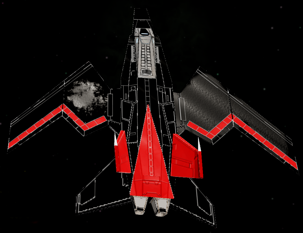
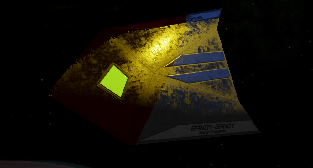
 Exercise in diffusemap conversions...
To retain the colors in the diffusemap, use a 'low value' dark 'color' in the spec gloss map.
The specular map acts like a mask for the reflection of 'light'
The gloss value is the amount of reflected 'light'
The diffusemap in this example has black wings, red parts and the original light grey ( cockpit and fuselage )
The specular layer has light grey splashes on the wings only.
The gloss map is completely filled with a lightgray repeating gradient.
Re: A Description of the Improved Lighting and Materials System
Posted: Sat Jan 18, 2025 10:27 pm
by another_commander
Specular is the amount of light reflected, gloss is the sharpness of the reflection or, in other words, how concentrated the light reflection is. Refer to the second image in the first post for an example of what 75% specular looks like at various gloss levels.
The cause of the diffuse color reduction at higher specular levels is the physically based renderer we use. A high specular value means that a large amount of incoming light gets reflected towards one single direction as specular light, therefore and as a result of energy conservation, a low amount of light is reflected as diffuse by the material. In contrast, a low specular value results in only a small fraction of incident light getting reflected as specular, meaning that a high amount of light is reflected off of the material as diffuse. This is why you see clearer diffuse colors at low specular values.
Edit: Improved phrasing in the second paragraph text.
