Page 2 of 2
Re: HUD elements: which are essential, delightful, superfluous?
Posted: Sun Nov 21, 2021 7:18 pm
by Cholmondely
Oolite now has some 40 downloadable HUDs.
I'm thinking about producing a chart to compare HUDs - along the lines of the Charts in the
Guide to Ambience OXPs and the
Guide to Economics OXPs.
I've so far come up with the following factors:
Actual speed shown?
Actual Torus speed shown?
Different HUDs for different green/yellow/red conditions/alerts?
Range of alerts shown
Docked HUD?
HUD Selector compatible?
# of MFDs?
Extras? (
eg Vimana HUD's cornucopia of goodies, DeeperSpace's Risk Assessment, Xenon HUD's sights, Dangerous HUD's noises).
But I'm not a combateer. And I'm not sure that I can work out if the HUD works well with different size screens. What else should go in?
Re: HUD elements: which are essential, delightful, superfluous?
Posted: Sun Nov 21, 2021 9:34 pm
by Cody
Less is more!
Re: HUD elements: which are essential, delightful, superfluous?
Posted: Sun Nov 21, 2021 11:50 pm
by Cholmondely
Cody wrote: ↑Sun Nov 21, 2021 9:34 pm
Any chance that you could write a short piece extolling the virtues as regards HUDs? We can then include it as a consideration on the wiki page...
Re: HUD elements: which are essential, delightful, superfluous?
Posted: Mon Nov 22, 2021 1:05 pm
by Cody
Cholmondely wrote: ↑Sun Nov 21, 2021 11:50 pm
Any chance that you could write a short piece extolling the virtues as regards HUDs?
<chuckles> I could
ramble on about screen-clutter, information-overload, distractions, etc - but I'll see what I can do.
Re: HUD elements: which are essential, delightful, superfluous?
Posted: Thu Feb 03, 2022 3:03 pm
by Cholmondely
Cholmondely wrote: ↑Sun Nov 21, 2021 7:18 pm
Oolite now has some 40 downloadable HUDs.
I'm thinking about producing a chart to compare HUDs - along the lines of the Charts in the
Guide to Ambience OXPs and the
Guide to Economics OXPs.
I've so far come up with the following factors:
Actual speed shown?
Actual Torus speed shown?
Different HUDs for different green/yellow/red conditions/alerts?
Range of alerts shown
Docked HUD?
HUD Selector compatible?
# of MFDs?
Extras? (
eg Vimana HUD's cornucopia of goodies, DeeperSpace's Risk Assessment, Xenon HUD's sights, Dangerous HUD's noises).
But I'm not a combateer. And I'm not sure that I can work out if the HUD works well with different size screens. What else should go in?
Adding to the above:
Precision Joystick Indicator?
Glare filter?
Glare contrast? (for reading HUD in Glare - cf Xenon HUD)
Current Location Display & Current Risk Notifier (Deeper Space HUD)
Distance from Compass target?
Weapons Bay Missile identifier? (ChupacabraHUD)
Extra reticles for other lasers (Xenon)
Choice of Colours? (Dangerous HUD & Xenon HUD)
Choice of Cockpits? (Dangerous HUD)
Natural materials? (Mega Walnut Dash)
Edited to add: I had a jolly good stab at this, but the intricacies of creating tables on the wiki flattened the entire project!
Re: HUD elements: which are essential, delightful, superfluous?
Posted: Thu Feb 03, 2022 7:15 pm
by Cody
Cholmondely wrote: ↑Sun Nov 21, 2021 11:50 pm
Any chance that you could write a short piece extolling the virtues as regards HUDs? We can then include it as a consideration on the wiki page...
The minimalist view: the default Oolite HUD has everything you actually
need. Its layout and appearance could be improved, and the beam and military laser crosshairs could be omitted - the default pulse laser crosshairs are all you need. It has one thing you don't need - the pitch/roll indicators.
Re: HUD elements: which are essential, delightful, superfluous?
Posted: Sun Feb 06, 2022 6:16 pm
by Mausnoab Williamston
[/quote]The minimalist view: the default Oolite HUD has everything you actually need. Its layout and appearance could be improved, and the beam and military laser crosshairs could be omitted - the default pulse laser crosshairs are all you need. It has one thing you don't need - the pitch/roll indicators.
[/quote]
The best one and I made everything smaller and lighter. I added the cargo indicator and dropped away the funny cargo mexican. How can I change away the "target flag" - the information of the object or ship - leftside from the target-rectangle?
Re: HUD elements: which are essential, delightful, superfluous?
Posted: Mon Jan 30, 2023 9:04 pm
by Cholmondely
Mausnoab Williamston wrote: ↑Sun Feb 06, 2022 6:16 pm
The best one and I made everything smaller and lighter. I added the cargo indicator and dropped away the funny cargo mexican. How can I change away the "target flag" - the information of the object or ship - leftside from the target-rectangle?
Did you ever get an answer for this?
Re: HUD elements: which are essential, delightful, superfluous?
Posted: Wed Feb 01, 2023 12:23 pm
by Redspear
If it's not too late to contribute, or at least to ask a semi-relevant question...
Once the HUD displays enough for basic navigation (scanner & compass) and combat (sights + energy gauges, missiles) then it's good to go.
Even showing laser temperature or fuel is of limited use (granted, the latter changes somewhat with injectors). Although non-essential, things like laser temperature are still in a very large group of things that can be 'nice'.
Beyond the essentials however I think it's a case of diminishing returns. HUDs can easily become more informative but simultaneously less readable. I've never stuck with any of the MFDs for example as, although I think they're a nice idea, they don't do enough for me to justify obscuring my field of view.
In fact, I don't know if this has already been done but MFDs that were 'callable', similar to the way one can call a recap of recent com messages (lingering briefly before disappearing), could be very appealing. I don't need a damage report on constant display but being able to call one easily without pressing f5 might be fun.
So it's enormously personal (I do love a good icon for example): the info you want, displayed the way you prefer and nothing else. In that sense, every well designed HuD is minimalist, even if some of them might be far busier than others.
Re: HUD elements: which are essential, delightful, superfluous?
Posted: Wed Feb 01, 2023 3:31 pm
by Stormrider
Redspear wrote: ↑Wed Feb 01, 2023 12:23 pm
I've never stuck with any of the MFDs for example as, although I think they're a nice idea, they don't do enough for me to justify obscuring my field of view.
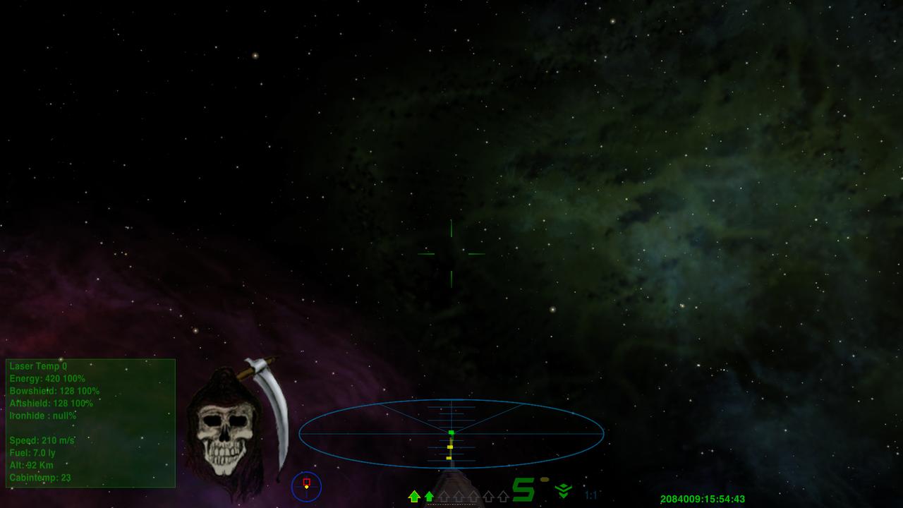
I actually found that I prefer to use one MFD to replace many of the dials, I find the semi transparent MFD to be easier to deal with. Here is my stripped down HUD.

Re: HUD elements: which are essential, delightful, superfluous?
Posted: Wed Feb 01, 2023 3:56 pm
by Redspear
Stormrider wrote: ↑Wed Feb 01, 2023 3:31 pm
Here is my stripped down HUD.
You're not kidding

Interesting take.
