Medusa Hud

Discussion and information relevant to creating special missions, new ships, skins etc.

Moderators: another_commander, winston

Post Reply
User avatar
ClymAngus
---- E L I T E ----
---- E L I T E ----
Posts: 2508
Joined: Tue Jul 08, 2008 12:31 am
Location: London England
Contact:

Medusa Hud

Post by ClymAngus »

Hello!

Just thought I'd share a little pet project I've been working on for a little while, the Medusa Hud.


http://www.crimsonforge.co.uk/cloister/ ... ud.oxp.zip

should look something like this:


Image

I've tried to keep everything a dog fighter would need "to hand" but not so close that it obscures your target!

Key features include;

1) Large darkened centre scope, for general tracking of targets.
2)Contrast resistant centre spot for pin point accuracy against space, planet or sun backdrops.
3) Scope also contains speed and laser temp information. For quick referencing during a fire fight
4) Over mounted ID and missile information, in-line with the scope. For easy weapon selection whilst still retaining visual target lock.
5) Low contrast IFF for easier ship identification.
6) combined pitch,roll and compass information.
7) combined shield fuel,temp and power graphic logically laid out for quick referencing.
8) Designed to be compact, unobtrusive yet easy to read. Giving the pilot the best possible trade off between visibility and accessibility.
User avatar
Cmdr. Maegil
Sword-toting nut-job
Posts: 1294
Joined: Tue Feb 27, 2007 10:28 pm
Location: On the mend in Western Africa

Post by Cmdr. Maegil »

I like it, it looks rather well balanced between functionality and eye-candy. Between this and the Fighter HUD, yours is more functional though slightly less cool - but it's only a matter of opinion and taste.

In any case, I won't be surprised if it becomes one of the board's favourite.
You know those who, having been mugged and stabbed, fired, dog run over, house burned down, wife eloped with best friend, daughters becoming prostitutes and their countries invaded - still say that "all is well"?
I'm obviously not one of them.
User avatar
Gunney_Plym
Dangerous
Dangerous
Posts: 64
Joined: Wed Jun 25, 2008 12:22 pm
Location: Sol 3, mostly.

Post by Gunney_Plym »

Very nice :)

Particularly like the concentric rings on the Main Scanner.

You should add it to the Wiki.
Gunney.

"In space nobody cares if you scream"

Wiki Page : http://wiki.alioth.net/index.php/User:Gunney_Plym
User avatar
TGHC
---- E L I T E ----
---- E L I T E ----
Posts: 2157
Joined: Mon Jan 31, 2005 4:16 pm
Location: Berkshire, UK

Post by TGHC »

Excellent!

I'm using the fighter hud at the moment, mainly because of it's appearance, but it does have visibility issues when dogfighting so this looks like an excellent alternative, I'm giving it a go.
The Grey Haired Commander has spoken!
OK so I'm a PC user - "you know whats scary? Out of billions of sperm I was the fastest"
User avatar
Commander McLane
---- E L I T E ----
---- E L I T E ----
Posts: 9520
Joined: Thu Dec 14, 2006 9:08 am
Location: a Hacker Outpost in a moderately remote area
Contact:

Post by Commander McLane »

Looks good. Please allow me three remarks, however.
2)Contrast resistant centre spot for pin point accuracy against space, planet or sun backdrops.
Note, however, that usually you won't have to aim dead centre, because weapon and camera are not in the same line.
6) combined pitch,roll and compass information.
Really like that one! :D
7) combined shield fuel,temp and power graphic logically laid out for quick referencing.
I know of the temptations of symmetry, but to me the fuel indicator seems a little too dominating. Perhaps it could become narrower, and the energy bars could grow? Anyway, just a suggestion.

The overall impression is really good! I think I'll try it out. :)
User avatar
ClymAngus
---- E L I T E ----
---- E L I T E ----
Posts: 2508
Joined: Tue Jul 08, 2008 12:31 am
Location: London England
Contact:

Post by ClymAngus »

Cmdr. Maegil wrote:
Between this and the Fighter HUD, yours is more functional though slightly less cool - but it's only a matter of opinion and taste.

In any case, I won't be surprised if it becomes one of the board's favourite.
Well, you can't really compete with the fighter hud, it's just too pretty & very atmospheric. So it's best not to try. There are many different and equaly valid solutions to the same problem. Atmosphere, accessability, visibility , micro scale, frivolous and themed. To name but a few. Hell you could even do a miner hud with fuel scoop guide lines. If you wanted. I did play with the idea of a IFF and average price key for CJ's physially fixed as a read out in the hud but decided it would take up space, look crap and confuse pilots more than help them.

I was thinking of having a faff with micro gif images but the lack of transparency put me off.

Still it's been a wonderful learning curve, might take a look into ship designs next. :)
Gunney_Plym wrote:
Very nice :)

Particularly like the concentric rings on the Main Scanner.

You should add it to the Wiki.
Glad you like it. I can send you the photoshop files if you want to have a play.
I'll get my head round the wiki and put it up.
TGHC wrote:
Excellent!

I'm using the fighter hud at the moment, mainly because of it's appearance, but it does have visibility issues when dogfighting so this looks like an excellent alternative, I'm giving it a go.
By all means road test. Any problems or annoyances I'm more than happy to hack it open and do some minor alterations.

I do have to say that the picture doesn't really do it justice. The scope looks a lot prettier in game, it's just that because it's unobtrusive (so you can concentrate on what your shooting at not how it's framed) it doesn't stand out in a screen grab.
User avatar
Gunney_Plym
Dangerous
Dangerous
Posts: 64
Joined: Wed Jun 25, 2008 12:22 pm
Location: Sol 3, mostly.

Post by Gunney_Plym »

ClymAngus wrote:
Still it's been a wonderful learning curve, might take a look into ship designs next.
Sounds like you're on the same curve that I'm on, take a look at my Wiki bit. I've got as far as the models and one of the textures. Sorting out the plist files is taking a little longer :?.

Good luck with your design.

PS: Looked at your website, love the jewellery and the converted leather jacket is just superb.
Gunney.

"In space nobody cares if you scream"

Wiki Page : http://wiki.alioth.net/index.php/User:Gunney_Plym
User avatar
Cmdr. Maegil
Sword-toting nut-job
Posts: 1294
Joined: Tue Feb 27, 2007 10:28 pm
Location: On the mend in Western Africa

Post by Cmdr. Maegil »

Gunney_Plym wrote:
my Wiki bit. I've got as far as the models and one of the textures. Sorting out the plist files is taking a little longer :?.
The shape progression reminds me of the FE2/FFE evolution from the Imperial Courier, the Imperial Trader (the Vixen, but I'm sure the Imps would also have a military ship out of the same platform) and the (FEU only) Cougar :D
You know those who, having been mugged and stabbed, fired, dog run over, house burned down, wife eloped with best friend, daughters becoming prostitutes and their countries invaded - still say that "all is well"?
I'm obviously not one of them.
User avatar
CaptKev
---- E L I T E ----
---- E L I T E ----
Posts: 519
Joined: Fri Jan 26, 2007 3:21 pm
Location: Shropshire, UK

Post by CaptKev »

ClymAngus wrote:
Well, you can't really compete with the fighter hud, it's just too pretty & very atmospheric.
Don't be so sure, you're doing a damn good job! 8)
Download Fighter HUD, Stingray and System Redux from the EliteWiki
User avatar
pagroove
---- E L I T E ----
---- E L I T E ----
Posts: 3035
Joined: Wed Feb 21, 2007 11:52 pm
Location: On a famous planet

Post by pagroove »

Very nice HUD!
How about a different hud for each standard Oolite ship?
:D
For P.A. Groove's music check
https://soundcloud.com/p-a-groove
Famous Planets v 2.7. (for Povray)
Image
https://bb.oolite.space/viewtopic.php?f=4&t=13709
User avatar
Cmdr. Maegil
Sword-toting nut-job
Posts: 1294
Joined: Tue Feb 27, 2007 10:28 pm
Location: On the mend in Western Africa

Post by Cmdr. Maegil »

Some OXP ships do have customized HUDs, often including part of the ship's nose; changing the HUD eliminates these visual obstructions. If this can be called an increase on visibility (realistically or not) or a loss on the ships' individuality (the Falcon comes to mind) is up to each player's tastes.

In any case, I think it'd be more realistic to have new HUDs purchasable on the shipyards as expensive extras than just throw them into the addons folder.
You know those who, having been mugged and stabbed, fired, dog run over, house burned down, wife eloped with best friend, daughters becoming prostitutes and their countries invaded - still say that "all is well"?
I'm obviously not one of them.
User avatar
ClymAngus
---- E L I T E ----
---- E L I T E ----
Posts: 2508
Joined: Tue Jul 08, 2008 12:31 am
Location: London England
Contact:

Post by ClymAngus »

Commander McLane wrote:
Note, however, that usually you won't have to aim dead centre, because weapon and camera are not in the same line.
Interesting so an image set at 0x,0y may not necessarily be where your blasting? To clarify, the red dot (four pixels) has a black surround to stop said red dot from disappearing when it's pointed at something bright.

Commander McLane wrote:
6) combined pitch,roll and compass information. Really like that one! :D
Well I find the pitch and roll some what redundant but considering they can be squished down into spots (as illustrated in some of the earlier huds). Why not overlay all 3? It's an interesting effect at the very least.

Commander McLane wrote:
I know of the temptations of symmetry, but to me the fuel indicator seems a little too dominating. Perhaps it could become narrower, and the energy bars could grow? Anyway, just a suggestion.
Symmetry when out the window when I realized I'd slapped all that on one side and only the alt and compass on the other :D

It's probably the solid fuel block vs multi block battery that's making the one look smaller than the other. It looks better say, on a cobra mk3 where there are less blocks. I can see your point though.
Commander McLane wrote:
The overall impression is really good! I think I'll try it out. :)
Yeah cool I'd like to hear your thoughts on the sight. Go on, blow something up. :)

I like the idea of buy a hud. Cockpit upgrade maybe?
User avatar
TGHC
---- E L I T E ----
---- E L I T E ----
Posts: 2157
Joined: Mon Jan 31, 2005 4:16 pm
Location: Berkshire, UK

Post by TGHC »

pagroove wrote:
How about a different hud for each standard Oolite ship? :D
Good idea if it can be linked to the ship OXP so that it comes with the ship when you buy it.
The Grey Haired Commander has spoken!
OK so I'm a PC user - "you know whats scary? Out of billions of sperm I was the fastest"
User avatar
ClymAngus
---- E L I T E ----
---- E L I T E ----
Posts: 2508
Joined: Tue Jul 08, 2008 12:31 am
Location: London England
Contact:

Post by ClymAngus »

minor improvements (new picture) the clock has been moved and more see through plastic inserted (everyone loves a bit of see through plastic)

Having some difficulty centering the missile display. Might take a look at some other huds, see if anyone else has cracked it.
Last edited by ClymAngus on Sun Jan 18, 2009 12:47 pm, edited 1 time in total.
Screet
---- E L I T E ----
---- E L I T E ----
Posts: 1883
Joined: Wed Dec 10, 2008 3:02 am
Location: Bremen, Germany

Post by Screet »

ClymAngus wrote:
Interesting so an image set at 0x,0y may not necessarily be where your blasting? To clarify, the red dot (four pixels) has a black surround to stop said red dot from disappearing when it's pointed at something bright.
Exactly what he was trying to tell. Consider you would have a gun...and place the sights for it somewhat away - in this example, a few centimetres are enough, in oolite it's meters. You look and aim through the sights...but there's this offset between sights and gun barrel that would always lead you to shooting a little bit off. You could fix the sights for a certain range to match, but then you need to consider that they won't show properly targets which do have a different distance.

I was pretty astonished about that effect myself, as it can be very strong on some ship models. Switching from a Dredger Trader to the Merlin instantly improved my aim dramatically.

I guess this also comes into account with that targetting enhancement that claims "you would hit now" while that's not true.
ClymAngus wrote:
Commander McLane wrote:
6) combined pitch,roll and compass information. Really like that one! :D
Well I find the pitch and roll some what redundant but considering they can be squished down into spots (as illustrated in some of the earlier huds). Why not overlay all 3? It's an interesting effect at the very least.
Strange. I once saw a hud which merged the spots, but got annoyed that they wouldn't move as one spot, but two within that thing. Couldn't imagine to like that info to be brought into the space compass - I practically never look for those indicators while I use the compass heavily for it's purpose and both are very different.

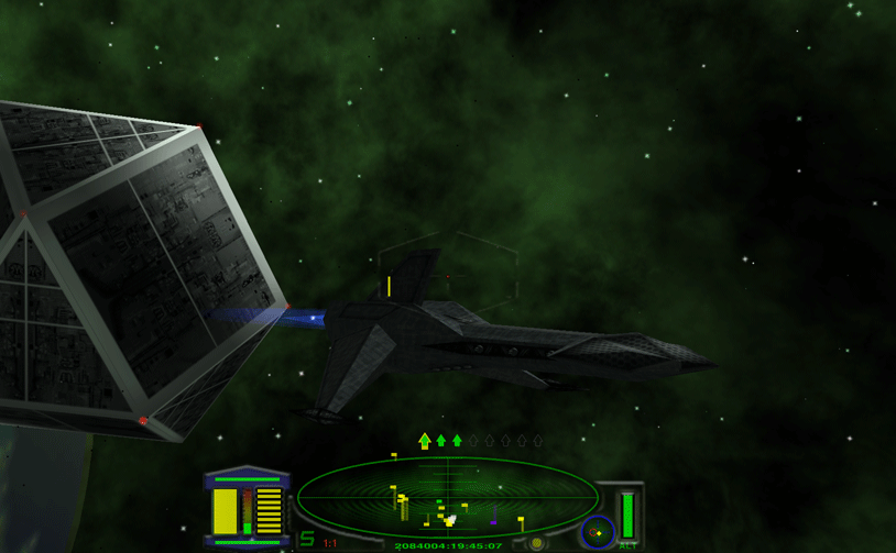
Concerning the scanner size, I noticed that it's much easier with a big scanner than with a downscaled one...which would rise the question which size the scanner is in this package.

As someone suggested that some ships come with pre-defined ship-specific huds: I noticed that many of those do have the wrong offset for the image, which creates a really strange look. For the Merlin it was enough to switch to the image supplied for the Kestrel HUD. Still, the scanner is too small in that version, but the ship's abilities outweigh that by far. I sold it, because it was making the game too easy.

Screet
Post Reply