
Iron Ass Vol.1 v1.01 1024px, addition version
Iron Ass Vol.2 b3 1024px version (18 MB, April.2022)
Iron Ass Vol.3 b3 1024px version (22.1 MB, July.2022)
Iron Ass Vol.4 b1 1024px version (20.5 MB, April.2022)
Iron Ass Vol.5 b1 1024px version (40 MB, July 2022)
Iron Ass Lave b1 1024px version (24.2 MB, April.2022)
Iron Ass Missionaries b1 1024px version (22.5 MB, June.2022)
Iron Ass OXP wikipage
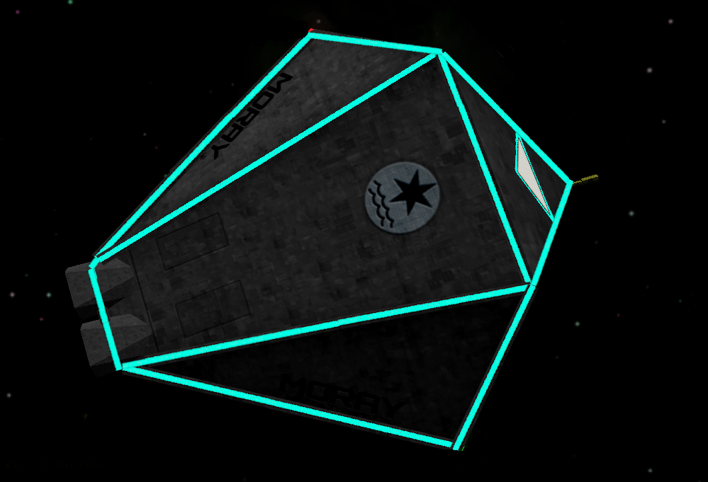
It's *slightly* old hat, but so am I. I have been toying with making my ideal retro core shipset version. Colourless, all darkened metal, with big obvious name signs for the ships. Uniform even. Dystopic and Soviet-like. Except I do like the Smivs flashers..
I had forgotten how pleasant I used to think it was to tinker with models and textures, so it has been enjoyable. I had also forgotten the agonies of managing the pLists, but I think it's all in there.
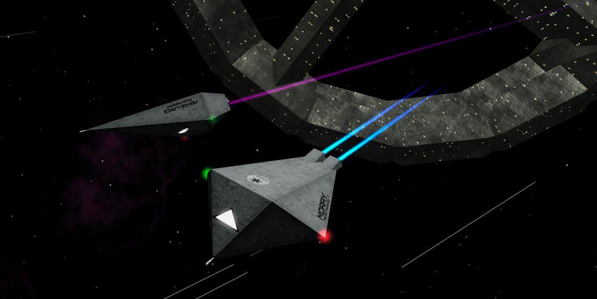
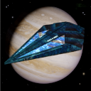
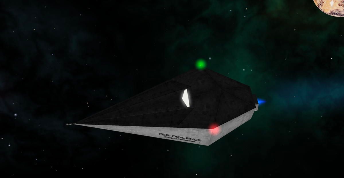
It is so to speak all old Giles models, except I couldn't leave the Ferdy and Asp alone, those were changed too much for me. As much as possible, the cues are from the “Observer’s Guide to Ships in Service”.
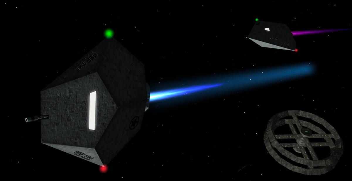
So the Ferdy is long and skinny, and the Asp is wide and right side up. I've been playing with my 2048pxOXP for a little while, I keep seeing some issues, changing little details, but it's slower going now. The 1024 reduction might bring a few surprises.
But how does this look on other machines than mine? Are my techniques embarrassingly outdated? I guess I would like to know. If anyone could help with a little testing or just running the herd through the gallery, any comment and nudge to improvement is most appreciated. There is always plenty that slips by..
I realise the narrow appeal of going so far backwards graphics-wise, but maybe there's a few more like me who sometimes yearn for the simpler times. The Halcyon days, pining for the umbilical cord, etc.
At any rate, any constructive criticism will make me grateful.
[Edited to add volumes and update links]