BPlanets
Moderators: winston, another_commander
Re: BPlanets
I stand corrected. This is amazing.
- Cody
- Sharp Shooter Spam Assassin

- Posts: 16081
- Joined: Sat Jul 04, 2009 9:31 pm
- Location: The Lizard's Claw
- Contact:
Re: BPlanets
The hexagon around Saturn's north pole is even more amazing.
I would advise stilts for the quagmires, and camels for the snowy hills
And any survivors, their debts I will certainly pay. There's always a way!
And any survivors, their debts I will certainly pay. There's always a way!
-
Commander_X
- ---- E L I T E ----

- Posts: 705
- Joined: Sat Aug 09, 2014 4:16 pm
Re: BPlanets
cbr != Commander_X
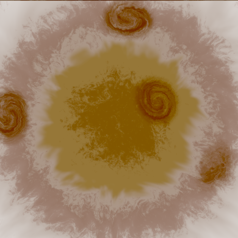
Well, not with the octagonal rigor of Jupiter's, but this is the "stormy" pole of the texture[*]:

... and another colouring scheme for the previous "star" like render:

[*] Quick comments about the storms:
- as can be seen, the polar ones have a more circular layout, and there's not too much I can do about it
- trying to "get rid of some of the storms" is very likely prone to let only parts of some of those left in the texture (the position of the storms is random, and similarly, the cut off parts would be random too -- very likely to interfere with the completeness of some left overs).
Re: BPlanets
Oops, I was not paying attention to who was posting what.
Around the pole the storms appear to be superimposed on the atmosphere rather than being part of it.
That OVERLAY DARKENONLY 55% is still my favorite so far, with the caveat of the upper left storm not wrapping the orange band around it
The appearance of that upper left storm in Commander_X's subsequent post was much better, but I want that combined with the darker central storm and overlay from the OVERLAY DARKENONLY 55% version. Maybe applying the darkening filter to what Commander_X did would do the trick?
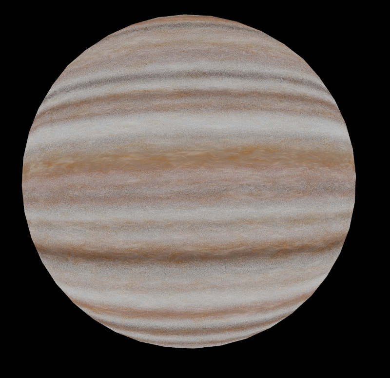
As for the latest recolour of the "star" render, the colours look better but the grainy roughness makes it look solid rather than atmospheric. Also, the outline of the planet's edge has visible vertex angles, is that because it's from the rendering program and not an in-game screenshot?
-
Commander_X
- ---- E L I T E ----

- Posts: 705
- Joined: Sat Aug 09, 2014 4:16 pm
Re: BPlanets
Yes, _all_ the storms _are_ superimposed over the "atmosphere" -- that's the reason they have a different presence than the initial presentation, where the upper-left one was being (almost) half-half rendered with in-between banding colours (also captured by cbr in his mock-up).
Milo wrote: ↑Thu Jul 30, 2020 2:41 am[...] As for the latest recolour of the "star" render, the colours look better but the grainy roughness makes it look solid rather than atmospheric. Also, the outline of the planet's edge has visible vertex angles, is that because it's from the rendering program and not an in-game screenshot?
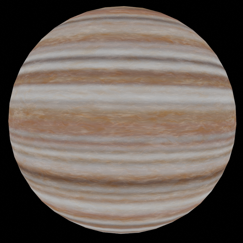
Correct, this, as the others mentioned, are viewport renders from Blender. The grainy roughness is a shader approximation of a blur filter. Although for "renders" there is real blur, baking and material shaders only have this noisy/grainy option. The bands would look too "bandy" otherwise, and post-process in ImageMagick would apply to the whole texture ...Commander_X wrote: ↑Wed Jul 29, 2020 7:43 pm[...] Below are some of the results (directly from Blender). The first two also have the Jupiter image I used as a reference. [...]
-
Commander_X
- ---- E L I T E ----

- Posts: 705
- Joined: Sat Aug 09, 2014 4:16 pm
Re: BPlanets
... but the looks of this option can be improved.Commander_X wrote: ↑Thu Jul 30, 2020 4:27 am[...] Although for "renders" there is real blur, baking and material shaders only have this noisy/grainy option. [...]
Another "direct" render of the previous noisy version:

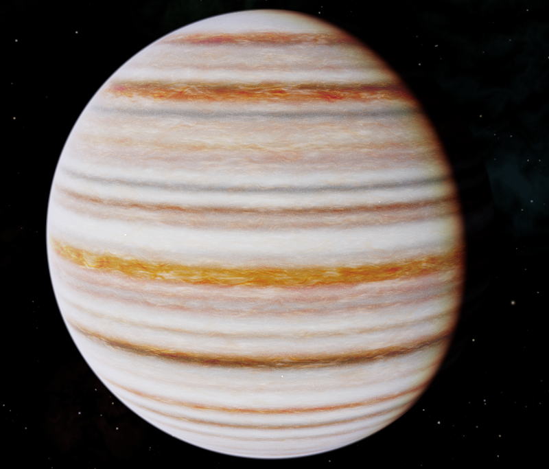
... and the in-game counterpart (with less brightness) presentation:

Re: BPlanets
This looks really promising.
Just a minor nitpick at city lights. Up close they look a bit blurry and low-res. Not sure why.
But to be honest I never thought the night lights could be implemented at all!
It's really impressive.
Thanks!
Just a minor nitpick at city lights. Up close they look a bit blurry and low-res. Not sure why.
But to be honest I never thought the night lights could be implemented at all!
It's really impressive.
Thanks!
-
Commander_X
- ---- E L I T E ----

- Posts: 705
- Joined: Sat Aug 09, 2014 4:16 pm
Re: BPlanets
This is my attempt at a trade-off: too small city lights would lead to a shimmering effect. Although it seems to be considered OK by some  , the forum here had some concerns about it being too strong. It cannot be avoided completely (e.g. when seeing the planet from a distance, on F7 screen, or even close up for the lights close to the edge), it's about the variable size of the very small moving spot, and the DPI of a monitor.
Re: BPlanets
I see. Yeah, shimmering is OK only for neon lightsThis is my attempt at a trade-off: too small city lights would lead to a shimmering effect. Although it seems to be considered OK by some, the forum here had some concerns about it being too strong.
This is how it should look.
You're getting pretty close, BTW.
I wonder if the game planet generator can be eventually tweaked to create planets looking this good.
Otherwise, it's gonna be another 10GB of textures for all 8 galaxies.
- phkb
- Impressively Grand Sub-Admiral

- Posts: 5370
- Joined: Tue Jan 21, 2014 10:37 pm
- Location: Writing more OXPs, because the world needs more OXPs.
Re: BPlanets
(Response from total non-grahpics guy) I imagine one huge hurdle we'd have to overcome is the time taken to render - the planet texture needs to be generated and loaded very quickly to keep the game running smoothly. And not just when exiting a wormhole - the textures would need to respond well on the F7 Planet Info screen as well.
Re: BPlanets
Right, but it all depends on how we generate them. We could possibly have pre-generated patterns. I mean do we really need 2048 variants of land/sea/clouds? We could use less textures, just swap the tiles, change colors, combine land/cloud layers. I think there are ways to optimize the generation process.
-
another_commander
- Quite Grand Sub-Admiral

- Posts: 6924
- Joined: Wed Feb 28, 2007 7:54 am
Re: BPlanets
Thing is, we would need to change the entire planet generation. There are no physical textures used for planets - you will not find any inside the game's resources. All planet textures (including their respective normal/specular maps) are generated
Edit: Fixed wording. We are not procedural anymore, but the texture generation algorithms still use the same parameters as when we were procedural.
Re: BPlanets
Obviously we'll need a different planet generator for that. I was just thinking that having better in-game planets configurable with the planetinfo.plist would be quite nice.
Re: BPlanets
T.B.H. I like the shimmering of the citylights, makes they somehow more 'alive' ...
