[Release] Dangerous HUD
Moderators: winston, another_commander
- gsagostinho
- ---- E L I T E ----
- Posts: 573
- Joined: Sun Jul 19, 2015 1:09 pm
[Release] Dangerous HUD
Dangerous HUD
=============
Version: 2.0.2
Required Oolite Version: 1.87
Author: Gilberto Agostinho (gsagostinho)
Credits: based on phkb's Xenon HUD
License: CC-BY-NC-SA 3.0
=============
Hi all,
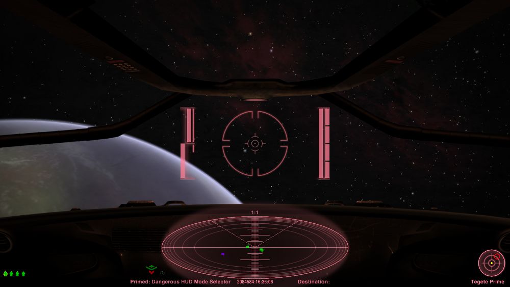
I am happy to finally release my Dangerous HUD, a HUD based on the style of Elite Dangerous, featuring an orange, blue, green or pink theme for both the HUD and for the GUI, cockpit views, glass effect, monitor effect for aft view, new sounds effects (ECM, hyperjumps, low energy, missile warning), custom made warnings signs, HUD animations including a pulsating scanner. Based on phkb's Xenon HUD.
Tested with vanilla Oolite as well as with BGS (Backgroundset) and Xenon UI OXPs, all of which work fine with the orange color scheme. Be warned that this HUD is more CPU intensive than your standard HUD, so a weak machine may not run it very well.
Finally, if you also happen to play Elite Dangerous at the same time as Oolite, you perhaps would like to take a look at mine Dangerous Keyconfig OXP which remaps Oolite's keyboard controls in a similar way as Elite Dangerous, so that one does not go crazy getting used to two different keyboard layouts for the same functions (link also below).
This HUD features a full cockpit:
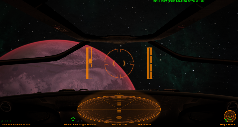
All views feature a glass effect (though difficult to see in low resolution static images here in the forum):
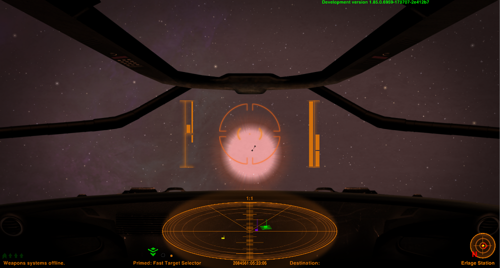
This is the side view:
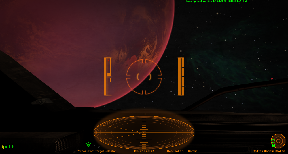
The aft view simulates a screen:
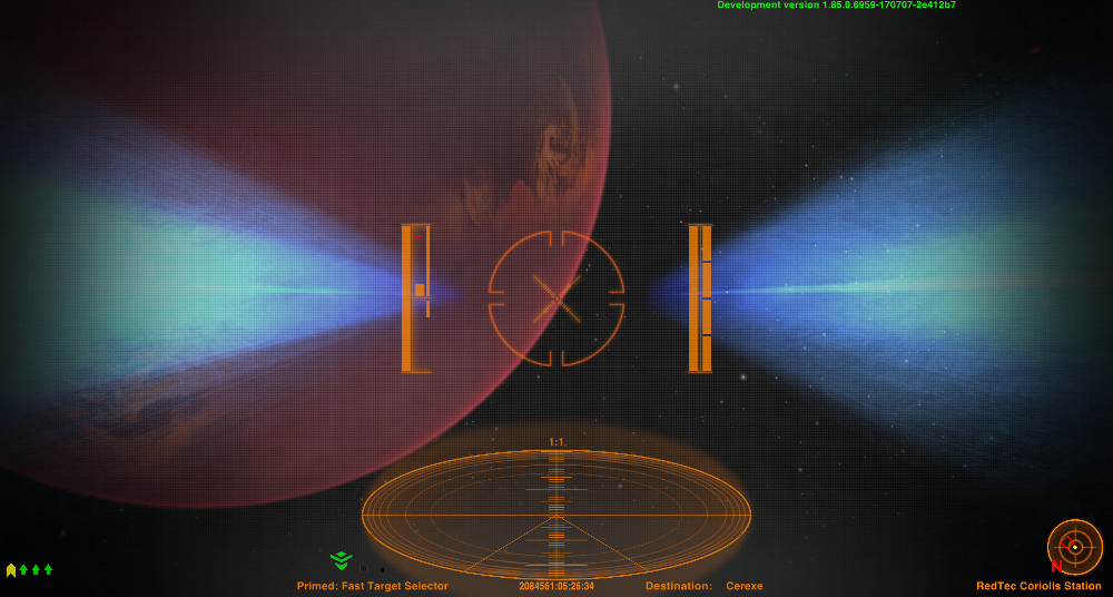
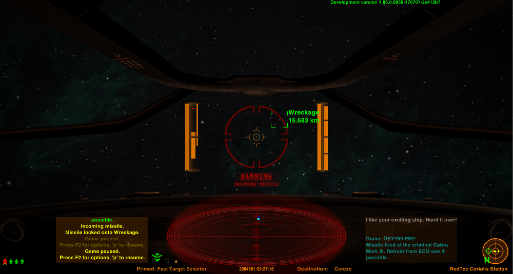
New warning messages, this is the missile warning:
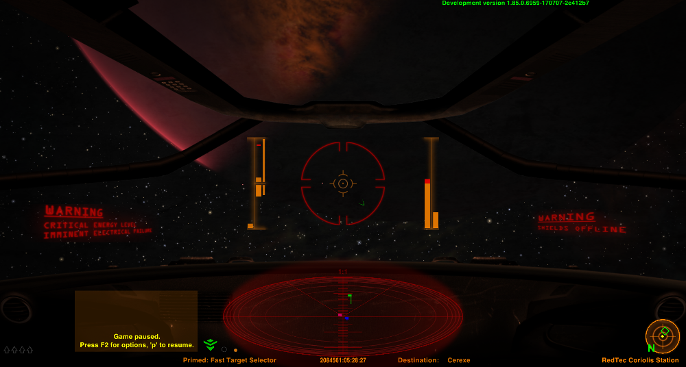
And here are the critical energy level warning and shields offline warning:
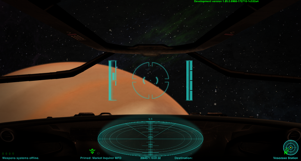
Other colours:
And here is a screenshot of the new mass lock indicator:
Hauler mode:
Glass mode:
Mass lock in glass mode:
Minimal crosshair mode, which turns the main gauges very transparent while in green or green/yellow alert, and they come back to normal when in red alert:
Link
====
Download it via the extension manager in the game.
Version history
===============
08/12/2018 - version 2.0.2:
- fixes a bug which kept the HUD sounds playing after autodocking.
24/10/2018 - version 2.0.1:
- fixes a bug in which the cockpit background was disappearing when in red alert and minimal mode.
23/07/2018 - version 2.0:
- simplified crosshairs (wepons off, weapons on, minimal mode and docking mode).
- simplified layout, removed clutter around crosshair.
- much improved scanner, with better animation and improved size.
- mass lock circle indicator is now visible in all cockpit modes.
- new torus drive sound.
- when using the Manual Witchjump Alignment OXP, the system target colour will now match the Dangerous HUD colour (thanks phkb!).
- when the player uses an escape pod the cockpit is not shown any longer in the escape pod docking animation after the ejection (thanks phkb!).
- if the player dies and if they are using the Ship Repurchase OXP, then the cockpit is not shown any longer in the docking animation after the crash (thanks phkb!).
19/07/2018 - version 1.11:
- cockpit lighting changes intensity when toggling weapons in minimal mode.
- enabled minimal mode by default (i.e. crosshairs only in red alert or when weapons are on, else they fade out).
18/07/2018 - version 1.10:
- cockpit lighting changes colour when in red alert or if HUD is damaged (using Breakable HUD/IFF Scanner OXP).
23/02/2018 - version 1.9:
- merging improvements made by phkb on his Xenon HUD (version 2.0.2).
- the hue of the cockpit now matches the colour variant.
- fixing the 'TypeError: this.playerBoughtNewShip is not a function' which would affect some users.
13/12/2017 - version 1.8:
- merging improvements made by phkb on his Xenon HUD (version 1.5.11).
29/11/2017 - version 1.7:
- merging improvements made by phkb on his Xenon HUD (version 1.5.10).
- new fuel leak warning message.
- small improvements to the missile warning.
- improvements to the position of the warnings on hauler and glass cockpits.
- when in minimal mode, toggling weapons now changes the HUD back to the default view.
20/08/2017 - version 1.6.1:
- fixes a small error due to a typo.
19/08/2017 - version 1.6:
- performance improvements (many thanks to cag and phkb for all the help!).
- improvements to the minimal crosshair mode: when crosshairs are set to be visible only in red/yellow alert, the gauges are now visible though very transparent.
- fixed a bug which caused JS errors when escape pod was launched.
- HUD now compatible with Breakable HUD/IFF Scanner OXP.
17/08/2017 - version 1.5:
- merging improvements made by phkb on his Xenon HUD (version 1.5.5), including improved HUDSelector integration and performance improvements.
14/08/2017 - Version 1.4:
- merging improvements made by phkb on his Xenon HUD (version 1.5.4).
- added hauler cockpit mode.
- flipped glass on side and aft (cockpit) views so that the glass dirt doesn't match when switching views.
18/07/2017 - Version 1.3:
- fixed a small error in the script.js, using a variable which was not defined.
- optimized the script by switching back to local variables.
- improved scanner pulsation.
17/07/2017 - Version 1.2:
- new pink variant.
- slight modification to the green variation's hue.
- darker scanner's background.
- added glass only mode (i.e. no cockpit).
- fixed wrong dates in version history.
- target reticle now has the same colours as the HUD.
10/07/2017 - Version 1.1:
- added new sound for missile warning.
- text on the message display is now also orange.
- fixed small bug with ECM noise sound being heard while docked.
- shipyard screen now also uses the same colour scheme as the other screens.
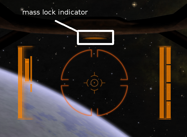
- new mass lock indicator.
- new green and blue variants.
07/07/2017 - Version 1.0:
- initial release.
=============
Version: 2.0.2
Required Oolite Version: 1.87
Author: Gilberto Agostinho (gsagostinho)
Credits: based on phkb's Xenon HUD
License: CC-BY-NC-SA 3.0
=============
Hi all,
I am happy to finally release my Dangerous HUD, a HUD based on the style of Elite Dangerous, featuring an orange, blue, green or pink theme for both the HUD and for the GUI, cockpit views, glass effect, monitor effect for aft view, new sounds effects (ECM, hyperjumps, low energy, missile warning), custom made warnings signs, HUD animations including a pulsating scanner. Based on phkb's Xenon HUD.
Tested with vanilla Oolite as well as with BGS (Backgroundset) and Xenon UI OXPs, all of which work fine with the orange color scheme. Be warned that this HUD is more CPU intensive than your standard HUD, so a weak machine may not run it very well.
Finally, if you also happen to play Elite Dangerous at the same time as Oolite, you perhaps would like to take a look at mine Dangerous Keyconfig OXP which remaps Oolite's keyboard controls in a similar way as Elite Dangerous, so that one does not go crazy getting used to two different keyboard layouts for the same functions (link also below).
This HUD features a full cockpit:
All views feature a glass effect (though difficult to see in low resolution static images here in the forum):
This is the side view:
The aft view simulates a screen:
New warning messages, this is the missile warning:
And here are the critical energy level warning and shields offline warning:
Other colours:
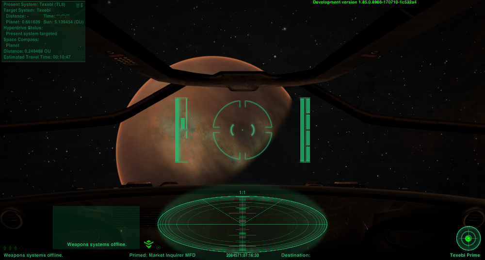
And here is a screenshot of the new mass lock indicator:
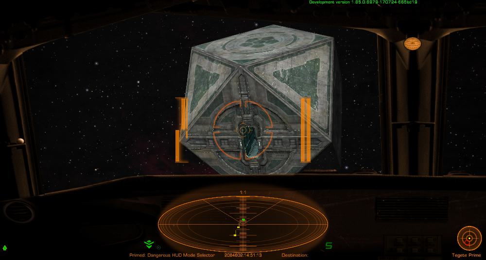
Hauler mode:
Glass mode:
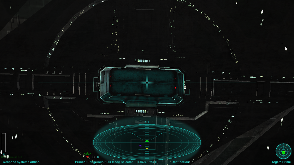
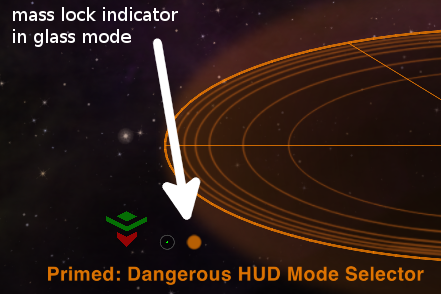
Mass lock in glass mode:
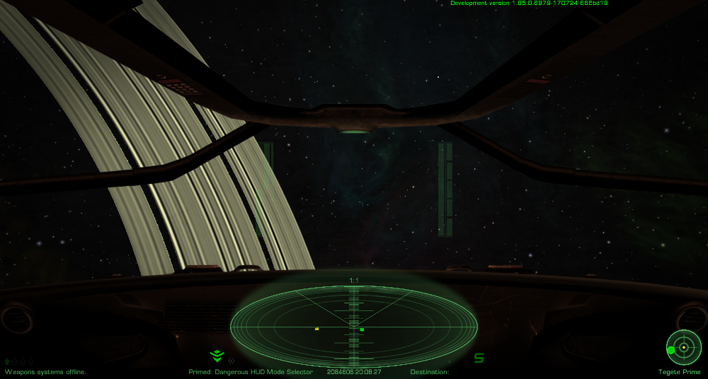
Minimal crosshair mode, which turns the main gauges very transparent while in green or green/yellow alert, and they come back to normal when in red alert:
Link
====
Download it via the extension manager in the game.
Version history
===============
08/12/2018 - version 2.0.2:
- fixes a bug which kept the HUD sounds playing after autodocking.
24/10/2018 - version 2.0.1:
- fixes a bug in which the cockpit background was disappearing when in red alert and minimal mode.
23/07/2018 - version 2.0:
- simplified crosshairs (wepons off, weapons on, minimal mode and docking mode).
- simplified layout, removed clutter around crosshair.
- much improved scanner, with better animation and improved size.
- mass lock circle indicator is now visible in all cockpit modes.
- new torus drive sound.
- when using the Manual Witchjump Alignment OXP, the system target colour will now match the Dangerous HUD colour (thanks phkb!).
- when the player uses an escape pod the cockpit is not shown any longer in the escape pod docking animation after the ejection (thanks phkb!).
- if the player dies and if they are using the Ship Repurchase OXP, then the cockpit is not shown any longer in the docking animation after the crash (thanks phkb!).
19/07/2018 - version 1.11:
- cockpit lighting changes intensity when toggling weapons in minimal mode.
- enabled minimal mode by default (i.e. crosshairs only in red alert or when weapons are on, else they fade out).
18/07/2018 - version 1.10:
- cockpit lighting changes colour when in red alert or if HUD is damaged (using Breakable HUD/IFF Scanner OXP).
23/02/2018 - version 1.9:
- merging improvements made by phkb on his Xenon HUD (version 2.0.2).
- the hue of the cockpit now matches the colour variant.
- fixing the 'TypeError: this.playerBoughtNewShip is not a function' which would affect some users.
13/12/2017 - version 1.8:
- merging improvements made by phkb on his Xenon HUD (version 1.5.11).
29/11/2017 - version 1.7:
- merging improvements made by phkb on his Xenon HUD (version 1.5.10).
- new fuel leak warning message.
- small improvements to the missile warning.
- improvements to the position of the warnings on hauler and glass cockpits.
- when in minimal mode, toggling weapons now changes the HUD back to the default view.
20/08/2017 - version 1.6.1:
- fixes a small error due to a typo.
19/08/2017 - version 1.6:
- performance improvements (many thanks to cag and phkb for all the help!).
- improvements to the minimal crosshair mode: when crosshairs are set to be visible only in red/yellow alert, the gauges are now visible though very transparent.
- fixed a bug which caused JS errors when escape pod was launched.
- HUD now compatible with Breakable HUD/IFF Scanner OXP.
17/08/2017 - version 1.5:
- merging improvements made by phkb on his Xenon HUD (version 1.5.5), including improved HUDSelector integration and performance improvements.
14/08/2017 - Version 1.4:
- merging improvements made by phkb on his Xenon HUD (version 1.5.4).
- added hauler cockpit mode.
- flipped glass on side and aft (cockpit) views so that the glass dirt doesn't match when switching views.
18/07/2017 - Version 1.3:
- fixed a small error in the script.js, using a variable which was not defined.
- optimized the script by switching back to local variables.
- improved scanner pulsation.
17/07/2017 - Version 1.2:
- new pink variant.
- slight modification to the green variation's hue.
- darker scanner's background.
- added glass only mode (i.e. no cockpit).
- fixed wrong dates in version history.
- target reticle now has the same colours as the HUD.
10/07/2017 - Version 1.1:
- added new sound for missile warning.
- text on the message display is now also orange.
- fixed small bug with ECM noise sound being heard while docked.
- shipyard screen now also uses the same colour scheme as the other screens.
- new mass lock indicator.
- new green and blue variants.
07/07/2017 - Version 1.0:
- initial release.
Last edited by gsagostinho on Sat Dec 08, 2018 8:41 pm, edited 20 times in total.
- gsagostinho
- ---- E L I T E ----
- Posts: 573
- Joined: Sun Jul 19, 2015 1:09 pm
Re: [Release] Dangerous HUD
A couple of extra comments:
- this is my first OXP, so I am really looking for every and all (constructive) criticism
- as I wrote, this HUD is perhaps a bit CPU intensive, so I am particularly interested in any optimization tips
- I had posted pictures before which features a cockpit extracted from an screenshot from Elite Dangerous. This release does NOT use that image nor any image from that game, I have recreated the cockpits from scratch so there is no licensing problems
-
- Quite Grand Sub-Admiral
- Posts: 6680
- Joined: Wed Feb 28, 2007 7:54 am
Re: [Release] Dangerous HUD
Wow, now this is an amazing piece of work. Installed and will keep it for a good while I think. The glass effect is a very nice touch. Even more impressive is the fact that this is your first attempt at creating expansions.
- Norby
- ---- E L I T E ----
- Posts: 2577
- Joined: Mon May 20, 2013 9:53 pm
- Location: Budapest, Hungary (Mainly Agricultural Democracy, TL10)
- Contact:
Re: [Release] Dangerous HUD
Well done! I did not see any problem in the code so you should upload it into the manager following the OXZ guide.
- Cody
- Sharp Shooter Spam Assassin
- Posts: 16081
- Joined: Sat Jul 04, 2009 9:31 pm
- Location: The Lizard's Claw
- Contact:
Re: [Release] Dangerous HUD
Love the cockpit stuff, hate the orange! <chortles> My screen size (1280x1024) seems to be a problem for it (but I'll be upgrading to 1920x1080 soon).
Good work! It'd probably annoy most people, but that sensor pulse deserves a nice ping - the
Here.. have some errors (presuming it's this OXP which threw them):<grins>
Good work! It'd probably annoy most people, but that sensor pulse deserves a nice ping - the
F7 .ogg
from BGS would suit.Here.. have some errors (presuming it's this OXP which threw them):
Code: Select all
00:17:43.147 [script.javaScript.unrootedTimer]: ----- WARNING: Timer <OOJSTimer 0x26e0b820>{nextTime: 90.178, one-shot, running, function: anonymous} is being garbage-collected while still running. You must keep a reference to all running timers, or they will stop unpredictably!
00:17:43.147 [script.javaScript.unrootedTimer]: ----- WARNING: Timer <OOJSTimer 0x26e0b880>{nextTime: 90.278, one-shot, running, function: anonymous} is being garbage-collected while still running. You must keep a reference to all running timers, or they will stop unpredictably!
00:17:43.147 [script.javaScript.unrootedTimer]: ----- WARNING: Timer <OOJSTimer 0x26e00ea0>{nextTime: 90.378, one-shot, running, function: anonymous} is being garbage-collected while still running. You must keep a reference to all running timers, or they will stop unpredictably!
00:17:43.147 [script.javaScript.unrootedTimer]: ----- WARNING: Timer <OOJSTimer 0x26e0b7c0>{nextTime: 90.478, one-shot, running, function: anonymous} is being garbage-collected while still running. You must keep a reference to all running timers, or they will stop unpredictably!
00:17:43.147 [script.javaScript.unrootedTimer]: ----- WARNING: Timer <OOJSTimer 0x26e0ba00>{nextTime: 90.578, one-shot, running, function: anonymous} is being garbage-collected while still running. You must keep a reference to all running timers, or they will stop unpredictably!
00:17:43.147 [script.javaScript.unrootedTimer]: ----- WARNING: Timer <OOJSTimer 0x26e0b4c0>{nextTime: 90.678, one-shot, running, function: anonymous} is being garbage-collected while still running. You must keep a reference to all running timers, or they will stop unpredictably!
00:17:43.147 [script.javaScript.unrootedTimer]: ----- WARNING: Timer <OOJSTimer 0x26e006c0>{nextTime: 90.778, one-shot, running, function: anonymous} is being garbage-collected while still running. You must keep a reference to all running timers, or they will stop unpredictably!
00:17:43.147 [script.javaScript.unrootedTimer]: ----- WARNING: Timer <OOJSTimer 0x26e0b8e0>{nextTime: 90.878, one-shot, running, function: anonymous} is being garbage-collected while still running. You must keep a reference to all running timers, or they will stop unpredictably!
Welcome to the dark side! Cookies in the jar!this is my first OXP
I would advise stilts for the quagmires, and camels for the snowy hills
And any survivors, their debts I will certainly pay. There's always a way!
- gsagostinho
- ---- E L I T E ----
- Posts: 573
- Joined: Sun Jul 19, 2015 1:09 pm
Re: [Release] Dangerous HUD
Hi everyone, thank you all so much for the positive feedback, I really appreciate what you all wrote!
@Norby I will look into that as soon as I have some time, I would be very happy to have this work in the manager
@Cody
@Norby I will look into that as soon as I have some time, I would be very happy to have this work in the manager
@Cody
I am still considering creating the blue version of this cockpit. The problem with that is that the HUD is already quite heavy on the CPU, so I believe the optimal approach would be to create a second blue release instead of using some fancy code to change between orange and blue on the fly. But then there is the maintenance problem: every time the orange HUD is updated, the same changes would have to be applied to the blue one. So I am kind of waiting for possible issues and bug reports, and once this is really stable I can make a non-orange releaseLove the cockpit stuff, hate the orange!
The issue is the following: this HUD was created for a wide screen, as my native resolution is 1920x1080. I did test it with aspect ratios of both 4:3 and 16:9, and the HUD does look fine, but your resolution is nearly a square! So I am afraid this will cause the hud to be clipped on the sides.My screen size (1280x1024) seems to be a problem for it (but I'll be upgrading to 1920x1080 soon).
That's a good idea, but I am also a bit afraid of how annoying it can become. I will experiment with thisGood work! It'd probably annoy most people, but that sensor pulse deserves a nice ping - the F7 .ogg from BGS would suit.
Thanks for the report. Two things: first, how do you get a log with errors from Oolite? I did not know we had this feature. As for the error, do you know when did that happen? Is it a constant error or does it happen only after you dock? There are 8 errors and the "nextTime" parameters are 0.1 s apart, so I am sure this has to do with the scanner animation.Here.. have some errors (presuming it's this OXP which threw them):
- gsagostinho
- ---- E L I T E ----
- Posts: 573
- Joined: Sun Jul 19, 2015 1:09 pm
Re: [Release] Dangerous HUD
And here is a question concerning how Oolite handles cached images: one of the issues I am having with this HUD and which I did not manage to improve is that there is a severe lag (albeit short, 0.5 second) on my computer every time a non-cached image has to be loaded. Example: first time you get a red alert, there are a lot of images that need to be loaded. If you get another red alert soon, the transition between yellow/red and red/yellow is seamless. But after some time, it seems that images not used for a while get dumped out of the cache, so that a new red alert 10 minutes later will also cause lag.
Is there a solution to this? I think that some people, in particular those with powerful machines and large amounts of RAM and GPU memory, would much rather have all HUD images cached all the time to avoid this. Or am I wrong about what is causing this?
- Cody
- Sharp Shooter Spam Assassin
- Posts: 16081
- Joined: Sat Jul 04, 2009 9:31 pm
- Location: The Lizard's Claw
- Contact:
Re: [Release] Dangerous HUD
Svengali's Library can offer OXP config options, and something we dumb pilots love are in-game, easily-switchable, options. Suitable?That's a good idea, but I am also a bit afraid of how annoying it can become.
As for those errors, I'll have another run this evening - but I'm not always aware of how I get them.
I would advise stilts for the quagmires, and camels for the snowy hills
And any survivors, their debts I will certainly pay. There's always a way!
Re: [Release] Dangerous HUD
Take a look at logcontrol.plist and the debug console.Two things: first, how do you get a log with errors from Oolite?
- gsagostinho
- ---- E L I T E ----
- Posts: 573
- Joined: Sun Jul 19, 2015 1:09 pm
Re: [Release] Dangerous HUD
Ok, so here are a couple of things:
- I got the Python Console working, and it is great! Thanks a lot
- but I am not seeing those error messages that Cody reported, concerning the scanner Timer objects.
- also, Cody, I tried adding a beep sound to the scanner but it is way too annoying, in particular since the scanner pulses at every 4 seconds, which looks really good as a visual effect but sounds way too frequent as an audio effect. I think I will just leave the sound FX out in the end.
- I have made some more improvements: the text in the message gui is now orange, and I added a missile warning sound. But this makes this HUD require version 1.85 to work properly.
- Norby
- ---- E L I T E ----
- Posts: 2577
- Joined: Mon May 20, 2013 9:53 pm
- Location: Budapest, Hungary (Mainly Agricultural Democracy, TL10)
- Contact:
Re: [Release] Dangerous HUD
Open the Logs/Latest.log file with a file viewer and refresh the content if needed. I use this way next to the debug console because more easy to find what I need in a long output.gsagostinho wrote:how do you get a log with errors from Oolite?
Code: Select all
You must keep a reference to all running timers
Code: Select all
this._timer2 = new Timer(this, this.$scannerAnimationFrame2, 0.1);
this._timer3 = new Timer(this, this.$scannerAnimationFrame3, 0.1);
...
About images lag maybe help if you add all images without condition somewhere out of screen also.
- gsagostinho
- ---- E L I T E ----
- Posts: 573
- Joined: Sun Jul 19, 2015 1:09 pm
Re: [Release] Dangerous HUD
Great, thanks a lot!Norby wrote:Open the Logs/Latest.log file with a file viewer and refresh the content if needed. I use this way next to the debug console because more easy to find what I need in a long output.
I actually used those timers without reference on purpose, I thought that creating a variable and assigning a timer to it would be less optimal than simply having an unreferenced timer, in particular since they are used only once per scan pulse for their delay (there is a master timer for the scanner which loops at 4 seconds, and then each cycle has several unreferenced timers used for delays). I will try what you suggest and see if there is any difference and if those errors disappear.You must keep a reference to all running timers
Great, I will try that. Would adding theseaffect the performance though?About images lag maybe help if you add all images without condition somewhere out of screen also.
Today I ran Oolite while monitoring my system (which is relatively powerful for a notebook, with a dedicated GPU and an i7), and even though I have those lags I described my system is actually not even close to being pushed to the limits (CPU, GPU and RAM memory all way below the upper limits). So it really seems to me that this is because how th cache is handled and because my HUD uses a lot of images.
- gsagostinho
- ---- E L I T E ----
- Posts: 573
- Joined: Sun Jul 19, 2015 1:09 pm
- Norby
- ---- E L I T E ----
- Posts: 2577
- Joined: Mon May 20, 2013 9:53 pm
- Location: Budapest, Hungary (Mainly Agricultural Democracy, TL10)
- Contact:
Re: [Release] Dangerous HUD
Then maybe if on screen but use 0 or 1 width and height, or full transparent alpha?
- gsagostinho
- ---- E L I T E ----
- Posts: 573
- Joined: Sun Jul 19, 2015 1:09 pm
Re: [Release] Dangerous HUD
I will try those today, thanks a lot for the suggestionsNorby wrote:Then maybe if on screen but use 0 or 1 width and height, or full transparent alpha?