Better, but IMP and EXP would be clearer still.Diziet Sma wrote:How about "Imp" and "Exp"? Ought to be clear enough.
Legal column on Market screen
Moderators: another_commander, winston
- Disembodied
- Jedi Spam Assassin

- Posts: 6885
- Joined: Thu Jul 12, 2007 10:54 pm
- Location: Carter's Snort
Re: Legal column on Market screen
- Wildeblood
- ---- E L I T E ----

- Posts: 2937
- Joined: Sat Jun 11, 2011 6:07 am
- Location: Nova Hollandia
- Contact:
Re: Legal column on Market screen
Who are these women you know? Women are mostly non-verbal, yes, but nuanced? No way.Diziet Sma wrote:Women seldom say exactly what they mean, and up to 95% of their communication is in nuance and non-verbal sub-communication.
R.I.P. John Lodge, 1943-2025.
- Diziet Sma
- ---- E L I T E ----

- Posts: 6312
- Joined: Mon Apr 06, 2009 12:20 pm
- Location: Aboard the Pitviper S.E. "Blackwidow"
Re: Legal column on Market screen
Perhaps 'nuanced' is not the term I'm after.. how else would one say "conveys several levels/layers of meaning, within one short statement"?Wildeblood wrote:Who are these women you know? Women are mostly non-verbal, yes, but nuanced? No way.
Most games have some sort of paddling-pool-and-water-wings beginning to ease you in: Oolite takes the rather more Darwinian approach of heaving you straight into the ocean, often with a brick or two in your pockets for luck. ~ Disembodied
Re: Legal column on Market screen
I would probably say "communication" for that.Diziet Sma wrote:how else would one say "conveys several levels/layers of meaning, within one short statement"?
Getting back on topic:
We could just have a star in that column for "legal issues apply, see F8F8", where there's much more room for information. The only slight catch with that is that with all core game goods being export restricted, anyone making an import restricted good in an OXP might have confusion. Though we do have two different stars in the default, so we could use one for import and one for export.spara wrote:How about a little warning sign in the market screen and explanation in the detail screen.
There's not really enough room for two columns or much more text in the current one, and for technical reasons the line can't be multiple colours at once without a very significant GUI rewrite.
I'd recommend that anyone with an idea also make a quick OXP for it - it needs to work in game, after all.phkb wrote:Anyway, here's my take on how it could look, without going into the more complicated two-screen thing: LegalColumnTweak.oxz
- Diziet Sma
- ---- E L I T E ----

- Posts: 6312
- Joined: Mon Apr 06, 2009 12:20 pm
- Location: Aboard the Pitviper S.E. "Blackwidow"
Re: Legal column on Market screen
Actually, I think 'sub-communication' is the term I should have used.cim wrote:I would probably say "communication" for that.Diziet Sma wrote:how else would one say "conveys several levels/layers of meaning, within one short statement"?
Back to the topic now, folks...
Most games have some sort of paddling-pool-and-water-wings beginning to ease you in: Oolite takes the rather more Darwinian approach of heaving you straight into the ocean, often with a brick or two in your pockets for luck. ~ Disembodied
- Disembodied
- Jedi Spam Assassin

- Posts: 6885
- Joined: Thu Jul 12, 2007 10:54 pm
- Location: Carter's Snort
Re: Legal column on Market screen
Can a single line be made a different colour - like damaged equipment on the F5 screen? Then goods that are illegal to import could be displayed in e.g. orange; illegal to export could be blue; and banned outright could be red. A small legend to that effect could be added, say at the lower right-hand side, opposite the player's credit count, removing the need for columns (and, indeed, allowing for goods that are illegal to import or export).cim wrote:There's not really enough room for two columns or much more text in the current one, and for technical reasons the line can't be multiple colours at once without a very significant GUI rewrite.
Re: Legal column on Market screen
Yes, though doing so would limit the ability of OXPers to produce goods which are not completely legal but don't have conventional import/export restrictions (e.g. "personal use only" quantity restrictions, or permits)Disembodied wrote:Can a single line be made a different colour - like damaged equipment on the F5 screen?
- Disembodied
- Jedi Spam Assassin

- Posts: 6885
- Joined: Thu Jul 12, 2007 10:54 pm
- Location: Carter's Snort
Re: Legal column on Market screen
Hmm ... unless the colour change could be added on the fly, so that, for "personal use" quantities (measured in tonnes?!cim wrote:Yes, though doing so would limit the ability of OXPers to produce goods which are not completely legal but don't have conventional import/export restrictions (e.g. "personal use only" quantity restrictions, or permits)Disembodied wrote:Can a single line be made a different colour - like damaged equipment on the F5 screen?
Of course, this sort of thing might need an expansion to, say, the F7 screen: somewhere that would give this sort of system-specific information ...
-
another_commander
- Quite Grand Sub-Admiral

- Posts: 7188
- Joined: Wed Feb 28, 2007 7:54 am
- Disembodied
- Jedi Spam Assassin

- Posts: 6885
- Joined: Thu Jul 12, 2007 10:54 pm
- Location: Carter's Snort
Re: Legal column on Market screen
That would work – although I'd suggest adding the legend to the screen, to explain. And maybe change it toanother_commander wrote:If we ever do have to change it, why not keep it as simple as possible?
I/E: Legal to Import/Export
I: Legal to Import only
E: Legal to Export only
It doesn't allow for further subtleties like Permit Required or Maximum Quantity, but it's definitely clearer than it is at present.
Re: Legal column on Market screen
I like that, a_c!
- phkb
- Impressively Grand Sub-Admiral

- Posts: 5637
- Joined: Tue Jan 21, 2014 10:37 pm
- Location: Writing more OXPs, because the world needs more OXPs.
Re: Legal column on Market screen
Those suggestions are definitely clearer, but FWIW it's still dealing with things from the wrong way around. Looking at those columns I still have to think, "'I' by itself means I get in trouble for exporting". It's inverted. Are we telling the player what it's OK to do, or what it's not OK to do? My feeling is that the column would be more useful telling me what it's not OK to do, which can be done in a far briefer way ("I" or "Im" or "Imp" or "IMP" for import restricted, "E" or "Ex" or "Exp" or "EXP" for export restrictions). The suggestions above are telling me what it's OK to do, which adds a lot of noise to the screen - it's kind of cluttered now. The extra data is highlighting the important items, but in the wrong way. But maybe that's just me.
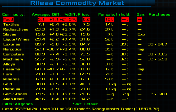
Edit: Screenshots certainly help, so here's my interpretation, based on some work I'm doing on the Smuggler's OXP from which all of this discussion sprang.

The "Ban" column (as I'm calling it) tells you it's illegal to export slaves, and illegal to import narcotics or firearms.
Edit: Screenshots certainly help, so here's my interpretation, based on some work I'm doing on the Smuggler's OXP from which all of this discussion sprang.

The "Ban" column (as I'm calling it) tells you it's illegal to export slaves, and illegal to import narcotics or firearms.
Re: Legal column on Market screen
One of the reasons for doing it the way it currently is compared with one of the earlier options was to make sure that the default goods could have something very simple - a dash, in the end - because any text there made the whole thing feel very crowded for providing very little information, and harder to spot the ones which were actually important.phkb wrote:The suggestions above are telling me what it's OK to do, which adds a lot of noise to the screen - it's kind of cluttered now.
- SteveKing
- ---- E L I T E ----

- Posts: 258
- Joined: Tue Apr 15, 2014 9:09 am
- Location: DownUnder (W Aus)
Re: Legal column on Market screen
I'm on board with phkb as far as inverting the meaning of the 'Legal' column. It stays simple, like the current method. You read the column header "Ban" then down to the item "Slaves" where the column entry is "Exp". The reading is "Ban Slaves Export ", reasonably unambiguous. Not that I like the work 'Ban', but it is 3 letters 
Where I see it has an advantage is in flexibility if at some point the idea of 'Licence' is added. Then just the column header can be altered to be something like Lic/Ban with the field entries remaining the same. This way you read "Licence/Ban Slaves Export ", so you would need to look further to find out which is relevant.
Where I see it has an advantage is in flexibility if at some point the idea of 'Licence' is added. Then just the column header can be altered to be something like Lic/Ban with the field entries remaining the same. This way you read "Licence/Ban Slaves Export ", so you would need to look further to find out which is relevant.
SteveKing
(not quite the author)
(not quite the author)
- phkb
- Impressively Grand Sub-Admiral

- Posts: 5637
- Joined: Tue Jan 21, 2014 10:37 pm
- Location: Writing more OXPs, because the world needs more OXPs.
Re: Legal column on Market screen
Yeah, it's not my favorite, but it is a full word (no contractions or truncation). Another option is "Restr" which, while being truncated, is quite suggestive of the whole word. Another option is "Limit", which is either the full word or could be a truncation of "Limitations", but both have similar meanings.SteveKing wrote:Not that I like the work 'Ban', but it is 3 letters
