Oolite Ship Re-design
Moderators: winston, another_commander
- Smithy2501
- Competent
- Posts: 53
- Joined: Fri May 24, 2013 10:56 am
Oolite Ship Re-design
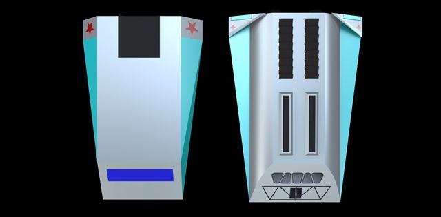
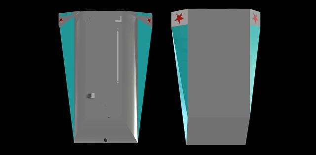
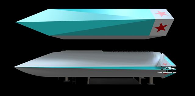
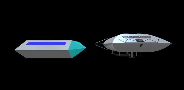
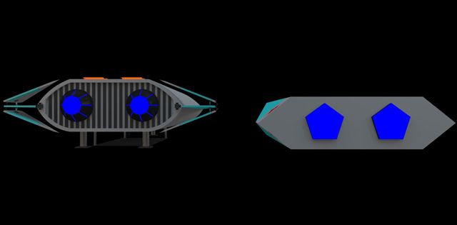
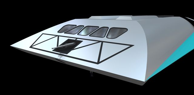
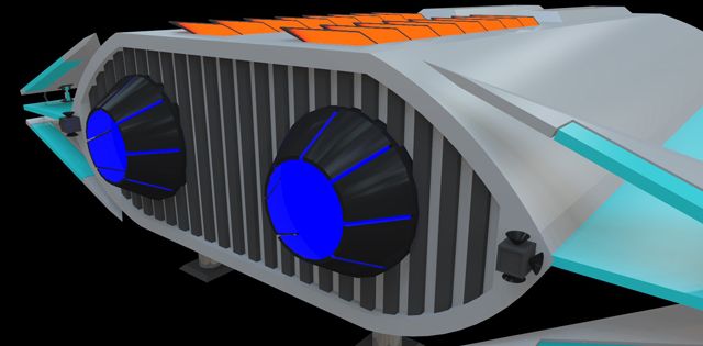
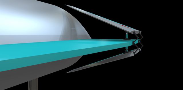
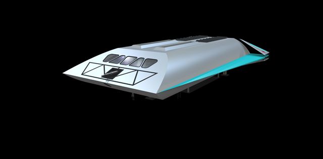
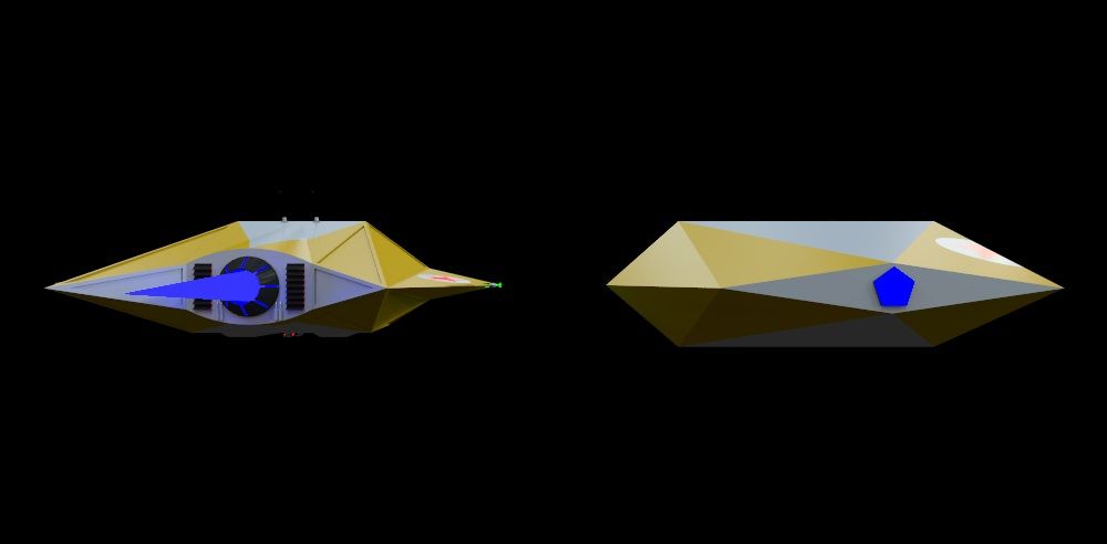
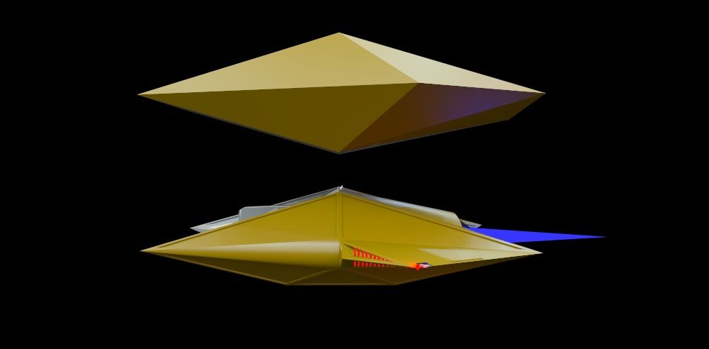
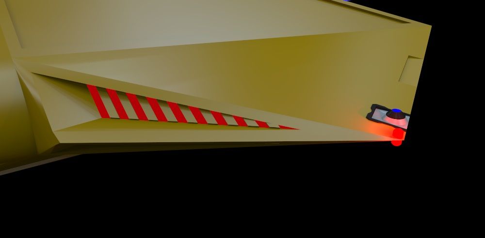
Hi all, with the upcoming release or Elite: Dangerous i was inspired to re-design some of the ships from Oolite to modernise them and jazz them up a bit. After posting my first re-design on the Frontier forums a few people suggested that as they are Oolite ships that I am using I should also post them here! I thought this sounded fair enough so here goes. Firstly these are only art pieces, I'm not building models to use in game (I wouldn't even know where to begin to attempt that! ) Secondly, I don't really know anything about creating textures, so these models are rendered fairly basically however if anybody would like to create some textures for them i would be eternally grateful as I would love to see these models fully finished. Anyway, enough babbling, here is my first attempt, the Adder!
Adder Top:
Adder Bottom:
Adder Side:
Adder Front:
Adder Back:
Adder Front Detail:
Adder Back Detail:
Adder Wing Hinge:
Adder Profile:
I hope you like them and I have more on the way! If anyone is interested, my next attempt is the Asp. Thank you in advance, any feedback is most appreciated
Cheers,
Smithy
- Cody
- Sharp Shooter Spam Assassin
- Posts: 16081
- Joined: Sat Jul 04, 2009 9:31 pm
- Location: The Lizard's Claw
- Contact:
Re: Oolite Ship Re-design
Welcome aboard, Smithy... nice artwork.
I would advise stilts for the quagmires, and camels for the snowy hills
And any survivors, their debts I will certainly pay. There's always a way!
-
- Quite Grand Sub-Admiral
- Posts: 6683
- Joined: Wed Feb 28, 2007 7:54 am
Re: Oolite Ship Re-design
I believe this qualifies as an Oolite discussion topic. Moved to Discussion.
Smithy2501: Nice job. It looks very simplistic from a distance, but once you start zooming into the details it is really quite impressive. Just be aware that all ships are normally viewed from a distance during gameplay, so all these fine details might end up not being noticeable and that would be a pity.
- Cody
- Sharp Shooter Spam Assassin
- Posts: 16081
- Joined: Sat Jul 04, 2009 9:31 pm
- Location: The Lizard's Claw
- Contact:
Re: Oolite Ship Re-design
That's one of the reasons I like dogfighting at really close quarters - Griff's ships deserve to be seen up close.another_commander wrote:... be aware that all ships are normally viewed from a distance during gameplay, so all these fine details might end up not being noticeable and that would be a pity.
I would advise stilts for the quagmires, and camels for the snowy hills
And any survivors, their debts I will certainly pay. There's always a way!
- Smithy2501
- Competent
- Posts: 53
- Joined: Fri May 24, 2013 10:56 am
Re: Oolite Ship Re-design
Griffs ships are definitely an inspiration to me, his models are incredible! As for the detail level I haven't designed this to be a playable ship, wouldn't know where to begin to do that! They are simply an art project because I like fooling around with SketchUp
Cheers,
Smithy
PS sorry about posting on the wrong board, wasn't sure exactly where it would fit in
Cheers,
Smithy
PS sorry about posting on the wrong board, wasn't sure exactly where it would fit in
- Fatleaf
- Intergalactic Spam Assassin
- Posts: 1988
- Joined: Tue Jun 08, 2010 5:11 am
- Location: In analysis mode on Phaelon
- Contact:
Re: Oolite Ship Re-design
Welcome to the Friendliest Forum this side of RiedquatTM Smithy2501Smithy2501 wrote:Griffs ships are definitely an inspiration to me, his models are incredible! As for the detail level I haven't designed this to be a playable ship, wouldn't know where to begin to do that! They are simply an art project because I like fooling around with SketchUp
Cheers,
Smithy
PS sorry about posting on the wrong board, wasn't sure exactly where it would fit in
Yeah, Griffs stuff has been an inspiration to a lot of commanders around here to create their own stuff. And I really like the detail on the Adder, good work.
As to where to post stuff, have a look around and you will soon pick it up. Don't be afraid to ask questions (even if they seem daft to you) as we like (at times the dafter the better) questions
Find out about the early influences of Fatleaf here. Also his OXP's!
Holds the Ooniversal record for "Thread Necromancy"
- Smivs
- Retired Assassin
- Posts: 8408
- Joined: Tue Feb 09, 2010 11:31 am
- Location: Lost in space
- Contact:
Re: Oolite Ship Re-design
Nice art Smithy2501, close to the original but better
If you are going to develop these further knowing some details is going to be useful. For example the blue rectangle is not a window. Nobody knows what it actually is but it's not a window. For what it's worth on my Shipset I've made it into a Star-Trek like deflector or sensor panel.
It might be worth studying Oolite scale a bit. It's pretty crazy in many ways, but the aspect I'm thinking of is ship size. These ships are enormous, and using your example of the Adder, the original is some 30m wide, and that makes each individual 'window pane' around 3-4m across at a guess, which is pretty big.
Of course you can ignore all this completely and just produce something that looks good - you wouldn't be the first to do so.
I'm looking forward to seeing the next one - Keep up the good work.
Commander Smivs, the friendliest Gourd this side of Riedquat.
- pagroove
- ---- E L I T E ----
- Posts: 3035
- Joined: Wed Feb 21, 2007 11:52 pm
- Location: On a famous planet
Re: Oolite Ship Re-design
Hi Smithy2501 nice to see your ships here!. They are very nice. Waiting for more
For P.A. Groove's music check
https://soundcloud.com/p-a-groove
Famous Planets v 2.7. (for Povray)
https://bb.oolite.space/viewtopic.php?f=4&t=13709
https://soundcloud.com/p-a-groove
Famous Planets v 2.7. (for Povray)
https://bb.oolite.space/viewtopic.php?f=4&t=13709
- Smithy2501
- Competent
- Posts: 53
- Joined: Fri May 24, 2013 10:56 am
Re: Oolite Ship Re-design
Thanks for that Smivs! I was just assuming that it was a window and I was also working on the area behind the window as less of a cockpit and more of an entire living space. Feel free to correct me if I'm wrong, but the Adder is more of a light trader than a fighter so I sort of viewed the area kind of like the inside of a caravan with living, cooking and ablutions all available with nice big bay windows to admire the wonders of the Ooniverse! The scale as you say is crazy, the Adder is huge for a single man craft but at least as a trader it's kind of believable, the Asp is 60m by 75m (or nearly twice the size of the Adder) and is meant to be a single man fighter! anyway I'll keep it in mind for my next re-design, thanks for the advice and support!Smivs wrote:Nice art Smithy2501, close to the original but better
If you are going to develop these further knowing some details is going to be useful. For example the blue rectangle is not a window. Nobody knows what it actually is but it's not a window. For what it's worth on my Shipset I've made it into a Star-Trek like deflector or sensor panel.
It might be worth studying Oolite scale a bit. It's pretty crazy in many ways, but the aspect I'm thinking of is ship size. These ships are enormous, and using your example of the Adder, the original is some 30m wide, and that makes each individual 'window pane' around 3-4m across at a guess, which is pretty big.
Of course you can ignore all this completely and just produce something that looks good - you wouldn't be the first to do so.
I'm looking forward to seeing the next one - Keep up the good work.
Cheers,
Smithy
- Cody
- Sharp Shooter Spam Assassin
- Posts: 16081
- Joined: Sat Jul 04, 2009 9:31 pm
- Location: The Lizard's Claw
- Contact:
Re: Oolite Ship Re-design
<cackles mischievously> The cockpit of the Adder has a whole wall of glassteel - that's why it looks so large.
I would advise stilts for the quagmires, and camels for the snowy hills
And any survivors, their debts I will certainly pay. There's always a way!
- Smivs
- Retired Assassin
- Posts: 8408
- Joined: Tue Feb 09, 2010 11:31 am
- Location: Lost in space
- Contact:
Re: Oolite Ship Re-design
It's a reasonable assumption, more so than you might realise. The Oolite models are pretty faithful recreations of the original Elite models, with one significant difference. The originals were measured in feet, but Oolite models are measured in metres.Smithy2501 wrote:I was just assuming that it was a window...
In other words the Elite ships were only about a third the size of the Oolite ships. And of course they were just wireframe as well, so it is quite likely that in Elite the 'rectangle' was supposed to be a cockpit window.
Having said that, canon has it that the pilot is using a viewscreen rather than looking out of a cockpit window.
so it is debatable if the ships even have windows of any kind.Elite Manual wrote:The main wall is occupied by the scanner screen, astrogation console and main systems monitors.
To my mind they would have - it's human nature (and probably Feline, Insectoid etc nature as well) to want to look outside. And I know some of our members prefer to imagine they are looking through a cockpit window rather than at a screen when playing.
That's one of the great things about Oolite - it's whatever you want it to be.
Commander Smivs, the friendliest Gourd this side of Riedquat.
- Smithy2501
- Competent
- Posts: 53
- Joined: Fri May 24, 2013 10:56 am
Re: Oolite Ship Re-design
Hmm, so somebody just took the numerical value and made it meters instead of feet huh? So instead of being 30m x 45m it would actually be closer to 10m x 15m? That would make a lot more sense! Also I think I'd prefer a wall of solid steel instead of glass, at least from a combat perspective
Cheers,
Smithy
Cheers,
Smithy
- Cody
- Sharp Shooter Spam Assassin
- Posts: 16081
- Joined: Sat Jul 04, 2009 9:31 pm
- Location: The Lizard's Claw
- Contact:
Re: Oolite Ship Re-design
Hmm... let's suppose you've taken heavy combat damage, and your scanners/viewscreens/cameras are buggered.Smithy2501 wrote:I think I'd prefer a wall of solid steel instead of glass, at least from a combat perspective
In that scenario, I'd definitely prefer a glassteel wall - at least I can still see the bandits and fight on.
I would advise stilts for the quagmires, and camels for the snowy hills
And any survivors, their debts I will certainly pay. There's always a way!
- Smithy2501
- Competent
- Posts: 53
- Joined: Fri May 24, 2013 10:56 am
Re: Oolite Ship Re-design
True, and if you can see you can navigate, beats the heck out of sticking out your thumb and hitching a lift! I'd just be a little nervous going close to a sun or knowing that that missile is actually sticking through my window and not just the lense of my camera! Of course, in that scenario I probably wouldn't be worrying about it for long
Cheers,
Smithy
Cheers,
Smithy
- Smithy2501
- Competent
- Posts: 53
- Joined: Fri May 24, 2013 10:56 am
Re: Oolite Ship Re-design
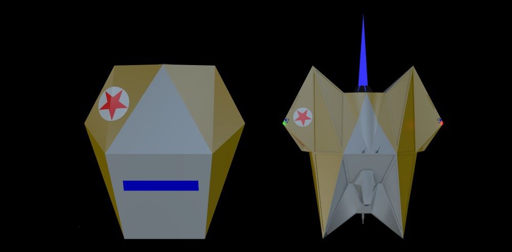
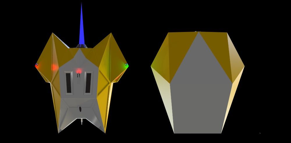
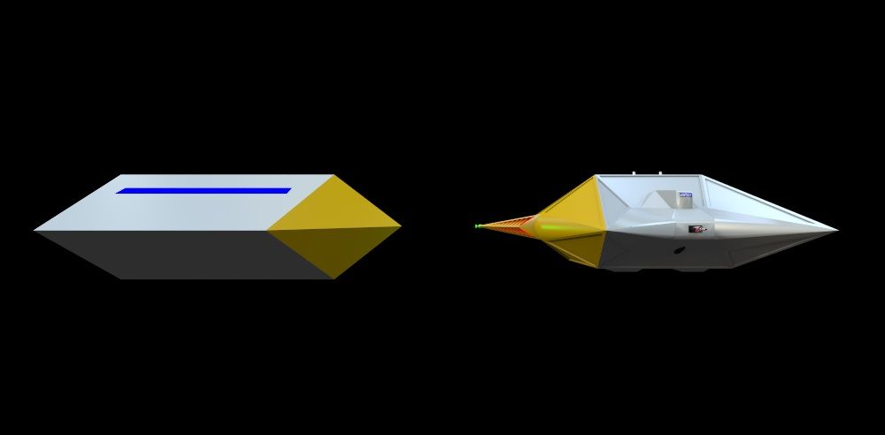
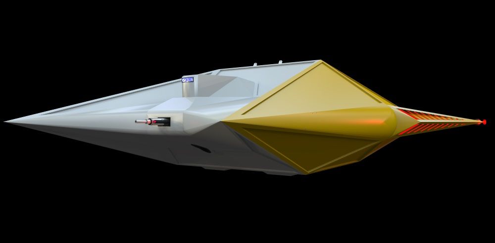
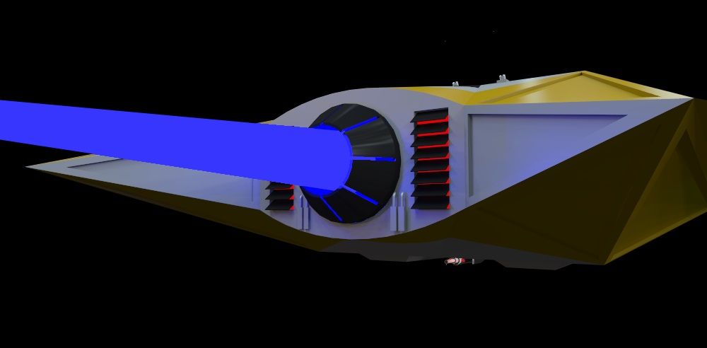
Ok, here is my next attempt, the Asp! I had a blast creating this and thanks to Smivs valued advice I went back and redesigned the cockpit to be a better scaled size (still has a window though! ). Let me know what you think!
Asp Top:
Asp Bottom:
Asp Front:
Asp Back:
Asp Side:
Asp Front Detail:
Asp Back Detail:
Asp Wing Detail:
Cheers,
Smithy
Asp Top:
Asp Bottom:
Asp Front:
Asp Back:
Asp Side:
Asp Front Detail:
Asp Back Detail:
Asp Wing Detail:
Cheers,
Smithy