It could be the kind of artefacts I get a lot due to the poor graphics system on this here netbook PC. I get triangles like this appearing and disappearing on large objects, eg on constores and coriolis stations.Eric Walch wrote:I am just a bit puzzled by the strange triangle bugs on the Zero Grav Factory ( =comfactory). The solar panel only consist of two triangles forming a big square. Where do the two small ones come from?
Feel free to use my Oolite creations
Moderators: another_commander, winston
- JazHaz
- ---- E L I T E ----

- Posts: 2991
- Joined: Tue Sep 22, 2009 11:07 am
- Location: Enfield, Middlesex
- Contact:
Re: Feel free to use my Oolite creations
JazHaz
Thanks to Gimi, I got an eBook in my inbox tonight (31st May 2014 - Release of Elite Reclamation)!Gimi wrote:Maybe you could start a Kickstarter Campaign to found your £4500 pledge.drew wrote:£4,500 though!<Faints>
Cheers,
Drew.
- DaddyHoggy
- Intergalactic Spam Assassin

- Posts: 8515
- Joined: Tue Dec 05, 2006 9:43 pm
- Location: Newbury, UK
- Contact:
Re: Feel free to use my Oolite creations
?JazHaz wrote:It could be the kind of artefacts I get a lot due to the poor graphics system on this here netbook PC. I get triangles like this appearing and disappearing on large objects, eg on constores and coriolis stations.Eric Walch wrote:I am just a bit puzzled by the strange triangle bugs on the Zero Grav Factory ( =comfactory). The solar panel only consist of two triangles forming a big square. Where do the two small ones come from?
That's almost like the gfx card is further sub-dividing the polygons present - but why - size?
Very odd!
Z-fighting perhaps - but Eric would have mentioned, I'm sure, if the model had two surfaces that were very close together - and would have culled the unnecessary surfaces if present.
Oolite Life is now revealed hereSelezen wrote:Apparently I was having a DaddyHoggy moment.
Re: Feel free to use my Oolite creations
I have noticed that sometimes, part of the 'far side' of the model shows through when viewed from some angles. This is especially noticeable with the SLAPU from this OXP. I use v 1.75.3, could this be something to do with it? I have noticed that the Space Bar from Random Hits and the donut shaped Rock Hermits (sorry I cant remember which OXP at the mo) have this problem too.
I must admit I did cheat a bit with the refection from the solar panel. The base photo I used included a nice reflection and lens flare to add to the effect. The reflection map really compliments this.
I'll amend the lighting map to include the repositioned commie logo. The red star logo taken unmodifed from the original OXP is a 'first draft' I will be amending these to the hammer and sickle only logo, as used on the Limousine and mining pod before I do a full issue of the retextures.
On a break
- Smivs
- Retired Assassin

- Posts: 8408
- Joined: Tue Feb 09, 2010 11:31 am
- Location: Lost in space
- Contact:
Re: Feel free to use my Oolite creations
I think this might be down to a problem in the model itself, flipped normals or something similar.Amaranth wrote:I have noticed that sometimes, part of the 'far side' of the model shows through when viewed from some angles.
Commander Smivs, the friendliest Gourd this side of Riedquat.
Re: Feel free to use my Oolite creations
That's why I prefer doing artwork, rather than 3d models as there far more that can go wrong.
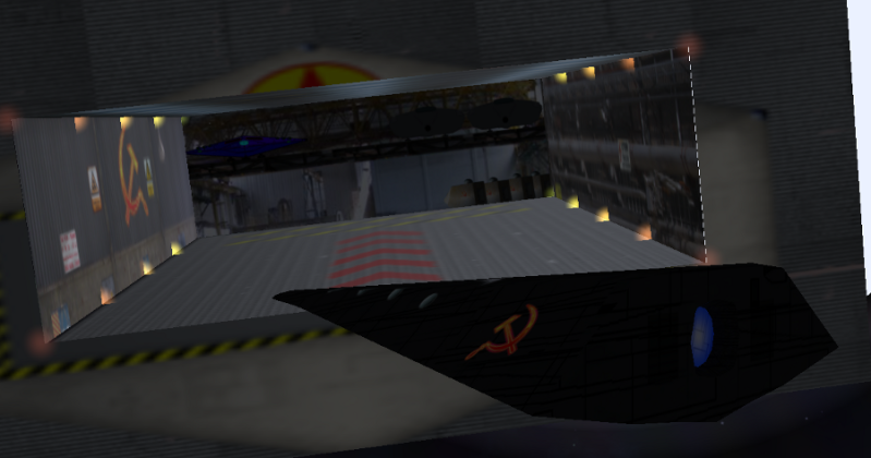
Heres a WIP for the docking bay. Its in the SLAPU that I'm working on which is why the external image doesnt line up yet.
I have used some images taken in industrial buildings to form the background and added some parked ships in the split level parking bay. I reckon I'll need to darken the sides a bit as the lighting makes it look a bit washed out.

On a break
- maik
- Wiki Wizard

- Posts: 2034
- Joined: Wed Mar 10, 2010 12:30 pm
- Location: Rheingau, Germany (mainly agricultural, democracy, TL13)
Re: Feel free to use my Oolite creations
Just added it to the WIP section of the [wiki]OXP List[/wiki]. Any idea for a name yet?
Re: Feel free to use my Oolite creations
Lovely reskins! I had a bash at reskinning the SLAPU too a while back:
https://bb.oolite.space/viewtopic.php?f= ... 69#p137169
(I'd have attempted the rest too but I only had the existing textures to go by and they don't make it easy to see what goes where: I don't have the know-how to create the blank panel-lined skin from the ship model itself...)
https://bb.oolite.space/viewtopic.php?f= ... 69#p137169
(I'd have attempted the rest too but I only had the existing textures to go by and they don't make it easy to see what goes where: I don't have the know-how to create the blank panel-lined skin from the ship model itself...)
Re: Feel free to use my Oolite creations
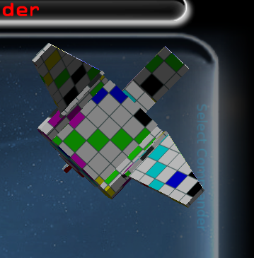
I like your Gulag station Tony. Really nice texture and lighting. If the texture provided does not make it easy to work out which bit goes where, I put a grid with coloured placemarks over it, then screengrab from all angles, and work it out from there. For example, as with the lambda shuttle I have also been working on. I can then overlay this image with the texture I want to use. In the case of the Lambda, I overlaid it with sections from a detailed CGI ortho view that I found online.

On a break
- Smivs
- Retired Assassin

- Posts: 8408
- Joined: Tue Feb 09, 2010 11:31 am
- Location: Lost in space
- Contact:
Re: Feel free to use my Oolite creations
A flying Scrabble board! 
Commander Smivs, the friendliest Gourd this side of Riedquat.
Re: Feel free to use my Oolite creations
or even an explosion in a Rubik's cube factory
Thought Police Ray
------------------
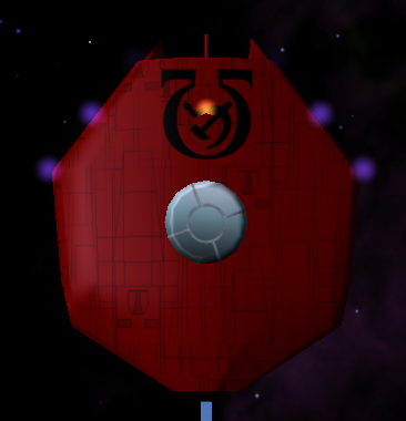
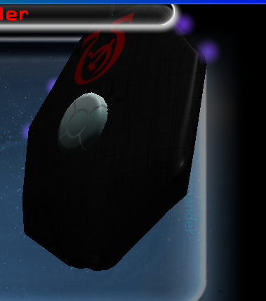
The red one is more faithful to the original, but the black one looks more evil and becoming of a totalitarian state. Not quite sure which I should use. The use of the omega logo is a bit of a nod to Babylon 5 and the Psy-cops
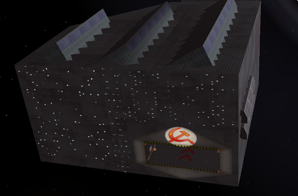
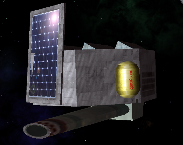
Zero G Factory
--------------
improved with lit windows on the front and new texturing on the roof and the tank.
Thought Police Ray
------------------
The red one is more faithful to the original, but the black one looks more evil and becoming of a totalitarian state. Not quite sure which I should use. The use of the omega logo is a bit of a nod to Babylon 5 and the Psy-cops


Zero G Factory
--------------
improved with lit windows on the front and new texturing on the roof and the tank.


On a break
- Mauiby de Fug
- ---- E L I T E ----

- Posts: 850
- Joined: Tue Sep 07, 2010 2:23 pm
Re: Feel free to use my Oolite creations
Then why not use both!? And yay for B5 references!Amaranth wrote:The red one is more faithful to the original, but the black one looks more evil and becoming of a totalitarian state. Not quite sure which I should use. The use of the omega logo is a bit of a nod to Babylon 5 and the Psy-cops
Re: Feel free to use my Oolite creations
Red for the uniformed guys that knock on you door, and black for the Thought Police Secret Service. I vote for both. You could even make the black one a bit tougher. I really like your work by the way, and I'm very happy that my post pulled in a valuable resource that can do what I can't do myself. Thank you for your efforts.Amaranth wrote:Thought Police Ray
------------------
The red one is more faithful to the original, but the black one looks more evil and becoming of a totalitarian state. Not quite sure which I should use. The use of the omega logo is a bit of a nod to Babylon 5 and the Psy-cops
I wish we could change the colour of the engine plume though. (More redish for less efficient engines).
"A brilliant game of blasting and trading... Truly a mega-game... The game of a lifetime."
(Gold Medal Award, Zzap!64 May 1985).
(Gold Medal Award, Zzap!64 May 1985).
- Eric Walch
- Slightly Grand Rear Admiral

- Posts: 5536
- Joined: Sat Jun 16, 2007 3:48 pm
- Location: Netherlands
Re: Feel free to use my Oolite creations
amaranth, watch out for how you draw the Hammer and Sickle. Only one orientation is correct. The one in above Zero G Factory is mirrored. I also noticed that you had a ship with them on both sides. But one side was also mirrored.
But, Dr. Nill also made this mistake in the Slapu dock. On one wall its also wrong in his original.
Also watch out that some modelers used mirrored textures to begin with. However, I think that commies textures are positive, as seen in game.
But, Dr. Nill also made this mistake in the Slapu dock. On one wall its also wrong in his original.
Also watch out that some modelers used mirrored textures to begin with. However, I think that commies textures are positive, as seen in game.
UPS-Courier & DeepSpacePirates & others at the box and some older versions
Re: Feel free to use my Oolite creations
Loving the new textures, although I'd vote for more red-star logo and less hammer-and-sickle, TBH. Or even come up with a brand new logo yourself. Personally I find re-using existing earth logos a bit .. meh.
As for the black thought-police ship, yes/no - in-game it'll be almost impossible to see. While that might be more 'realistic' personally I prefer brighter coloured models so that I can actually see & appreciate them.
It's why I keep wavering about running my game with the Griff-ships - they look absolutely lovely, but can't really see them very well in-game. Things look very different in a modeling program vs in-game.
Just my 0.2Cr - keep up the great work! +Giles knows I can't model/texture if my life depended on it!
The glass is twice as big as it needs to be.
Re: Feel free to use my Oolite creations
Thanks for your observations on the use of the H&S logo. I think I'll have to modify a few of the textures to correct this.. I see where you are coming from Micha, however I have decided to keep the H&S logo in game for a number of reasons. 1) The Ooniverse is set in a predominantly human-derived colonial environment. Hence human cultural aspects will have been exported to the stars, along with humanity. Oolite is set just over 1000 years from now. Established religious (for example) symbols have lasted for well over 1000 years and are still in use, hence another established, easily recognised and well used symbol may easily do the same and lastly it makes commie ships distinctive to the player. The red and yellow star as a symbol is something that is more likely to be absorbed into general usage for military or commercial logos. I'm not too sure about using all the Russian text to make thing look communist, as it does look a bit corny, however it was in the original OXP so I will try to retain a bit of faithfullness to the original author. On that note, I think I'll use the red Secret Police vessel not the black one.
Maik, sorry I forgot to get back to you. The name you have given this WIP as 'Commies retextures' is ideal, as that's exactly what it is and also implies that it is an addition to Commies, not a replacement for it.
Maik, sorry I forgot to get back to you. The name you have given this WIP as 'Commies retextures' is ideal, as that's exactly what it is and also implies that it is an addition to Commies, not a replacement for it.
On a break
