(NEW RELEASE) NumericHUDv3.oxp

Discussion and information relevant to creating special missions, new ships, skins etc.

Moderators: winston, another_commander

Post Reply
User avatar
CommonSenseOTB
---- E L I T E ----
---- E L I T E ----
Posts: 1397
Joined: Wed May 04, 2011 10:42 am
Location: Saskatchewan, Canada

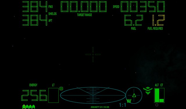
(NEW RELEASE) NumericHUDv3.oxp

Post by CommonSenseOTB »

Edit: UPDATE NumericHUDv3.oxp is now available.

Here it is: NumericHUDv3 :D

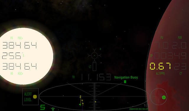
Leaving the station
Image
NumericHUDv3 #1 by CommonSenseOTB, on Flickr

Picking a fight
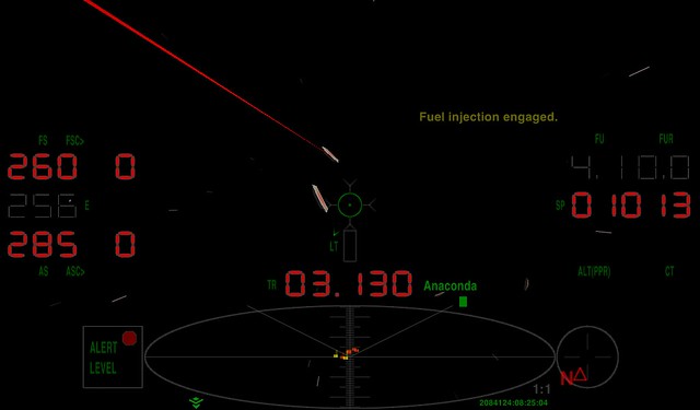
Image
NumericHUDv3 #2 by CommonSenseOTB, on Flickr

Dogfighting
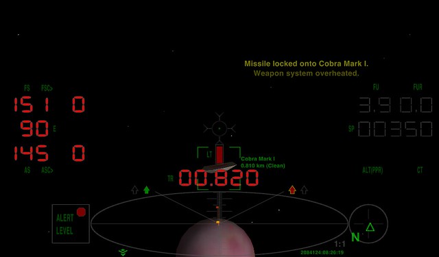
Image
NumericHUDv3 #3 by CommonSenseOTB, on Flickr

The big improvement in number design came about as I was experimenting with the selector drawStatusLight and experimenting with its' dimensions led me to discover that if one dimension was under 4 that you would actually get a grey line drawn instead of the status light. So any hud could use this technique to draw equipment icons, animated crosshairs, custom bar gauges both straight and curved, custom number or letter animations, etc, etc.

The real improvement in NumericHUDv3 comes from keeping the normal readouts just barely visible and not distracting while making them glow/pulse a bright color to draw your attention to the gauges that need to be monitored closely. This concept works quite nicely, particularily during combat when your attention is focused on killing or being killed rather than the gauges and NumericHUDv3 is now quite close to what I had originally envisioned for a numeric hud display when I first set out to make version 1 over 10 months ago.

Enjoy yourselves and have fun with this product! :D


Download link:

http://wiki.alioth.net/index.php/Numeric_Style_HUDs


==========================================
Edit: UPDATE NumericHUDv2.1.oxp is now available.

Now with a redesigned crosshair and a few minor script tweaks.

Download here:

http://wiki.alioth.net/index.php/Numeric_Style_HUDs

Playtest results and comments are welcome. :)
Have fun with this! :D
Cheers! :D
==========================================
Edit: (NEW RELEASE)NumericHUDv2.oxp is now available.
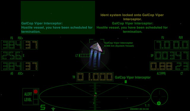
Image
NumericHUDv2 #1 by CommonSenseOTB, on Flickr
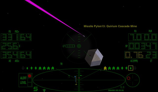
Image
NumericHUDv2 #2 by CommonSenseOTB, on Flickr
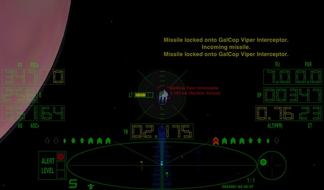
Image
NumericHUDv2 #3 by CommonSenseOTB, on Flickr

Download here:

http://wiki.alioth.net/index.php/Numeric_Style_HUDs

Playtest results and comments are welcome. :)

Have fun with this! :D

Cheers! :D
==========================================
Edit: UPDATE NUMERIC HUDv1.3.2.oxp(bugfixed)is now available.

Download here:
http://wiki.alioth.net/index.php/Numeric_Style_HUDs

==========================================

Edit: UPDATE NUMERIC HUDv1.3.1.oxp(bugfixed)is now available.

Download here:
http://wiki.alioth.net/index.php/Numeric_Style_HUDs

==========================================
Edit: UPDATE NUMERIC HUDv1.3.oxp is now available.

Download here:
http://wiki.alioth.net/index.php/Numeric_Style_HUDs

Notable New Features:

Morphing gauge swapout triggered by alert conditions.
Basic escape pod hud.

Full details on the readme. Have fun! :D
==========================================

Edit:UPDATE NUMERIC HUDv1.2.1.oxp bugfixed now available.

Edit:UPDATE NUMERIC HUDv1.2.oxp now available.

Happy Canada Day!! :D

I bring you fireworks! 8)

Image
NumericHudv1.2#1 by CommonSenseOTB, on Flickr
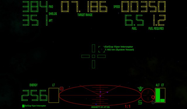
Image
NumericHudv1.2#2 by CommonSenseOTB, on Flickr
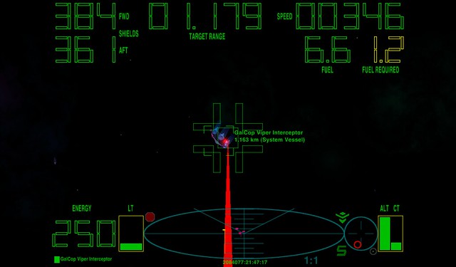
Image
NumericHudv1.2#3 by CommonSenseOTB, on Flickr
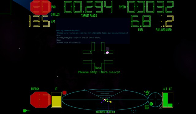
Image
NumericHudv1.2#4 by CommonSenseOTB, on Flickr


Now available for download: NUMERIC HUDv1.2.oxp

New features: animated adjustable crosshair and shield/energy warning lights.

For the past 2 weeks I've been tinkering away to get this to work and I have found a practical limit to how much can be put in a hud.plist with "equipment_required" before the fps slowdown becomes noticeable(on my slow machine that is). The animated adjustable crosshair is a result of reworking my hud.plist additions down as low as I can and still get most of what I wanted. The only other way out would have been to have a separate hud for each crosshair position and I don't want to do it that way because it will prevent some future expansions that would need to go that route. As a result there is a little bit of slowdown from the crosshair. If it is a concern just use the old version 1.1 instead.

Have fun with this and let me know what you think. I believe a crosshair position of 5 or 6 forward and aft works pretty good on a stock Cobra MkIII. Your personal ship will be trial and error.

Download here:

http://wiki.alioth.net/index.php/Numeric_Style_HUDs

Now time for a long weekend break. See yah! :D

Edit:END OF UPDATE
------------------------------------------------------------------------------------
------------------------------------------------------------------------------------

May 29,2011 I pulled another all-nighter and had another eureka moment and this time I practically solved the other types of HUD gauges as the solution will use similar methods and again it is quite obvious and I should have seen it.

:D :D :D

The better news is that a feature request for a bugfix has been put in to allow/fix equipment required to be used on the Legends section of the hud.plist. 8)

Do you know what this means?(Docs voice in BACK TO THE FUTURE)

It means that the huds I'm going to make might be obsolete in a few months as will likely alot of other huds. Regardless of that some of the techniques will be directly useable for the new version huds that will be allowable so I will make the foundation for that and it will speed the whole process up anyway!

So, I have on a standard hud a working numeric gauge. It's not bad and the earliest it could have been made would have been when javascipt first started to be used in oolite oxp's. It needs both hud.plist and script refinement(can be improved).
I will not post any pictures or a hud until I refine it and have a full hud for you to test. Might release a needle(analogue)type gauge hud at the same time we'll see.

What I need from all interested people is their input on numeric huds. Size/placement of gauges, which gauges should/shouldn't be numeric, percent or unit gauges prefered(good example is shields), other features/uses for numeric gauges/huds and all your comments and ideas about them. What do you want? Let me know so when the gauge is ready I know what to do with it and/or I'll come up with what ever seems workably decent.

Oolite HUDS will never be the same again!!! :D :lol: :D :lol: :D
Last edited by CommonSenseOTB on Sat Apr 21, 2012 1:35 am, edited 15 times in total.
Take an idea from one person and twist or modify it in a different way as a return suggestion so another person can see a part of it that can apply to the oxp they are working on.


CommonSense 'Outside-the-Box' Design Studios Ltd.
WIKI+OXPs
another_commander
Quite Grand Sub-Admiral
Posts: 6682
Joined: Wed Feb 28, 2007 7:54 am

Re: (WIP) Numeric Style HUDs(another first!)

Post by another_commander »

CommonSenseOTB wrote:
The better news is that a feature request for a bugfix has been put in to allow/fix equipment required to be used on the Legends section of the hud.plist. 8)
Well, there is no such thing as a feature request for a bugfix. You are referring to what was decided to be considered a feature for a release after the upcoming stable, although it was initially discussed as a possible bug. This means it will be a good while before it is implemented, since no more new features are to be added in the game until after v1.76.
User avatar
CommonSenseOTB
---- E L I T E ----
---- E L I T E ----
Posts: 1397
Joined: Wed May 04, 2011 10:42 am
Location: Saskatchewan, Canada

Re: (WIP) Numeric Style HUDs(another first!)

Post by CommonSenseOTB »

Misunderstood, another commander.

Well,that's a reprieve from obsoleting a lot of huds and all the more reason to pursue what I'm working on as it might be the only practical way to see numeric huds for quite some time. Better take a little longer and make them that much better! :)
Take an idea from one person and twist or modify it in a different way as a return suggestion so another person can see a part of it that can apply to the oxp they are working on.


CommonSense 'Outside-the-Box' Design Studios Ltd.
WIKI+OXPs
Zireael
---- E L I T E ----
---- E L I T E ----
Posts: 1396
Joined: Tue Nov 09, 2010 1:44 pm

Re: (WIP) Numeric Style HUDs(another first!)

Post by Zireael »

As for size/placement - I'd put make the shield strength bar big enough to have the number (whether it's a unit or a percent it's fine) like this:
------------------
20
------------------

I don't know about other things. Someone already made a nice fuel bar split into seven parts, one part for each LY of fuel.
User avatar
CommonSenseOTB
---- E L I T E ----
---- E L I T E ----
Posts: 1397
Joined: Wed May 04, 2011 10:42 am
Location: Saskatchewan, Canada

Re: (WIP) Numeric Style HUDs(another first!)

Post by CommonSenseOTB »

Thanx Zireael, at this point it looks like the numeric gauges that I'm making this way will be kinda big. But they won't obstruct the vision much as I've got a big prototype and it's decently usable in combat. What I'm really striving for now is to insure that the gauges update quickly enough to be better than usable and I might have to make a few different variations to get it right.
In your picture do the lines represent the hud size or the standard bar gauge size in core hud?
The fuel gauge you're thinking of was just done by Captain Beatnik and is actually a normal gauge with green surrounds drawn over it to make it more segmented.

More ideas all, please. :)
Take an idea from one person and twist or modify it in a different way as a return suggestion so another person can see a part of it that can apply to the oxp they are working on.


CommonSense 'Outside-the-Box' Design Studios Ltd.
WIKI+OXPs
User avatar
CommonSenseOTB
---- E L I T E ----
---- E L I T E ----
Posts: 1397
Joined: Wed May 04, 2011 10:42 am
Location: Saskatchewan, Canada

Re: (WIP) Numeric Style HUDs(another first!)

Post by CommonSenseOTB »

Well some good news. I got the first gauge to update very quickly so now I'm making some specific gauges and I need 2 things: the variable for the player's laser/weapon temperature and for altitude. If anyone could post it here for me would be appreciated. Thanx.
Take an idea from one person and twist or modify it in a different way as a return suggestion so another person can see a part of it that can apply to the oxp they are working on.


CommonSense 'Outside-the-Box' Design Studios Ltd.
WIKI+OXPs
User avatar
Commander McLane
---- E L I T E ----
---- E L I T E ----
Posts: 9520
Joined: Thu Dec 14, 2006 9:08 am
Location: a Hacker Outpost in a moderately remote area
Contact:

Re: (WIP) Numeric Style HUDs(another first!)

Post by Commander McLane »

Do you mean selector = "drawWeaponTempBar:"; and selector = "drawAltitudeBar:"; from hud.plist?

If you're after a JS variable for laser temperature, I'm afraid that doesn't exist. You can establish the altitude by searching for the closest planet or sun and subtracting its radius from the player's distance to it.


EDIT: clarified a bit
Last edited by Commander McLane on Wed Jun 01, 2011 10:20 am, edited 1 time in total.
Ganelon
---- E L I T E ----
---- E L I T E ----
Posts: 534
Joined: Fri Jul 02, 2010 11:45 am
Location: Around Rabiarce or Lasoce

Re: (WIP) Numeric Style HUDs(another first!)

Post by Ganelon »

Analog/needle type gauges would be a whole 'nother jump, so I'll stick to just thoughts on digital for the moment. LOL

I think altitude would be good as a digital. Fuel would make good sense as digital, since how many units of it one has does figure into the game and the bar graph isn't so good for that.

Energy banks could go either way. I rather like what you've done there with the pie versions, since it's compact and easy to see what is going on with a glance. Speed would be nice to have digital as an "eye candy" at least. Shields, I suppose it's a matter of taste, but I think seeing "Forward shield is down to 12%" is more dramatic than "Umm, they're in the red."

The problem with a lot of these bits of data, though, is I don't know what we're actually seeing in the "vanilla" HUD anyway. Is it some sort of a percentage or units or what?

Some of data that has been in bar is kind of nonsensical in bar/colour form. Take speed for example. I can't think of any cases where whether the bar is red or yellow or green actually matters. A number for speed wouldn't matter either, but it *could* open some possibilities. Like there could be legal speed limits for docking. It doesn't make sense that a station or whatever would say "Ok, you can dock, but don't come in faster than just a little ways into the yellow.." No, it'd be some set speed your ship should adjust to that's considered usually safe and would avoid a fine (since there is already an OXP out there that has some speed limit on docking).

With altitude, if it's an actual altitude that the bar graph shows, numerical would be more useful. Like if a certain altitude is right for making the final approach on a planetfall, and some other altitude is how close one needs to get to a star to skim it for fuel, then the actual number would be a lot more useful than the bar graph has been.

Yaw/pitch/roll, well.. It's usually on the HUDs I use, but it's not really that useful most of the time. The only uses I've seen for it are once in a blue moon one might look at it to see if controls are actually responding, or look at it in a screenshot to have a better understanding of what the pilot was doing at that moment. But I personally wouldn't call it essential, if anything more useful needs the space. LOL Some yaw/pitch/roll displays look cool, which can be enough justification for keeping them in a game.

Cabin temp and weapon temp may as well stay bars, since I'd say that's as meaningful as any other way of displaying them. But again, since I don't know what data they're actually showing, it's hard to say. There might be potential for numerical to be useful if trumbles or other pests die at a certain specific temp, for example.

One of my points is that there are some places where more precise displays could be useful, if we know what was being displayed in the first place and it can have some application in the gameplay.

It being possibly more confusing to a brand-new Jameson is rather irrelevant, since the default HUD is what they'd be coping with unless they make a deliberate choice otherwise. If they install an "expert" HUD or buy a ship that comes with a control panel that's more complex than they're used to and a little baffling at first, I think that's so much the better! The default/strict-mode HUD should be easy and minimal, like it already is, and HUDs/panels should be available that give extra data or more precise data that a more experienced player can use. Perfectly understandable that there would be a bit of a learning curve between the two.

One thing I'd like to see as a numerical item on a HUD would be the range to the currently targeted object. Range is shown on the reticle, but it moves. It can move out of your field of vision if it's a large object and you are close, or if you turn away from the object while manoeuvring. "How many meters before collision" would be something that would just be sensible to have clearly displayed in a consistent part of the screen even just for docking.
Sleep? Who needs sleep? Got game. No need sleep.
User avatar
CommonSenseOTB
---- E L I T E ----
---- E L I T E ----
Posts: 1397
Joined: Wed May 04, 2011 10:42 am
Location: Saskatchewan, Canada

Re: (WIP) Numeric Style HUDs(another first!)

Post by CommonSenseOTB »

Commander McLane wrote:
Do you mean selector = "drawWeaponTempBar:"; and selector = "drawAltitudeBar:"; from hud.plist?

If you're after a JS variable for laser temperature, I'm afraid that doesn't exist. You can establish the altitude by searching for the closest planet or sun and subtracting its radius from the player's distance to it.


EDIT: clarified a bit
:(

That is unfortunate Commander McLane. The previous pie hud gauges were made from existing selector = "drawWeaponTempBar:"; and selector = "drawAltitudeBar:"; and therfore no JS variable was required. To make actual new gauges for numeric and analogue(needle) and any other future animated type of gauge for these 2 would REQUIRE some sort of JS variable. It is fortunate that there is a workaround for altitude because this gauge should be available as both numeric and needle. As there are other possible uses for these 2 (non-existent) JS variables I think I will have to put in a feature request for them in relation to creating new hud gauges(among other things).

If anyone has any further information on this in particular, perhaps other workarounds or information that I might be missing or could benefit from please and thanx and appreciated. :)
Take an idea from one person and twist or modify it in a different way as a return suggestion so another person can see a part of it that can apply to the oxp they are working on.


CommonSense 'Outside-the-Box' Design Studios Ltd.
WIKI+OXPs
User avatar
CommonSenseOTB
---- E L I T E ----
---- E L I T E ----
Posts: 1397
Joined: Wed May 04, 2011 10:42 am
Location: Saskatchewan, Canada

Re: (WIP) Numeric Style HUDs(another first!)

Post by CommonSenseOTB »

Thank you Ganelon. You have a nice perspective on things. I tend to agree with most of your ideas.

What we are seeing in the "vanilla" hud varies depending on each type of variable. Shields, energy, speed all have straight units which can be changed to a percentage if required. When you upgrade your shields or change to a faster ship straight units will let you really "see" the difference. It's quite refreshing in a way to have that kind of information. Fuel goes up to 7.0 by 0.1 increments and does make a great numeric gauge as you really need a truly accurate readout for fuel anyway. Cabin temperature goes from 0 to 1 and works as a percentage numeric gauge. There are no temperature units, but a "scale" :lol: of temperature could be created(simulated) for the gauge itself. Nearest I can figure the reading is about 0.2 normal in-ship temperature. Perhaps it is intended to represent room temperature in which case the percent conversion of this actually represents a "scale" of 1 to 100 degrees C and if not the ship, you yourself destruct at 100 degrees(loose consciousness or die?) and therefore the game assumes your ship does soon after. Any information on what the true intention of the cabin temperature "scale" is would be helpful.

As for having the range to the targetted object on the hud display let me say this: Any variable in the Ooniverse can be displayed and it can be equipment activated. Now you know why I'm so enthusiastic for this method. :D Creating custom gauges from scratch let's you do whatever you want with them. Imagine buying a piece of equipment, say an internal fuel tank, or a target range indicator or a railgun or whatever and a display for the extra fuel or the target range or the railgun ammo instantly pops onto the hud or does when the equipment is activated or when an event or condition or variable triggers it. Almost anything is possible with this method. Now start dreaming. 8)

More ideas and comments please. Keep them coming.All information helps and will save me time and make things better.
Take an idea from one person and twist or modify it in a different way as a return suggestion so another person can see a part of it that can apply to the oxp they are working on.


CommonSense 'Outside-the-Box' Design Studios Ltd.
WIKI+OXPs
User avatar
CommonSenseOTB
---- E L I T E ----
---- E L I T E ----
Posts: 1397
Joined: Wed May 04, 2011 10:42 am
Location: Saskatchewan, Canada

Re: (WIP) Numeric Style HUDs(another first!)

Post by CommonSenseOTB »

I have some decent progress to report on this project. At this point I have a customizable 8 digit readout that can be specified how many digits and on each side of the decimal place. The script portion allows any number of readouts to be modified and triggered in this manner. It has been tested with all applicable in-game variables and there are some interesting results.
Forward and Aft shield indicators look good as displays in units(up to 384) as opposed to percentages. Speed as units look really cool as a cobra 3 reads 349/350 top speed, injectors 2450, and torus 11200. Seeing it this way as you change speeds is quite useful and gives a real sense of your speed. As well when you change ships it emphasizes the real difference between them. Energy is also done well in the form of units. The way the script sets these up there are no worries. All unit values will be displayed. :D
Altitude looks good as units and the station is about 55km up at Inera and the regular bar gauge starts dropping when you reach about 35km. What concerns me alittle is it is not very clear about the units involved. Are the bar gauge and the numeric display the same units? I hope so. This also looks good in the form of a (meters) numeric gauge. Acts like a regular atmospheric airplane altimeter.
Cabin temperature as a percent doesn't work. Must be degrees but what is the scale? 1 to 100 what? Might just leave it as a bar gauge.
Fuel will be interesting. It looks good as units 7.0 but I believe I will have 2 displays. 1 for current fuel and 1 for required fuel for hyperspace destination. A bit of an anomaly is the fuel variable itself. It appears that sometimes it is not rounded up. 3.1 might appear as 3.09 for 2 right digits or 3.0 for 1 right digit from the decimal point. At the same time the status page displays the proper number. Does it round the number here? I might have to round the number in this case to display the fuel properly. Not sure what to make of this.
Laser temperature, as you know, is unworkable so may as well stay as a bar for now. With both temp gauges as bars you can just imagine how hot it is from the bar reading and don't need to know the scale. :wink:

The big piece of candy here is what I'm currently working on. I'm going to try to allow selectable readout color out of 2 colors with a set point above a certain selectable value where the color would switch to the other one(and back again when the value drops). This would allow you to choose to have for instance one color for the speed readout which changes to the other color over a certain value. This would allow some color indication of either danger or a normal zone of operation just like the bar gauges to a certain extent.

Well that's about it. The work goes on. Must make it user adjustable/definable for future developers and ease of use so it will be a while. Until then keep all your ideas, suggestions and comments coming. :D
Take an idea from one person and twist or modify it in a different way as a return suggestion so another person can see a part of it that can apply to the oxp they are working on.


CommonSense 'Outside-the-Box' Design Studios Ltd.
WIKI+OXPs
User avatar
Commander McLane
---- E L I T E ----
---- E L I T E ----
Posts: 9520
Joined: Thu Dec 14, 2006 9:08 am
Location: a Hacker Outpost in a moderately remote area
Contact:

Re: (WIP) Numeric Style HUDs(another first!)

Post by Commander McLane »

Code: Select all

this.$altitudeOverClosestCelestialBody = function()
{
    function $isCelestialBody(entity)
    {
        return entity.isSun || entity.isPlanet
    }
     var closestCelestialBody = system.filteredEntities(this, $isCelestialBody, player.ship)[0];
     var altitude = player.ship.position.distanceTo(closestCelestialBody) - closestCelestialBody.radius;
     return altitude
}
Put this function into your script. Then you can call it from inside the script via

Code: Select all

this.$altitudeOverClosestCelestialBody()
and it will give you back the distance in meters.

The function will give a false result if you're right in the middle between two celestial bodies of vastly different radius. This is because it will find the body whose centre is closest to your ship. But if the body whose centre is a little farther from you has a much bigger radius, its surface may actually be closer to you than the surface of the other body. This will however only affect the gauge if there is a moon very close to a planet. I'll think about how the function can be modified to reliably find the closest surface without complicating it too much.


EDIT: it could be that a function like this already exists in Cabale Common Library. You should check it. If not, it could easily be included.
User avatar
Thargoid
Thargoid
Thargoid
Posts: 5528
Joined: Thu Jun 12, 2008 6:55 pm

Re: (WIP) Numeric Style HUDs(another first!)

Post by Thargoid »

You might want to add a check and bail-out for interstellar space, or at least a check that there is a planetary body found in the scan (as I guess some OXPs like Achenar will add planets in IS) or else it'll cough up log errors if called after a misjump.
User avatar
Commander McLane
---- E L I T E ----
---- E L I T E ----
Posts: 9520
Joined: Thu Dec 14, 2006 9:08 am
Location: a Hacker Outpost in a moderately remote area
Contact:

Re: (WIP) Numeric Style HUDs(another first!)

Post by Commander McLane »

Thargoid wrote:
You might want to add a check and bail-out for interstellar space, or at least a check that there is a planetary body found in the scan (as I guess some OXPs like Achenar will add planets in IS) or else it'll cough up log errors if called after a misjump.
Good point!

Here's the amended code:

Code: Select all

this.$altitudeOverClosestCelestialBody = function()
{
    function $isCelestialBody(entity)
    {
        return entity.isSun || entity.isPlanet
    }
     var closestCelestialBody = system.filteredEntities(this, $isCelestialBody, player.ship)[0];
     if (!closestCelestialBody) return undefined;
     var altitude = player.ship.position.distanceTo(closestCelestialBody) - closestCelestialBody.radius;
     return altitude
}
Now the result of the function will be undefined if there is no sun or planet. You can check for this case with

Code: Select all

if(!this.$altitudeOverClosestCelestialBody())
Ganelon
---- E L I T E ----
---- E L I T E ----
Posts: 534
Joined: Fri Jul 02, 2010 11:45 am
Location: Around Rabiarce or Lasoce

Re: (WIP) Numeric Style HUDs(another first!)

Post by Ganelon »

Sounds good, CommonSenseOTB. The speed readout in particular sounds good. I hadn't been thinking about it showing the injector and torus speeds, for some odd reason. That sounds highly cool.

In atmospheric aircraft, the most basic instruments are "the holy six" which usually will be prominent on the instrument panel. Not all of them would have any use in Oolite (even if one uses the Planetfall.OXP to make planetary landing), but I'll list them for general interest. Airspeed indicator, altimeter, artificial horizon, attitude gyro, directional gyro, and vertical speed indicator.

Since planets (and moons, with some OXPs) in Oolite aren't moving, there isn't really a difference between speed in space or speed in an atmosphere when coming down for a landing. So your speed display already does that. You already have the altimeter pretty well figured out as well, by the looks of it.

A vertical speed indicator might be interesting. Sample the change in altitude at one second intervals and display it as + or - meters per second. But since we don't have gravity in Oolite, it's not a critical stat like it would be on an aircraft. No need to worry about falling or escape velocity in Oolite.

The other three of the "holy six" also aren't of much consequence in Oolite as it is now. If we actually had to navigate between planetside locations, maybe, but I don't think that's likely to become an important part of the game any time soon. We don't fly through fog or clouds or have sloping terrain to deal with, so the artificial horizon wouldn't be of any huge use, other than maybe seeing when you're close enough to a planetary or lunar body to masslock the torus. Pretty much all Oolite ships have a fairly unobstructed view of straight ahead, and so if there's a "horizon", it's simply visible. The gyros are mostly for being able to "get a bearing" or set a heading, which doesn't actually figure in Oolite gameplay.

I think you have a pretty good handle on what sort of data is useful to display. There is a lot of data that *can* be displayed, though, that would only be of use on occasion. For instance, information about railgun ammo is really only needed in combat. To keep the panel from getting cluttered, maybe use something like a switchable dynamic HUD or whatever to make one of the screens an MFD (Multi-Function Display) so the player can switch it to the info he/she wants to see at any given moment? For example, one could have one screen on the display that could switch between space compass, perhaps communications, target range and ammo, etc.

So long as we're dreaming, and talking about various sorts of displays, a display window or small panel with some indicator lights to tell what equipment of what is installed is actually functional would be handy sometimes. Sometimes that info scrolls by rather fast if you took a lot of damage in a particularly zesty furball. LOL
Sleep? Who needs sleep? Got game. No need sleep.
Post Reply