Page 1 of 5
Yet another contribution to the collection of HUD´s
Posted: Tue Mar 08, 2011 8:28 pm
by Captain Beatnik
Hi folks,
first of all I want to say thank you very much to Aegidian and all contributors for developing Oolite an bringing back this great game to us. Playing it reminds me of the good times when I was young spending hours in front of my C64 to get that !ß+*# ship docked without crashing.

Unfortunately, in 1985 there was no navigation bouy! Whoever programed the buoy: Thanks a lot!

I have spent some time in customizing the hud.plist. My attempt on the HUD was inspired a lot by the excellent HUD´s designed by Wyvern and JeffBTX, which imho are among the best HUD´s available yet.
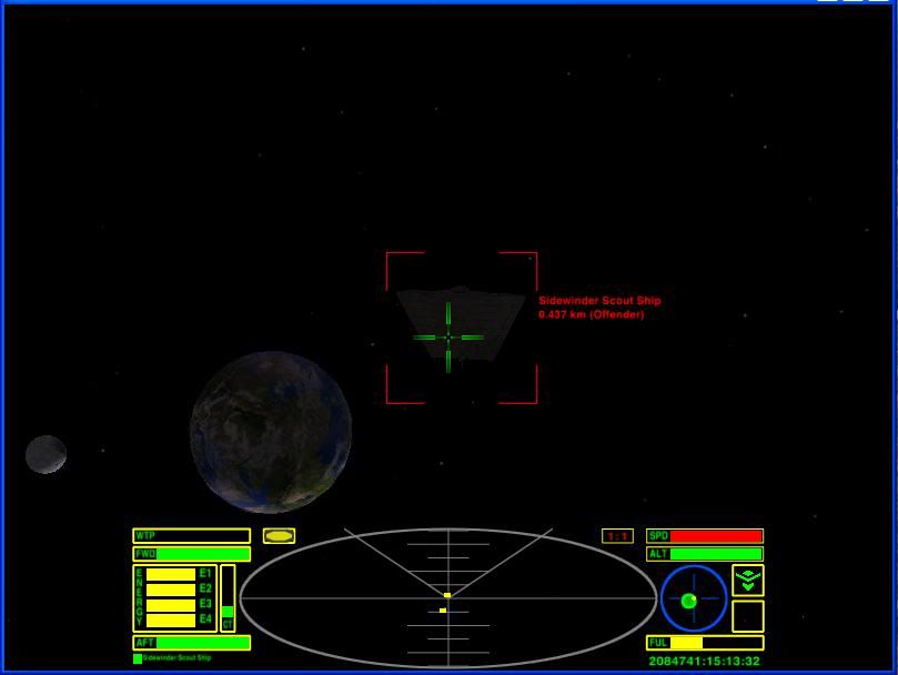
And this is how my first attempt on the HUD looks like:

The crosshairs (from left to right: Pulse-laser, beam-laser, military-laser and mining laser.)

The normal hud

The small hud
If you like to give CB_Hud.oxp a try, you may download it here:
http://www.box.net/shared/b8u0aot2yc
Enjoy!
If you find any bugs, please report them to me. Thanks in advance!
Best regards from the lovely planet Xexedi
CB.
Re: Yet another contribution to the collection of HUD´s
Posted: Wed Mar 09, 2011 8:28 am
by TGHC
Very nice, I particularly like the large scanner. and the larger status indicator.
Re: Yet another contribution to the collection of HUD´s
Posted: Wed Mar 09, 2011 9:21 am
by Commander McLane
What happens while the clock is adjusted? Will the ' (adjusting)' be printed only outside the screen?
Re: Yet another contribution to the collection of HUD´s
Posted: Wed Mar 09, 2011 2:47 pm
by Commander Ragugaki
Captain Beatnik wrote:I have spent some time in customizing the hud.plist. My attempt on the HUD was inspired a lot by the excellent HUD´s designed by Wyvern and JeffBTX, which imho are among the best HUD´s available yet. And this is how my first attempt on the HUD looks like:

Love the way the cross hairs turn from green to red when target in your sights!

Re: Yet another contribution to the collection of HUD´s
Posted: Wed Mar 09, 2011 2:55 pm
by Cody
Commander Ragugaki wrote:Love the way the cross hairs turn from green to red when target in your sights!
Do you mean the 'target reticle' square? If so, that's the [wiki]Target_Reticle[/wiki] OXP.
Re: Yet another contribution to the collection of HUD´s
Posted: Wed Mar 09, 2011 3:21 pm
by Mauiby de Fug
El Viejo wrote:Commander Ragugaki wrote:Love the way the cross hairs turn from green to red when target in your sights!
Do you mean the 'target reticle' square? If so, that's the [wiki]Target_Reticle[/wiki] OXP.
'Tis also built in to MilHUD and JeffBTX's HUD, which is where he said the inspiration came from, so I would guess that he's integrated it in to this HUD as well...
Re: Yet another contribution to the collection of HUD´s
Posted: Wed Mar 09, 2011 3:21 pm
by Smivs
Or a simple tweak in the hud.plist.....mine turns red, too.

And I've moved the console messages to the left side out of the way.
Stuck with the standard layout though...elegant simplicity which to my mind cannot be improved upon.
Re: Yet another contribution to the collection of HUD´s
Posted: Wed Mar 09, 2011 3:32 pm
by Gimi
Smivs wrote:Or a simple tweak in the hud.plist.....mine turns red, too.

And I've moved the console messages to the left side out of the way.
Stuck with the standard layout though...elegant simplicity which to my mind cannot be improved upon.
Would you mind enlightening us with what changes are required to do this.
Both making the reticle turn red and to move the messages out to the side.
(Please keep in mind that I need to be spoon fed all code changes.)
Re: Yet another contribution to the collection of HUD´s
Posted: Wed Mar 09, 2011 3:37 pm
by Cody
A boffin has been summoned.
Re: Yet another contribution to the collection of HUD´s
Posted: Wed Mar 09, 2011 3:40 pm
by Smivs
Hi Gimi,
Copy the hud.plist and change the bit at the bottom from
Code: Select all
overall_alpha	= 0.75;
	reticle_target_sensitive = no;
	cloak_indicator_on_status_light = yes;
}
to
Code: Select all
overall_alpha	= 0.75;
	reticle_target_sensitive = yes;
	cloak_indicator_on_status_light = yes;

                message_gui =
                {
                width = 210;
                height = 160;
                x = -200;
                y = -50;
                row_height = 12;
                };
}
Then place this revised hud.plist in a folder called Config inside another folder called (for example) Gimi'sHUD.oxp.
Pop that in AddOns and you're good to go.
Edit:- actually I think you can just put the hud.plist in AddOns. Try it.
Re: Yet another contribution to the collection of HUD´s
Posted: Wed Mar 09, 2011 4:01 pm
by Cody
On this subject, could someone kindly remind me of the bit of code needed in order to move the 'comms' messages over to the left as well.
Re: Yet another contribution to the collection of HUD´s
Posted: Wed Mar 09, 2011 4:15 pm
by Smivs
Its the "message_gui" bit in the code I posted above.
Edit:- WRONG! Sorry I mis-understood the question.
Re: Yet another contribution to the collection of HUD´s
Posted: Wed Mar 09, 2011 4:16 pm
by Gimi
El Viejo wrote:On this subject, could someone kindly remind me of the bit of code needed in order to move the 'comms' messages over to the left as well.
Code: Select all
  message_gui =
                {
                width = 210;
                height = 160;
                x = -200;
                y = -50;
                row_height = 12;
                };
This part of what Smivs said above I belive. Haven't tested yet though.
Edit: Ninjaed by the nice provider of solutions, Smivs

Thank you by the way.
Re: Yet another contribution to the collection of HUD´s
Posted: Wed Mar 09, 2011 4:30 pm
by Cody
Re: Yet another contribution to the collection of HUD´s
Posted: Wed Mar 09, 2011 4:36 pm
by another_commander
This would be it:
Code: Select all
comm_log_gui =
{
	width = 250;
	height = 100;
	x = -195;
	y = 100;
	row_height=10;
};
The usual exercise. This goes inside
hud.plist.
 Unfortunately, in 1985 there was no navigation bouy! Whoever programed the buoy: Thanks a lot!


