Join us at the Oolite Anniversary Party -- London, 7th July 2024, 1pm
More details in this thread.
More details in this thread.
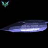
My new Dynamic Hud
Moderators: another_commander, winston
-
pagroove
- ---- E L I T E ----

- Posts: 3035
- Joined: Wed Feb 21, 2007 11:52 pm
- Location: On a famous planet
Good Hud. I especially like the 'docked'screen.
For P.A. Groove's music check
https://soundcloud.com/p-a-groove
Famous Planets v 2.7. (for Povray)

https://bb.oolite.space/viewtopic.php?f=4&t=13709
https://soundcloud.com/p-a-groove
Famous Planets v 2.7. (for Povray)
https://bb.oolite.space/viewtopic.php?f=4&t=13709

Err, what? Iiiek. Selftest...stressing old RAM...result...not found. Can you waggle your finger in this direction so I can correct it?JeffBTX wrote:I haven't tried BGS, though I looked at screenshots and read the descriptions. For one thing the description for BGS states that it requires the game to be in windowed mode(?) and I like to play in full screen.
I think the most difficult part is to get a design that works for all (or at least most) situations. Sometimes less is more (and I'm still not pleased with it).JeffBTX wrote:I liked that about the BGS screenshots; that they depict map legends for the short range chart, etc (although apparantly in monochrome-ish).
Anyway - I like your new creation and it would be a shame if your computer would be the only one that displays it.

Sorry, Sven... it is probably MY RAM that is at fault. Blame it on aging. Senility. I DISTINCTLY remember from SOMEWHERE the phrase " ... only works in windowed mode ... " and it DOES seem to be linked to BGS in MY old memory cells. Maybe I am not getting enough sleep lately. Or, after I installed Oolite 1.74.2 recently after a months-long hiatus between that and 1.73.x, I downloaded and tried a LOT of OXPs.Svengali wrote:Err, what? Iiiek. Selftest...stressing old RAM...result...not found. Can you waggle your finger in this direction so I can correct it?JeffBTX wrote:I haven't tried BGS, though I looked at screenshots and read the descriptions. For one thing the description for BGS states that it requires the game to be in windowed mode(?) and I like to play in full screen.I think the most difficult part is to get a design that works for all (or at least most) situations. Sometimes less is more (and I'm still not pleased with it).JeffBTX wrote:I liked that about the BGS screenshots; that they depict map legends for the short range chart, etc (although apparantly in monochrome-ish).
Anyway - I like your new creation and it would be a shame if your computer would be the only one that displays it.
I apologize for mis-remembering and mis-information.
-----
I am going to consider some criticism in this thread and re-design the whole thing.
Sword, thy name is Cobra. And Cobra has fangs!
I edited the first post in this thread; links to the individual screenshots were removed, just the link to the main page was left intact.
Again, thanks all for comments.
I've considered ALL suggestions, and I have made a list of changes to make.
Among other things, I am going to go ahead and put together a raytraced "docked" hud.
I am going to work on the instruments, and play with making the contrasters less conspicuous by darkening them WHILE adjusting the alphas, resizing and reshaping them, etc.
I will go to the Elite Wiki pages, and check on which *DEFAULT* Oolite ships have the highest energy banks and missiles; I will temporarily use ooCheat to give myself enough money to buy a large fully loaded ship, and use that in HUD development. The HUD will no longer be Cobra_Mk_III -centric or system_centric (the docked HUD will no longer display the Function Keys or any other legends associated w/ keyboard strokes). It will still have colored map legends, though, with Econ and Gov types.
Sword, thy name is Cobra. And Cobra has fangs!
-
Smivs

- Retired Assassin

- Posts: 8408
- Joined: Tue Feb 09, 2010 11:31 am
- Location: Lost in space
- Contact:
Hi JeffBTX,JeffBTX wrote:
I will go to the Elite Wiki pages, and check on which *DEFAULT* Oolite ships have the highest energy banks and missiles; I will temporarily use ooCheat to give myself enough money to buy a large fully loaded ship, and use that in HUD development.
I think you'll find the Boa Class Cruiser has he most - Five missiles and Eight Energy Banks. Thinking about it, the Energy banks may not be a problem as the standard HUD just re-sizes them down to very thin bands that fit in the same area as the Cobra's four, so yours may well automatically do the same. It's certainly worth checking though.
Commander Smivs, the friendliest Gourd this side of Riedquat.
Smivs;
Yes, I cheated temporarily, got myself a Boa 2. The energy bar area just sub-divides itself more, from the 4 bars for the Cob3 to 8 bars for the Boa2; but the energy area still takes up the same space on the screen.
I went from 4 pylons / missiles to 5 pylons / missiles, and noted the effect. It just increased by 1 pylon / missile icon to the right. (quashes that idea... I was playing with the idea again of having the missiles centered on the bottom... but with from 1 to 7 missiles for the default ships, there is no "auto-centering").
The Anaconda has 7 energy, 7 missiles.
I think I will just put the missiles on the very bottom of the screen, right under the scanner (I will have to move the scanner up a bit). I will just start Pylon 1 right in the center of the screen, and player ships from the Adder to the Anaconda can just have their 1 to 7 missiles.
I've experimented, and the largest object name, from PAGroove Stations, "Frontierworldsranger1 Station (Frontierworldsranger1 Variant)" does not present a problem, it will not run off the right bottom edge when targeted. There is even SOME room to make the missile icons / target text a LITTLE larger if I want.
I've decided that instead of many contrasters at different places, I will just use 1 big one at the bottom of the screen to cover ALL instruments. People might like it better (from comments in this thread), and it will be easier to implement. I've experimented, and if the base color of the contraster is black, with an alpha value of 0.50 set in the plist, then the contraster is invisible when facing the black of space. It only shows up when a planet, station, the sun, etc., is behind it. With an alpha of 0.50 everything works just fine, and the contraster will not obscure stations, enemy ships, cargo pods, etc.
It will not be just a solid band, though... I will make it more interesting by trimming the top edge a bit, to follow the contours of the instruments... gentle curves, rounded corners.
I will have to change the color of the scanner, of course. I want it NOT to be a color that matches any of the radar blips. I'm thinking medium grey.
I'm still going to keep the same instrument groupings. They just seem logical to me. I will tweak their sizes and exact placement. I MIGHT put the weapon temperature bar somewhere else.
What is going to take a while to do is to design the docking hud in the raytracer.
Sword, thy name is Cobra. And Cobra has fangs!
I am agonizing over the final thingy.Svengali wrote:No prob, Jeff. I wasn't sure if something like this slipped through.JeffBTX wrote:Sorry, Sven... it is probably MY RAM that is at fault.
Oh, and with your RAM everything seems to be ok - as seen with your HUD. Will be interesting to see the final thingie.-)
I have all of the in-flight HUDs redesigned, based on my own thoughts / improvements, and comments / suggestions in this thread (again... thanks all).
-----
The contraster underlay looks better... just one contraster for all of the instruments, as opposed to many little contrasters; slim and trim, with rounded corners where appropriate.
The contraster underlay is adjusted to JUST underlay the instruments with no wasted space (I.E. it isn't just a band at the bottom of the screen).
The instrument placement has been tightened up, all elements adjusted / moved. The instruments (and the contraster underlay) are "compatible" with the longest object name, one of the station names from PAGrooveStations (61 characters); the object name does not spill off of the screen or clash with any other element.
The contraster is black with an alpha of 0.5, so it is invisible unless something is bright behind it.
The in-flight HUDs are perfectly compatible with an Anaconda (7x Energy, 7x Missiles) and a Boa 2 (8x Energy, 5x missiles).
After thinking about it, for the "Critical Condition" HUD, I have gone minimalist. ALL INSTRUMENTS and the underlay disappear except for the ship clock.
-----
I will put some screenshots together and delete the old images and upload new screenshots sometime today (for the in-flight HUDs).
-----
*For now* I have a "temporary" Docked HUD that is just the same as the "Condition Green in-flight" HUD, but without a targeting disk (from inside the crosshair area) and without an instruments contraster underlay (because it isn't needed when docked).
-----
This morning after a coffee overdose I had a GREAT idea for a new approach, for raytracing a Docked HUD.
another_commander suggested to get away from a "keyboard legend", the F1 through F8 keys (less F4) because users can refine their keys. Okay.
It occurred to me that having Legends for the Econ/Gov types can be "sexy eye candy", but they only serve while docked... and sometimes I scoop up cargo in Anarchies and re-set my course on the fly... changing my mind about destinations (if my fuel tank is full). The Docked HUD is unavailable while in-flight. The purpose of keyboard, Econ and Gov legends is kind of meaningless. I have all of the keys, and the Econ/Gov icons memorized anyway.
Assuming that what we see in-flight is a "projection" model (based on forward, aft, port and starboard) as opposed to a "solid dashboard" model... (and a solid dashboard seems illogical with F/A/P/S views anyway)... then when docked, why not show what you would see. You wouldn't really necessarily be staring at a little terminal to buy cargo or outfit your ship or set a destination. Why not present a view of the inside of your docking bay / the station interior?
-----
This is what I started working on, and it was maybe about 40% competed:
I already did one experiment using the raytracer (hence my coffee overdose earlier). Basically; your ship is in a docking berth, and the pilot is looking at what is in front of his ship. There is a big screen literally hanging in front of the ship... all of the game screens/menus appear on that screen. At the bottom there is a panel that says:
"Your ship is linked to the local network.
Welcome to the station."
There is a clock at the bottom, and a panel thats says "Ordnance Scan" and shows what missiles are mounted.
I put some signs near the screen with warnings about following safety protocols when launching from the docking bay, and a statement "This is an open berth:" and observing Galcop Protocols for trading and contraband.
And in the background... visible past the left / right / bottom edges of the big screen... the station interior.
This is where I got crazy and over-finessed again.
Stairways, walkways. Shops, bars, offices. Passageways.
I put a in bar called "Anarchy Club", with the purple Anarchy Gov Logo and a skull and crossbones on the black sign over the bar. On the blacked-out windows there was an innocuous sign, "Soft Hallucinogens".
A restaurant; "Trumblicous". A nod to another series of games that I play:
http://www.uesp.net/wiki/General:Fishy_Stick
... with a "FishyStick" sign hanging near "Trumblicous".
A Galcop office. Sign that says "Pay fines here".
A marquee with apparantly random messages and announcements. Among them, "Vager and Zevens - your party is waiting for you in room 3125".
http://en.wikipedia.org/wiki/In_the_year_2525
A repairdock. "Goo, Grease and Quirium / Ship Repairs". I have an old file archived with the simplified vertices of Elite classic ships... I was going to model maybe a Cobra III, Cobra I, a Sidewinder...
... And so on.
-----
I overextended a bit (JUST a bit).
Then I realized (dunno why it took so long) that not every station interior will look the same.
but I was having so much fun
So... I may do something kind of minimalist and generic. Just a docking bay, opening onto a vast metal and concrete cavern... passageways... a few windows, lit and unlit. In the raytracer I CAN simulate "media effects"... atmospherics... floodlights / beams of light can be visible in a natural seeming way, "light cones" illuminating dusty and / or / dank atmosphere.
-----
Sorry about the long post. Just wanted to describe what I was thinking, and what I MIGHT complete. If I can ever be satisfied with it.
Sword, thy name is Cobra. And Cobra has fangs!
Old images removed. Three screenshots posted; originally at my native resolution of 1680x1050, these were resized to 1024 x 640 before uploading.
Apparantly, you do NOT need Active-X/Java enabled to see the large size (1024x640). You can leave your browser locked tight... just select/click a screenshot, then click the "+" plus sign over the top right edge of the image to see it enlarged.
http://www.flickr.com/photos/34159828@N06/
I just started over with a new game (after deleting an OXP that I decided I didn't want)... so my instrumentation is a little sparse. The Fuel Scoop goes as in screenshot "03"... a little to the left and down from the Nav Buoy, under that curve on the contraster underlay.
Sword, thy name is Cobra. And Cobra has fangs!
-
Mauiby de Fug

- ---- E L I T E ----
- Posts: 847
- Joined: Tue Sep 07, 2010 2:23 pm
-
Commander McLane

- ---- E L I T E ----
- Posts: 9520
- Joined: Thu Dec 14, 2006 9:08 am
- Location: a Hacker Outpost in a moderately remote area
- Contact:
I'm looking forward to your station interiors! 
Perhaps, as a middle way between a generic environment and the "Anarchy Club" you could go the same way as the planet texture OXPs and create a couple of alternative interiors? It should be fairly easy to consistently display the same image in the same station, using more or less the same pseudo random scripting as in System Redux et al.
As a basic set you could have one background for each political system. For more variation you could have high/medium/low economy versions of those. You would also need something different for Rock Hermits, and something other dockable objects (e.g. carriers). It could become a fair amount of work, that's true. But it could be well worth the effort.
I didn't even know that I could do that... and one comment that I almost put into my already too lengthy post was "wouldn't it be neat if the game engine could let us use different Docked HUDs based on different stations". OK, these are backgrounds, not HUDs per say, but that is a better way of doing it. I've spent the morning playing with BGS and I should have realized one could do that. (my eyes are red and blurry)Commander McLane wrote:I'm looking forward to your station interiors!
Perhaps, as a middle way between a generic environment and the "Anarchy Club" you could go the same way as the planet texture OXPs and create a couple of alternative interiors? It should be fairly easy to consistently display the same image in the same station, using more or less the same pseudo random scripting as in System Redux et al.
As a basic set you could have one background for each political system. For more variation you could have high/medium/low economy versions of those. You would also need something different for Rock Hermits, and something other dockable objects (e.g. carriers). It could become a fair amount of work, that's true. But it could be well worth the effort.
Anyway... what I was thinking at the time, was that it would be cool if there was an "interior" for a coriolis, one for dodos, one for icos and finally one for rock hermits.
It could certainly be extended for governments, tech levels and economies.
I am not experienced enough at coding yet; AND I am not getting enough time to PLAY the game... every now and then I get in the mood to try OXPs. This morning I installed BGS and about 6 other OXPs. Somewhere along the line, both Rock Hermits stopped showing up, AND the GRS Beacon Factories NEVER showed up. I suspect a bad conflict occured somewhere, so I un-installed a lot of OXPs and now I am back down to using just 6 OXPs, basic ones that I KNOW work. I have to start over w/ a new game, just in case some of those OXPs that I threw away left something in my save.
Sword, thy name is Cobra. And Cobra has fangs!
-
Commander McLane
- ---- E L I T E ----
- Posts: 9520
- Joined: Thu Dec 14, 2006 9:08 am
- Location: a Hacker Outpost in a moderately remote area
- Contact:
As I said, the coding part should be fairly easy. And indeed, for station interiors you should consider a background picture instead of a HUD.JeffBTX wrote:I am not experienced enough at coding yet;
Perhaps you could even use a combination of the two layers of background pictures and a HUD in the foreground. I can imagine that playing with the opacity of the HUD could allow for some really nice effects.
The real work lies in creating all the pictures needed.
-
ClymAngus

- ---- E L I T E ----
- Posts: 2508
- Joined: Tue Jul 08, 2008 12:31 am
- Location: London England
- Contact:
Oh how soon they forget! https://bb.oolite.space/viewtopic.ph ... ght=medusaMauiby de Fug wrote:I haven't seen any other HUDs with a combined compass/pitch/roll indicator,
Nice hud, lots of possibilities extensively explored! Arguably a new base line for hud design. I wish we could get away from bar graphs as personally believe pie charts to be easier to read. The output for me seems to be a bit of a cludge between curves and straights.
Still I like the switching idea. Not sure about the automatic nature of it. Still, with all new things the joy comes from the experimenting and honing. I'm quite surprised more people haven't had a go. This really does make Huds much more active and less passive.
ClymAngus;ClymAngus wrote:Oh how soon they forget! https://bb.oolite.space/viewtopic.ph ... ght=medusaMauiby de Fug wrote:I haven't seen any other HUDs with a combined compass/pitch/roll indicator,
Nice hud, lots of possibilities extensively explored! Arguably a new base line for hud design. I wish we could get away from bar graphs as personally believe pie charts to be easier to read. The output for me seems to be a bit of a cludge between curves and straights.
Still I like the switching idea. Not sure about the automatic nature of it. Still, with all new things the joy comes from the experimenting and honing. I'm quite surprised more people haven't had a go. This really does make Huds much more active and less passive.
Agree on the Pie Charts ! (make mine apple, cherry or pumpkin please)
I remember a study that I read about a LONG time ago in I-Forget-Which Magazine... concerning how people perceive; how they perceived computer data screens / menus, reaction times, comprehension, etc. This article had pictures and graphics, and published results.
There was grouping and presenting data and menus in the "old, standard" way. Linear. Columns and rows.
Then as an experiment, they created tests... test programs, in different flavors. "The Old Standard Way". AND all kinds of "wacky, revolutionary" ways.
When menus were presented as Colored Buttons in circular arrangments (kind of like a pie chart; that is, the buttons were NOT in columns and rows, but in "arcs"); people reacted more quickly with faster comprehension.
When menu selections / and / data were like a pie chart (sort of)... buttons = "wedges"; reaction was even quicker. These "menus" were not necessarily complete circles (I.E. "not a whole pie"). They looked like labeled multicolored wedges and arcs, relatively "futuristic" looking. People comprehended what was presented and reacted much quicker.
At the very least, I could see the Cabin and Weapon Temperature Gauges, and the Fuel Gauge, as "pie chart" style.
-----
Anyway... regarding the last few posts. I've been researching, thinking, experimenting.
I don't want or need to be so sophisticated for my purposes.
For one thing, the "meaningfulness" of all of this changes with different native resolutions. My native resolution is 1680x1050. I forced myself to play in 640x480 for a while to help me consider a few things.
I will make 1 new HUD for the "Docked" condition; it will depict a screen (the Oolite menus, data area, etc.); mounted to a "wall" or the "ceiling" with "girders" or "braces"; and the visible areas around the menu border areas will depict the inside of a docking berth... rather generic looking, but I will try to make it interesting. When you think about it, a giant screen hanging in front of the ship is kind of silly, wacky and cartoonish. I can almost imagine Daffy Duck and Marvin the Martian peeking out from behind it.
If that doesn't work for me (it probably won't), I will try to depict a "terminal" that one would find inside of a docking bay... it "links to the player's ship", where the pilot can order services from the shipyard, exchange cargo, take contracts, etc.
IF there is interest, I can use the raytracer (along with Paint Shop Pro 5.03, which I have been using for years) to create images / HUD paks for different resolutions. I can test them simply by switching resolutions in Oolite.
Soon.
I'm busy now with playing the game, finalizing what my ""favored" OXPs to use are, drinking coffee and taking care of my wacky militant cat.
Nice to be retired, though.
Sword, thy name is Cobra. And Cobra has fangs!