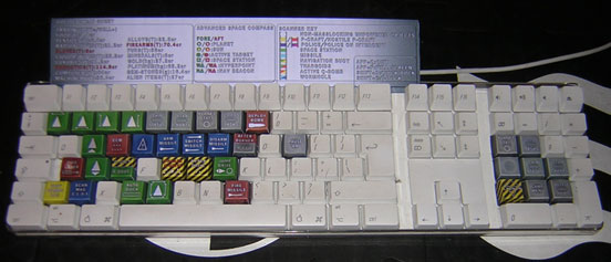
A series of suggestions from a new player.
Posted: Sun Dec 06, 2009 5:27 am
Well, greetings, Oolite community! I recently found Oolite looking for a good, free space combat trading game I could play on Linux (pining for some Flatspace, actually, but alas, it's Windows only). I've been having a lot of fun (despite my failure as yet to even upgrade any of my weapons or ship parts), but I, as is to be expected with any game, have some suggestions to make it better. For me, anyway.
One: Remove that autopackager stuff
I really don't like it when I download a game, and I end up having to adapt to a new installer program, or the game doesn't give me control of where it goes. I have a particular setup, and the autopackage creature that Oolite is packaged with only managed to make Oolite the only game on my computer which breaks form and isn't in the same directory as all my other games.
It would be far better for the game to be released as a simple .tar.gz or .zip than as an autopackager package thing. They're standard, they're simple, and everyone knows how to use them.
Two: Randomly generated galaxies
This is actually something I liked in particular about Flatspace. It generated the world from a seed (as Oolite does), but also allowed the player to specify their own seed from which to generate the play area. Such a feature for Oolite (even if it was only one galaxy, and not multiple, like we have currently) would be very nice, since I really like knowing that my game setting isn't the same as the last one I played, or even the one before that. A brief chat on IRC brought to my attention some hurdles, such as making sure that all sectors were reachable, and making sure that no sectors were in the same spot, and making sure that no sectors had... ahem... objectionable names, but each of these seems like a moderately easy obstacle to overcome.
Three: Some interface improvements
One thing I noted almost immediately upon entering the game was HOW IN THE FLARGBAMMIT DO I GET OUT OF THIS SCREEN. Of course, I guess it was totally my fault that I had no idea of any of the controls, seeing how I hadn't read a single readme or control reference, but the fact that navigating the station menu isn't naturally understandable is a bit of a flaw in the game's interface. I think a good (and easy, I suspect) way to avoid this problem would be to add some intuitive buttons to the top (or bottom, wherever) of the station screen. "Undock" "Market" "Job boards" et cetera. (As a corollary to this, I think a more unifying "Game Menu" should be implemented, such that pressing, say, Escape will bring up the standard Pause -> F2 menu, and that the F2 menu should be removed from the station menu.)
As a sort of sidenote, the mouse's double click seems very unresponsive, such that sometimes when I successfully double-click, I don't think I managed it, and try again, only to be greeted by the menu before I finish the new double-click.
End suggestions! Discussion goes down there! VVVVVVV

