I like the colours - and the blend - I like the new ratio - I like the text inside and outside the logo - as others have said - inside - badge-like (as if somebody was wearing it - and it's self contained) - outside - like the letterhead on an official document - therefore no reason not to have both.
Not sure about the "winged head" - the face is a little too "love heart" shaped for my liking.
I like the font - not to worried about it's lack of "squareness"!
Well done for making the sensible leap to vectorisation!
Wheel Reinvention - The Oolite Icon
Moderators: another_commander, winston
-
DaddyHoggy
- Intergalactic Spam Assassin

- Posts: 8501
- Joined: Tue Dec 05, 2006 9:43 pm
- Location: Newbury, UK
- Contact:
Oolite Life is now revealed hereSelezen wrote:Apparently I was having a DaddyHoggy moment.
-
KZ9999

- Deadly

- Posts: 225
- Joined: Fri Jan 23, 2009 8:55 pm
- Location: Lost in Witchspace being hunted by a Thargoid Swam.
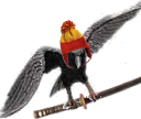
Wheel Reinvention version C
I just had to post these before I hit the sack. What can I say, I'm on a bit of a artistic bent at the moment.1>  Looking at what been said before here a few more twists on the basic shape and my issues with the square typeface.
Version C.01: Recreation of the current design with the text set in the main bar.

While you can get away with it on a 64x64 icon as soon as you go above that, there is problems with the type. (These examples are all over 200 pixels in each directions.) The original Elite logo works because the weight of each letter match on the opposite number each side of the centre I. When you try to replicate that effect in a square type, single stroke letters like O and S visually become thinner than heavier multiple stroke letters like E and M. This is why most typefaces have noticeable width differences for each stroke weight. That's why the O look lighter than the E in the above example.
Version C.02: Widening the body and tail of the starbird.

I tried stretching the width of the lower bars in larger steps. The visual result is closer to the both Oolite and Elite originals. A nice side effect is that the space gives me room to the spread the wings more which means that the head can lose the helm and not be overpowered by the wings.
Version C.03: Serif typeface embedded in body of the starbird.

The starbird is looking good, but the serif type looks overpowered.
Version C:04: A SF style square typeface embedded in the body of the starbird.

I realised that I could have the letters really square. Oolite is set in the future after all, and what says the future than a mono-block typeface. The weight of the type looks clean at all sizes and set in a mount doesn't look heavy on the starbird. 2>
Version C.05: The design redone with the SF type set below.

Like DaddyHogg suggest, the logo done as a letter head with the name set below and the badge bar removed. The type is the same width as the wings but visually appears smaller so the logo looks like it's taking flight.
Here's an interesting side note. People have said that they prefer a wide version over the tall ones. Version C.02 to C.05 now match the visual width of the originals but they are almost square, 87mm wide by 82mm tall on my Inkscape page. 3>
I can up colour look of the logos. Inkscape has a bunch of image filters that I'm dying to try out. May a glossy blue metal effect, or space chilled steel. he-he-he....
I may also be able to do the mono-block typeface of C.04 and C.05 as a proper truetype font set. I'll have to do some reading of the legal fine print of font design program I've got access to see if I can do it as a Creative Commons release.
I'll say sorry to you Ahruman. I had not planned for this thing to make you announce the Logo Design Contest ahead of schedule. (Not that I had any knowledge about it.) I started this because of my annoyance about the current icon. My goal was to try and match the current one as close as possible, but it just kind of snowballed. <said with a rueful grin.>
As before, please insert ideas below....
1> The manual has hit a bit of bump as I'm trying to figure out a funky way to cover the trading stuff. Maybe an idiot's guide to trading/carrier markets, or a transcript of one of those Power Selling Course info-mercial?
2> You know DaddyHogg, the badge ideal isn't that silly. I've done little bit of plastic casting and the logo design is do-able. I believe I could convert the design into a cad/cam model that could be mass cast. Maybe something to set on the back burner a post 1.73 future.
3> I can't help but recommend the current snapshot version of Inscape 0.47. The improvements over the stable 0.46 is like going from a pulse to beam laser. <grin>.
Version C.01: Recreation of the current design with the text set in the main bar.
While you can get away with it on a 64x64 icon as soon as you go above that, there is problems with the type. (These examples are all over 200 pixels in each directions.) The original Elite logo works because the weight of each letter match on the opposite number each side of the centre I. When you try to replicate that effect in a square type, single stroke letters like O and S visually become thinner than heavier multiple stroke letters like E and M. This is why most typefaces have noticeable width differences for each stroke weight. That's why the O look lighter than the E in the above example.
Version C.02: Widening the body and tail of the starbird.
I tried stretching the width of the lower bars in larger steps. The visual result is closer to the both Oolite and Elite originals. A nice side effect is that the space gives me room to the spread the wings more which means that the head can lose the helm and not be overpowered by the wings.
Version C.03: Serif typeface embedded in body of the starbird.
The starbird is looking good, but the serif type looks overpowered.
Version C:04: A SF style square typeface embedded in the body of the starbird.
I realised that I could have the letters really square. Oolite is set in the future after all, and what says the future than a mono-block typeface. The weight of the type looks clean at all sizes and set in a mount doesn't look heavy on the starbird. 2>
Version C.05: The design redone with the SF type set below.
Like DaddyHogg suggest, the logo done as a letter head with the name set below and the badge bar removed. The type is the same width as the wings but visually appears smaller so the logo looks like it's taking flight.
Here's an interesting side note. People have said that they prefer a wide version over the tall ones. Version C.02 to C.05 now match the visual width of the originals but they are almost square, 87mm wide by 82mm tall on my Inkscape page. 3>
I can up colour look of the logos. Inkscape has a bunch of image filters that I'm dying to try out. May a glossy blue metal effect, or space chilled steel.
I may also be able to do the mono-block typeface of C.04 and C.05 as a proper truetype font set. I'll have to do some reading of the legal fine print of font design program I've got access to see if I can do it as a Creative Commons release.
I'll say sorry to you Ahruman. I had not planned for this thing to make you announce the Logo Design Contest ahead of schedule. (Not that I had any knowledge about it.) I started this because of my annoyance about the current icon. My goal was to try and match the current one as close as possible, but it just kind of snowballed. <said with a rueful grin.>
As before, please insert ideas below....
1> The manual has hit a bit of bump as I'm trying to figure out a funky way to cover the trading stuff. Maybe an idiot's guide to trading/carrier markets, or a transcript of one of those Power Selling Course info-mercial?
2> You know DaddyHogg, the badge ideal isn't that silly. I've done little bit of plastic casting and the logo design is do-able. I believe I could convert the design into a cad/cam model that could be mass cast. Maybe something to set on the back burner a post 1.73 future.
3> I can't help but recommend the current snapshot version of Inscape 0.47. The improvements over the stable 0.46 is like going from a pulse to beam laser. <grin>.
KZ999's Oolite documents, including the new draft Oolite Game Manual, can be found at www.box.net
-
ClymAngus

- ---- E L I T E ----

- Posts: 2508
- Joined: Tue Jul 08, 2008 12:31 am
- Location: London England
- Contact:
Re: Wheel Reinvention version C
That logo design is f*****g ninja:
The way the font fits the the logo in this one is great!
Might it be possible to try a fourth scale down of your original font with added spacing between the letters?
For that I would just straight give you the prize. (not that I can but I would if I could). I know I'm being a bit critical here, but really I see (with the angular shield you created for the text) as something that's almost legendary. You have a great eye for what works. What do you think?
Credit where credit it due. Stunning work sir, much better than I could do.
I can't wait to slap something like this on the maps!
-
DaddyHoggy
- Intergalactic Spam Assassin
- Posts: 8501
- Joined: Tue Dec 05, 2006 9:43 pm
- Location: Newbury, UK
- Contact:
at the time of writing 15:13 BST 10th July 2009 - I see mostly broken link icons and not images!

Thanks for the credit for the badge idea - but I don't think I thought of it first!
Thanks for the credit for the badge idea - but I don't think I thought of it first!
Oolite Life is now revealed hereSelezen wrote:Apparently I was having a DaddyHoggy moment.
-
KZ9999
- Deadly
- Posts: 225
- Joined: Fri Jan 23, 2009 8:55 pm
- Location: Lost in Witchspace being hunted by a Thargoid Swam.
Here's something to hold you for now.
Geez, I'm going to get a swelled head with all the support (well a head fatter than I've already got. <smirk>)
ClymAngus Since you need something to slap into your most excellent maps I finished remaking the Current Logo in vector format.

While it's not a perfect match, it's close enough to get away with for now. The colours are ink-dropper from the original PNG and have matched the gradents as close as I can. I hope this is useful. 1>
Also recreated in a letterhead look, for use in sub 2x2cm size image.

I have put both Scalable Vector Graphics and Encapsulated Postscript version of the two above images in this zip file along with the original Inscape enhanced SVG file and a reference PNG.
If there is anything still wrong with the image, post or PM so I can fix it. I'll leave posting any new logo ideas till Ahruman puts the post up for the New Logo Contest, and I will stick them there.
Other thoughts:
1> May I say that the effort you have put into mapping the Ooniverse seriously impresses me. Be warned for I'll be stealing them for the game manual, but with your authorisation of course.<grin>
ClymAngus Since you need something to slap into your most excellent maps I finished remaking the Current Logo in vector format.
While it's not a perfect match, it's close enough to get away with for now. The colours are ink-dropper from the original PNG and have matched the gradents as close as I can. I hope this is useful. 1>
Also recreated in a letterhead look, for use in sub 2x2cm size image.
I have put both Scalable Vector Graphics and Encapsulated Postscript version of the two above images in this zip file along with the original Inscape enhanced SVG file and a reference PNG.
If there is anything still wrong with the image, post or PM so I can fix it. I'll leave posting any new logo ideas till Ahruman puts the post up for the New Logo Contest, and I will stick them there.
Other thoughts:
- If we were to adopt the mono-block I used in version C.04, I can actually make a full TrueType font out of it for our use. The program I'm using has the requirements that all fonts generated by it can only ever be a full Creative Commons - BY - SA - NC licence. Spacing out the font will not be an issue either.
I'll have a juggle with the breast-shield-text idea over the weekend and see what I come up with.
Oh and sorry about the broken images DaddyHoggy. TerraStorage seems to have fallen off the face of the internet for me so I'm having to use a 'free' image hosting site for the pictures. It mighty be a bit more flaky and this is the first time I've used it. if the issues still persist, PM me and I'll find an alternative host for the images I've posted.
1> May I say that the effort you have put into mapping the Ooniverse seriously impresses me. Be warned for I'll be stealing them for the game manual, but with your authorisation of course.<grin>
KZ999's Oolite documents, including the new draft Oolite Game Manual, can be found at www.box.net

-
DaddyHoggy
- Intergalactic Spam Assassin
- Posts: 8501
- Joined: Tue Dec 05, 2006 9:43 pm
- Location: Newbury, UK
- Contact:
Now I can see it C.04 is very cool!
Oolite Life is now revealed hereSelezen wrote:Apparently I was having a DaddyHoggy moment.
-
KZ9999
- Deadly
- Posts: 225
- Joined: Fri Jan 23, 2009 8:55 pm
- Location: Lost in Witchspace being hunted by a Thargoid Swam.
As promised, a few more play-around with the Logo.
Version D.01: Starbird with a round mount with the serif font.

Version D.02 & 0.3: Starbird with two members names in the modified mono-block font.


Since everyone loved the idea of the logo as an actual name badge, I thought i would give it a go to see how it looks.
So far the c.04 version seems to be the popular choice so far...
Remember I've also uploaded my vector recreation of the current logo to inspire you in the up-coming compo'. (See previous post.)
Version D.01: Starbird with a round mount with the serif font.
Version D.02 & 0.3: Starbird with two members names in the modified mono-block font.
Since everyone loved the idea of the logo as an actual name badge, I thought i would give it a go to see how it looks.
So far the c.04 version seems to be the popular choice so far...
Remember I've also uploaded my vector recreation of the current logo to inspire you in the up-coming compo'. (See previous post.)
KZ999's Oolite documents, including the new draft Oolite Game Manual, can be found at www.box.net


-
KZ9999
- Deadly
- Posts: 225
- Joined: Fri Jan 23, 2009 8:55 pm
- Location: Lost in Witchspace being hunted by a Thargoid Swam.
Seeking an escape from the issues I'm having in writing about the mechanics of trade in the Ooniverise I've done a bit more playing around with the design to come up with this...

I don't know about you, but I think that this is one choice little starbird. With just bit more fine turning it should be spot on.
And in answer to the in the last few posts.
ramon: The version of the starbird with the names on are just a play-around on the idea. They are more of sketches than final products, just showing what can be done with the idea.
Nemoricus: These designs are test of the shape, I will worry about the colouring once the look is finalised. (see page 1 of this thread for more details.) If you have any suggestions for colours, feel free to add a post or pm me.
tomsk: Strangely enough, that thought had occurred to me today. A series of rank badges for each of the combat ranks, with merit pips for every 256 kills. 1>
So stick any other comments or ideas below...
1> You earn a total of 25 Right on commander! from the Guild of the Elite (Guild of the Oolite?) as you climb from Harmless to Elite
KZ999's Oolite documents, including the new draft Oolite Game Manual, can be found at www.box.net
-
ClymAngus
- ---- E L I T E ----
- Posts: 2508
- Joined: Tue Jul 08, 2008 12:31 am
- Location: London England
- Contact:
Re: Here's something to hold you for now.
Hmm, I'm getting an empty file when ever I try and down load this and unzip it. Any chance you could check it's integrity and re-upload if it's corrupted?KZ9999 wrote:I have put both Scalable Vector Graphics and Encapsulated Postscript version of the two above images in this zip file along with the original Inscape enhanced SVG file and a reference PNG.
-
KZ9999
- Deadly
- Posts: 225
- Joined: Fri Jan 23, 2009 8:55 pm
- Location: Lost in Witchspace being hunted by a Thargoid Swam.
Re: Here's something to hold you for now.
Why yes it was.ClymAngus wrote:Hmm, I'm getting an empty file when ever I try and down load this and unzip it. Any chance you could check it's integrity and re-upload if it's corrupted?KZ9999 wrote:I have put both Scalable Vector Graphics and Encapsulated Postscript version of the two above images in this zip file along with the original Inscape enhanced SVG file and a reference PNG.
KZ999's Oolite documents, including the new draft Oolite Game Manual, can be found at www.box.net