Page 1 of 2
New HUD Design
Posted: Wed Jun 25, 2008 12:54 pm
by Gunney_Plym
Hi all,
Many moons ago I was a keen player of Elite (on the BBC-B

and Electron

) and then Frontier (on the PC) but found that version strangely unsatisfying. After a long period on other games (try out the I-War series). I bumped into Oolite a week or so ago. Proper Elite

After a poke around the Wiki I uncovered these OXP things and decided to try one of my own, starting with the easy option of a new HUD.
The G-HUD (cheesey I know, but it was all I could come up with at the time

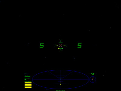
) is more combat centric, to my mind, with all the important stuff toward the center of the viewscreen.
Shields are above the gunsight, Speed to it's right and Laser Temperature to it's left. Either side of this are the Status indicators and further out the Station Space Indicators. Below the gunsight is the Missile Display. The Scanner is somewhat larger than the default with Fuel, Altitude, Cabin Temperature, and Energy Gauges to it's left. The compass, with integrated Pitch and Roll, and the Fuel Scoop displays to it's right.
Some ideas were borrowed from the Klepto and MilSpec HUD's so kudos to their respective designers.
Take a look and feel free to comment.
A screenshot and link to the OXP are at the bottom of the HUD Images page in the Wiki (I'd post a link but as a n00b I'm not allowed to

). If I've FUBAR'ed and shouldn't be changing Wiki pages, or if you'd like to comment then drop me a line.
Posted: Wed Jun 25, 2008 1:25 pm
by Commander Mysenses
Good move... I bin meanin to muss about with the KleptoHUD fer a while now... save be a job.
Will check it out later.
Posted: Wed Jun 25, 2008 1:32 pm
by TGHC
Great first post Gunney, and welcome to the boards.
Posted: Wed Jun 25, 2008 1:37 pm
by Cmdr. Maegil
Hi, Gunney_Plym, welcome to the Friendliest Board This Side of Riedquat!
Here's your HUD

I found it a bit too cluttered on the middle, precisely in the area where you want to keep the enemies, but congratulations anyway: it's not everybody that puts up their first post on the board to announce an OXP

Posted: Wed Jun 25, 2008 9:34 pm
by DaddyHoggy
@G_P - first posting and an OXP - bravo!
Welcome.
Posted: Wed Jun 25, 2008 10:40 pm
by pagroove
Welcome and a nice addition !

Posted: Thu Jun 26, 2008 7:15 am
by Gunney_Plym
Thanks for the welcome everybody, gives me a warm fuzzy feeling

.
Ping : Cmdr. Maegil
After playing with my HUD (doesn't make you go blind!

) I think I agree. I'll put a Mk2 up there with some of the information displays out side of the crosshairs. Watch this space.
PS Are there any good guides to creating more involved OXP's out there ?
Posted: Thu Jun 26, 2008 9:11 am
by Commander Mysenses
Have you taken the file down already?... just get invalid/corrupted errror on it now.
I was hoping to have a lil tinker.

Posted: Thu Jun 26, 2008 9:59 am
by TGHC
Gunney_Plym wrote:
PS Are there any good guides to creating more involved OXP's out there ?
The resident experts on this board will be able to give you excellent guidance, you can look at some of the simpler ones and see how they work, and the
Wiki has a lot of info too, but you've probably looked at that already.
Posted: Thu Jun 26, 2008 11:40 am
by Gunney_Plym
Ping : Commander Mysenses
Don't know what happened there, the link also sent me somewhere completely , as they say, different

. I've updated the link.
Get it direct from '
http://wiki.alioth.net/index.php/Image:G-HUD.oxp.zip' (I can't post links yet

).
Posted: Thu Jun 26, 2008 12:08 pm
by DaddyHoggy
@G_P to enter a link to somewhere else in the forum just use the URL tabs
i.e. [ url ]http://a_a_link_to_somewhere.com/somewhere[ /url ]
Note I've put space in the between the "[]" and the text "url" and "/url" lest it would turn into a hyperlink and you wouldn't see what I was trying to show you.
HTH
DH
Posted: Thu Jun 26, 2008 4:33 pm
by Eric Walch
Hello G_P,
Gunney_Plym wrote:PS Are there any good guides to creating more involved OXP's out there ?
Probably you discovered it alredy, but a good startingpoint for OXP creation in the wiki is:
http://wiki.alioth.net/index.php/OXP_howto
Most of the oxp structure is explained there but not the HUD. It is still waiting for documentation. But on your work I see not everybody needs that.
Posted: Thu Jun 26, 2008 8:20 pm
by Gunney_Plym
Thanks for the pointers guys. I spent a little time playing with Wings3D today, something tells me it make be a while before a new ship is uploaded by me

.
Ping : DaddyHoggy
Ta muchness but I'd found how to post the links, however the forum won't let me include them in a post until I've done 5 posts.
This makes 4

Gunney.
Updated to Mk 2
Posted: Tue Jul 08, 2008 1:47 pm
by Gunney_Plym
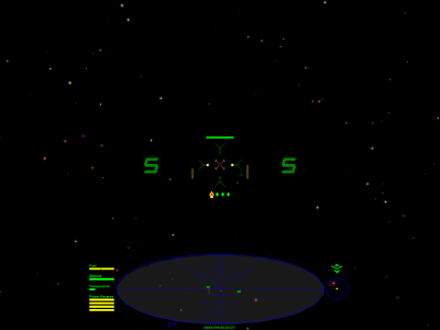
With thanks to Cmdr. Maegil for suggestions this has now been updated to Mk2.
Shield, Speed, Weapon Temp. and Missile Display moved outside of the space used by the Scanner Targeting Enhancement. In addition the Main Scanner now has a background to it for extra clarity.
Posted: Tue Jul 08, 2008 1:50 pm
by Gunney_Plym
I suppose it may help to also post a link
 Like this one
And a screen shot

 and Electron
  ) and then Frontier (on the PC) but found that version strangely unsatisfying. After a long period on other games (try out the I-War series). I bumped into Oolite a week or so ago. Proper Elite
 ) is more combat centric, to my mind, with all the important stuff toward the center of the viewscreen.
  ). If I've FUBAR'ed and shouldn't be changing Wiki pages, or if you'd like to comment then drop me a line.
