New splash screen and icon

General discussion for players of Oolite.

Moderators: another_commander, winston
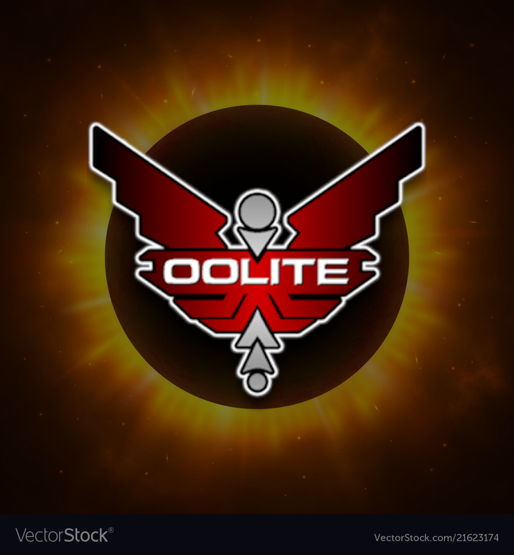
Thoughts on the new icon/splash screen

I like it!
6
46%
Mixed feelings.
3
23%
I don't like it.
2
15%
I think it needs something...
2
15%
 
Total votes: 13

User avatar
Redspear
---- E L I T E ----
---- E L I T E ----
Posts: 2639
Joined: Thu Jun 20, 2013 10:22 pm

Re: New splash screen and icon

Post by Redspear »

Consider the following a rough mockup, not optimised, not agonised over. just patched up...

(source of original royalty free background image included at base).

Image

Printed far too large of course (apologies) but how does one shrink post link, so to speak?
User avatar
phkb
Impressively Grand Sub-Admiral
Posts: 4646
Joined: Tue Jan 21, 2014 10:37 pm
Location: Writing more OXPs, because the world needs more OXPs.

Re: New splash screen and icon

Post by phkb »

I was thinking something along those lines, but using in game assets instead.
User avatar
hiran
Theorethicist
Posts: 2056
Joined: Fri Mar 26, 2021 1:39 pm
Location: a parallel world I created for myself. Some call it a singularity...

Re: New splash screen and icon

Post by hiran »

phkb wrote: Sat Oct 28, 2023 9:22 pm
hiran wrote: Sat Oct 28, 2023 12:51 pm
When looking at OoliteStarter now the question would be whether I go for an orange icon or for a splashscreen that better matches the new logo..
It's a pretty good splash screen, without changing anything. I probably wouldn't go with an orange variant on the logo, as the image has a predominance of orange already.

I just did a quick look at putting the red logo on the existing image, and I have to say I think the red logo adds to the drama. I'd probably recommend doing that, and keeping it simple!
Thank you for taking a look.
I updated the splash screen for future versions.
Sunshine - Moonlight - Good Times - Oolite
another_commander
Quite Grand Sub-Admiral
Posts: 6552
Joined: Wed Feb 28, 2007 7:54 am

Re: New splash screen and icon

Post by another_commander »

For fun, I asked Copilot (the new AI thing bot installed with MS Edge) to create its own version of the Oolite logo. The prompt it worked with was:
"create a logo based on the existing Oolite game logo, but make it predominantly red. The new logo should be viewed reasonably clearly up to resolutions of 16x16 for use in icons,"
And it came up with this:
Image

Not too bad (I guess), although it's got plenty of "artistic license" in there... I get Star Trek vibes too if I stare at it for a while.
Good boy, Copilot. Here is a cookie.
User avatar
Redspear
---- E L I T E ----
---- E L I T E ----
Posts: 2639
Joined: Thu Jun 20, 2013 10:22 pm

Re: New splash screen and icon

Post by Redspear »

another_commander wrote: Sun Nov 05, 2023 3:24 pm
Good boy, Copilot. Here is a cookie.
Not bad...

phkb wrote: Fri Nov 03, 2023 3:28 am
I was thinking something along those lines, but using in game assets instead.
Besides an in-game eclipse or a ringed planet, what about the nav buoy? It's unique to oolite, an intriquing shape yet a simple outline... Just a thought.
User avatar
phkb
Impressively Grand Sub-Admiral
Posts: 4646
Joined: Tue Jan 21, 2014 10:37 pm
Location: Writing more OXPs, because the world needs more OXPs.

Re: New splash screen and icon

Post by phkb »

Here's my first pass at this:
Image

Or maybe this:
Image
User avatar
phkb
Impressively Grand Sub-Admiral
Posts: 4646
Joined: Tue Jan 21, 2014 10:37 pm
Location: Writing more OXPs, because the world needs more OXPs.

Re: New splash screen and icon

Post by phkb »

Another attempt:
Image
arquebus
---- E L I T E ----
---- E L I T E ----
Posts: 512
Joined: Sun Oct 31, 2021 6:07 am
Contact:

Re: New splash screen and icon

Post by arquebus »

I'm in love with those last three! Especially the one with the three ships.
Here is my YouTube channel, where I play poorly: Arquebus X
User avatar
Redspear
---- E L I T E ----
---- E L I T E ----
Posts: 2639
Joined: Thu Jun 20, 2013 10:22 pm

Re: New splash screen and icon

Post by Redspear »

arquebus wrote: Thu Nov 09, 2023 3:23 am
I'm in love with those last three! Especially the one with the three ships.
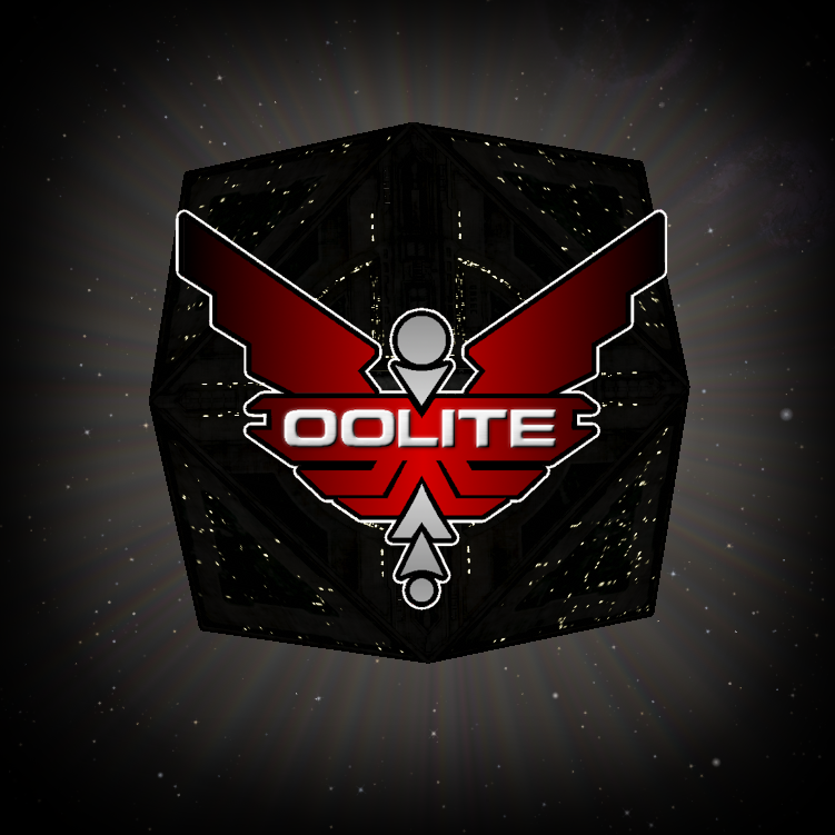
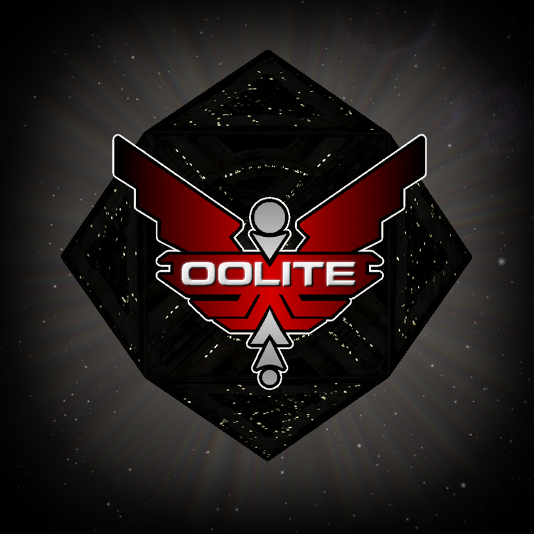
That's the one I like the least :lol:

First one is good though. Reason being that it's clearest what it is (that's the angle that you'd typically line up to dock), the shadows don't interfere with that clarity (unlike with the ships) and it's simple. That combination makes it the most iconic of the three, to my mind at least.
arquebus
---- E L I T E ----
---- E L I T E ----
Posts: 512
Joined: Sun Oct 31, 2021 6:07 am
Contact:

Re: New splash screen and icon

Post by arquebus »

I don't like the first two as much mainly because there's not enough definition in the station. If you don't know what it is already, you won't know what it is. I think it would work better if the light were hitting it more from the front.
Here is my YouTube channel, where I play poorly: Arquebus X
User avatar
cbr
---- E L I T E ----
---- E L I T E ----
Posts: 1390
Joined: Thu Aug 27, 2015 4:24 pm

Re: New splash screen and icon

Post by cbr »

Image
User avatar
0b1
Above Average
Above Average
Posts: 22
Joined: Thu Mar 09, 2023 3:14 pm

Re: New splash screen and icon

Post by 0b1 »

All fanstastic work! I wish I had something that spectacular for Obelite (the WebGPU Port)
User avatar
Killer Wolf
---- E L I T E ----
---- E L I T E ----
Posts: 2269
Joined: Tue Jan 02, 2007 12:38 pm

Re: New splash screen and icon

Post by Killer Wolf »

i kinds think it might look good if the logo was painted on the space station.
User avatar
seventh
Dangerous
Dangerous
Posts: 82
Joined: Sun Nov 15, 2009 5:29 pm
Location: Moscow, Russia
Contact:

Re: New splash screen and icon

Post by seventh »

Image
Image
Last edited by seventh on Tue Dec 05, 2023 8:42 pm, edited 1 time in total.
Post Reply