(Release) Vimana-X HUD
Moderators: another_commander, winston
-
phkb

- Impressively Grand Sub-Admiral

- Posts: 4655
- Joined: Tue Jan 21, 2014 10:37 pm
- Location: Writing more OXPs, because the world needs more OXPs.
Re: (Release) Vimana-X HUD
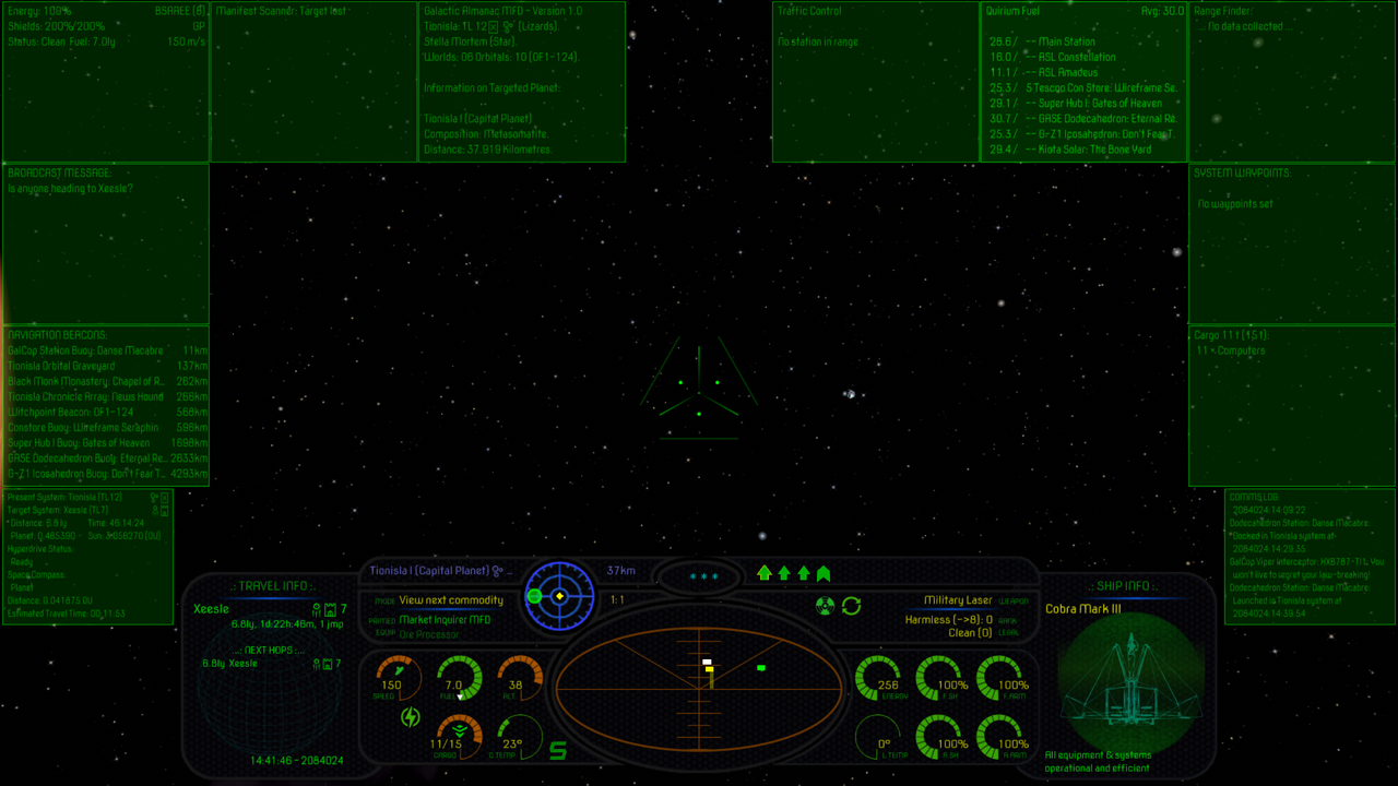
Version 1.3 is out now. Added some more ship images. There's about 450-odd thumbnails for lots of different ships and other items, so with any luck you should always get something in the target module.

Re: (Release) Vimana-X HUD
Kudos for being so thorough with the wireframe images, that's no small undertaking.
It's the true wireframes rather than the elite-syle 'selective' wireframes but in many cases it works better than I'd have expected.
Well done and thanks for another great oxp
It's the true wireframes rather than the elite-syle 'selective' wireframes but in many cases it works better than I'd have expected.
Well done and thanks for another great oxp
-
phkb
- Impressively Grand Sub-Admiral
- Posts: 4655
- Joined: Tue Jan 21, 2014 10:37 pm
- Location: Writing more OXPs, because the world needs more OXPs.
Re: (Release) Vimana-X HUD
Looking for opinions for those who might be using the Vimana-X:
Was a little tired of the blue MFD's, and the colour didn't really match the rest of the UI text elements (which are mostly in green).
What do you think?
Was a little tired of the blue MFD's, and the colour didn't really match the rest of the UI text elements (which are mostly in green).
What do you think?
Re: (Release) Vimana-X HUD
i find it a little easier to read too...
Been giving this a try and was reminded of the main reason I stopped using the original.
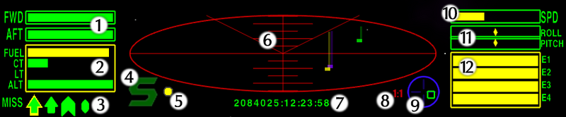
The dials look awesome to me but in some cases they're not as readable as the original bars. I also find that the dials work better with ascending rather than descending scales.
- Take energy for example
- the dial is smaller than the bars on a typical HUD
- the spiral design means that the smallest segments are the ones that are most important as energy decreases
There are some tweaks I have in mind for my personal use but here's a simple one that could be implemented for altitude.
(Feel free to ignore or critique obviously...)
Change 'altitude' to 'proximity' - we now have an ascending scale with increasing visibilty corresponding to increasing danger.
Change 'blank' segments to green and have them change to red upon approach - intuitive sense that green = safe and red = danger, segments sequentuially changing from green to red is more noticeable than changing from blank to red (esp, if planet surface is red!)
-
Cholmondely

- Archivist

- Posts: 5006
- Joined: Tue Jul 07, 2020 11:00 am
- Location: The Delightful Domains of His Most Britannic Majesty (industrial? agricultural? mainly anything?)
- Contact:
Re: (Release) Vimana-X HUD
Frankly, I'm more interested in the contents of my MFDs than their colours. So tweak away!
Comments wanted:
•Missing OXPs? What do you think is missing?
•Lore: The economics of ship building How many built for Aronar?
•Lore: The Space Traders Flight Training Manual: Cowell & MgRath Do you agree with Redspear?
•Missing OXPs? What do you think is missing?
•Lore: The economics of ship building How many built for Aronar?
•Lore: The Space Traders Flight Training Manual: Cowell & MgRath Do you agree with Redspear?
-
phkb
- Impressively Grand Sub-Admiral
- Posts: 4655
- Joined: Tue Jan 21, 2014 10:37 pm
- Location: Writing more OXPs, because the world needs more OXPs.
Re: (Release) Vimana-X HUD
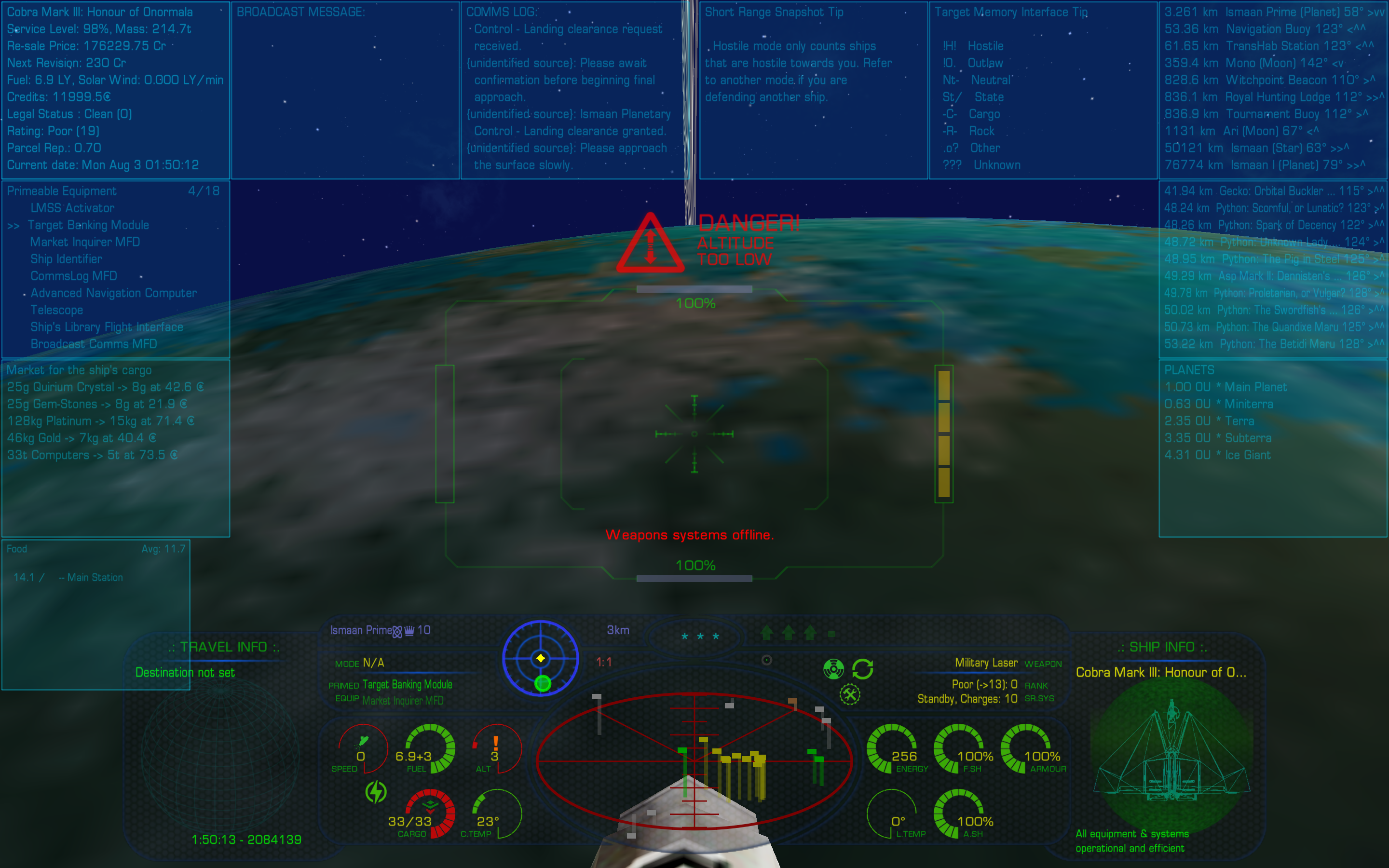
Although, to be fair, the default HUD operates in the same way, except as bars, rather than a circular gauge. So the issue is not about the method (ie some sort of image that is reducing in size), but more its size or prominence, I guess. And I suspect most of those concerns are minimised as you become familiar with the HUD, which is true for all the HUDs actually. I mean, in a plane, the altimeter is just a dial with hands. It doesn't flash or go red or do anything when you're too low. You just train yourself to look at it and respond to the information. And I know that I've been caught out in Oolite when I have to use the default HUD, and not notice the energy bars disappearing because I'm looking at the wrong thing.
I did put a prominent red exclamation mark in the dials where there is an issue, to draw your attention to it. And by default there are also big warning indicators that appear above the reticle in flashing red letters, when energy is low, or your altitude, or your shields, and so on. So maybe that helps.
I'm having a look at the proximity style gauge and will see how it goes.
Re: (Release) Vimana-X HUD
I think you've turned an already very good oxp into an even better one and further that your work in including so many wireframes borders on the heroic. With that said, I can't say that I fully agree with you here:
So yes, size and prominence are important (I personally plan for the energy dial to be larger for example) but tapering the gauge at the 'wrong end' (YMMV) is, IMHO, sub-optimal design.
Much of this is largely a matter of personal preference of course, so I'm just presenting the case for the way I see it, I make no claim to be see it more clearly, rather to see another side that I think might be worth considering.
Meanwhile, congrats and thanks on another great contribution to oolite.
The bars in the default HUD do not taper at one end. Ths is important because if the last segment that you need to read is also the smallest then the most important part of the dial/bar/whatever is also the least readable. Consider that the smallest segment on the dial is less than half the size of the largest.
So yes, size and prominence are important (I personally plan for the energy dial to be larger for example) but tapering the gauge at the 'wrong end' (YMMV) is, IMHO, sub-optimal design.
As for the altimeter comparison, I don't know how big your monitor is but a real life altimeter would a lot bigger in my field of view than any design I've ever seen on an oolite HUD (at least on my monitor anyway). TBH, I think the biggest issue is the energy gauge for the reason that it's most relevant when the player is most distracted, i.e. during combat, so visibilty really counts.phkb wrote: ↑Tue Aug 22, 2023 8:17 amAnd I suspect most of those concerns are minimised as you become familiar with the HUD, which is true for all the HUDs actually. I mean, in a plane, the altimeter is just a dial with hands. It doesn't flash or go red or do anything when you're too low. You just train yourself to look at it and respond to the information.
Much of this is largely a matter of personal preference of course, so I'm just presenting the case for the way I see it, I make no claim to be see it more clearly, rather to see another side that I think might be worth considering.
Meanwhile, congrats and thanks on another great contribution to oolite.
-
Cholmondely
- Archivist
- Posts: 5006
- Joined: Tue Jul 07, 2020 11:00 am
- Location: The Delightful Domains of His Most Britannic Majesty (industrial? agricultural? mainly anything?)
- Contact:
Re: (Release) Vimana-X HUD
Don't you also get a numerical readout from your Vimana as you get within 10km or so of the planet surface?Redspear wrote: ↑Tue Aug 22, 2023 9:02 pmI think you've turned an already very good oxp into an even better one and further that your work in including so many wireframes borders on the heroic. With that said, I can't say that I fully agree with you here:
The bars in the default HUD do not taper at one end. Ths is important because if the last segment that you need to read is also the smallest then the most important part of the dial/bar/whatever is also the least readable. Consider that the smallest segment on the dial is less than half the size of the largest.
So yes, size and prominence are important (I personally plan for the energy dial to be larger for example) but tapering the gauge at the 'wrong end' (YMMV) is, IMHO, sub-optimal design.
As for the altimeter comparison, I don't know how big your monitor is but a real life altimeter would a lot bigger in my field of view than any design I've ever seen on an oolite HUD (at least on my monitor anyway). TBH, I think the biggest issue is the energy gauge for the reason that it's most relevant when the player is most distracted, i.e. during combat, so visibilty really counts.phkb wrote: ↑Tue Aug 22, 2023 8:17 amAnd I suspect most of those concerns are minimised as you become familiar with the HUD, which is true for all the HUDs actually. I mean, in a plane, the altimeter is just a dial with hands. It doesn't flash or go red or do anything when you're too low. You just train yourself to look at it and respond to the information.
Much of this is largely a matter of personal preference of course, so I'm just presenting the case for the way I see it, I make no claim to be see it more clearly, rather to see another side that I think might be worth considering.
Meanwhile, congrats and thanks on another great contribution to oolite.
Comments wanted:
•Missing OXPs? What do you think is missing?
•Lore: The economics of ship building How many built for Aronar?
•Lore: The Space Traders Flight Training Manual: Cowell & MgRath Do you agree with Redspear?
•Missing OXPs? What do you think is missing?
•Lore: The economics of ship building How many built for Aronar?
•Lore: The Space Traders Flight Training Manual: Cowell & MgRath Do you agree with Redspear?
Re: (Release) Vimana-X HUD
Whilst I appreciate that, we were discussing the dials themselves. The dials don't disappaear at low altitude (do they???) and so if they are there then wouldn't it be nice if they were as readable as possible without compromising other important information?Cholmondely wrote: ↑Tue Aug 22, 2023 10:22 pmDon't you also get a numerical readout from your Vimana as you get within 10km or so of the planet surface?
-
Cholmondely
- Archivist
- Posts: 5006
- Joined: Tue Jul 07, 2020 11:00 am
- Location: The Delightful Domains of His Most Britannic Majesty (industrial? agricultural? mainly anything?)
- Contact:
Re: (Release) Vimana-X HUD
But the number appears inside the dial -Redspear wrote: ↑Wed Aug 23, 2023 7:57 pmWhilst I appreciate that, we were discussing the dials themselves. The dials don't disappear at low altitude (do they???) and so if they are there then wouldn't it be nice if they were as readable as possible without compromising other important information?Cholmondely wrote: ↑Tue Aug 22, 2023 10:22 pmDon't you also get a numerical readout from your Vimana as you get within 10km or so of the planet surface?
and below 1km ALT (altitude) you get fractions to 3 decimal places...
Comments wanted:
•Missing OXPs? What do you think is missing?
•Lore: The economics of ship building How many built for Aronar?
•Lore: The Space Traders Flight Training Manual: Cowell & MgRath Do you agree with Redspear?
•Missing OXPs? What do you think is missing?
•Lore: The economics of ship building How many built for Aronar?
•Lore: The Space Traders Flight Training Manual: Cowell & MgRath Do you agree with Redspear?
Re: (Release) Vimana-X HUD
But you're lauding the accuracy, whilst I'm my issue is with the readabilty.Cholmondely wrote: ↑Wed Aug 23, 2023 8:07 pmBut the number appears inside the dial -
and below 1km ALT (altitude) you get fractions to 3 decimal places...
A clear graph/bar/whatever is much more intuitivelty readable than a number.
Are the numbers a nice feature? Absolutely.
Do they solve my issue (however trivial/personal/annoying to anyone reading this it might be)? No.
-
Cholmondely
- Archivist
- Posts: 5006
- Joined: Tue Jul 07, 2020 11:00 am
- Location: The Delightful Domains of His Most Britannic Majesty (industrial? agricultural? mainly anything?)
- Contact:
Re: (Release) Vimana-X HUD
Redspear wrote: ↑Wed Aug 23, 2023 8:47 pmBut you're lauding the accuracy, whilst I'm my issue is with the readabilty.Cholmondely wrote: ↑Wed Aug 23, 2023 8:07 pmBut the number appears inside the dial -
and below 1km ALT (altitude) you get fractions to 3 decimal places...
A clear graph/bar/whatever is much more intuitivelty readable than a number.
Are the numbers a nice feature? Absolutely.
Do they solve my issue (however trivial/personal/annoying to anyone reading this it might be)? No.
Adapted from the Snoopers wiki page. I moved from your quote and found myself looking at the wiki page. Irresistible.And the Vimana-X brings your altitude to you. Directly onto your screen, through your eyeballs and into your brain.
Comments wanted:
•Missing OXPs? What do you think is missing?
•Lore: The economics of ship building How many built for Aronar?
•Lore: The Space Traders Flight Training Manual: Cowell & MgRath Do you agree with Redspear?
•Missing OXPs? What do you think is missing?
•Lore: The economics of ship building How many built for Aronar?
•Lore: The Space Traders Flight Training Manual: Cowell & MgRath Do you agree with Redspear?
Re: (Release) Vimana-X HUD
Snoopers is an in game news/advertising oxp right?Cholmondely wrote: ↑Wed Aug 23, 2023 8:54 pmAdapted from the Snoopers wiki page. I moved from your quote and found myself looking at the wiki page. Irresistible.
If you disagree with me that's fine, you may even be the wiser. If however, you're suggesting that your quote somehow overrules my point then I'd suggest that you look again at the image you posted earlier.
Compare that with your quote.
Then compare with this.
Similar amount of 'real estate' for the bar/dials but take the 'Vimana-X' out from your quote and which HUD it suits the better is open for debate I think.
-
phkb
- Impressively Grand Sub-Admiral
- Posts: 4655
- Joined: Tue Jan 21, 2014 10:37 pm
- Location: Writing more OXPs, because the world needs more OXPs.
Re: (Release) Vimana-X HUD
I think the point is well made - the dials in Vimana-X may not be as visually alerting in and of themselves, and that the way they present data doesn’t assist in that. It has narrower segments for info that is more important than the wider segments.
Which is why the HUD compensates for that by a number of other alerting devices (like the massive icon and big red letters in the middle of the screen when your energy is low, or your altitude).
I might have a go at switching around the width of the segments for some dials (alt, energy, shields, even fuel maybe).
-
phkb
- Impressively Grand Sub-Admiral
- Posts: 4655
- Joined: Tue Jan 21, 2014 10:37 pm
- Location: Writing more OXPs, because the world needs more OXPs.
Re: (Release) Vimana-X HUD
Version 1.4 is now available. In this version:
- Target info for escape pods now just shows speed and bounty.
- Fixed issue where not all cargo containers were getting an image in the target info.
- Made the background of MFD's a bit darker when in "dark" mode.
- Changed the color of the MFD's to green to match the rest of the UI.
- Switched to CombatMFD's target speed value, for consistency between that MFD and the target info displayed here.
- Switched to CombatMFD's altitude calculation, as there's no need to calculate the same number twice.
- Borrowed missile tracking system from XenonHUD for improved performance.
- Resized most of the image files to save Oolite time resizing them after starting.
- Made the HUD work properly without HUD Selector installed.
- Better integration with HUD Selector, particularly the number of MFD's shown as available.
- Added options to sell each of the mods.
- Witchspace destination and the travel mod now honour the concealment property on systems.
- Added more ship images.
- Code cleanup and refactoring.