All work, and no show,
How's it now, I want to know.
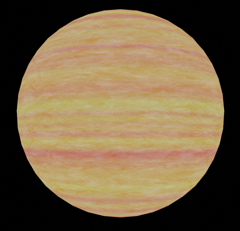
On a more serious note, though, after more research about procedural gas giants, the techniques suggested by some more dedicated people are quite difficult to implement for me at this time. Plus, Jupiter-like, also called "gold standard" somewhere, turns out to be one of the harshest challenges.
Trying to accomplish something in a finite amount of time, I'm mostly looking for "good enough" votes
Sorry to say but I preferred the previous version. The banding here looks less natural somehow, even though it is thinner. I think many small bands with alternating colors gives the impression of artificiality. Also too much white overall. The multiple identically shaped spots (and the fact that the spots are perfectly round and the "atmosphere" around them isn't distorted) also make it look artificial. I actually thought the last version looked quite nice and was hoping for just a little bit of tweaking.
The same first one with procedural storms (storms that might make it in the Earth-like maps at some point):
The same texture from two different angles, with lowered brightness (to compensate for the new lighting in shaders -- you might notice the screenshot above is brighter than the original ):
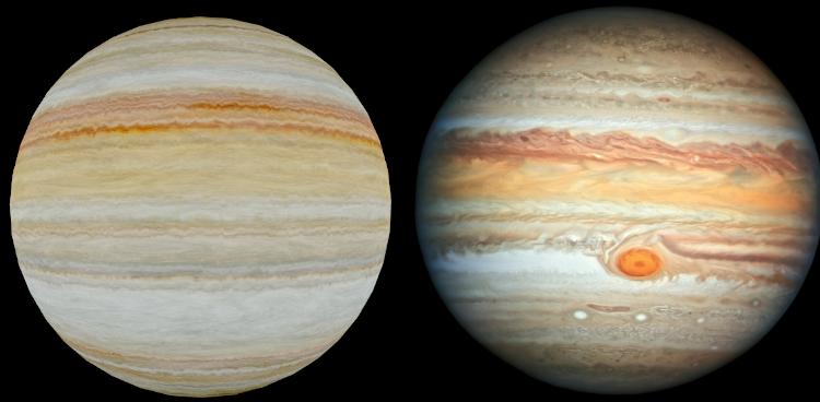
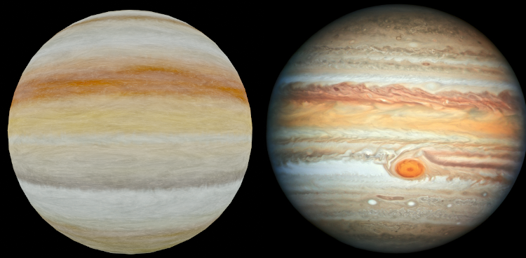
For the record, I've been also trying to reproduce some other people's ways of doing the gas giants. Below are some of the results (directly from Blender). The first two also have the Jupiter image I used as a reference.
This one used a part of the reference image to generate the map:
This one used a 29 step gradient sampled from the reference.
This one used a different way to generate the banding.
In your latest post, I think the second/third image and the first of the "reproducing other people's ways" images are the most convincing. The first image in your latest post has too many storms and the spirals are too "loose." With the lowered brightness in the subsequent images, the dark storms are more convincing and the darkness in the storm disguises the "looseness" of the spiral. The lower, more-central spiral is better than the upper left spiral that has a light upper portion and dark lower portion. The upper left spiral isn't as obviously a spiral in the lowered brightness images but when you notice that it is a spiral, it looks less convincing because if it was really part of the atmosphere then you'd expect the color of the adjacent yellow/orange band to wrap all the way around it (like it does for the other spiral).
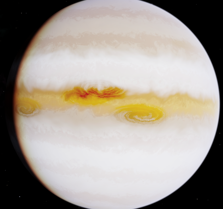
For the "other people's ways" image series, the first with narrow bands looks too regular but the one with very wide and diffuse bands looks even less convincing. The last image looks like a star, not a gas giant. The yellows and oranges give the impression of heat.
I see 2 branches somehow, the ones with big and the ones with smaller bands,
perhaps it is possible to combine those to further enhance the details of the gasgiants
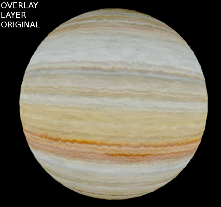
Simple example
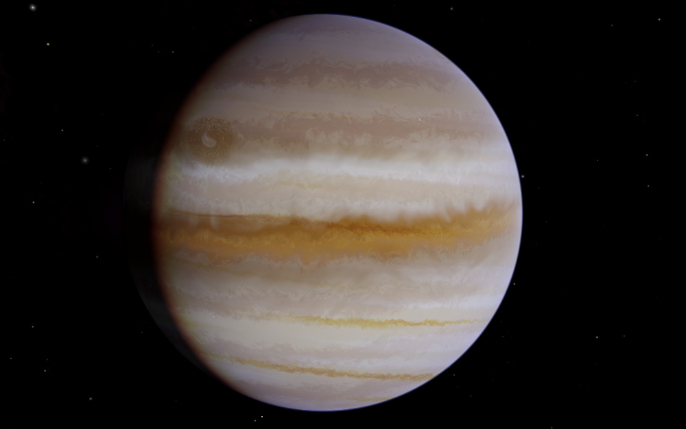
Take this original
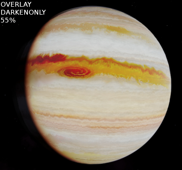
Add this overlay as darkenedonly 50-60%
The result
Aside from some oddness around the dark side atmosphere edge in the darkened third image, I agree it looks best so far. But I think the more central storm there looks excellent, while the storm up and to the left of it looks fake because the upper edge of the spiral is light coloured. It's like someone stamped a spiral on top of the atmosphere instead of actually mixing it around in a spiral.
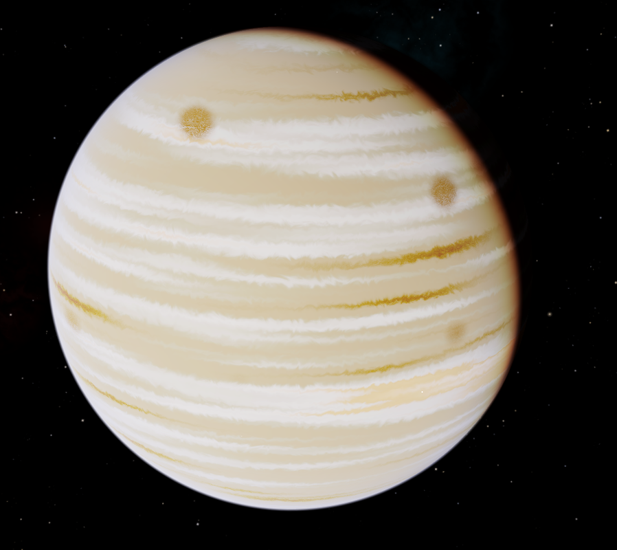
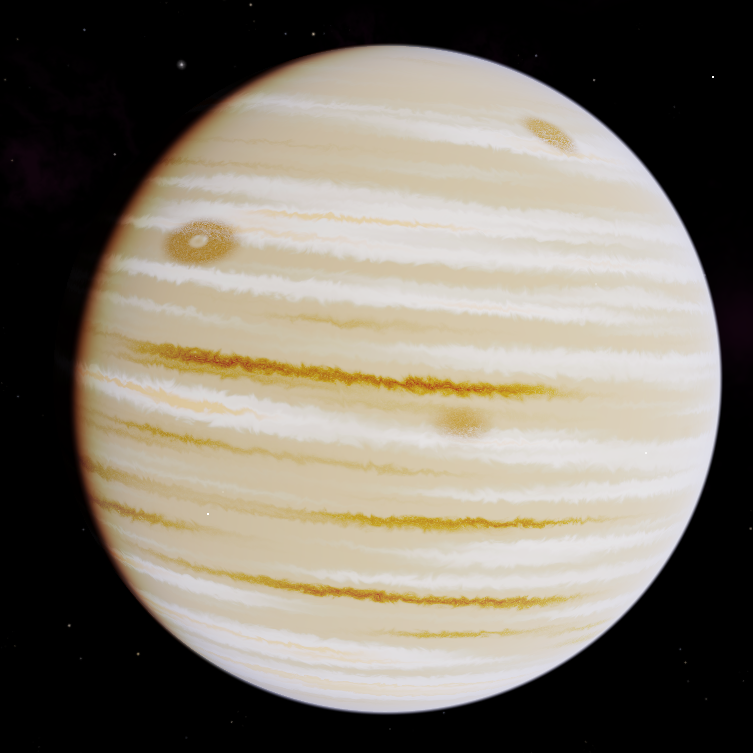
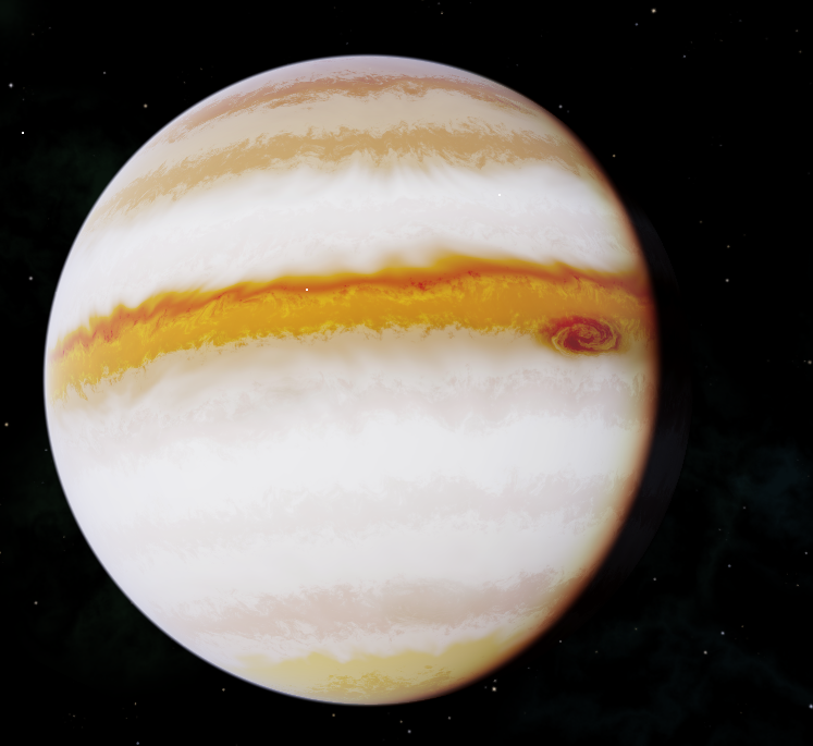
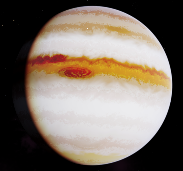
The first three images in my previous post are the same texture seen from different positions, with the major difference of reduced brightness for the last two. The third image snapshot is taken "earlier" (in the planet's day) than the first one (where a third storm can be seen).
This is what it would look with a different kind of "painting" the storms (they would all have the same colour -- in the initial three their colour was "derived" from the underlying colour of the planet):
This way some other storms will be seen (notice the one in the lower part which was not visible earlier).
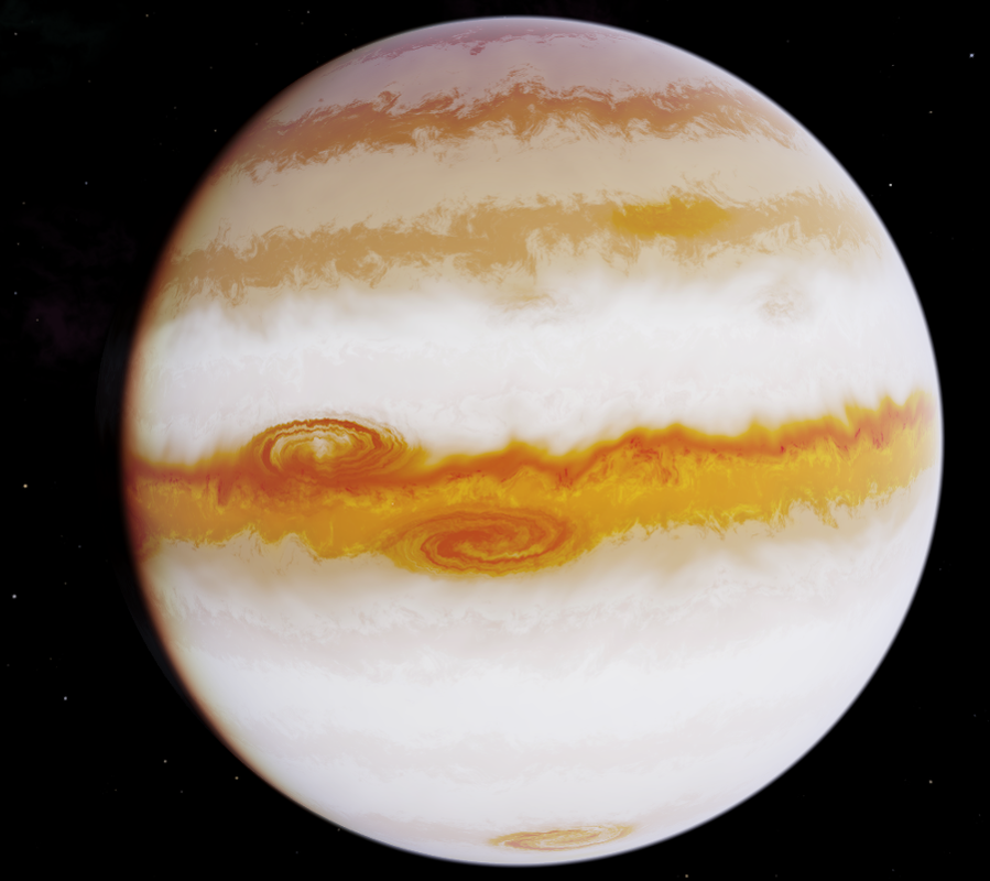
The last image in your previous post (OVERLAY DARKENONLY 55%) was much better, in my opinion, except for the upper-left spiral that I complained about. In this latest version, that spiral is better but I like the more central spiral less (I preferred the darker version of it). The overall appearance of the planet without the banded overlay is also less appealing, but I know that's a separate issue. The storm at the bottom of the planet I would remove if possible. I think it looks out of place so close to the pole.