HUD with large scanner
Posted: Thu Apr 06, 2017 10:04 pm
Greetings, Commanders.
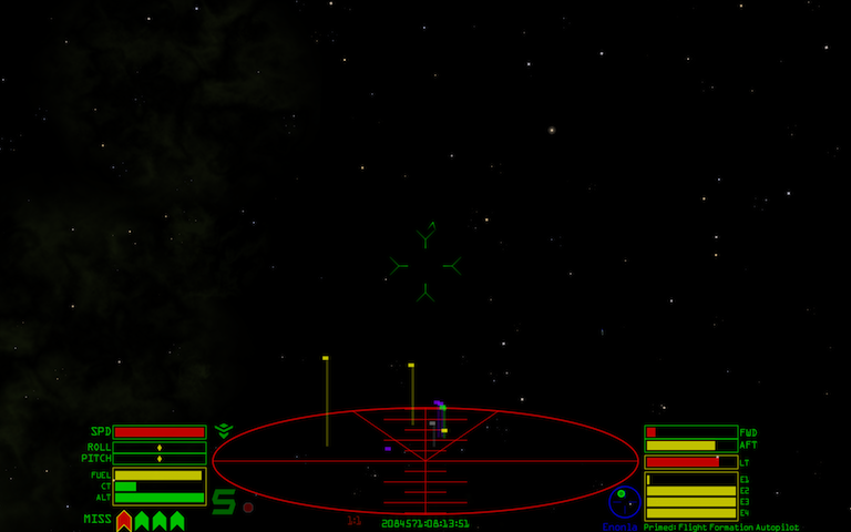
I made a HUD. Well .. I edited the stock HUD a bit.
I like the default HUD a lot, but I wanted a larger scanner. This HUD is based on the default HUD. I started out with a copy of the stock hud.plist and just changed some coordinates and sizes.
The gauges have been moved a bit further apart to make room for the bigger scanner.
Also, the speed, roll, pitch gauges have been moved to the left side. The laser temperature and shield gauges are now on the right, with the energy banks, so that all the status indicators you need during combat are together on the right side.
Otherwise, everything is stock.
Here is the OXP --> oolite.oxp.hoqllnq.big_scanner_hud-1.0.oxz
It looks like this:

I've played with it for a bit. I really like the big scanner. The rearranged gauges take a little bit getting used to.
I made a HUD. Well .. I edited the stock HUD a bit.
I like the default HUD a lot, but I wanted a larger scanner. This HUD is based on the default HUD. I started out with a copy of the stock hud.plist and just changed some coordinates and sizes.
The gauges have been moved a bit further apart to make room for the bigger scanner.
Also, the speed, roll, pitch gauges have been moved to the left side. The laser temperature and shield gauges are now on the right, with the energy banks, so that all the status indicators you need during combat are together on the right side.
Otherwise, everything is stock.
Here is the OXP --> oolite.oxp.hoqllnq.big_scanner_hud-1.0.oxz
It looks like this:

I've played with it for a bit. I really like the big scanner. The rearranged gauges take a little bit getting used to.