Page 1 of 2
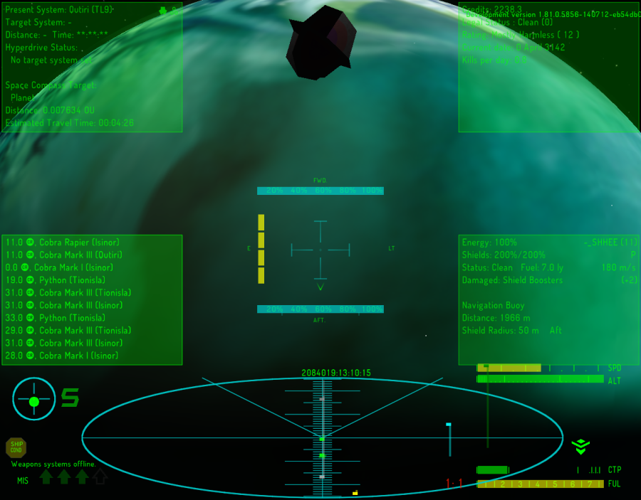
[RELEASE] Cyan HUD
Posted: Mon Jul 14, 2014 7:03 pm
by Zireael
Grab it from my Dropbox:
https://www.dropbox.com/s/bdmej4larnhssgd/Cyan-HUD.zip

Features:
[*] big scanner like the one in past versions of Numeric HUD
[*] percentage labels for shield readouts like the ones for energy in CBB HUD
[*] shield, energy and laser dials grouped around the crosshairs similar to Combat HUD's Red Alert mode
[*] up to 4 MFDs in front view
[*] cyan color!
Re: [RELEASE] Cyan HUD
Posted: Mon Jul 14, 2014 7:22 pm
by mossfoot
I am intrigued and will be trying this!
Also, what font is that? Part of the HUD package or a complete font change?
Also, how about a widescreen verson for those with, 16:9ish type screens?
Are you going to OXZ that puppy?

Re: [RELEASE] Cyan HUD
Posted: Mon Jul 14, 2014 11:55 pm
by Redspear
Intrigued by the colour. Cyan and green were often text colours I'd use on a black screen when clumsily programming on my spectrum years ago

...
I like the idea of the MFDs but they seem to be taking over the screen in a lot of HUDs lately.
Has anyone tried/enabled them without the green background?

Anyway, cyan seems like a nice colour choice to me but (and shoot me down in flames here if you want...) might it be shown off better in a screenshot with more of a starfield backdrop rather than an essentially cyan planet?
Re: [RELEASE] Cyan HUD
Posted: Tue Jul 15, 2014 3:28 am
by Diziet Sma
I'd suggest moving the scanner zoom ratio indicator over to that empty spot to the immediate left of the scanner, rather than have it overlapping the scanner display itself..
Very nice job, however!
Re: [RELEASE] Cyan HUD
Posted: Tue Jul 15, 2014 4:09 am
by mossfoot
got a weird radar echo going on here...

Re: [RELEASE] Cyan HUD
Posted: Tue Jul 15, 2014 6:48 am
by Zireael
The font is Font:Dangerous, and it's not included.
The cyan planet was a happy coincidence

Re: [RELEASE] Cyan HUD
Posted: Tue Jul 15, 2014 6:57 am
by Smivs
Zireael wrote:The font is Font:Dangerous, and it's not included.
i have found that using Font:Dangerous can
upset the spacing of text on HUDs, so a HUD designed using it may not look so good with the default font. Admittedly my problem was with an earlier version, but thought this was worth a mention just in case.
Re: [RELEASE] Cyan HUD
Posted: Wed Jul 16, 2014 7:34 pm
by SARR
great hud, but I´ve got the same troubles as mossfoot.......can they be resolved somehow?
Re: [RELEASE] Cyan HUD
Posted: Wed Jul 16, 2014 7:51 pm
by Captain Beatnik
mossfoot wrote:got a weird radar echo going on here...

I´m not sure if this is a little bug or a feature. The doubled scanner is displayed once the scanner enhancement is installed because the entry in the hud.plist for the enhanced scanner has a different y-origin and y-coordinate than the normal scanner. This can easily be tweaked by editing the hud.plist:
{ // scanner
selector = "drawScanner:";
x = 2;
y =
-188;
y_origin =
0;
height = 120.0;
width = 480.0;
rgb_color = (0.0, 0.8, 0.8 );
alpha =
0.50;
},
After changing the three red marked values, installing the scanner enhancement will no longer cause an echo, the scanner will only glow a little bit brighter.
A very nice HUD btw, good work!

If I may make a suggestion, I would suggest to use new alert_conditions key from Oolite 1.80 to hide the dials around the crosshairs when docked.
Re: [RELEASE] Cyan HUD
Posted: Thu Jul 17, 2014 6:51 am
by Zireael
Heh, thanks for spotting the bug, will fix soon.
Also, I'm bad at Maths, what would be the number required to hide the dials when docked? I only know the individual numbers for green, yellow and red...

Re: [RELEASE] Cyan HUD
Posted: Thu Jul 17, 2014 6:55 am
by spara
Zireael wrote:Heh, thanks for spotting the bug, will fix soon.
Also, I'm bad at Maths, what would be the number required to hide the dials when docked? I only know the individual numbers for green, yellow and red...

According to
![[EliteWiki]](/images/elitewikismall.png) the wiki
the wiki that would be 1.
Re: [RELEASE] Cyan HUD
Posted: Thu Jul 17, 2014 7:13 am
by SARR
another question: on my pc the hud looks exactly the same as mossfoot shows on his screenshot. I mean I do not have the cool info boxes in the corners. Is this yet another bug or do I have to install another oxp?
Re: [RELEASE] Cyan HUD
Posted: Thu Jul 17, 2014 7:21 am
by spara
The boxes are MFDs and you need oxps (look for MFDs under the HUDs category) that provide them and you need to select and activate them with ; and :.
Re: [RELEASE] Cyan HUD
Posted: Thu Jul 17, 2014 8:11 am
by Smivs
spara wrote:Zireael wrote:...what would be the number required to hide the dials when docked? I only know the individual numbers for green, yellow and red...

According to
![[EliteWiki]](/images/elitewikismall.png) the wiki
the wiki that would be 1.
Please note that the numbers are cumulative - you need to add them up.
the wiki wrote:In Oolite 1.79 or later, this controls which alert conditions the dial appears at. It is a number from 0 to 15, formed by adding together the numbers for the individual alert conditions - 1=docked, 2=green, 4=yellow, 8=red.
so a feature that is not required when docked would need
which is 2(green)+4(yellow)+8(red)=14
Re: [RELEASE] Cyan HUD
Posted: Thu Jul 17, 2014 12:46 pm
by Zireael


