Page 1 of 2
[Release] Font: Dangerous: Square v1.1
Posted: Thu Jun 12, 2014 2:09 pm
by edgepixel
Hi. This OXP brings yet another font from Elite: Dangerous into Oolite: the modern squarish one (or at least something sufficiently similar to it). Improved icons over my
previous font.
Latest version: 1.1
>>
DOWNLOAD <<
PICS
(The backgrounds are not part of the .oxp, only the font. I prefer to play Oolite with the BGS .oxp, and I just changed the background images to some from Elite: Dangerous, for my personal enjoyment)


LICENCE
This work is licensed under the Creative Commons Attribution-NonCommercial 4.0 International License. To view a copy of this license, visit
http://creativecommons.org/licenses/by-nc/4.0/.
Re: [Release] Font: Dangerous: Square v1
Posted: Thu Jun 12, 2014 2:18 pm
by edgepixel
A bit of a problem though. In columns, numbers with one digit get shifted a bit to the left from numbers with two digits. Not sure if I messed-up somewhere (The figures are monospaced. I checked all files) or if it's the product of how the display code works: See how "4", "6", "8" are well behaved inside a number with two digits, yet shift to the left when all alone. Naughty little things.

Re: [Release] Font: Dangerous: Square v1
Posted: Thu Jun 12, 2014 2:22 pm
by Norby
Nice and easier to read than before imho.
Re: [Release] Font: Dangerous: Square v1
Posted: Thu Jun 12, 2014 2:48 pm
by Disembodied
It's definitely a lot more atmospheric than Helvetica, but I think the superscript "CR" for credits looks a bit too much like ™ ... I really liked the C* symbol from the other font, both as a symbol and a concept: any chance of continuing with it in this one?
Re: [Release] Font: Dangerous: Square v1
Posted: Thu Jun 12, 2014 3:57 pm
by edgepixel
I think the superscript "CR" for credits looks a bit too much like ™
Well yes, the credits symbol was precisely inspired from the TM symbol

, I wanted to see how a more minimal solution would look, but I don't like it. It was subject to change anyway. I am not overly attached to any of the credits symbol variants, so yes, it can be changed back to C*.
Re: [Release] Font: Dangerous: Square v1
Posted: Fri Jun 13, 2014 9:22 am
by Diziet Sma
That looks really good.. might make a good font for the Pandora, too.. due to the small screen, the default Oolite font is not the easiest to read, apparently.
Re: [Release] Font: Dangerous: Square v1
Posted: Fri Jun 13, 2014 2:49 pm
by Neelix
edgepixel wrote:A bit of a problem though. In columns, numbers with one digit get shifted a bit to the left from numbers with two digits. Not sure if I messed-up somewhere (The figures are monospaced. I checked all files) or if it's the product of how the display code works: See how "4", "6", "8" are well behaved inside a number with two digits, yet shift to the left when all alone. Naughty little things.
I'd say it's because although the numbers are mono-spaced, the spaces are a different width. I'm guessing that column is left aligned, and relies on the space being the same width as the numbers to align them.
Diziet Sma wrote:That looks really good.. might make a good font for the Pandora, too.. due to the small screen, the default Oolite font is not the easiest to read, apparently.
For the record the only font issue I've seen on the Pandora is that because the system names on the Galactic Charts are at a reduced size it's almost impossible to read them, which complicates the use of the ANA. I'm not sure this will make much difference, but I'll give it a go on the Pandora, to see how it looks on the Chart.
If that turns out to be an improvement in legibility, is there an easy way to tweak it so I can keep all the original symbols and just keep the new lettering?
- Neelix
EDIT: As I suspected, using this font does not solve that problem, but it was worth a try.
Re: [Release] Font: Dangerous: Square v1
Posted: Fri Jun 13, 2014 6:44 pm
by mossfoot
Oooh, I like where this font is going!
N
Re: [Release] Font: Dangerous: Square v1
Posted: Sat Jun 14, 2014 8:46 am
by cim
edgepixel wrote:A bit of a problem though. In columns, numbers with one digit get shifted a bit to the left from numbers with two digits. Not sure if I messed-up somewhere (The figures are monospaced. I checked all files) or if it's the product of how the display code works: See how "4", "6", "8" are well behaved inside a number with two digits, yet shift to the left when all alone. Naughty little things.
Ah ... there's another assumption about the font in the code. The space character (32, first one on row 3) is assumed to be exactly half the width of the monospaced number. (And I think the em-dash character is then assumed to be exactly as wide as three spaces)
That one might be fixable relatively easily since it only affects the F8 screen, I think.
Re: [Release] Font: Dangerous: Square v1
Posted: Tue Jun 17, 2014 9:04 pm
by Tichy
I like it very much!
It's stylish and has good readability. The only defect that I found is that wide space after the 'W'. Is it possible to fix it?

Re: [Release] Font: Dangerous: Square v1.1
Posted: Wed Jun 18, 2014 1:33 am
by edgepixel
Re: [Release] Font: Dangerous: Square v1.1
Posted: Wed Jun 18, 2014 1:38 am
by mossfoot
I take it those are all 1.8 screenshots? (drool)
Love the font

It's definitely my preferred choice.
Re: [Release] Font: Dangerous: Square v1.1
Posted: Wed Jun 18, 2014 8:18 am
by edgepixel
mossfoot wrote:I take it those are all 1.8 screenshots?
No, that's just my 1.77 Oolite install, with the BGS .oxp added, whose background images I then changed to my own liking, using some "Elite: Dangerous" screenshots and concept art from the internet.
Diziet Sma wrote:might make a good font for the Pandora
What is Pandora?
Neelix wrote:is there an easy way to tweak it so I can keep all the original symbols and just keep the new lettering?
An easy way? Other than having me providing two versions of the .oxp, one with the new symbols, and one with the default symbols, I guess you'd need an image editor, notepad++ (to make it easier), patience, attention, and a bit of know-how, to edit the files yourself by hand.
---A. 1. Open both the new font texture and the old font texture in an image editor. 2. You might need to convert the new font texture file from grayscale mode to RGB mode, to enable editing. 3. Make a selection of the top two symbol rows of the default file. 4. Paste it over the new texture, making sure the edges of the pasted image align to the top, left and right edges of the document. 5. Flatten the document if it has more than one layer, convert it to grayscale, and save it.
---B. 1. Open both the new and the old .plist file. 2. Look carefully to see which lines of code set the widths for the symbols. The file from my .oxp has extensive notes, it should be easy to find the lines you need (38 to 62 - this is where notepad++ comes handy, because it numbers the lines of code). Paste the old symbol width lines of code in place of the new symbol width lines of code.
Re: [Release] Font: Dangerous: Square v1.1
Posted: Wed Jun 18, 2014 9:48 am
by Diziet Sma
edgepixel wrote:I changed the images from the BGS oxp to some more to my liking, fitting the Elite: Dangerous itch I have, of which the fonts are just a part. I could release those images as a "BGS - Dangerous Flavor.oxp", but I'm not sure about the legality of using Elite: Dangerous images in an Oolite .oxp, even if they are freely available on the net.
You could always try politely asking Frontier for permission, but I'm pretty sure the answer would be "No". Which is a pity.. they look great!
edgepixel wrote:Diziet Sma wrote:might make a good font for the Pandora
What is Pandora?
The Pandora is a small handheld game console and mobile personal computer with a Linux OS. A successor, the Pyra Dragonbox, is currently in development.
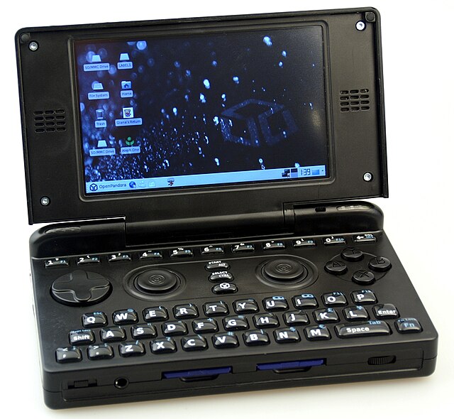
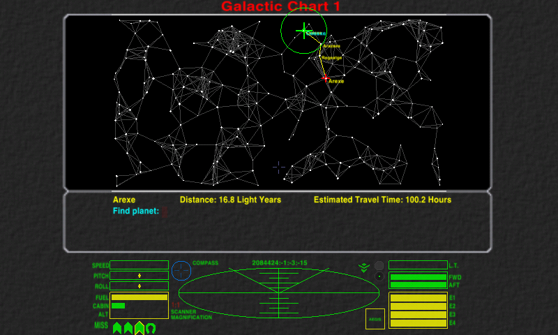
Recently, Oolite was successfully ported to the Pandora, which generated considerable excitement. However, due to the small screen size, there are some problems with font legibility on the Galactic Chart screen. With the help of some Pandora users (I don't have one myself, though a few members of the Oolite Board do), I did some testing and found that while it's not entirely suitable as-is,
OCR-A Extended (link is to a free version) may be a promising basis for building upon, but I'm a rank beginner in the entire area of font-making (and doubly so for Oolite), and it's beyond my current abilities and available time to produce something viable.
Here are a couple of images Neelix posted in the
Oolite thread on the Pandora Forum, illustrating the problem. As he pointed out in
his post, you should keep in mind that the Pandora Screen has only a 4.3" (11 cm) diagonal size, so the 800×480 resolution has a fairly high pixel density of 217ppi, so the screenshot may appear larger on some monitors than it does on the pandora itself.
With the default Oolite font:
With your new Square font:

The Oolite thread on the Pandora Forum has some more info and feedback on this, if you're inclined to look into it. I do know that if you succeeded in coming up with a font that looked good on that display, you'd earn the undying gratitude of quite a lot of Pandora-Oolite fans..

Re: [Release] Font: Dangerous: Square v1.1
Posted: Fri Jun 20, 2014 11:40 pm
by UK_Eliter
Very nice. And a bit Hitchhiker-y. Downloading.


