[RELEASE] GHOST Raptor (v0.9.1)
Posted: Wed Nov 09, 2011 11:02 am
For information and discussion about Oolite.
https://bb.oolite.space/
I've just noticed there's the transparency checkerboard effect at the wingtips - so the original texture is partially transparent - which won't work in oolite anyway.ace\56 wrote:Cool ship but it could do with a better texture
The Red Baron effect?Killer Wolf wrote:it's kinda nice, but TBH that texture is messing w/ my ability to work out exactly what it looks like :-/ what i can make out looks cracking though.
It's blue with lots of bits - just a suggestionmaik wrote:Sigh. Another new ship without any description.
Smivs wrote:It's blue with lots of bits - just a suggestionmaik wrote:Sigh. Another new ship without any description.
Lt. Commander Data once said:Smivs wrote:It's blue with lots of bits - just a suggestionmaik wrote:Sigh. Another new ship without any description.
It is... <pauses, tastes beverage> it is.. <pauses again, looks at beverage, considers> it is green.
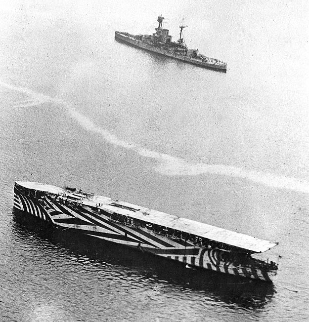
First I made it white using materials (in much the same way that I made the Gunship) but it looked silly, then I made it blue, but for some reason it refused to have shadows and again looked silly, then I made a quick texture map in blenders texture paint function, I was slightly inspired by the boat camo that was used in one of the world wars (not entirely sure which) but in the end it was just scribbling on it from different angles, but hey:DaddyHoggy wrote:I've just noticed there's the transparency checkerboard effect at the wingtips - so the original texture is partially transparent - which won't work in oolite anyway.ace\56 wrote:Cool ship but it could do with a better texture
at least it is hard to identify.Killer Wolf wrote:it's kinda nice, but TBH that texture is messing w/ my ability to work out exactly what it looks like :-/ what i can make out looks cracking though.
Staer9 wrote:First I made it white using materials (in much the same way that I made the Gunship) but it looked silly, then I made it blue, but for some reason it refused to have shadows and again looked silly, then I made a quick texture map in blenders texture paint function, I was slightly inspired by the boat camo that was used in one of the world wars (not entirely sure which) but in the end it was just scribbling on it from different angles, but hey:DaddyHoggy wrote:I've just noticed there's the transparency checkerboard effect at the wingtips - so the original texture is partially transparent - which won't work in oolite anyway.ace\56 wrote:Cool ship but it could do with a better textureat least it is hard to identify.Killer Wolf wrote:it's kinda nice, but TBH that texture is messing w/ my ability to work out exactly what it looks like :-/ what i can make out looks cracking though.
A little more clarification on the actual ship:
It is a very light fighter, with high speed capabitilties (thanks to six ridiculous engines on the back) and decent shielding and energy banks. maybe slightly uberbut hopefully the 650,000 price tag covers that. It is intended mainly for sharp-shooters and is a great dog fighter. fortunately the fact that it has only 1500 polygons means that oolite runs it rather nicely with no noticable frame-rate losses (even when I went agaist a pack of 6, but then again, raptors hunt in packs)
The texture issues are mainly unintentional but are completely un-noticable in-game (it is a tiny ship, and likes injectors) when I was play-testing it it was almost impossible to tell that it was actually blue.
