Formatting text msgs on a HUD
Posted: Sat Sep 17, 2011 11:14 pm
Hi all...
I'm trying to solve an issue which is hard to describe... and even harder (for me at least) to figure out WHERE I should be asking about. So I'm expecting this to be possibly moved elsewhere. And I couldn't begin to figure even WHAT I should be searching for, so pls bear with me...
Ok, done with the excuses. Best way to show my issue is to unabashedly STEAL other people's screenshots (some more boring excuses omitted).
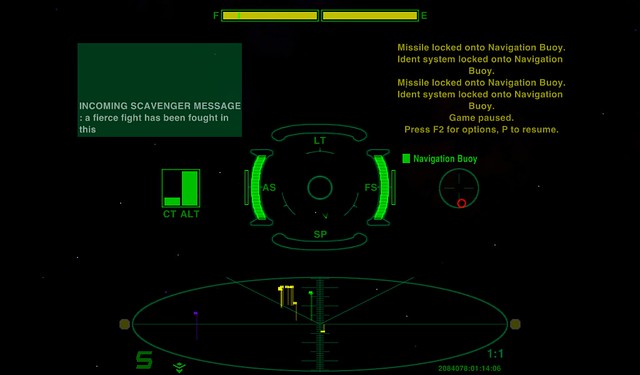
So, from this post from CommonSenseOTB, from the yet unreleased ChupaCabra HUD, we have the screenshot below, with a small yellow display on the right for the status messages (is this how they should be properly called ?), and a green one on the left with the... erm, communication log, I guess.

Then in this other post from El Viejo there's the screenshot below - where, if I decoded it right, the communication log is on the upper left and the status messages on lower left.

While on my machine, using MilHUD with some personal tweaks, I get both the status messages and the communication messages in giant yellow and green letters right in the center of the screen, which fade out quite slowly and get pushed upwards by subsequent messages. This sometimes ends up taking about 30-40% in the middle of the screen... While quite annoying at all times, when in combat it makes things quite cumbersome and unwieldy.
I suppose (???) this sort of stuff can be adjusted in the HUD's plist. As the ChupaCabra is not yet available for download, I can't check this for myself... and I have no idea of which HUD was being used by El Viejo, and with which tweaks if any.
So, if anyone would be kind enough to educate me on this with any hints, that would be great. If it's indeed done inside a HUD's plist, I (think that I) could try and paste some code snippets inside my own MilHUD plist and fly on my own from there.
Thx a lot and cheers !!!
I'm trying to solve an issue which is hard to describe... and even harder (for me at least) to figure out WHERE I should be asking about. So I'm expecting this to be possibly moved elsewhere. And I couldn't begin to figure even WHAT I should be searching for, so pls bear with me...
Ok, done with the excuses. Best way to show my issue is to unabashedly STEAL
So, from this post from CommonSenseOTB, from the yet unreleased ChupaCabra HUD, we have the screenshot below, with a small yellow display on the right for the status messages (is this how they should be properly called ?), and a green one on the left with the... erm, communication log, I guess.

Then in this other post from El Viejo there's the screenshot below - where, if I decoded it right, the communication log is on the upper left and the status messages on lower left.

While on my machine, using MilHUD with some personal tweaks, I get both the status messages and the communication messages in giant yellow and green letters right in the center of the screen, which fade out quite slowly and get pushed upwards by subsequent messages. This sometimes ends up taking about 30-40% in the middle of the screen... While quite annoying at all times, when in combat it makes things quite cumbersome and unwieldy.
I suppose (???) this sort of stuff can be adjusted in the HUD's plist. As the ChupaCabra is not yet available for download, I can't check this for myself... and I have no idea of which HUD was being used by El Viejo, and with which tweaks if any.
So, if anyone would be kind enough to educate me on this with any hints, that would be great. If it's indeed done inside a HUD's plist, I (think that I) could try and paste some code snippets inside my own MilHUD plist and fly on my own from there.
Thx a lot and cheers !!!