Page 1 of 5
(NEW RELEASE) ChupacabraHUD.oxp
Posted: Wed Aug 17, 2011 12:48 am
by CommonSenseOTB
It's here!

ChupacabraHUD.oxp stand-alone version.(Oct. 26/2011)
Download link:
http://wiki.alioth.net/index.php/ChupacabraHUD
Any comments on your playtesting and experiences with this HUD may be posted here and are most welcome. Have fun with this and enjoy!

===========================================
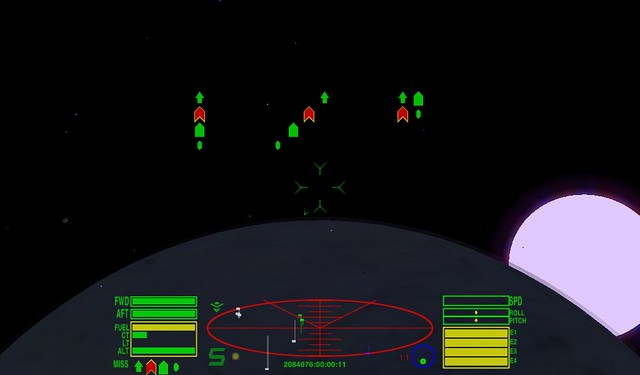
A couple of nights ago while doing some adjustments, after just finishing the curved segmented-looking bar gauges central to the chupacabra hud, I had another "eureka" moment and figured out a way to have a custom missile display with the pylon icons in any pattern that you want. There are no limits on this one that I can see. You could even mix and match different sizes of icons as well. It's kind of cool so I thought you would all like to see. The chupacabra hud is only half done so I modified a standard hud with 3 basic examples for illustration purposes.
Check it out.

 Adjustable Missile Displays
 by
CommonSenseOTB, on Flickr
This could be something many huds will want to incorporate.
Now I have a question. For the last day I've been trying to find a way to create a changing animated version of this. What I need is a way to tell which missile pylon is currently selected. Also would be nice to have the animation react to arming and disarming the current missile pylon. Is any of this possible in JS and what would the code be? Any ideas of what the JS is for this would be appreciated as I can't seem to make any headway finding the right scripting.
One of the many animation ideas I have for this involves having a single missile pylon icon near the crosshairs showing the currently selected missile.

Knowing the currently selected missile pylon would allow this and a couple of other ideas I have to be possible.
Any thoughts on the scripting?
Re: (WIP)ChupacabraHUD
Posted: Wed Aug 17, 2011 4:52 am
by Capt. Murphy
You might be able to do something with the event-handler this.playerTargetedMissile = function(missile), so that at least if the selected missile is armed you could show the current armed missile. But I don't think you can detect the selected pylon if the missile isn't armed.
Doh! - in light of Thargoid's clarification of when this.playerTargetedMissile is fired.
Re: (WIP)ChupacabraHUD
Posted: Wed Aug 17, 2011 5:41 am
by Thargoid
this.playerTargetedMissile is triggered when the player targets an incoming missile (with shift-T) to try and destroy it (e.g. via a turret) rather than the player actually firing a missile (that one triggers this.shipFiredMissile with reference to the player ship, although that one can be used by NPC ship scripts too).
You can access the current missile payload with player.ship.missiles and the number of pylons available by player.ship.missileCapacity (with player.ship.missiles.length being how many of those pylons are actually loaded with something).
Unfortunately the key piece of the puzzle, namely which pylon is currently selected, is not exposed to JS. You could perhaps work around it by maintaining the missile list in a separate array (updated on station launch and equipment award fired by this.shipWillLaunchFromStation and this.playerBoughtEquipment respectively) and then comparing that to player.ship.missiles and working out which pylon just fired when this.shipFiredMissile is triggered for the player by playing spot the difference between the two and seeing which pylon item just vanished. But that would need to be done with care, as something like the missile rack which re-awards itself instantly to the same pylon (using player.ship.awardEquipmentToCurrentPylon) would potentially mess things up.
Re: (WIP)ChupacabraHUD
Posted: Wed Aug 17, 2011 2:52 pm
by CommonSenseOTB
Thanx Capt. Murphy and Thargoid. This clarifies things somewhat.
Thargoid, your workaround is inspired and I think could work IF there was something to trigger a script based on selecting a different pylon even if we can't know which pylon it is. Without at least that possibility this kind of animation I'm thinking of is a dead end.
Unless....
Could one check if each missile in the players missile array has a target by timer or frame callback? Then you would already know which pylon's missile has a target and could use that to display the correct missile pylon near the crosshairs. Would only cause the animation display when a missile has a target but it is better than nothing. Is this possible?
if(player.ship.missile(1).target)
{your code here}
Would the above work? If so I can do something with this.

Re: (WIP)ChupacabraHUD
Posted: Wed Aug 17, 2011 3:19 pm
by Thargoid
Offhand I don't think so, as the target is the player ship's target rather than the missiles (at least until it's fired and becomes a distinct entity). I know the multi-targetting system does this, but to my knowledge that information isn't exposed to JS.
It also gets confusing as not all pylon-based equipment can have a target (missile-based items do, but mine-based ones don't).
But that's without testing it, which I will do later if I have chance.
Re: (WIP)ChupacabraHUD
Posted: Sun Aug 21, 2011 4:10 pm
by CommonSenseOTB
I had a go of really trying to get this to work but its no dice. I can still do other animation stuff with the missile icons/pylons based on other triggers like if(player.ship.target) so there may be a little missile animation in this hud in the end.
For the past 3 days I've been experimenting with an animated compass and using the target mode to act as a better locator of the targetted ship whilst dogfighting(close-up) while preventing it from being in the way when not in use. There are 2 things that I'm having to use frame callback's for checks because they either don't work correct or work different than one would expect as using an event trigger doesn't work for these.
1)Cycling compass modes when you have a target from target mode to nav mode doesn't trigger the compassTargetChanged handler.
2)When scooping a target, the shipTargetLost handler doesn't trigger either.
I knew of the first one and was wondering if it will be fixed or not. The second one was a surprise and was wondering if it is supposed to work this way, if it will be fixed, and is there an event workaround, perhaps in some other event handler that triggers when you scoop a target.
If both of these worked to trigger an event handler there would be no need to check using frame callbacks and would be a better solution. As it is, I'm using a frame callback to check target, alert condition, and compass mode and thus control the state of the compass and any possible animation starts for it and it works just fine.
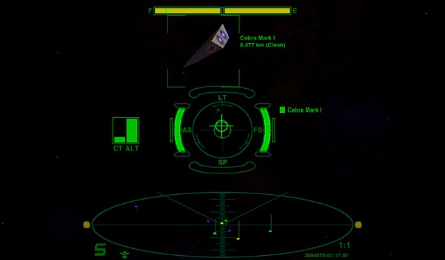
Interestingly, I discovered 1 viewtopic from years ago while looking for information on these 2 points. Apparently, 1 other chap had the same idea of using the compass in target mode as a more accurate locator of the targetted ship than the simple arrow around the crosshairs. He was right. Done in the right way, it does work real good as you can determine very accurately in either the forward or aft hemisphere's of your ship where the target is when it is offscreen. So this would actually be an aide when dogfighting and you would use it when the opponent is more maneuverable and faster than you.
There are some interesting points in here:
https://bb.oolite.space/viewtopic.php?f=6&t=5954
I believe that making the compass mode writable and perhaps the compass target writable as well would allow a lot of cool things to be done with the compass, like a real nav screen, some custom scripted nav modes, custom scripted targetting options, etc.
Any thoughts on the above 2 points?
Re: (WIP)ChupacabraHUD
Posted: Sun Aug 21, 2011 8:10 pm
by Eric Walch
CommonSenseOTB wrote:2)When scooping a target, the shipTargetLost handler doesn't trigger either.
..... The second one was a surprise and was wondering if it is supposed to work this way, if it will be fixed, and is there an event workaround, perhaps in some other event handler that triggers when you scoop a target.
That is fully intentional. There is even special code in place to avoid the target lost stuff on scooping. On screen you already get a scooping message and a second message would just spam the screen.
On handlers side, there will be no handler firing. Only scooping scripted stuff triggers a scooping handler, but most cargo will not be scripted.
Re: (WIP)ChupacabraHUD
Posted: Sat Aug 27, 2011 9:05 pm
by CommonSenseOTB
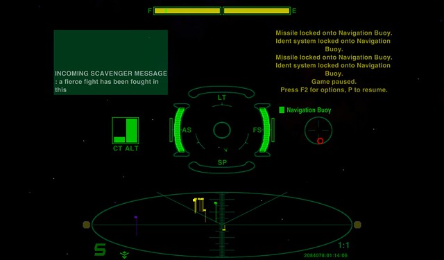
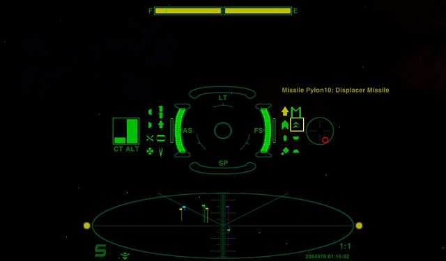
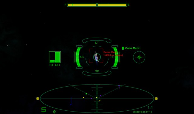
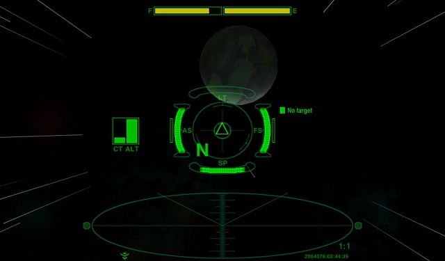
Most of the ChupacabraHUD is complete and some of the features that have been consuming much of my meager free time in the last 2 weeks have been tested repeatedly ad nauseum and work real nice. Here are a few very preliminary pics of the current state of the work in progress.(The overall design has changed 3 times since the beginning and a few items may yet change before the final version is released)
 ChupacabraHUD general layout
 by
CommonSenseOTB, on Flickr
 ChupacabraHUD missile ID feature
 by
CommonSenseOTB, on Flickr
 ChupacabraHUD compass as target tracker
 by
CommonSenseOTB, on Flickr
 ChupacabraHUD target tracker does not block view
 by
CommonSenseOTB, on Flickr
 ChupacabraHUD condition green compass for better navigation
 by
CommonSenseOTB, on Flickr
The 2 bars next to the shield indicators are for the capacitors and will change size and color to show state of charge. This is not yet scripted. Also the CT and ALT block will be scripted to appear/disappear when needed. More information is available in the descriptions of the pictures.
The main feature of this hud is the curved animated bar gauges for the shields and speed. The gauges expand and contract in both directions and there is color change and flashing for level warning. Laser temp is a normal bar gauge as there is no JS to read to make a custom one. The central gauge cluster image was provided by Staer9 and following this for the gauges was of primary importance. Curved bar gauges was a tough one but I hope that what I came up with meets expectations. The next curved gauges hud like this should probably wait till after 1.76 and images can be custom made for the curved bars themselves as using selector drawSurround for this has limits.
Well, back to the work now.

Re: (WIP)ChupacabraHUD
Posted: Sat Aug 27, 2011 10:42 pm
by RyanHoots
That looks like a pretty good HUD, I like the fact that everything is close to the center and easy to see...
Re: (WIP)ChupacabraHUD
Posted: Sun Aug 28, 2011 7:43 am
by Mauiby de Fug
Wow! While I'm very happy with my current HUD, and I don't think I'd actually use any of yours, I think it's safe to say that if I ever have the time and inclination to try and create my own HUD, it would be your HUDs that I would be opening up for help and techniques! Impressive job!
Re: (WIP)ChupacabraHUD
Posted: Sun Aug 28, 2011 9:09 am
by another_commander
CommonSenseOTB wrote:Most of the ChupacabraHUD is complete and some of the features that have been consuming much of my meager free time in the last 2 weeks have been tested repeatedly ad nauseum and work real nice. Here are a few very preliminary pics of the current state of the work in progress.(The overall design has changed 3 times since the beginning and a few items may yet change before the final version is released)
 ChupacabraHUD general layout
 by
CommonSenseOTB, on Flickr
I'll be darned! Freespace2 HUD!?
Rock on, CommonSenseOTB.
Re: (WIP)ChupacabraHUD
Posted: Sun Aug 28, 2011 10:14 am
by Disembodied
That's a nice, compact display layout. My one comment would be that it might be better to have the energy display more central (as it's important information you need in a fight), and to sideline the cabin temperature and altitude readouts, as they don't change much during normal operations.
Re: (WIP)ChupacabraHUD
Posted: Sun Aug 28, 2011 11:13 am
by Killer Wolf
frick, that's unbelievable!
awesome work!
Re: (WIP)ChupacabraHUD
Posted: Sun Aug 28, 2011 9:07 pm
by pagroove
Fricking awesome hud-programming. Good work

Re: (WIP)ChupacabraHUD
Posted: Mon Aug 29, 2011 9:30 am
by Svengali
Pretty, CSOTB!
I think it's the first one that looks like a real HUD. Good job, Commander.
Like Disembodied I think it may be a good thing to move Cabin Temperature and the Compass out of the center section (maybe to the side of the Scanner) and to make the comms_gui and message_gui wider as longer texts will be hard to read. For the central section elements it may help to use a different alpha setting to guide the players attraction to the action around him.
Anyway - Rock On!


 Knowing the currently selected missile pylon would allow this and a couple of other ideas I have to be possible.