On a roll tonight:
The Text on the GalNav Badge is a bit ropey, I'm not happy with it. If someone with better Photoshop-Fu wants to tidy it up, be my guest.
Note: Trumble ad - the "brightness" of the blue text and the brown background is almost the same - on one of my monitors there's hardly any difference.
They're stonkingly good ads.
@Gogz69 - cracking ad - I have a suggestion - same ad - diagonally across the 'vert "Cancelled due to smog" (that way sometimes the game is on - sometimes it's cancelled)
I did have a go at your navy ad - the colour gradient in the Oolite logo is a little frustrating to clean up - although I did shorten the name to 'Gal Nav' - still no dice - but yes... a tricky one.
I did have a go at your navy ad - the colour gradient in the Oolite logo is a little frustrating to clean up - although I did shorten the name to 'Gal Nav' - still no dice - but yes... a tricky one.
And you didn't do it just to ogle Ensign Hawt.......
With the emergence of all these banks offering competitive loans at reduced rates, it'll be inevitable that some poor Jameson will overdo it. For that reason:
With the suggestion from Daddy Hoggy, I have updated the last ad:-
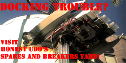
I'm not too happy with this ad myself, as the area around the text seems to be somewhat distorted. I've tried to repair it, but the results seem to end with the same distorted effect around the text. If anyone out there can give this a quick fix, feel free to try it out.
G.
Last edited by gogz69 on Fri Feb 13, 2009 10:57 pm, edited 1 time in total.