The Seraphim - A custom Ship OXP from start to finish.
Moderators: another_commander, winston


-
DaddyHoggy

- Intergalactic Spam Assassin

- Posts: 8515
- Joined: Tue Dec 05, 2006 9:43 pm
- Location: Newbury, UK
- Contact:
At scarecrow - that's a fantastic ship!
Is the domed cockpit using the flipped normals you described? If yes, excellent effect! Is that how it will appear in game?
I'm presuming (for those without shader support) that this is an un-shadery version of the ship - are you planning on adding eye candy bumps and glows at any point?
Keep up the fantastic work!
Oolite Life is now revealed hereSelezen wrote:Apparently I was having a DaddyHoggy moment.


Aw shucks. 
I'm finding the black and white paint job a bit dull though and the cockpit area needs mucho work still. I've remodelled and retextured the pilots now so they're improved, at least.
DH, yes I am intending on doing all the fancy eye-candy gubbins for it (shaders, normal map, specular etc). It's probably at that point I'll start badgering Griff for much help and advice
Also, yes that is the reversed normals effect that is still yet to be tested in the actual game. Theoretically it should work but until I see it with my own eyes, it's a "known unknown"!.
Crow
-
Disembodied

- Jedi Spam Assassin

- Posts: 6885
- Joined: Thu Jul 12, 2007 10:54 pm
- Location: Carter's Snort
-
Captain Hesperus

- Grand High Clock-Tower Poobah

- Posts: 2310
- Joined: Tue Sep 19, 2006 1:10 pm
- Location: Anywhere I can sell Trumbles.....
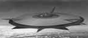
Nah, This is what you need.Disembodied wrote:I like the idea of black-and-white for the police, though ... maybe all it needs is a higher contrast between the stripes and the bodywork? And possibly a red jam-sandwich stripe behind the word "POLICE"?Scarecrow wrote:I'm finding the black and white paint job a bit dull ...
Captain Hesperus
-
wackyman465

- ---- E L I T E ----

- Posts: 831
- Joined: Thu Nov 06, 2008 10:15 pm
- Location: Currently hunting you down in an Imperial Courier
-
DaddyHoggy
- Intergalactic Spam Assassin
- Posts: 8515
- Joined: Tue Dec 05, 2006 9:43 pm
- Location: Newbury, UK
- Contact:
Ah yes, the "Battenburg" model of colouration...Captain Hesperus wrote:Nah, This is what you need.Disembodied wrote:I like the idea of black-and-white for the police, though ... maybe all it needs is a higher contrast between the stripes and the bodywork? And possibly a red jam-sandwich stripe behind the word "POLICE"?Scarecrow wrote:I'm finding the black and white paint job a bit dull ...
Captain Hesperus
Oolite Life is now revealed hereSelezen wrote:Apparently I was having a DaddyHoggy moment.
-
JensAyton

- Grand Admiral Emeritus

- Posts: 6657
- Joined: Sat Apr 02, 2005 2:43 pm
- Location: Sweden
- Contact:
Looks like a toned-down version of current Swedish livery.Captain Hesperus wrote:Nah, This is what you need.
E-mail: [email protected]
-
Commander McLane
- ---- E L I T E ----
- Posts: 9520
- Joined: Thu Dec 14, 2006 9:08 am
- Location: a Hacker Outpost in a moderately remote area
- Contact:
Urghs! Have the police forces in these countries no taste?!?Ahruman wrote:Looks like a toned-down version of current Swedish livery.Captain Hesperus wrote:Nah, This is what you need.
-
DaddyHoggy
- Intergalactic Spam Assassin
- Posts: 8515
- Joined: Tue Dec 05, 2006 9:43 pm
- Location: Newbury, UK
- Contact:
I think the point is that they're supposed to look vile so that you notice them - the UK car posted by Cap'n H is a "patrol car" i.e. out on the roads - British Police believe it's more effective to have a car that's clearly visible and therefore everybody (briefly) obeys the laws, speed limits etc that way they only chase the idiots who still tear past them at warp snot - based on the assumption that if they're oblivious to a police car that looks like that - they're oblivious to everything else as well...
Oolite Life is now revealed hereSelezen wrote:Apparently I was having a DaddyHoggy moment.
-
JensAyton
- Grand Admiral Emeritus
- Posts: 6657
- Joined: Sat Apr 02, 2005 2:43 pm
- Location: Sweden
- Contact:
Police liveries have two goals:Commander McLane wrote:Urghs! Have the police forces in these countries no taste?!? :?
1. High visibility. The Swedish one, at least, achieves this well. (Both the blue and the yellow panels are retroreflective.)
2. To invoke appropriate emotions (i.e., propaganda). There are two perspectives on what emotions are “proper”; you can either aim for imposing/awe-inspiring, or friendly and harmless. The Swedish design goes for the latter, and I think it’s reasonably successful.
Being pretty is not one of the goals. ;-)
E-mail: [email protected]
-
Disembodied
- Jedi Spam Assassin
- Posts: 6885
- Joined: Thu Jul 12, 2007 10:54 pm
- Location: Carter's Snort
I think GalCop should be aiming for the imposing/awe-inspiring (not to say threatening) livery more than the cheerful-local-bobby look. After all, this is a legal system where a bounty of just one measly credit is enough to make your summary execution, either by the police or by any member of the public who happens to be passing, entirely legitimate... Evenin' all ... zzzap! BOOM ... mind how you go sir ...
-
Captain Hesperus
- Grand High Clock-Tower Poobah
- Posts: 2310
- Joined: Tue Sep 19, 2006 1:10 pm
- Location: Anywhere I can sell Trumbles.....
I don't think there's anything more awe-inspiring/threatening than copious laser burns and row after row of kill markings on the hull......Disembodied wrote:I think GalCop should be aiming for the imposing/awe-inspiring (not to say threatening) livery more than the cheerful-local-bobby look. After all, this is a legal system where a bounty of just one measly credit is enough to make your summary execution, either by the police or by any member of the public who happens to be passing, entirely legitimate... Evenin' all ... zzzap! BOOM ... mind how you go sir ...
Captain Hesperus