Page 7 of 33
Posted: Tue Jan 06, 2009 4:30 pm
by Pangloss
DaddyHoggy wrote:@Pangloss - I like very much! "Oops" - remains one of my favourite Ads - especially as I remember colouring the pixels by hand because I didn't then know another method of doing it (PSP7 on the PC at the time)!
By HAND? What are you, insane?!?? Nice little gradient is what you needed there. That's how I did the rainbow effect for the Ad Ring background. Bish bash bosh, done.
But yeah, I chose it because it looks great. Nice with a shadow, interesting shape too.
Posted: Tue Jan 06, 2009 4:35 pm
by DaddyHoggy
Pangloss - Perhaps two versions of Mall Wart then - as it would be nice to keep the old one as a nod to the Constore which inspired it in the first place - you do the new one and I the old one? (This way the replicant pi-42 Set E's and F's and soon to be G could have you black Star and new Mall Wart)
With regards to the sidewinders - please leave me the Tescoo Oxpress one - at least until I profess that I have neither the time nor the capability to produce a decent looking one - it'll be my redemption for not backing up the Tescoo Bulk Hauler I was working on when my HD died many moons ago.
Posted: Tue Jan 06, 2009 6:09 pm
by Pangloss
Here's the Star one done.


Posted: Tue Jan 06, 2009 6:25 pm
by Ark
Pangloss very nice job !!!

Posted: Tue Jan 06, 2009 6:35 pm
by Pangloss
Ark wrote:Pangloss very nice job !!!

Thank you!

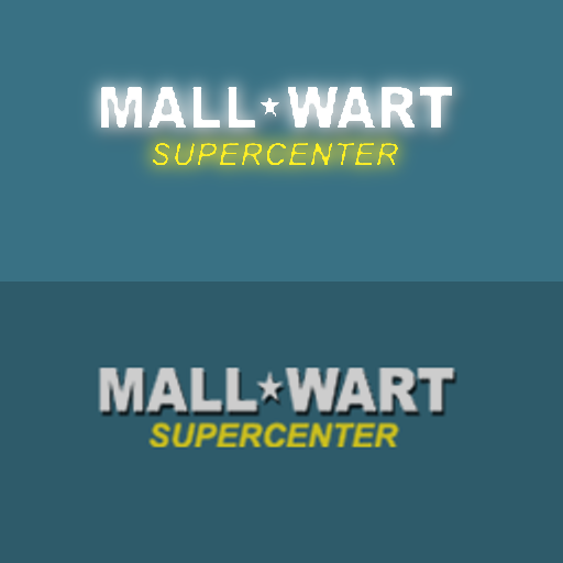
This is the last one. I have to get to work. Mallwart, new design based on Walmart's 2008 logo.

...and the corresponding ship. With a stripe.

Posted: Tue Jan 06, 2009 7:06 pm
by Pangloss
...and on the way out of the door, the best of the lot. Pi-42.

Let me know if there's a problem with having one half red, and one half orange.
Posted: Wed Jan 07, 2009 6:43 am
by Ark
Pangloss wrote:...and on the way out of the door, the best of the lot. Pi-42.

Let me know if there's a problem with having one half red, and one half orange.
Well actually is half red half brown. I think it would be better if it was all brown. HaddyHoggy what is your opinion?
Well done pangloss. Now we just wait for DaddyHoggy (no presure here!!

) for the Tescoo defender
@DaddyHoggy:About the MallWart firm ad and defender. What should i do? Use them. Are the Firm ad close to the original constore?
Posted: Wed Jan 07, 2009 11:43 am
by DaddyHoggy
Sorry, about the delay - forgot I was at my Writer's group meeting last night.
Anyway, as you can see Ark - two Wall Marts are very different...

My own feeling on the subject is that if this is initially a homage to the original Constores in YAH then it should have the original style of adverting - if we also plan on keep up with, or later, superceding, YAH then there will be space in this version's Set E,F and whn it finally reaches 50 Ads, Set G - for variants (perhaps) of the stores - after all it may take some time for the New logos to roll out across the fleet so to speak!
Just my 0.02Cr....
V. simple (eased back from simple) Tescoo Defender to follow.
@Pangloss - I like new Mallwart logo - clearly has a place - I just think not in "original set".... <shrug> Q: I like the two tone Pi-42 ship but wondering why two-tone and not just green....
Posted: Wed Jan 07, 2009 11:53 am
by Ark
Well green would be to similar with the star defender (nice thinking pangloss), so i prefer it in brown or brown and red. Personaly i prefer it in one color (brown)
What about the mall wart defender i think we sould also include it in the original (set_C). Two deferent defenders for 2 deferent mall wart versions of the station would be to much IMHO
Posted: Wed Jan 07, 2009 1:04 pm
by Pangloss
Ark wrote:Well green would be to similar with the star defender (nice thinking pangloss), so i prefer it in brown or brown and red. Personaly i prefer it in one color (brown)
What about the mall wart defender i think we sould also include it in the original (set_C). Two deferent defenders for 2 deferent mall wart versions of the station would be to much IMHO
I looked at the skin in Oolite, and it looked ...well, wrong. Not symmetrical. I wanted to include the burgundy / green / orange on the ship, so I decided to give the ship little orange accents and keep the ship that burgundy red-brown color.

I also included a little flourish to the bottom of the ship... a slight brushed metal look.

Pretty easy to create: add Gaussian noise to the area (monochrome, so the green still shows). Then add motion blur and the noise becomes streaks. A quick and easy way to add a brushed metal look to your ship.
Here's the skin.

Posted: Wed Jan 07, 2009 1:08 pm
by Pangloss
DaddyHoggy wrote:Sorry, about the delay - forgot I was at my Writer's group meeting last night.
Anyway, as you can see Ark - two Wall Marts are very different...

My own feeling on the subject is that if this is initially a homage to the original Constores in YAH then it should have the original style of adverting - if we also plan on keep up with, or later, superceding, YAH then there will be space in this version's Set E,F and whn it finally reaches 50 Ads, Set G - for variants (perhaps) of the stores - after all it may take some time for the New logos to roll out across the fleet so to speak!
Just my 0.02Cr....
V. simple (eased back from simple) Tescoo Defender to follow.
@Pangloss - I like new Mallwart logo - clearly has a place - I just think not in "original set".... <shrug> Q: I like the two tone Pi-42 ship but wondering why two-tone and not just green....
Agreed with using the old MallWart design originally... in the US, the new logo is on their ads on TV, but all the stores still have the Soviet star and Ariel Black font instead of the new asterisk and Trebuchet (-ish) font.
Please stand by... ship design incoming within 10 minutes...
Posted: Wed Jan 07, 2009 1:45 pm
by pagroove
You guys are good. You should also consider to do new versions of the Globe and TransHab stations. I've sent Griff a pm about making a new version of the Torus.(also great for ads). So keep those great ads coming.
Can anyone also make Spaceway L1 ad?
Posted: Wed Jan 07, 2009 1:56 pm
by Ark
pagroove wrote:You guys are good. You should also consider to do new versions of the Globe and TransHab stations.
Well retexturing and remodeling are 2 totaly deferent things. I do not believe that we have Griff's talent (at least not me)
pagroove wrote:
I've sent Griff a pm about making a new version of the Torus.(also great for ads). So keep those great ads coming.
I think this is selezens job (maybe something with shaders oh!! boy) but i really do not want to see a torus with ads!!. Some things are clasic and torus stations are defenetly one of them. Moreover we can not expect from Griff to change every model in the game and every model in every oxp.
Posted: Wed Jan 07, 2009 2:18 pm
by Pangloss
Yeah... texturing is easy.
Pimpin' 3D models ain't easy.
I added vents to the MallWart ship. Here she is.

Top and bottom...


Posted: Wed Jan 07, 2009 3:14 pm
by Pangloss
By the way... where would I find a system with these Trading Posts? is there a set Tech level, or type of government, I should be looking for? I'm currently flying around the Aanbiat system, Galaxy 1 (go NorthEast of Lave to nearly the top of the map) and I have a copy of the work-in-progress OXP to do the artwork.


