Page 6 of 7
Re: BB Logo competition for v1.75
Posted: Wed Mar 02, 2011 10:57 am
by Smivs
I don't think I like the transparent ones as much, and I've got plenty of spare Jellybabies now - have one of mine.

Re: BB Logo competition for v1.75
Posted: Wed Mar 02, 2011 11:07 am
by Smivs
That got me thinking.....perhaps we should just bow to the inevitable.


Re: BB Logo competition for v1.75
Posted: Wed Mar 02, 2011 11:23 am
by TGHC
Re: BB Logo competition for v1.75
Posted: Wed Mar 02, 2011 3:40 pm
by Zireael
Smivs wrote:That got me thinking.....perhaps we should just bow to the inevitable.
NOOOO!!!
Re: BB Logo competition for v1.75
Posted: Wed Mar 02, 2011 5:50 pm
by Gimi
Disembodied wrote:@Gimi: sadly no wallpapers possible – I'm working on 640 x 192 originals, and can't scale up to wallpaper sizes.
I suspected as much, hence my question about the Oolite font.

Re: BB Logo competition for v1.75
Posted: Thu Mar 03, 2011 9:28 am
by Disembodied
Gimi wrote:I suspected as much, hence my question about the Oolite font.
Aha, I see! I'd thought you were referring to the logo font, sorry ... I don't know exactly what font Oolite uses in-game but I suspect that you could use Helvetica Bold and nobody would notice.
Re: BB Logo competition for v1.75
Posted: Thu Mar 03, 2011 10:42 pm
by JensAyton
It is Helvetica Bold.
Re: BB Logo competition for v1.75
Posted: Fri Mar 04, 2011 9:18 am
by drew
Disembodied wrote:another_commander wrote:This is probably the first and last time I'm going to be saying this, but I have a feeling that completely removing the ship models (sorry Griff!) and leaving just the background with the short chart overlay would probably make this my favorite selection for the board logo.
Worth a try!

Cool! Didn't know Lave, Tionisla et al were part of the Pleaides star cluster. Will have a closer look in the Autumn with my 'scope!
Cheers,
Drew.
Re: BB Logo competition for v1.75
Posted: Fri Mar 04, 2011 10:59 am
by ClymAngus
Mind you making a picture which accurately mirrors g1 is not that tricky. I did one for a star trek audio play once:
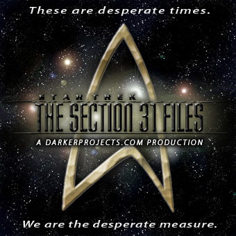
The stars behind the logo mirror the arrangement on the United federation of planets insignia
Creating a star field that accurately replicates the positioning of the stars in g1 shouldn't be insanely tricky, I did this once for a star trek fan site.
taking the fedoration of planets logo and mapping stars to it:

the article is here (I have a copy in my "cool sh*t I can do with photoshop file)
http://gallery.artofgregmartin.com/tuts ... field.html
drew wrote:Disembodied wrote:another_commander wrote:This is probably the first and last time I'm going to be saying this, but I have a feeling that completely removing the ship models (sorry Griff!) and leaving just the background with the short chart overlay would probably make this my favorite selection for the board logo.
Worth a try!
Cool! Didn't know Lave, Tionisla et al were part of the Pleaides star cluster. Will have a closer look in the Autumn with my 'scope!
Cheers,
Drew.
Re: BB Logo competition for v1.75
Posted: Sun Mar 27, 2011 11:45 am
by Zireael
So which logo won the competition?
Re: BB Logo competition for v1.75
Posted: Sun Mar 27, 2011 11:54 am
by Smivs
aegidian wrote: ...and I'll judge a winner on the first of May.
Says it all

Re: BB Logo competition for v1.75
Posted: Wed Apr 20, 2011 11:01 am
by aegidian
Just a few days left to enter a logo or comment on one already suggested...
Re: BB Logo competition for v1.75
Posted: Tue May 03, 2011 3:12 pm
by Kaks
<Prod> just curious, of course, nothing to do with my own entry...

Re: BB Logo competition for v1.75
Posted: Tue May 03, 2011 3:29 pm
by aegidian
Sorry, got caught up in stuff... judging now...
 all-logos
 by
aegidian, on Flickr
Re: BB Logo competition for v1.75
Posted: Tue May 03, 2011 3:55 pm
by aegidian
I plumped for Another Commander and Disembodied's first team effort. Nice big logo, starry background, no ships (I would have liked ships, but I agree with those who said it looked better without.
Well done, thank you everyone!