Join us at the Oolite Anniversary Party -- London, 7th July 2024, 1pm
More details in this thread.

Wheel Reinvention - The Oolite Icon

General discussion for players of Oolite.

Moderators: winston, another_commander

Post Reply
User avatar
KZ9999
Deadly
Deadly
Posts: 225
Joined: Fri Jan 23, 2009 8:55 pm
Location: Lost in Witchspace being hunted by a Thargoid Swam.

Post by KZ9999 »

Here's a small post just to give you an idea with some of the ideas I've been playing with. The following are sketches of some of the ideas that have turned up on my laptop.

A logical progression on the Classic Oolite Logo...
ImageImage
ImageImage

Attacking the logo concept without using the starbird.
ImageImage

Finally a totally random `realistic' starbird.
Image
KZ9999 wrote:
Any more suggestions out there?
ClymAngus wrote:
yes, gif animation mouse overs and userbars both rich sources of cool stuff that might embellish an already good design.
To be honest, I've all-ways been a bit dubious about the use of animation on the web. If it used with care, then it is very effective; the problem is that most times it is totally mis-handled. In this situation, the extra bandwidth that an animation would consumed would be better used in actual contents. Web Pages That Sucks covers the issues in more detail than I'll post here and with some truly eye-bleeding examples. Not to say that it doesn't have a place, by way of an example your icon is quite nice. (I would pump it through several programs I've got to clean its' look while saving half the file size.)

In answer to your question Nemoricus.
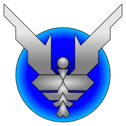
Core contributors, tinted wings with claws: Red for coders, Blue for artists (3d, sound, textures, etc), Green for other roles such running the BBS (or coming up with the new Logo :) ). Magenta for OXP creators, Cyan for creators of other materials, Yellow for other people of merit. Black, White and Clear are spare.
For other roles on the bb we have the standard elite starbird badge with tinted wings: The same range of colours, with only Black wings for assassins and Red for the snipers, and seven more to be assigned.
If the concept is doable, the colours could be decided by a vote of some kind, adding new categories too.
KZ999's Oolite documents, including the new draft Oolite Game Manual, can be found at www.box.net
User avatar
Nemoricus
---- E L I T E ----
---- E L I T E ----
Posts: 388
Joined: Mon May 18, 2009 8:51 pm

Post by Nemoricus »

Sounds good. I think that they would work out rather well.
Dream as if you'll live forever
Live as if you'll die tomorrow
User avatar
ClymAngus
---- E L I T E ----
---- E L I T E ----
Posts: 2508
Joined: Tue Jul 08, 2008 12:31 am
Location: London England
Contact:

Post by ClymAngus »

KZ9999 wrote:
To be honest, I've all-ways been a bit dubious about the use of animation on the web. If it used with care, then it is very effective; the problem is that most times it is totally mis-handled. In this situation, the extra bandwidth that an animation would consumed would be better used in actual contents. Web Pages That Sucks covers the issues in more detail than I'll post here and with some truly eye-bleeding examples. Not to say that it doesn't have a place, by way of an example your icon is quite nice. (I would pump it through several programs I've got to clean its' look while saving half the file size.)
that's cool I prefer the (big) version anyway.

Image
although technically the gears were more tricky to make
Image

Hey, I like animations. Like freedom to an enslaved man I haven't had the opportunity to use it. So I over compensate for the wilderness years. :D

Still some nice bespoke mouse overs running off a database back would look quite slick.

An unfurling logo running as a one off would look quite slick. Actually run the top 4 images together and you have an animation.
Last edited by ClymAngus on Sat Jul 25, 2009 10:50 am, edited 1 time in total.
User avatar
Kaks
Quite Grand Sub-Admiral
Posts: 3009
Joined: Mon Jan 21, 2008 11:41 pm
Location: The Big Smoke

Post by Kaks »

Hi, just wanted to say I really like the icons below, even though I'd swap the harmless & mostly harmless ones, like this:

Harmless and Mostly Harmless
ImageImage

Poor, Average, Above Average
ImageImageImage

Competent, Dangerous, Deadly and Elite.
ImageImageImageImage


Just a thought: maybe placing a bigger version of the gold elite badge in the middle of this image
Image
would make a pretty nice new splash screen... Anyway, not my department... I've still got tons of code-monkeying to do when/if I get the time!

Cheers,

Kaks.
Hey, free OXPs: farsun v1.05 & tty v0.5! :0)
User avatar
Captain Tylor
Dangerous
Dangerous
Posts: 90
Joined: Fri Sep 26, 2008 11:44 am
Location: London

Post by Captain Tylor »

I like the Cobra Mk3 flying to the planet as an excellent variant. :D.
User avatar
Cody
Sharp Shooter Spam Assassin
Posts: 16071
Joined: Sat Jul 04, 2009 9:31 pm
Location: The Lizard's Claw
Contact:

Post by Cody »

I also like the Cobra Mk3 flying to the planet.
It has a certain something...

A thought occurs...how would it look with the Cobra outbound?
I would advise stilts for the quagmires, and camels for the snowy hills
And any survivors, their debts I will certainly pay. There's always a way!
User avatar
KZ9999
Deadly
Deadly
Posts: 225
Joined: Fri Jan 23, 2009 8:55 pm
Location: Lost in Witchspace being hunted by a Thargoid Swam.

Post by KZ9999 »

El Viejo wrote:
I also like the Cobra Mk3 flying to the planet.
It has a certain something...

A thought occurs...how would it look with the Cobra outbound?
Well El Viegjo, ask and you will receive. The Dynamic Cobra variant as an outbound, with the text at various sizes.
ImageImageImageImage
I'm two minds about the thrust/engine glow and may take it out on the final version. If anyone wonders why there is no star field, simply because it blurs the image when you start to scale it down. I might experiment with a blur or tint effect to simulate the `texture of space.'

Given the issues being covered in this thead, I though I should pull the look of the Starbird a bit more away from the original look. This version invokes the feel of the classic Acornsoftware logo but should be sufficiently different enough to avoid the issues of look and feel.
Image

As before these designs are more sketches than finalised products. I will have to put this work on a bit of a back-burner for a while as I'm finally making progress on the game manual. I'm currently 75% done on the first full draft and it should weigh in at about 20-25 thousand words when done. (The original Acorn manual is only 13k words long.) More on that in a separate thread when I've got finished rtf/pdf version for general consumption.

I'll post the vector files for the various stuff later on this week when I've cleaned them up a bit more.

As before, if you got any ideas or suggestions then just post away.
KZ999's Oolite documents, including the new draft Oolite Game Manual, can be found at www.box.net
User avatar
Cody
Sharp Shooter Spam Assassin
Posts: 16071
Joined: Sat Jul 04, 2009 9:31 pm
Location: The Lizard's Claw
Contact:

Post by Cody »

KZ. Many thanks.
I like that a lot. You may be right about the thrust/engine glow.
Trouble is, they're both good. Glad it's someone else's choice.
I would advise stilts for the quagmires, and camels for the snowy hills
And any survivors, their debts I will certainly pay. There's always a way!
User avatar
Selezen
---- E L I T E ----
---- E L I T E ----
Posts: 2525
Joined: Tue Mar 29, 2005 9:14 am
Location: Tionisla
Contact:

Post by Selezen »

Finally managed to find that 3D logo. I butchered it about last night for a bit and came up with this idea:

Image

Currently it's only a bitmap and only exists as a 3D object, but the plan is to beat it up a bit more in Inkscape and generate a scalable SVG. The style of the bars may change during that process. The design should scale well to different icon formats too.

The word OOLITE in the middle can be taken away to just leave the pristine logo. The design should also be able to take on some design and colour options for things like rank and elite rating and so on if desired.
User avatar
Cody
Sharp Shooter Spam Assassin
Posts: 16071
Joined: Sat Jul 04, 2009 9:31 pm
Location: The Lizard's Claw
Contact:

Post by Cody »

Actually, KZ, I've changed my mind...I wish it was my choice. The outbound Cobra (without drive plumes) is perfect. It has a nice aura of menace about it and is, IMHO, all the better for being totally different from the original logo.
I can just see it on a t-shirt!

Again, many thanks.
I would advise stilts for the quagmires, and camels for the snowy hills
And any survivors, their debts I will certainly pay. There's always a way!
User avatar
KZ9999
Deadly
Deadly
Posts: 225
Joined: Fri Jan 23, 2009 8:55 pm
Location: Lost in Witchspace being hunted by a Thargoid Swam.

Hum... RW promo idea......

Post by KZ9999 »

El Viejo wrote:
Actually, KZ, I've changed my mind...I wish it was my choice. The outbound Cobra (without drive plumes) is perfect. It has a nice aura of menace about it and is, IMHO, all the better for being totally different from the original logo.
I can just see it on a t-shirt!
Well El Vigjo, don't give me these ideas... A image file in a4 that could printed on inkjet fabric transfer paper :idea: That is certainly do-able, as the source is totally vectored so would scale up with no problem. What would you suggest for the back of the shirt? Maybe also throw in one of those 2d-barcodes that you can scan with a cell-phone camera that contains a web link to Oolite.org and a matching http text address. Damn it, I've got enough to do without you giving me more ideas :lol:

An interesting take of the current design there Selezen. I'm very intrigued to see where you will take it. I've dumped the text from my first submission as it just gets in the way when you scale the image. Just to avoid the double post, head over to the icon comp' thread as I've posted my first official entry to the comp'. More to come as time allows.
KZ999's Oolite documents, including the new draft Oolite Game Manual, can be found at www.box.net
User avatar
Cody
Sharp Shooter Spam Assassin
Posts: 16071
Joined: Sat Jul 04, 2009 9:31 pm
Location: The Lizard's Claw
Contact:

Post by Cody »

The back of the t-shirt, KZ…mmm

Whichever winged logo is adopted as standard, overwritten by:
Galactic Tour 2084 and a list of planets of note from the Ooniverse i.e.

Reidquat
Zadies
Lave
Xeer etc.

Regards, El Viejo.
I would advise stilts for the quagmires, and camels for the snowy hills
And any survivors, their debts I will certainly pay. There's always a way!
User avatar
Selezen
---- E L I T E ----
---- E L I T E ----
Posts: 2525
Joined: Tue Mar 29, 2005 9:14 am
Location: Tionisla
Contact:

Post by Selezen »

The 3D version of the logo I showed above can be seen in full below:

Image
However, after a ridiculously short time to work on this idea, I totally reworked the whole logo in Inkscape with rounded edges and better spacing between the components.

Image
It's simple and clean and I think it would be nice as a badge or embroidered patch that could be worn on (in-game) flight suits or civvy clothes as well as a game logo.

I drew this one up as an idea for rank insignia rather than an official logo - have a look:

Image
The blue I'm not too sure about. Maybe a darker blue or a different colour, maybe even white!
User avatar
Nemoricus
---- E L I T E ----
---- E L I T E ----
Posts: 388
Joined: Mon May 18, 2009 8:51 pm

Post by Nemoricus »

I think that a dark blue would be best.
Dream as if you'll live forever
Live as if you'll die tomorrow
User avatar
DaddyHoggy
Intergalactic Spam Assassin
Posts: 8507
Joined: Tue Dec 05, 2006 9:43 pm
Location: Newbury, UK
Contact:

Post by DaddyHoggy »

How about starting with (dark) green (because as a harmless you are 'green') with each rank adding progressively more red until you reach the standalone gold rank of Elite.
Selezen wrote:
Apparently I was having a DaddyHoggy moment.
Oolite Life is now revealed here
Post Reply