Replacing Constores with Griff Trade outposts@Griff and Doc

Discussion and information relevant to creating special missions, new ships, skins etc.

Moderators: winston, another_commander

Post Reply
User avatar
Ark
---- E L I T E ----
---- E L I T E ----
Posts: 664
Joined: Sun Dec 09, 2007 8:22 am
Location: Athens Greece

Post by Ark »

DaddyHoggy wrote:
I don't know whether I should be relieved that we're "being left to it" with this potential OXP or slightly disappointed that it hasn't generated more discussion...
Do not disappoint. The code merging is over. Even some bugs of the old version are gone. To tell you the truth what we need is some more artwork:

1.The skins for the 4 sidewinders done!
2.1 or 2 more adrings done!
3.Maybe one more 1x1 billboard ad done!
4.A firm ad for the Mall-Wart constore done!
5.We realy – realy need some alternative Griff_station_glow_ads pngs done!
6.To beg Griff for deferent colors in the station inself ( griff_station_bottom.png and griff_station_top.png in deferent colors). This would make a lot deference guys!!!!!! But is something that only Griff can do. done! yes!! yes!!
7. 2 or 3 more textures (shader and non-shader version) that we can put on the top of the station (roof billboard) done!!
I may even try to make some of them myself but I am a terrible artist. Do not say that I did not warn you!!!!!!

I think we have enough ads for the 1x2 billboards.

Unfortunately we had the misfortune that Dr Nil is gone for some time now and also bear in mind that there are a lot of interesting projects this time (planetfal, solar system oxp a new anarchies version -that actually has a lot of Griff’s models with shaders- and you cannot even imagine what impact the cataclysm oxp will have in the community)

So from my point of view I am quite satisfied from the progress we had made in the past days given all the above facts. As for the discussion just look how many times this tread is being written from 28/12/2008…
Last edited by Ark on Sun Feb 08, 2009 8:37 am, edited 8 times in total.
User avatar
Pangloss
---- E L I T E ----
---- E L I T E ----
Posts: 303
Joined: Wed Dec 13, 2006 5:57 pm
Location: Scranton, PA (via Stevenage, Herts)

Post by Pangloss »

Just tell me:

the resolution of the images you need
what they should say
if there is existing artwork I can work from

...and I'll do some tomorrow morning (have to go to work soon... nearly 1pm EST here). The ad-rings are easy... I've just been tweaking people's artwork from the Your Ad Here thread. 1024 wide, 64 high.
"All is for the best in this best of all possible worlds..."
Dr.Pangloss, Voltaire's 'Candide'.

Image
User avatar
Pangloss
---- E L I T E ----
---- E L I T E ----
Posts: 303
Joined: Wed Dec 13, 2006 5:57 pm
Location: Scranton, PA (via Stevenage, Herts)

Post by Pangloss »

wackyman465 wrote:
Arabic... Mayhaps we should have different languages for ads?
Or maybe we could have government messages, like those on the billboards, that are from the Ad Cooncil?....
If anyone wants to generate Japanese text... go here.

Remember to type in CAPITALS, as Katakana is what foreign words are written in. And remember, there's no letter 'L'. And if a letter won't add, just add a 'U' at the end (U at the end of syllables in Japanese is like H at the beginning of syllables in East London). So GALCOP will be GARUKOPU and OOLITE will be OORITE.
"All is for the best in this best of all possible worlds..."
Dr.Pangloss, Voltaire's 'Candide'.

Image
User avatar
Griff
Oolite 2 Art Director
Posts: 2483
Joined: Fri Jul 14, 2006 12:29 pm
Location: Probably hugging his Air Fryer

Post by Griff »

DaddyHoggy wrote:
@Griff - is it possible to do multiframe versions of the ad-rings - i.e. two 1024x64 images on top of each other making a 1024x128 and using the same technique used for the other multiframe ads, switch between them (at a much slower frame rate) - just a thought...
I had a quick mess about with the shaders and this should do it:
save the following code out as griff_station_animated_adring.vertex

Code: Select all

// Information from Oolite.
uniform float       uTime;

varying vec3        v_normal;      // Surface normal
varying vec3        v_pos;      // Vertex/fragment position in eye space

// Control factors.
uniform float         TimePerFrame;
uniform float         FrameCount;

float   kAnimCycleTime = TimePerFrame * FrameCount;
float   scrollspeed = 0.05;

void main(void)
{

   v_normal = normalize(gl_NormalMatrix * gl_Normal);
   v_pos = vec3(gl_ModelViewMatrix * gl_Vertex);
   gl_Position = ftransform();
   vec4 coord = gl_TextureMatrix[0] * gl_MultiTexCoord0;
   
   // Select frame.
   coord.t += floor(mod(uTime, kAnimCycleTime) / TimePerFrame);
   
   // Scale texture co-ordinates to 0..1
   coord.t /= FrameCount;

   // Scroll s texture coord
   coord.s = gl_MultiTexCoord0.s + mod(uTime * scrollspeed, 1.0); 
   
   //final transformed texture coords 
   gl_TexCoord[0] = coord;
}
save the following out as griff_station_animated_adring.fragment

Code: Select all

const float specExponent = 1.0;
const float specIntensity = 0.2;

// Information from Oolite.
uniform sampler2D      tex0; // Diffuse Map

// Information from vertex shader.
varying vec3         v_normal;      // Surface normal
varying vec3         v_pos;      // Vertex/fragment position in eye space

// Calculate the contribution of a single light. Ought to be a function, but OS X's GLSlang implementation isn't sufficiently clever.
#define LIGHT(idx) \
   { \
      vec3 lightVector   = normalize(gl_LightSource[idx].position.xyz); \
      vec3 reflection   = normalize(-reflect(lightVector, v_normal)); \
      diffuse += gl_FrontMaterial.diffuse * gl_LightSource[idx].diffuse * max(dot(v_normal, lightVector), 0.0);  \
      specular += gl_LightSource[idx].diffuse * pow(max(dot(reflection, eyeVector), 0.0), specExponent); \
   }

void main()
{
   vec4 diffuse = vec4(0.0), specular = vec4(0.0);
   vec3 eyeVector = normalize(-v_pos);
   
/*   Light 0 is the "showroom" light, used in the demo screen and shipyard.
     Light 1 is the sun. */
#ifdef OO_LIGHT_0_FIX
   LIGHT(0);
#endif
   LIGHT(1);
   diffuse += gl_FrontMaterial.ambient * gl_LightModel.ambient;  

   vec4 color = texture2D(tex0, gl_TexCoord[0].st);
   gl_FragColor = color + specular * specIntensity;
}
shipdata.plist entry:

Code: Select all

"griff_station_animated_adring" = 
	{
	ai_type = "nullAI.plist";
	model = "griff_station_adring.dat"; 
	roles = "griff_station_subent";
	shaders = 
    { 
        "griff_station_adring.png" = 
        { 
            vertex_shader = "griff_station_animated_adring.vertex"; 
            fragment_shader = "griff_station_animated_adring.fragment"; 
            
            textures = ({name = "griff_station_adring.png"; repeat_s = "yes";});
            uniforms = 
            { 
		FrameCount = { type = "float"; value = 2.0; };
		TimePerFrame = { type = "float"; value = 1.2; };				
                uTime = "timeElapsedSinceSpawn"; 
            };  
        }; 
	};	
	};	
These two shaders and the shipdata.plist entry should creatw an animated version of the scrolling ad ring - stack frames vertically like we do for the animated billboards
I noticed that the current trade outpost shaders could do with clean up, some shaders have uniform bindings in them that they don't use etc, i'll spruce them up over the weekend and add in the stuff from the griff_boa shader to allow us to change the texture colors using values written into the shipdata.plist
Last edited by Griff on Mon Jan 05, 2009 8:45 pm, edited 1 time in total.
User avatar
JensAyton
Grand Admiral Emeritus
Posts: 6657
Joined: Sat Apr 02, 2005 2:43 pm
Location: Sweden
Contact:

Post by JensAyton »

Ark wrote:
@Pangloss: Your adring looks great at a static image but bear in mind that although the adring is moving from the right to the left the station itself rotates at the opposite position with at least twice the speed so avoid banners unless you want to write something in Arabic.
Or you could just turn it over; after all, there’s no right way up in space.
User avatar
Ark
---- E L I T E ----
---- E L I T E ----
Posts: 664
Joined: Sun Dec 09, 2007 8:22 am
Location: Athens Greece

Post by Ark »

Ahruman wrote:
Ark wrote:
@Pangloss: Your adring looks great at a static image but bear in mind that although the adring is moving from the right to the left the station itself rotates at the opposite position with at least twice the speed so avoid banners unless you want to write something in Arabic.
Or you could just turn it over; after all, there’s no right way up in space.
Really :oops:
User avatar
wackyman465
---- E L I T E ----
---- E L I T E ----
Posts: 831
Joined: Thu Nov 06, 2008 10:15 pm
Location: Currently hunting you down in an Imperial Courier

Post by wackyman465 »

Can the station not rotate? Please? I always enjoyed screaming into the con store on injectors....
I shot him back first. That is to say, I read his mind and fired before he would have fired on me. No, sir, he wasn't a fugitive.
User avatar
DaddyHoggy
Intergalactic Spam Assassin
Posts: 8515
Joined: Tue Dec 05, 2006 9:43 pm
Location: Newbury, UK
Contact:

Post by DaddyHoggy »

As ever Ahruman gets straight to the point - I was going to suggest putting the Ad-ring the other way up.

@Griff - nice one re:shader ad-ring

@Ark - something to thing about for v2?
Selezen wrote:
Apparently I was having a DaddyHoggy moment.
Oolite Life is now revealed here
User avatar
Pangloss
---- E L I T E ----
---- E L I T E ----
Posts: 303
Joined: Wed Dec 13, 2006 5:57 pm
Location: Scranton, PA (via Stevenage, Herts)

Post by Pangloss »

Ahruman wrote:
Ark wrote:
@Pangloss: Your adring looks great at a static image but bear in mind that although the adring is moving from the right to the left the station itself rotates at the opposite position with at least twice the speed so avoid banners unless you want to write something in Arabic.
Or you could just turn it over; after all, there’s no right way up in space.
He's right. He's not wrong.

Image

And there now follows a Party Political Broadcast on behalf of the Scrolling Party. Let me know which one of these scrolls the right way (and I know the logos are 90 degrees the wrong way, but hey, it's a quick fix and I can tweak them if either of these works!!)...

Image Image

I feel dizzy looking at those. Time for bed.

EDIT: crap, I have to rotate both of them through 90 degrees, don't I.

Arse-biscuits.

EDIT TO THE EDIT: oh, PhotoBucket lets me do it online. Never mind. Job done.
"All is for the best in this best of all possible worlds..."
Dr.Pangloss, Voltaire's 'Candide'.

Image
User avatar
Ark
---- E L I T E ----
---- E L I T E ----
Posts: 664
Joined: Sun Dec 09, 2007 8:22 am
Location: Athens Greece

Post by Ark »

DaddyHoggy wrote:
@Ark - something to thing about for v2?
What v2 the German Rocket of WW2?

To tell you the truth I am not very font with the idea of turning the adring upside down. Let me think about it

@pangloss: Read your PMs man
User avatar
Pangloss
---- E L I T E ----
---- E L I T E ----
Posts: 303
Joined: Wed Dec 13, 2006 5:57 pm
Location: Scranton, PA (via Stevenage, Herts)

Post by Pangloss »

Ark wrote:
DaddyHoggy wrote:
@Ark - something to thing about for v2?
What v2 the German Rocket of WW2?

To tell you the truth I am not very font with the idea of turning the adring upside down. Let me think about it

@pangloss: Read your PMs man
At 3 in the morning? I need my beauty sleep!

Thanks for the images, Ark. Here's what I did with some of them.

First of all, I said I was going to play around with transparency. As the ads created for Your Ad Here were 128 pixels high (but the ad ring is 64 pixels high), I created a banner of double size. 2048 pixels wide by 128 high.

For those of you that want to see the background image, and you're all free to use it yourself, click here. It's in 24-bit PNG, very small file size, and you see the bands at the top and bottom? Transparent, my friends.

So I went through the Your Ad Here (Set A) pictures and picked out a few. Trimmed off jagged lines, added some drop shadows and a bevel or a stroke, trimmed a few lines and moved text around so everything fit better. And then I overlaid them on the background ring.

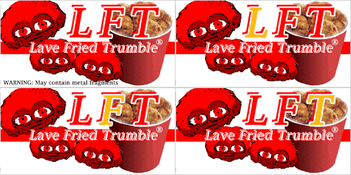
Working at a higher resolution meant I was able to be more precise with the images. I managed to get the colors running through the ads (check out the central band of the LFT ad, for example... it changes with the background colors). This is what I have.

Image

Notice the transparency of the bands, showing the phpBB page behind it? I'm hoping that transparency allows the Trade Outpost to be visible behind the banner. Oh, and if anyone ever decides to take Oolite into super Hi Def, the original 2048 by 128 file is 227KB. You can see that here...

Once the image was complete, I merged all the layers onto one layer and then reduced the size to 1024 by 64. Saved as a 24-bit PNG, it's only 96KB. The 8-bit version was over 60KB, and the image looks MUCH sharper with more shades of loveliness.

Want me to do the same with the other Your Ad Here entries over the next few days? Now I have the background, and I have a system, it shouldn't take me long in my free time to knock out a few more.

And many, MANY thanks to all the glorious bastards that contributed to this. Could not have done this without you.
"All is for the best in this best of all possible worlds..."
Dr.Pangloss, Voltaire's 'Candide'.

Image
User avatar
JensAyton
Grand Admiral Emeritus
Posts: 6657
Joined: Sat Apr 02, 2005 2:43 pm
Location: Sweden
Contact:

Post by JensAyton »

It strikes me – somewhat belatedly – that if you alpha-masked the banners, you could have the hue gradient implemented in the shader and running at a different speed, opposite direction, occasionally flashing or whatever.

Anything to make banner ads even more annoying.
User avatar
Pangloss
---- E L I T E ----
---- E L I T E ----
Posts: 303
Joined: Wed Dec 13, 2006 5:57 pm
Location: Scranton, PA (via Stevenage, Herts)

Post by Pangloss »

Ahruman wrote:
It strikes me – somewhat belatedly – that if you alpha-masked the banners, you could have the hue gradient implemented in the shader and running at a different speed, opposite direction, occasionally flashing or whatever.

Anything to make banner ads even more annoying.
Holy crap, we'd have people having seizures. Background running with a strobe effect, ads hovering over the top... I'd be foaming at the mouth!!
"All is for the best in this best of all possible worlds..."
Dr.Pangloss, Voltaire's 'Candide'.

Image
User avatar
DaddyHoggy
Intergalactic Spam Assassin
Posts: 8515
Joined: Tue Dec 05, 2006 9:43 pm
Location: Newbury, UK
Contact:

Post by DaddyHoggy »

@Pangloss - I like very much! "Oops" - remains one of my favourite Ads - especially as I remember colouring the pixels by hand because I didn't then know another method of doing it (PSP7 on the PC at the time)!
Selezen wrote:
Apparently I was having a DaddyHoggy moment.
Oolite Life is now revealed here
User avatar
Pangloss
---- E L I T E ----
---- E L I T E ----
Posts: 303
Joined: Wed Dec 13, 2006 5:57 pm
Location: Scranton, PA (via Stevenage, Herts)

Post by Pangloss »

OK: just PMing Ark and Griff... I'll do the Sidewinders tomorrow. And possibly design the Mall Wart logo, based on the new US Wal-Mart logo, and stick that on one too...

Image

...no problem there.

@Griff: I'm also willing to do the 256 by 256 collection of little neon signs, as long as you can send me an image that shows what the boundaries are (so I don't color over the lines).
"All is for the best in this best of all possible worlds..."
Dr.Pangloss, Voltaire's 'Candide'.

Image
Post Reply