Page 6 of 8
Re: [Release] Bulletin Board system
Posted: Mon Jan 15, 2018 9:44 pm
by phkb
Thanks for that. I've found the bug, and I'll get a fix out shortly.
Re: [Release] Bulletin Board system
Posted: Mon Jan 15, 2018 10:30 pm
by herodotus
Cool - thanks!
Re: [Release] Bulletin Board system
Posted: Sat Jan 20, 2018 6:22 am
by phkb
Version 1.4 of the BB system is now available. In this version:
- Makes use of new short range chart and custom chart options available in Oolite 1.87.
- Better method of determining when missions are expired and then removing them from the BB list.
- Added a flag to Library Config that will allow the internal ID of a mission to be added to the mission details page, which can be useful for debugging.
- Now plays the "[contract-accepted]" sound when any contract is accepted.
- Added new flag to the "$addBBMission" object: "playAcceptedSound", a boolean value allowing the contract to control whether the "[contract-accepted]" sound will be played.
And version 1.4 of the Contracts On BB OXP is also now available. In this version:
- Fixed issue with Escort Contracts, where failing the contract by jumping to the wrong system would not remove the Bulletin Board item.
- Added contracts from "Taxi Galactica" OXP (v2.0) onto the Bulletin Board.
- Updates to handle new features in Bulletin Board v1.4
- Code refactoring.
Re: [Release] Bulletin Board system
Posted: Sun Jan 21, 2018 7:57 pm
by herodotus
Hey,
Just got a chance to try out the latest update. Looks like the Escort Missions still aren't working quite as expected on the BB. I accepted one from the BB, but then something weird happened. The F4 screen showed me as only having one mission active in the main list (I already had another mission active before I accepted the escort, so the active mission count should have been 2), but when I went into the BB, the escort mission was there as an accepted mission. When I launched the trader was nowhere to be seen, and the f5 manifest didn't list the mission any more. From that point on it was as if the mission had never existed! This has happened reliably with every escort mission I've accepted so far since the new version.
Re: [Release] Bulletin Board system
Posted: Sun Jan 21, 2018 9:20 pm
by phkb
Thanks for the report. I'll investigate and get an update out shortly.
Update: OK, I found the culprit, I think. New version of Contracts On BB OXP (v1.5) now available.
Re: [Release] Bulletin Board system
Posted: Wed Jan 24, 2018 10:12 am
by herodotus
Ok, will give it a go when I get a moment. In the meantime I have a suggestion/feature request. With some of the old mission screens - I think the escort missions and maybe also the parcel/passenger/cargo ones, you could view the map for the mission and then press next/previous to scroll through the whole list without leaving the map screen. This is especially useful when you've got a route plotted in already and want to find missions that are roughly along the same path. For extra bonus points, also display the credits value of the mission on the same screen so that you can see if it's worth bothering with. Probably not the useful if you're an old space dog who knows the entire chart upside down, but good for rookies like me who can't remember where are the systems are....
Re: [Release] Bulletin Board system
Posted: Sat Jan 27, 2018 3:12 pm
by phkb
I've had a bit of a think about this one. On the old F4 interface screens, there was only ever 1 type of contract on offer. Which means that you, as a player, would know that if you went to the next contract, it would be of the same type. So it was understandable that a "next/previous" contract would be efficient in that scenario, because a key piece of information - the type of contract being viewed - could be assumed.
With the BB system, that's not the case. There is no guarantee that the next contract is going to be of the same type as the current one, and the type of contract is a key piece of information that (I feel) needs to be visible up front.
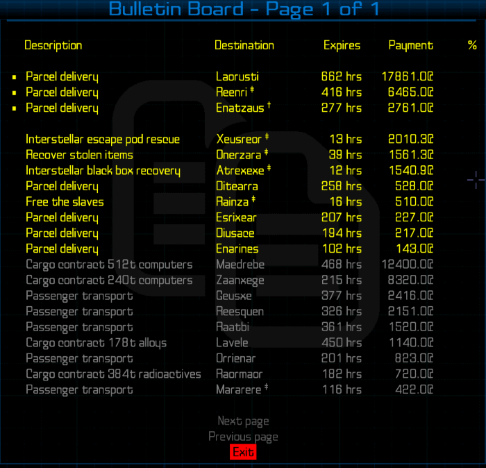
That said, finding contracts that are on or near to your currently plotted path is a useful thing. Rather than approach it from the map screen end, though, how about if I added some sort of flag to the destination name displayed on the initial mission list? Something like this:

Where the "†" symbol indicates the system is directly on the current plot, and "‡" would indicated the system is within 7ly of one of the systems on your current plot.
What do you think?
Re: [Release] Bulletin Board system
Posted: Sat Jan 27, 2018 5:07 pm
by Disembodied
phkb wrote: ↑Sat Jan 27, 2018 3:12 pm
It's a handy wrinkle … instead of flags, though, would it be possible to use colours? E.g. green for en route, blue for within 7ly? It might make things more immediately obvious.
Re: [Release] Bulletin Board system
Posted: Sun Jan 28, 2018 12:29 am
by phkb
Disembodied wrote:would it be possible to use colours?
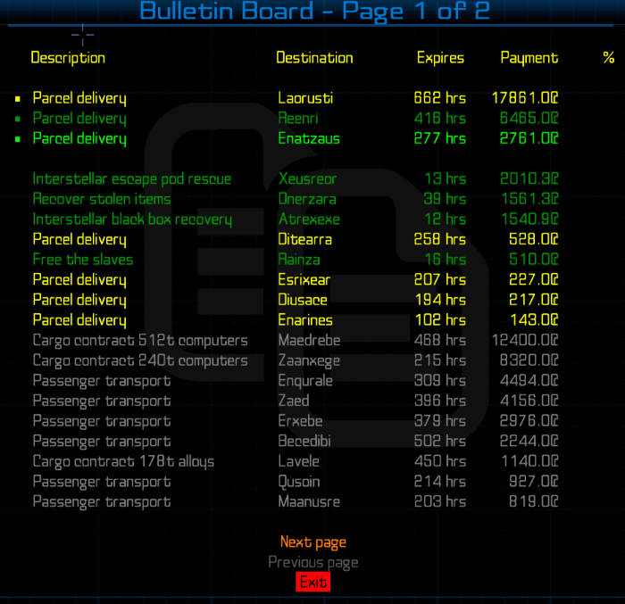
Here's a sample with colors. I found blue to be a bit too garish, so I opted for green and dark green.

Thoughts?
Re: [Release] Bulletin Board system
Posted: Sun Jan 28, 2018 10:42 am
by Disembodied
Looks good! Is there a key anywhere, to tell users what the different colours mean - e.g.
On current route
<7ly detour
Not on current route
Or do they have to Read The Instructions?
Re: [Release] Bulletin Board system
Posted: Sun Jan 28, 2018 10:58 am
by phkb
Read the instructions of course! I mean, everyone reads the instructions, don’t they?
Re: [Release] Bulletin Board system
Posted: Mon Jan 29, 2018 11:00 am
by herodotus
Yeah, that does seem like a reasonable compromise - it would certainly help me filter down the list to ones worth looking at more closely. Out of interest, would it (in theory, perhaps not in practice if it's a faff to do) be possible to do the next/previous thing on the map but also display the contract type on the map screen? Or are you very limited about what can be displayed there? Personally I find the visual prompt of being able to actually *see* the routes works better for my brain, and it also means I can flick back and forth easily working out how I might be able to plot a route that incorporates a bunch of different missions in sequence for extra fun and profit. This is obviously much harder to do when you've only got a limited "close to current course" prompt.
Cheers,
Re: [Release] Bulletin Board system
Posted: Mon Jan 29, 2018 9:56 pm
by phkb
herodotus wrote:
Out of interest, would it (in theory, perhaps not in practice if it's a faff to do) be possible to do the next/previous thing on the map but also display the contract type on the map screen? Or are you very limited about what can be displayed there?
I'm kind of limited at the moment. There are two different types of map screen - a short range one, and a long range one. The long range map has 2 or 3 lines to play with, so it's not too bad there. On the short range map, though, I have 1 line left before I have to start dropping existing items (either menu items, or removing the number of jumps). I could put the mission description into that line, but there'd be no room for a "Next mission" menu item, and definitely no room for a "Previous mission".
The options are, (a) I could drop the "Accept mission" menu item, and only show it on the mission briefing page (meaning you can
only accept a mission from the briefing screen). (b) I could remove the "Close" menu item, and only have the "Return to mission briefing" item (meaning you couldn't close the mission and return to the main mission list directly from the map screen). (c) I could leave out the mission description and just add one extra menu item, being "Next mission". I guess it all depends on how important we think this is.
I
can put text on top of the map itself, but I'd like to avoid that if I can, as there's always the potential for text overwriting some critical piece of the map display (like the destination system).
Adding "Next mission"/"Previous mission" menu items to the mission briefing screen is simple enough, although the menu would eat into screen real estate quite a bit. Anyway, let me know what you think.
As an aside, should I implement these options, what should the text say? "Next mission"? "Next contract"? "Next Bulletin Board item"?
Re: [Release] Bulletin Board system
Posted: Wed Jan 31, 2018 5:18 pm
by herodotus
I'm only one person, so maybe this isn't worth faffing with if no one else thinks it's a good idea. I definitely agree that putting text on the map is a mistake.
Personally I'd be happy to lose the "close" option in exchange for a quick "next" option from the map, but that make it worse for people who use it differently to me.
phkb wrote:
As an aside, should I implement these options, what should the text say? "Next mission"? "Next contract"? "Next Bulletin Board item"?
I'd say "Next contract". AFAICT everything on the BBS is a contract with a fee but maybe that's because I haven't come across the things that aren't yet!
Re: [Release] Bulletin Board system
Posted: Sat Feb 03, 2018 1:00 am
by phkb
Version 1.5 is now available. In this version:
- Added option to highlight missions whose target system is on or near to your current course. Highlight can be via color or markers, switchable via Library.
- Code refactoring.
- Added mission description and payment amount to the map screen.
- Added "Next contract" menu item to mission details page.
- Included option (switchable via Library Config) of adding "Next contract" to map screen.
I haven't put a "Previous contract" option on yet. I thought I'd see how the "Next contract" option goes first.

